Buy a print of the TIME 100th Anniversary Centennial cover here
I am frequently asked, as creative director of TIME, to choose my favorite cover in the magazine’s history—a history that now covers a full century. It’s a question I typically avoid, given that any one answer leaves too many covers on the cutting-room floor. However, on the occasion of TIME’s 100th birthday, I decided to answer the question (sort of)—by picking not just one favorite cover, but 100, one from each year in TIME’s history.
Some years the choice was obvious: the provocative typographic “Is God Dead” from 1966; the memorable “Yep, I’m Gay” cover with Ellen DeGeneres in 1997; the powerful black-bordered Sept. 11, 2001, cover. But some years it was difficult to pick just one. (I have nearly a dozen favorites in 1968 alone, though 1950’s “World & Friend”—the iconic image of the earth drinking a Coke—is the only cover I have hanging in my house.)
Read more: 100 Years of Impact
Many of the following behind-the-scenes stories about the cover of TIME are drawn from the pages of the magazine—typically the Letter From the Publisher, which first appeared in 1942. Other anecdotes and background come from artist and photographer biographies, stories passed down through the years, and two in-depth books on TIME’s history: specifically, an essay by Frederick S. Voss in Faces of TIME, which was published in conjunction with the magazine’s 75th anniversary and TIME’s ongoing cover-art donation to the National Portrait Gallery, and TIME: The Illustrated History of the World’s Most Influential Magazine by Norberto Angeletti and Alberto Oliva.
Here are the stories behind my favorite TIME covers—one from each year.
Jump to: The 1920s; the 1930s; the 1940s; the 1950s; the 1960s; the 1970s; the 1980s; the 1990s; the 2000s; the 2010s; the 2020s
The 1920s
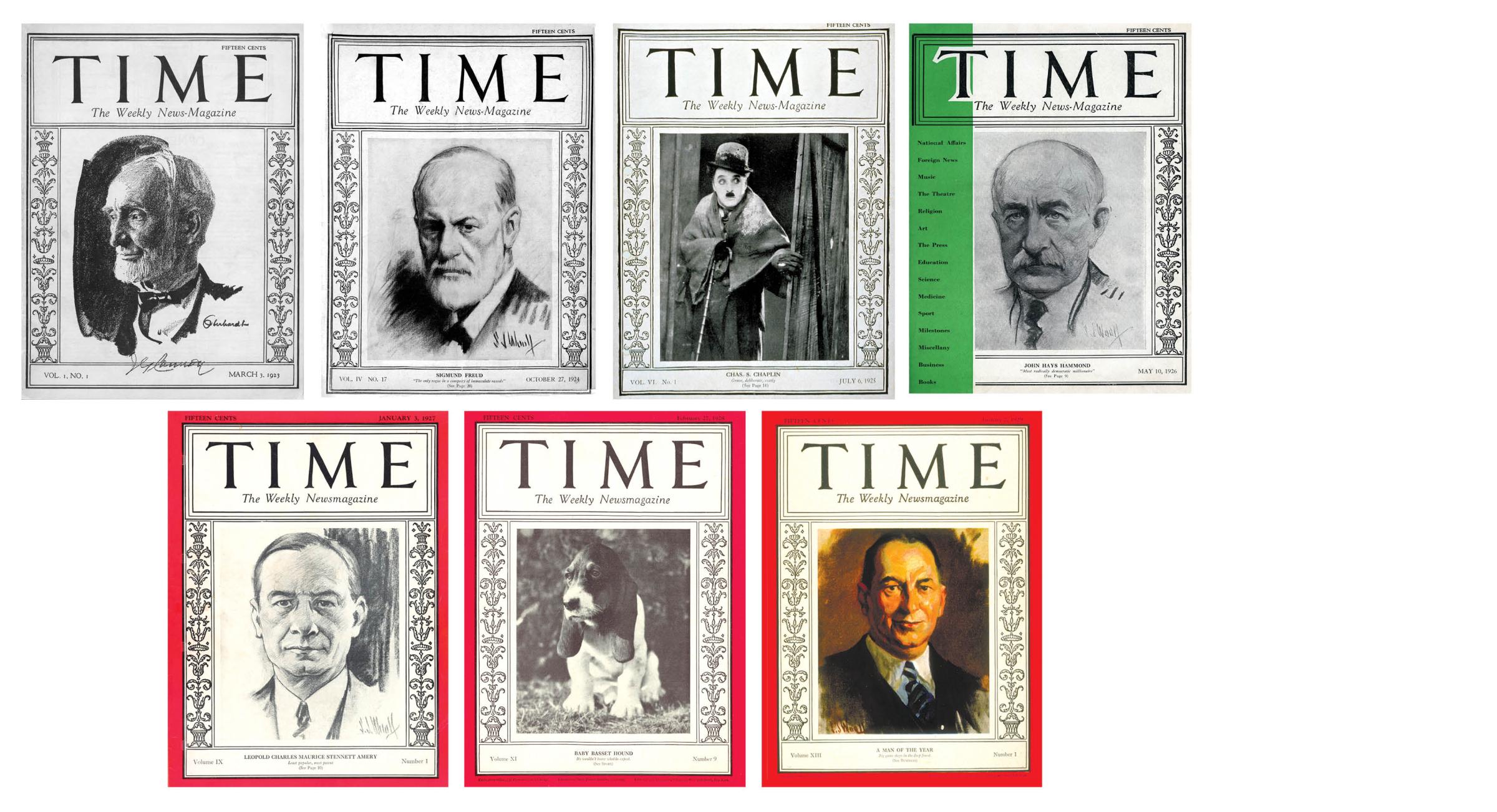
March 3, 1923: Joseph Cannon Illustration by William Oberhardt
Oct. 27, 1924: Sigmund Freud Illustration by S.J. Woolf
July 6, 1925: Charlie Chaplin
May 10, 1926: John Hays Hammond Illustration by S.J. Woolf
Jan. 3, 1927: Leopold Stennett Amery Illustration by S.J. Woolf
Feb. 27, 1928: Baby Basset Hound
Jan. 7, 1929: Walter P. Chrysler Illustration by S.J. Woolf
I’ve always found it funny that for the first issue of TIME, dated March 3, 1923, founders Henry Luce and Briton Hadden waited until the last minute to finalize the cover—a practice that occasionally occurs to this day. Faced with pressing deadlines, they hurriedly asked a contact at advertising agency J. Walter Thompson to create an ornate “diddling” scroll up the sides, and organized pertinent information within hand-drawn boxes. Luce paid artist William Oberhardt $50 for the onetime use of a portrait of then Speaker of the House Joseph Cannon, which Oberhardt had created two years earlier as a commission for the U.S. government.
Read the first issue of TIME here in the TIME Vault
The story on Cannon was only 300 words, but that first cover image started one of the magazine’s recognizable features: placing a frame around a newsworthy person. Said Luce of the first issue: “I picked it up and began to turn through its meager 32 pages (including cover). Half an hour later, I woke up to a surprise: what I had been reading wasn’t bad at all.”
What I enjoy most about the early TIME covers is the handcrafted feel—from the squiggly hand-drawn lines to the rough charcoal drawings, many by artist S.J. Woolf, who previously worked as a frontline artist-correspondent in Europe with the U.S. Army during World War I. Woolf’s work also accompanied noteworthy covers such as the John Hays Hammond portrait in 1926 that, with its green vertical stripe, shows how Luce and Hadden were up for trying new ideas. Green and orange colors were both published before they settled on the iconic red border, which debuted on the Jan. 3, 1927, cover alongside another charcoal painting by Woolf, of British politician Leopold Stennett Amery.
It would be easy to choose Woolf’s portrait of TIME’s first Man of the Year, Charles Lindbergh (Jan. 2, 1928) as a favorite. The 25-year-old aviator, who posed in Paris just six days after completing his transatlantic flight, actually autographed Woolf’s portrait. But that would overlook the Baby Basset Hound (Feb. 27, 1928), whose sole reason for appearing on TIME’s cover was that this particular pup had not been invited to the Westminster Kennel Club’s 52nd Annual Dog Show. As TIME wrote: “Of all beasts, dogs are perhaps the most melancholy in their looks; of all dogs, the slouching basset hound is the most sad. Of all basset hounds, none is more woebegone, more tragic than a certain basset hound puppy.”
The 1930s
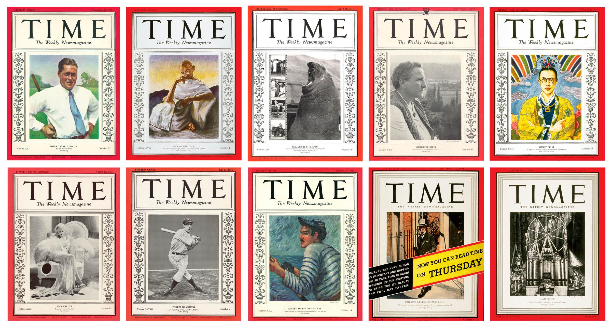
Sept. 22, 1930: Robert Tyre Jones Jr. Painting by Eleanor Harris
Jan. 5, 1931: Man of the Year—Gandhi by Vladimir Perfilieff
April 18, 1932: Goliath II & Friends
Sept. 11, 1933: Gertrude Stein
March 5, 1934: Henry Pu Yi by Jerry Farnsworth
Aug. 19, 1935: Jean Harlow
July 13, 1936: Joe DiMaggio
Oct. 18, 1937: Ernest Hemingway by Waldo Peirce
Oct. 17, 1938: Britain’s Neville Chamberlain by S.J. Woolf
Jan. 2, 1939: Man of the Year—Hitler by Rudolph Charles von Ripper
As TIME settled into its groove in the 1930s, the cover became a place to show off just how much range the magazine could cover. There was sports; amateur golfer Bobby Jones (Sept. 22, 1930) is one of many athletes to grace the cover, and it’s no surprise Sports Illustrated was spun off from TIME’s pages in 1954. There were strong points of view; the choice of Mohandas Gandhi as 1930’s Man of the Year included this bold headline: “In jail, he; at large, Wiggin, Jones, Lewis, Stalin, Hitler, Capone.” (That one is my choice for 1931, not 1930, as Man of the Year selections used to appear in the first issue of the following year.) There was glamor; a 1935 photograph of Jean Harlow, whom TIME called “the foremost U.S. embodiment of sex appeal,” was such a departure from the norm that some readers were scandalized. “Movie stars’ faces are all right in the movie magazines, in pictures, and in their proper place,” one wrote in, “but not on the front cover of TIME.” There was whatever the opposite of glamor is: a 5,000-lb. elephant seal for the 1932 cover on the Ringling Brothers circus.
There was commerce; a 1938 painting of Britain’s Neville Chamberlain is overtaken by a banner exclaiming “Now you can read TIME on Thursday.” There was art; 1937’s Ernest Hemingway cover was created by Waldo Peirce, once called the Hemingway of American painters. (His reply: “They’ll never call Ernest Hemingway the Waldo Peirce of American writers.”) And there was politics: The Sept. 11, 1933, cover of Gertrude Stein is interesting mostly for the logo printed at the top. It was one of 11 covers in 1933 that featured the NRA logo, a symbol used by U.S. companies to show their support of President Franklin D. Roosevelt’s National Industrial Recovery Act. The magazine devoted a significant amount of coverage to the National Recovery Administration—culminating four months later in the selection of the first director of the NRA, Hugh Johnson, as the 1933 Man of the Year. No such branding has appeared on TIME’s cover since.
TIME’s annual Person of the Year franchise is meant to name “who or what most influenced the events of the past 12 months, for good or for ill.” That said, publisher Ralph Ingersoll wanted to make sure readers didn’t view the choice of Adolf Hitler for 1938 as an endorsement of the dictator. After seeing a cover portrait that he felt was too flattering, Ingersoll took the suggestion of none other than his psychiatrist and reached out to artist Rudolph C. von Ripper, who was jailed in Germany for his caricatures of Nazis but had a New York gallery show in 1938. The show included a piece titled Hitler Plays the Hymn of Hate, depicting Hitler playing a pipe organ that is also a torture device. That was the image TIME ran as its cover. One reader characterized it as the “lowest and foulest thing” the magazine had ever done. To Ingersoll, the image perfectly captured the moment. Ingersoll, however, didn’t apprise Henry Luce of the cover image until after it was published. TIME’s co-founder was livid, and Ingersoll left the magazine shortly after. This remains the only TIME Person of the Year cover on which the subject’s face doesn’t appear.
The 1940s
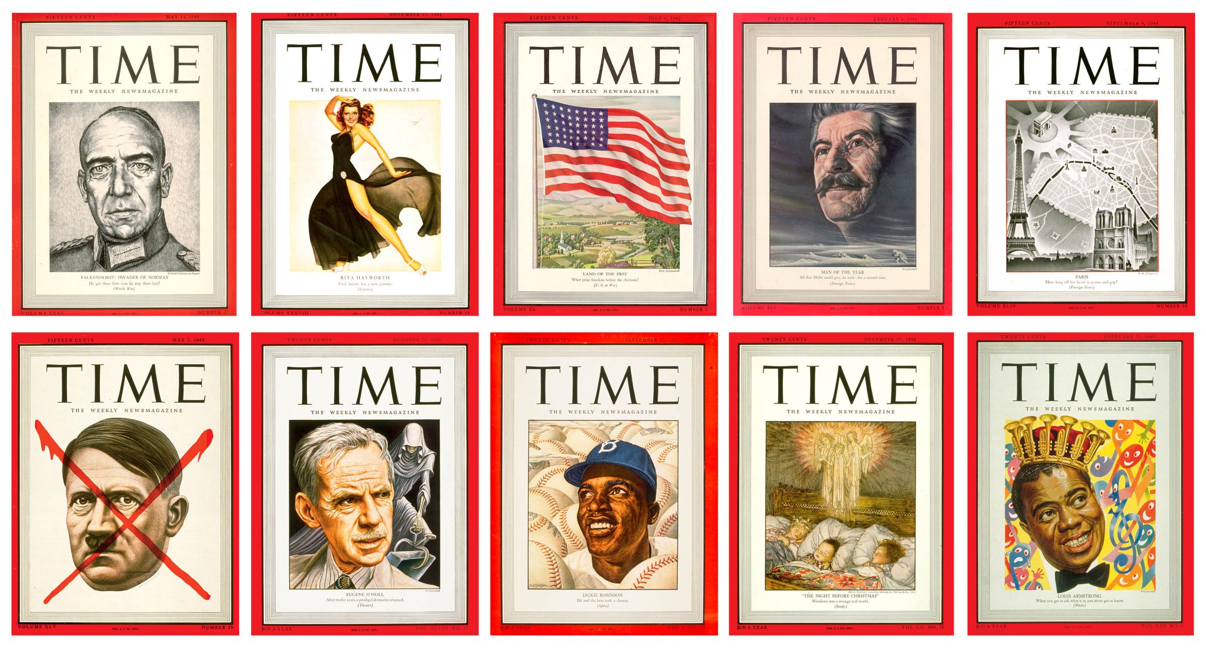
May 13, 1940: Falkenhorst by Rudolph Charles von Ripper
Nov. 10, 1941: Rita Hayworth by George Petty
July 6, 1942: Land of the Free by Boris Artzybasheff
Jan. 4, 1943: Joseph Stalin by Boris Artzybasheff
Sept. 4, 1944: Paris by R.M. Chapin Jr.
May 7, 1945: Hitler “X” by Boris Artzybasheff
Oct. 21, 1946: Eugene O’Neill by Boris Artzybasheff
Sept. 22, 1947: Jackie Robinson by Ernest Hamlin Baker
Dec. 27, 1948: The Night Before Christmas
Feb. 21, 1949: Louis Armstrong by Boris Artzybasheff
The first 15 years of covers were predominantly black-and-white images of men (694 of the first 782, to be exact). That started to change when editor Dana Tasker arrived in the late 1930s. Tasker was hired to be TIME’s business and finance editor but soon reorganized the magazine’s visuals, began taking charge of the covers, and took more risks. One of his earliest risks was the Nov. 10, 1941, color image of a leggy Rita Hayworth, by famed pinup artist George Petty. “Do you think that the majority of your subscribers will not be offended by the frontispiece on TIME … displaying the almost nude body of Rita Hayworth,” wrote a reader from Philadelphia. Other readers, however, loved the change—“WOW!!!!!!!!” exclaimed one, with eight exclamation points. Whatever the reaction, Tasker led the direction of a new identity with realistic painted likenesses featuring colorful backgrounds that helped describe the cover subject, and some further departures from the norm of an individual portrait on the cover. One example of the latter is from July 6, 1942, a World War II–Fourth of July idyll titled “Land of the Free,” featuring a waving American flag set atop a pastoral scene painted by artist Boris Artzybasheff (more on him later).
The first graphic cover of TIME was the Sept. 4, 1944, illustrated map of Paris by Robert M. Chapin. Chapin, an architect turned cartographer who was at TIME for 33 years, worked while referring to “two large floating globes—one political, one physical—hung from the ceiling by pulleys and counterweights,” in order to capture any angle and perspective. Another of TIME’s iconic graphic symbols was established in 1945. A cover featuring Soviet Marshal Georgy Zhukov was already rolling off the printing press when news broke that Hitler was dead. Fortunately, TIME already had a portrait of Hitler by Artzybasheff and immediately sent it to the printers with instructions to put a large red X over his face. It was the first cover of TIME that didn’t have a headline. It didn’t need one. As TIME wrote: “For seldom had so many millions of people hoped so implacably for the death of one man.” The bold graphic symbol has since been used five times on the cover.
The last half of the 1940s continued the visual cover approach that Tasker desired, with a vivid portrait of Eugene O’Neill and a dramatic background for his play The Iceman Cometh; a powerful image of a smiling Jackie Robinson emerging from oversize baseballs; an angelic painting of sleeping children on “The Night Before Christmas”; and a joyously colorful illustration of jazz king Louis Armstrong, complete with a crown of trumpets.
The 1950s
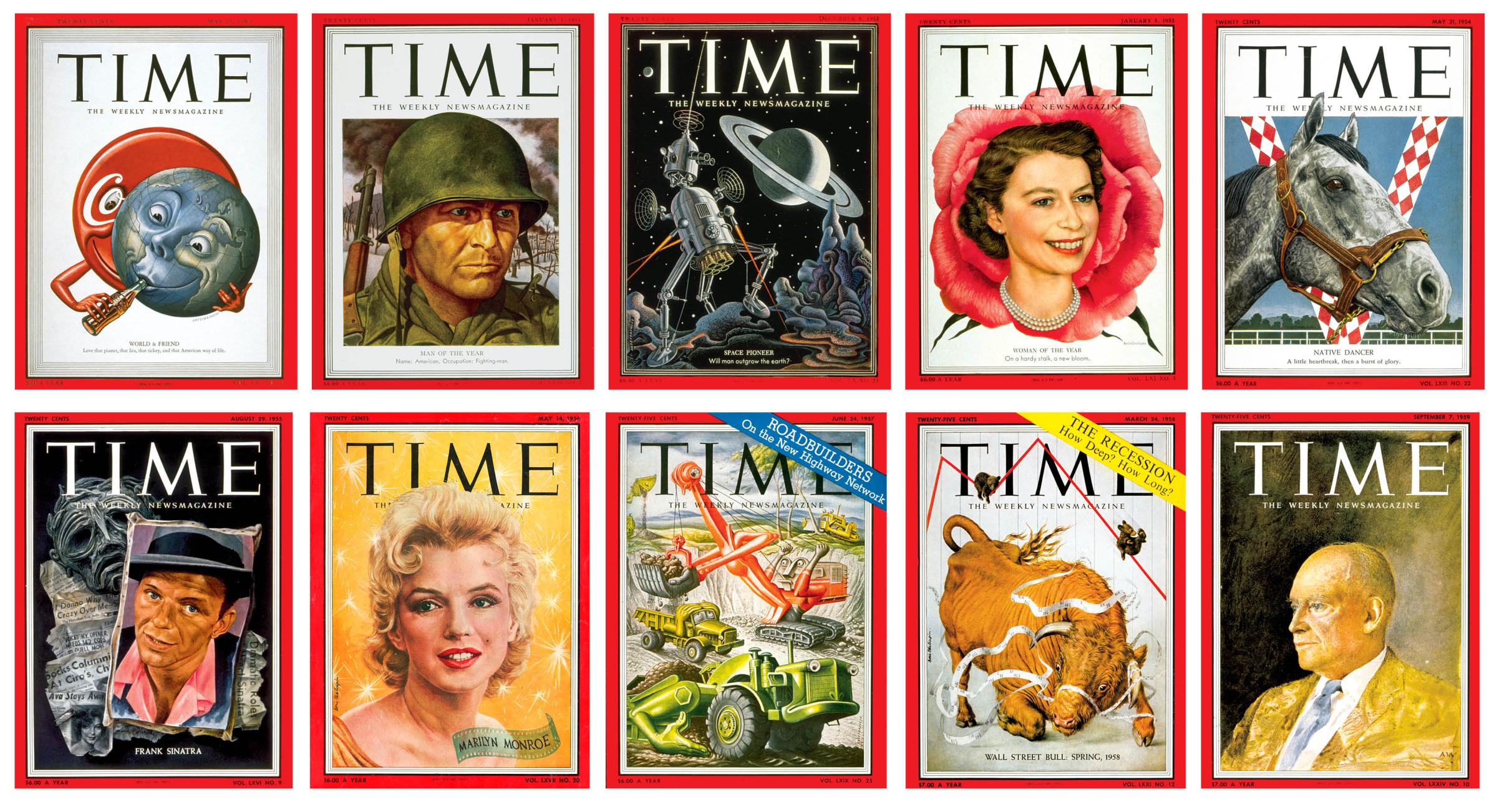
May 15, 1950: World & Friend by Boris Artzybasheff
Jan. 1, 1951: Man of the Year—Fighting Man by Ernest Hamlin Baker
Dec. 8, 1952: Space Pioneer by Boris Artzybasheff
Jan. 5, 1953: Queen Elizabeth by Boris Chaliapin
May 31, 1954: Native Dancer by Ernest Hamlin Baker
Aug. 29, 1955: Frank Sinatra by Aaron Bohrod
May 14, 1956: Marilyn Monroe by Boris Chaliapin
June 24, 1957: Roadbuilders by Boris Artzybasheff
March 24, 1958: The Recession by Boris Chaliapin
Sept. 7, 1959: Dwight Eisenhower by Andrew Wyeth
The 1950s was the golden age of an incredibly prolific and talented trio of artists called the ABCs—Boris Artzybasheff, Ernest Hamlin Baker, and Boris Chaliapin. All three were hired by Tasker, and between them produced more than 900 covers over three decades, creating a style known for journalistic realism with a strong dose of personality.
Baker, whose labor-intensive method included examining photographs of his subjects under a magnifying glass, was brought on first in 1939. Said Baker in a letter to the editors a few years later: “If [a cover] works, I will then be telling TIME readers not only what the man looks like but what he Is like—a really good reporting job.” One of Baker’s 300 covers is the American GI (Man of the Year for 1950). It was the first conceptual choice for that designation, and Baker had to illustrate a nameless, fictional likeness of an American soldier. A combat artist named Robert “Weldy” Baer wrote to Baker to criticize his version, indicating the soldier was too handsome and self-assured to be realistic.
But of all the artists who have painted covers the past 100 years, my favorite is without question Artzybasheff. And my favorite of his more than 200 covers is “World & Friend” (May 15, 1950), in which a Coca-Cola logo serves a joyous globe a drink. TIME approached Coca-Cola CEO Robert Woodruff to ask if he would appear on the cover for a story about the company. But Woodruff declined, insisting that the bottle itself be the star.
This era’s journalistic portraiture set many conventional precepts aside. For one, the cover was typically determined by that week’s news, leaving no time for the subject to sit for a portrait. Instead, cover artists typically worked by combining references from a range of photographs of the person. Enter Boris Chaliapin. Russian-born, like Artzybasheff, he arrived in 1942 and carried with him a timed-drawing talent he had perfected while doing painting exercises in Paris. He was able to turn around completed portraits in less than 24 hours and established himself as the artist for quick cover solutions.
But the ABCs did sometimes get a week off. Like most Presidents, Dwight D. Eisenhower wasn’t a fan of sitting for a portrait artist, never allowing more than an hour or two. However, Ike was a fan of the gentle work of American realist Andrew Wyeth, whom TIME commissioned to paint the President for the Sept. 7, 1959, cover. Eisenhower granted TIME and Wyeth five full days of access, during which the President posed whenever he had a moment to spare. “At Wyeth’s request, Ike donned his favorite jacket, a straw-colored, nubby silk,” the magazine told readers. “He sat unsmiling and as if alone with his thoughts. Previous portraitists, working mostly from photographs, tended to crystallize the popular image of a beamingly paternal President. Wyeth showed an elderly, strong-minded, dedicated public servant, calm in the vortex of great events.”
The 1960s
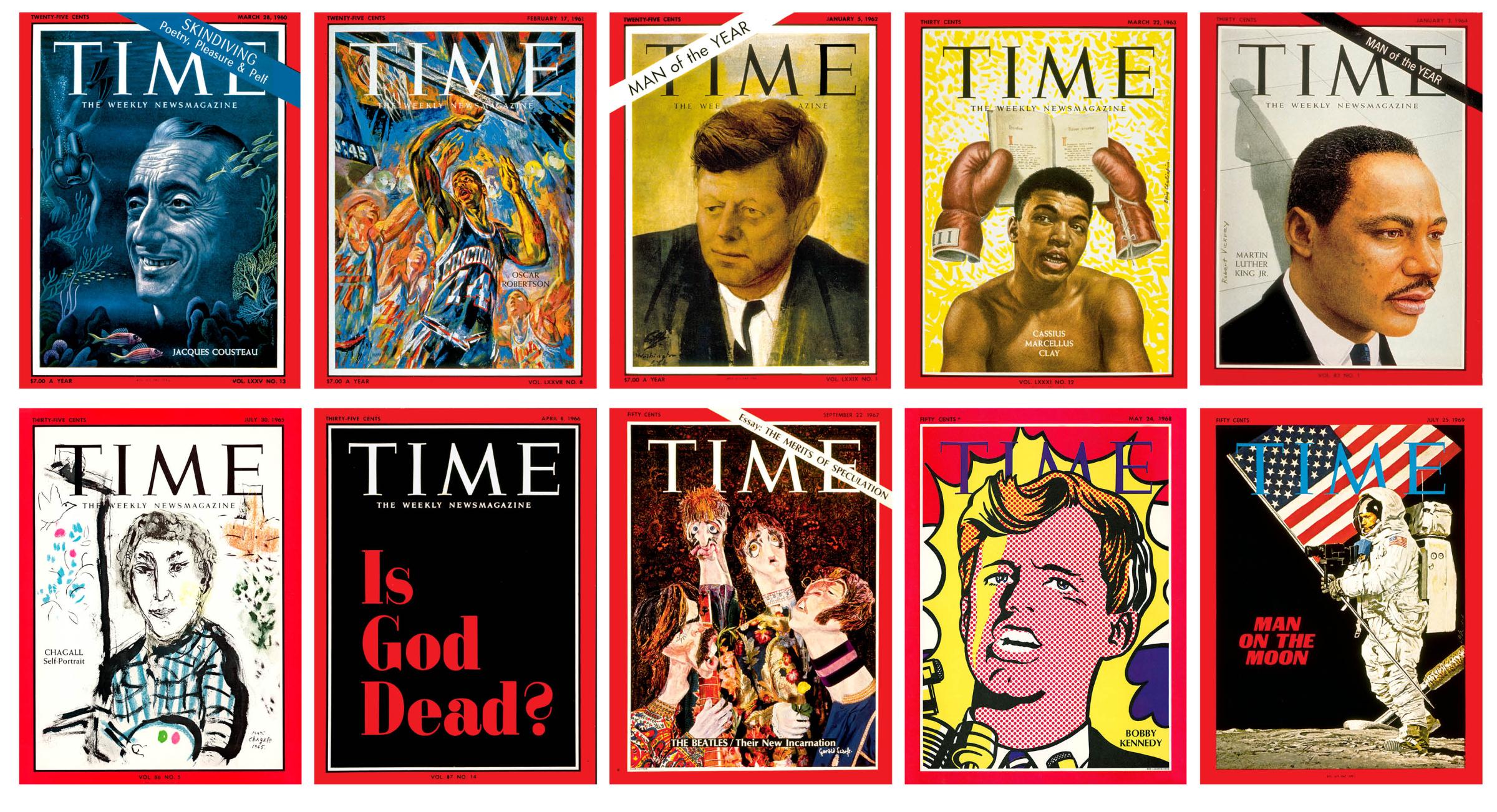
March 28, 1960: Jacques Cousteau by Boris Artzybasheff
Feb. 17, 1961: Oscar Robertson by Russell Hoban
Jan. 5, 1962: John F. Kennedy by Pietro Annigoni
March 22, 1963: Cassius Marcellus Clay by Boris Chaliapin
Jan. 3, 1964: Man of the Year—Martin Luther King Jr. by Robert Vickrey
July 30, 1965: Chagall by Marc Chagall
April 8, 1966: Is God Dead?
Sept. 22, 1967: The Beatles by Gerald Scarfe
May 24, 1968: Bobby Kennedy by Roy Lichtenstein
July 25, 1969: Man on the Moon by Louis Glanzman
Though the ABCs continued to make invaluable contributions to the magazine in the 1960s—Jacques Cousteau, by Artzybasheff (March 28, 1960), for example, provides a window into the world of the famed explorer—the decade also saw a wide range of art-world greats working within the red border.
Robert Vickrey, considered one of the world’s most perfect craftsmen in egg tempera painting, created 78 covers for TIME from 1957 to 1968. One of my favorites is his portrait of Martin Luther King Jr. (Man of the Year for 1963). And TIME asked Italian portraitist Pietro Annigoni to paint President John F. Kennedy for TIME’s Jan. 5, 1962, Man of the Year cover—though the artist “at first did not understand the need for secrecy,” the magazine noted, around the choice for that title, and soon the Italian press were reporting that he was heading to the White House. “The President struck Annigoni as a man ‘who is always asking and always listening,” and “it was this Kennedy, not the grinning campaigner, whom Annigoni tried to catch” in the watercolor. Some at TIME were worried about the cover appearing grim, but managing editor Otto Fuerbringer was immediately drawn to it. Many readers agreed, including one who wrote that the portrait “projected a magnificent image of an individual burdened with the world’s most critical responsibilities.”
Gerald Scarfe, whose “whose grotesque caricatures in the British press have been the nemesis of the high, mighty and famous” was hired to create a papier-mâché sculpture of the Beatles (Sept. 22, 1967). “Scarfe started by sketching Ringo at the drummer’s London suburban home, raced back to his Thames-side studio to construct a likeness on a wire frame with papier-mâché made of old newspapers soaked in paste,” the magazine informed readers. “He followed the same process for all four.” The May 24, 1968, cover subject, Bobby Kennedy became, the issue noted, one of the few real people ever portrayed by Roy Lichtenstein, who said that he admired RFK’s “pop-heroic proportions as part of a legend.” (When Kennedy was assassinated two weeks later, TIME turned again to Lichtenstein for a cover on “The Gun in America.”) For the July 30, 1965, cover story about Marc Chagall, the artist agreed to do a self-portrait. Lunching with editors in a dining room on the 47th floor of the Time & Life Building, he noted that the view of Manhattan was, as he put it, “très Chagall.” After completing the painting and the interviews for the story, the artist declared the experience “one of the great events of my life.”
Yet, for all the decade’s visual variety, the cover from the 1960s that remains the most iconic featured no image at all. The magazine’s first typography-only cover was the April 8, 1966, issue, which asked: “Is God Dead?” The issue noted: “After months of searching for a work of art suggesting a contemporary idea of God, the editors concluded that no appropriate representation could be found.” As for the provocative headline, religion editor John Elson wrote, “It is a question that tantalizes both believers, who perhaps secretly fear that he is, and atheists, who possibly suspect that the answer is no.”
Read more: “Is God Dead?” at 50
The 1970s
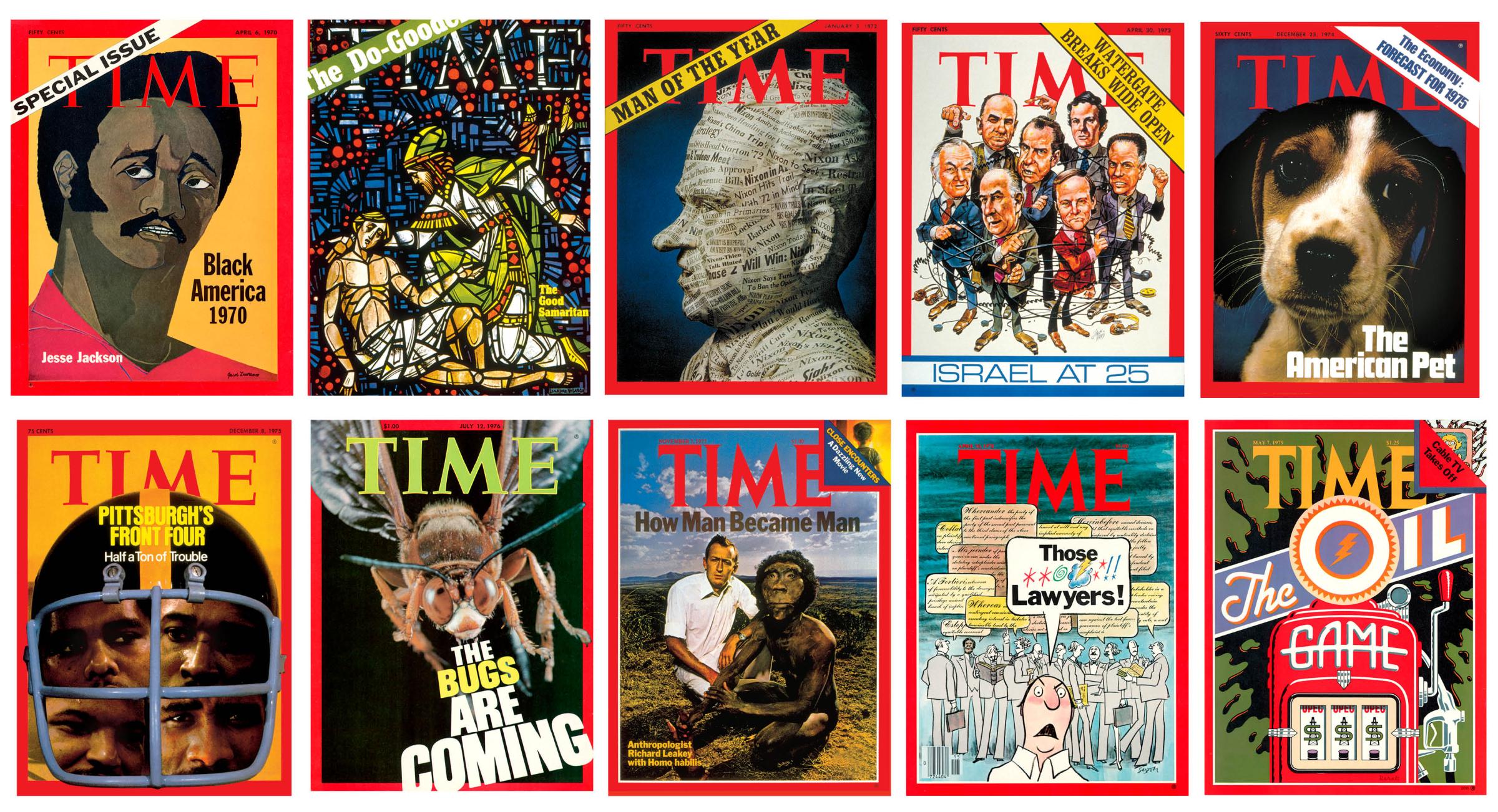
April 6, 1970: Black America 1970 by Jacob Lawrence
Dec. 27, 1971: The Good Samaritan by Leandro Velasco
Jan. 3, 1972: Man of the Year—Richard Nixon by Stanley Glaubach
April 30, 1973: Watergate Breaks Wide Open by Jack Davis
Dec. 23, 1974: The American Pet by Eddie Adams
Dec. 8, 1975: Pittsburgh’s Front Four
July 12, 1976: The Bugs Are Coming by Roman Vishniac
Nov. 7, 1977: How Man Became Man by Carl Fischer
April 10, 1978: Those **@!! Lawyers! by Charles Saxon
May 7, 1979: The Oil Game by Michael Doret
Two years after Martin Luther King Jr. was assassinated, TIME published a cover titled “Black America 1970,” featuring an illustration of civil rights activist Jesse Jackson, by Jacob Lawrence, the first Black artist to earn representation at a major New York City gallery. By 1970, Lawrence’s stake amid the canon of American Modernism was secure. “I remember [when I found out] Jacob Lawrence was going to do the cover of TIME magazine, I was just overwhelmed by the idea,” Jackson later said, noting that the portrait captured the pain and passion he felt amid the trauma of that time. “Lawrence was our Michelangelo.”
The decade that followed presented a range of challenges. How to depict an ancient man who’d never been seen—or a modern one who was seen perhaps too often? When it came to getting a 2 million-year-old human ancestor onto the Nov. 7, 1977, cover on human evolution, art director Walter Bernard and photographer Carl Fischer opted to show anthropologist Richard Leakey next to Homo habilis—really a volunteer in a mask. “When TIME first said they wanted me to pose with Homo habilis, I thought it was a joke,” Leakey said. “But the result is quite good: the photo shows that while the human head has changed through evolution, the body of early man is similar to that of today’s man.”
President Richard Nixon has appeared on the cover of TIME more than anyone else—55 times. The most memorable to me is a 1972 papier-mâché sculpture covered in newspaper headlines, by Stanley Glaubach, for the 1971 Man of the Year cover. Another artist who frequently illustrated Nixon was cartoonist Jack Davis, a founder of MAD magazine. During the Watergate scandal (April 30, 1973), his expressive caricature of Nixon surrounded by a chaotic circle of finger pointers beautifully illustrated the moment.
What I love about the Dec. 23, 1974, cover titled “The American Pet” isn’t the image of the beagle staring back, but rather that the dog was photographed by Eddie Adams, who covered 13 wars and whose image of a Viet Cong lieutenant being executed at close range on a Saigon street won Adams the Pulitzer Prize. Ditto for 1976’s “The Bugs Are Coming”: that picture of a wasp was taken by Russian photographer Roman Vishniac, better known for documenting harrowing visual evidence of the rise of Nazism. (Another cover artist famous for a different kind of work: Michael Doret, who created the bold illustration for “The Oil Game” cover of May 7, 1979, is best known for designing the New York Knicks logo.)
Rounding out the decade, a few grab-bag favorites: The April 10, 1978, headline “Those **@!! Lawyers!” is not TIME’s most provocative or risk-taking cover, but remains the only one that uses profanity. And the “Pittsburgh’s Front Four” cover (Dec. 8, 1975) on the Steelers is one of my favorites for purely personal reasons: my flag football team of the same name won the city recreation department Flag-Tag Football League championships the year before.
The 1980s
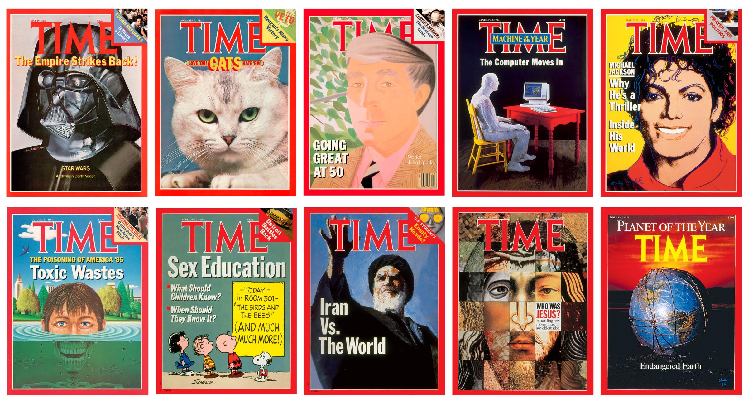
May 19, 1980: The Empire Strikes Back by Marshall Arisman
Dec. 7, 1981: Cats: Love ’Em! Hate ’Em! by Neil Leifer
Oct. 18, 1982: John Updike by Alex Katz
Jan. 3, 1983: Machine of the Year by George Segal
March 19, 1984: Michael Jackson by Andy Warhol
Oct. 14, 1985: Toxic Wastes
Nov. 24, 1986: Sex Education by Charles Schulz
Aug. 17, 1987: Iran vs. the World by Allen Hirsch
Aug. 15, 1988: Who Was Jesus?
Jan. 2, 1989: Endangered Earth by Christo
The 1980s was a time of intriguing pairings, such as the Dec. 7, 1981, cover, which featured a green-eyed feline peering out from under the line “CATS: Love ’Em! Hate ’Em!” The image was photographed by Neil Leifer, who had two dogs—and was best known for his sports photography, including of his favorite subject Muhammad Ali. (The reporter of the cover story was also noteworthy: Correspondent Maureen Dowd, who grew up with five cats and went on to win the 1999 Pulitzer Prize for distinguished commentary.)
Read more: Behind the Greatest Photo of Muhammad Ali Ever Taken
Speaking of Katz—the Oct. 18, 1982, cover of novelist John Updike also created an interesting pairing. Painter Alex Katz, whose work generally flattened the subject’s perspective and reduced the features, was commissioned to paint Updike, whose fans were not all pleased with the result: “What a washed-out portrait of Updike on the cover!” one reader complained. But Katz offered some advice to viewers of art: “You can wreck a painting very easily,” he noted, “if you get obsessive about likeness.”
In order to depict the computer revolution on the Jan. 3, 1983, cover, TIME reached out to sculptor George Segal, best known for his life-size white plaster people. In what would seem another odd pairing, Peanuts creator Charles Schulz was tapped to illustrate a Nov. 24, 1986, cover on sex education. And to capture the fame of Michael Jackson post-Thriller, the magazine asked none other than Andy Warhol. The artist described in his diary the process behind the picture, which now hangs in the National Portrait Gallery. “March 7, 1984: I finished the Michael Jackson cover. I didn’t like it but the office kids did. Then the TIME people came down to see it, about forty of them. And they stood around saying that it should increase newsstand sales. … Then later the TIME guy called me … and said they were going to use it. I think the yellow one. And I told him to cross his fingers that it wouldn’t get bumped on Saturday and he said he would.”
Artists Christo and Jeanne-Claude were known for wrapping Berlin’s Reichstag building in 100,000 sq m of silver fabric, installing 7,503 saffron-colored gates in New York City’s Central Park, and creating a floating walkway of 200,000 polyethylene cubes on a lake in Italy. For the Jan. 2, 1989, Planet of the Year cover, Christo “bundled a 16-in. globe in polyethylene and rag rope and drove more than 350 miles up and down New York’s Long Island,” the issue told readers, “in search of the perfect combination of light, air, and sea for a photograph. The result—Wrapped Globe 1988—is a fitting symbol of earth’s vulnerability to humankind’s reckless ways.”
The 1990s
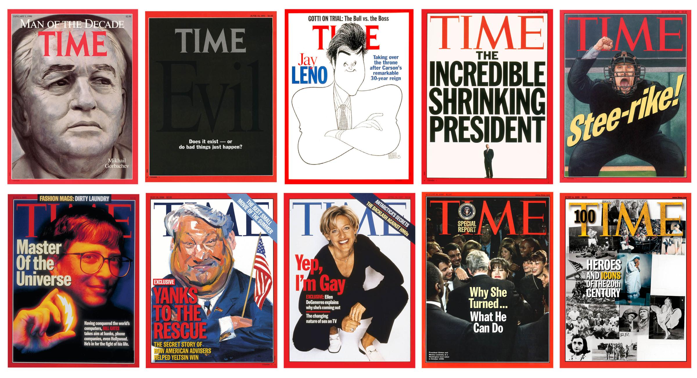
Jan. 1, 1990: Mikhail Gorbachev by Hans Jorg Limbach
June 10, 1991: Evil: Does It Exist—or Do Bad Things Just Happen?
March 16, 1992: Jay Leno by Al Hirschfeld
June 7, 1993: The Incredible Shrinking President
Aug. 22, 1994: Stee-rike! by C.F. Payne
June 5, 1995: Master of the Universe: Bill Gates
July 15, 1996: Yanks to the Rescue by Philip Burke
April 14, 1997: Yep, I’m Gay—Ellen DeGeneres
Aug. 10, 1998: Why She Turned … What He Can Do by Dirck Halstead
June 14, 1999: Heroes and Icons of the 20th Century by Robert Rauschenberg
Most completed cover artwork is now delivered to us digitally, by email attachments and downloadable links. But when I first started at TIME in 1998, artwork was typically packaged up by the artist, put on a plane, and flown to one of New York City’s three airports, where a delivery service would wait for the “baggage” and drive it to the Time & Life Building in midtown Manhattan. While we were anxious waiting for packages to arrive, there was always a sense of excitement opening them up.
In the summer of 1999, art director Arthur Hochstein, my mentor and predecessor who taught me how to make a TIME cover, opened a package from artist Robert Rauschenberg. The envelope, which was coming from Rauschenberg’s home in Florida, contained a dozen images Scotch-taped together to create a composite for the “Heroes and Icons of the 20th Century” cover (June 14, 1999), leaving Hochstein to figure out how to make it work as a cover. (Speaking of making it work: What I love about the June 10, 1991, cover—which features the word evil in black on top of a black background—is that the same issue touts the creation of TIME’s new in-house imaging department, the group responsible for making pictures look crisp and clear. As TIME’s current imaging director Rick Prue says of the black-on-black design, “that must have been a fun challenge for that new department.”)
The covers from this decade remind me of that excitement and show the great lengths that go into the cover production. The first time that idea sank in for me was walking into TIME managing editor Jim Kelly’s office in the late 1990s. Sitting off to the side was a bronze statue of Mikhail Gorbachev. It was clear the sculpture, by Swiss contemporary artist Hans Jorg Limbach for the Man of the Decade cover (Jan. 1, 1990), would require two people to move it, and it became a regular reminder of what is possible inside the red border.
Read more: Read the ‘Yep, I’m Gay’ Ellen DeGeneres Interview From 1997
Some issues from this decade made history; Ellen DeGeneres’ 1997 “Yep, I’m Gay” remains one of TIME’s most iconic covers. Others were a reminder of the importance of preserving history. Photographer Dirck Halstead, who worked nearly 30 years for TIME and has more covers than any other photographer (nearly 50), covered topics ranging from the Vietnam War and Nixon’s visit to China to the 1996 presidential campaign. While that last might not seem as historical as the others, a photograph that he took during an ordinary campaign stop became perhaps his most famous. After news broke of Clinton’s affair with Monica Lewinsky, Halstead asked an assistant to sift through thousands of archived film slides. The effort turned up a remarkable image of Clinton embracing Lewinsky at a fundraiser nearly two years earlier. The image, which appeared on the cover in 1998, won Halstead an Eisie Award for color photography, a win for the old-school technique, and for not throwing anything away.
The 2000s
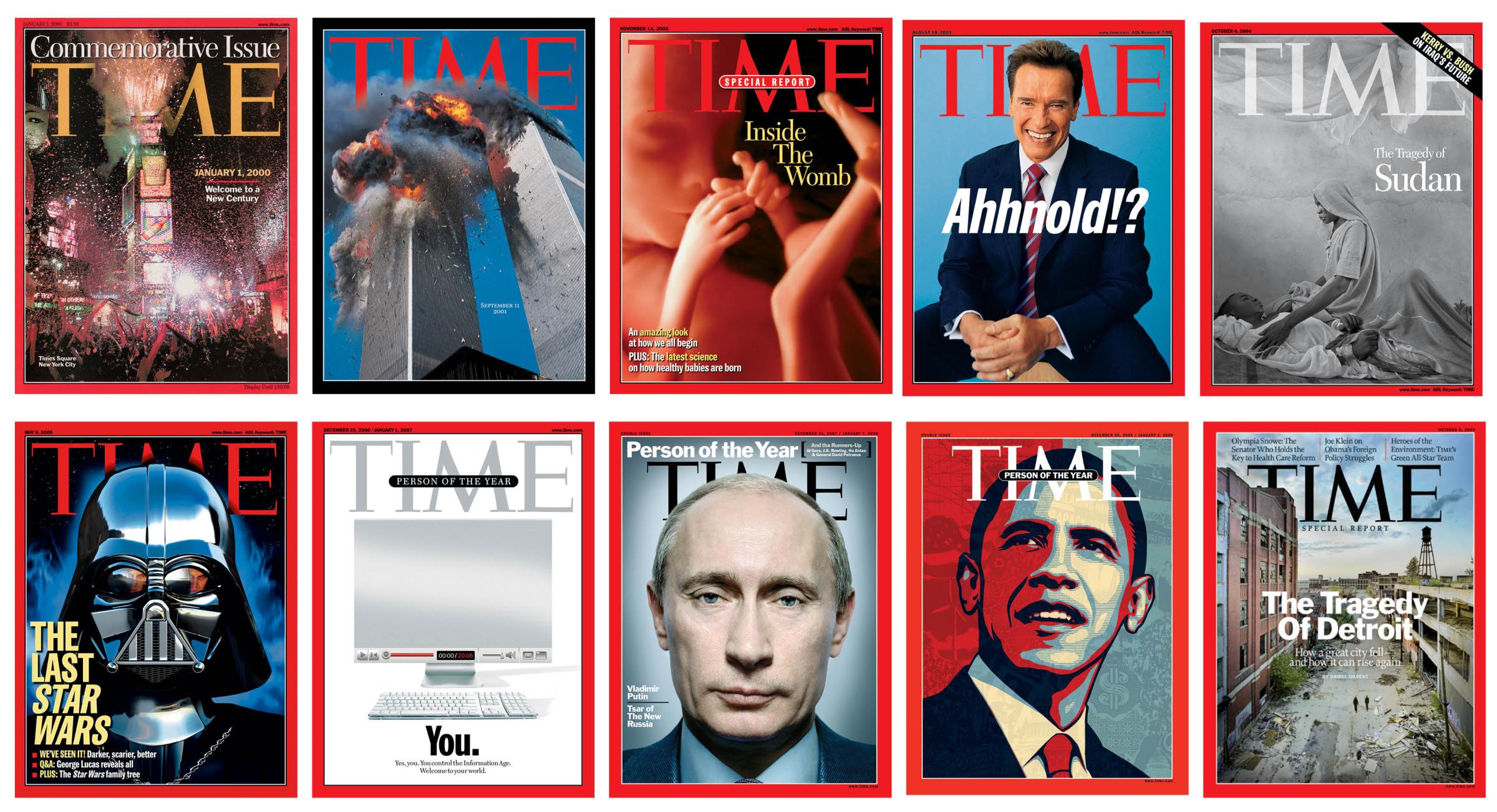
Jan. 1, 2000: Welcome to a New Century
Sept. 11, 2001: 9/11 by Lyle Owerko
Nov. 11, 2002: Inside the Womb by Alexander Tsiaras
Aug. 18, 2003: Ahhnold!?
Oct. 4, 2004: The Tragedy of Sudan by James Nachtwey
May 9, 2005: The Last Star Wars by Ed Gabel
Dec. 25, 2006: Person of the Year—You
Dec. 31, 2007: Person of the Year—Vladimir Putin by Platon
Dec. 29, 2008: Person of the Year—Barack Obama by Shepard Fairey
Oct. 5, 2009: The Tragedy of Detroit by Yves Marchand and Romain Meffre
At the end of the 20th century, I can vividly remember the anxiety in the newsroom as we started planning for coverage of Y2K. And, as is usually the case, the more planning that’s done in advance, the less likely anything will happen. But nothing could really prepare us for what was to happen the following year.
On the morning of Sept. 11, 2001, photographer Lyle Owerko was in his Tribeca apartment when he heard a sound that defied description. It was a plane hitting the World Trade Center. As a second plane began to approach the towers, he told TIME years later, “I heard the sound of this jet, and I thought it was air traffic being redirected. I saw it off in the distance. The plane did this little shoulder shrug where it dipped its wing and when I saw it arc, then I knew its intention.”
In that tragic moment, Owerko shot two frames with his Fuji 645zi medium-format camera. “I waited until it hit,” he said, “and when it hit, I had no idea, but I thought something would occur. And then nothing happened for a second until this fireball of heat and debris erupted out of the backside of the building and that’s when I caught the cover shot.”
A split second later, he was composing the second shot. “And then the debris started raining down on us,” he said. Owerko started walking up Broadway toward a nearby lab to process his images; he recalled the owner telling him, “You have the cover of TIME magazine.” And he did. Owerko’s image was framed by a black border—the first time the red border was changed since 1927.
Read more: The Story Behind TIME’s Original 9/11 Cover
Some of the decade’s most memorable covers stand out for their pairings of the right artist with the right subject. For a 2004 cover about conflict in Sudan, where 50,000 had died and more than 1 million people lost their homes, photographer James Nachtwey, who has dedicated his life to humane portrayal of some of the world’s neediest people, found a mother caring for her ill son in a refugee camp in Darfur—an image that served to personalize the atrocities. For the 2007 Person of the Year portrait of Russian President Vladimir Putin, TIME turned to British photographer Platon, known for his intense closeups. Putin typically does not pose for portraits, but he did for Platon at his presidential dacha outside of Moscow. (During the quick portrait session, Platon was able to get Putin to answer a question he typically asks his subjects: “What is your favorite Beatles song?” The Russian leader’s answer was “Yesterday.”) And Shepard Fairey, who’d created the iconic “Hope” poster during Barack Obama’s candidacy, was the perfect choice when Obama was named Person of the Year.
Others stand out for thinking outside the box. After TIME named “You” the person who had the most influence on the year 2006, in response to the impact of “engaged citizens of a new digital democracy,” editor Rick Stengel chose to put a mirror on the cover. After a supplier was found in Minnesota, TIME made the company sign a confidentiality agreement before placing an order for 6,965,000 pieces of reflective material for the cover. For a 2002 cover giving readers a look “Inside the Womb,” photographer Alexander Tsiaras and his team manipulated layers of data gathered by CT scans, MRIs, and other visualization techniques. And in 2009, the editors at Time Inc. did something they’d never done before for a cover: they bought a house in Detroit. They paid $99,000, about $80,000 above the average price of a house in the city limits. Why? Because as Time Inc. editor-in-chief John Huey wrote, “we believe that Detroit right now is a great American story.”
The 2010s
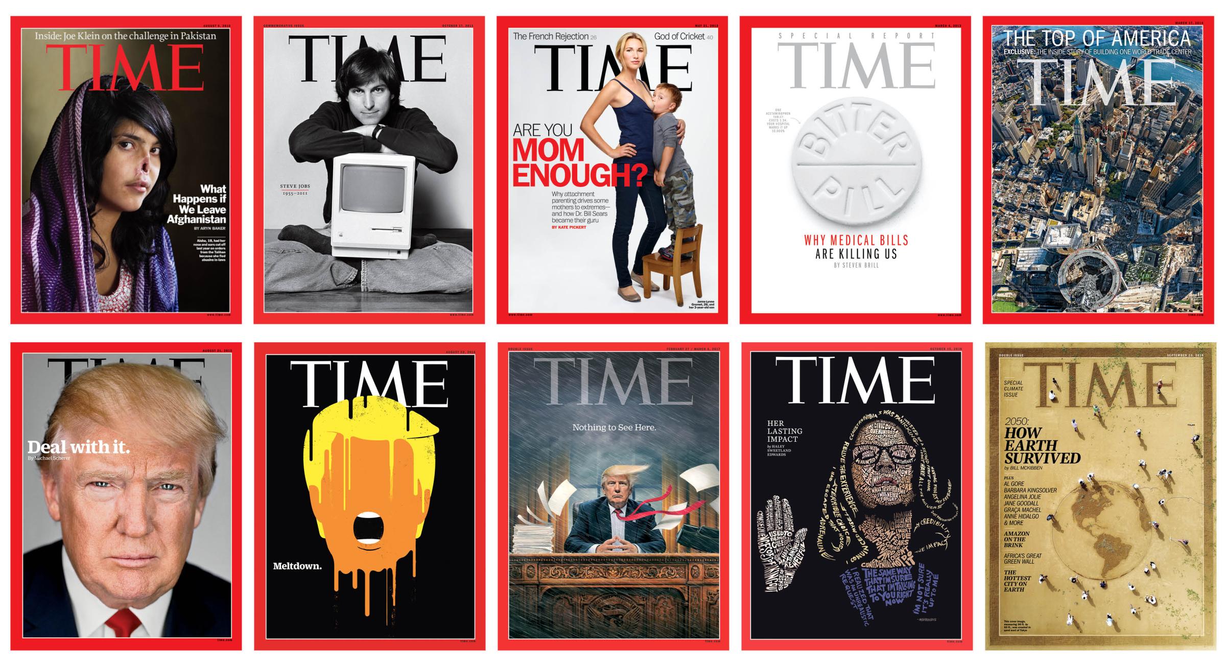
Aug. 9, 2010: What Happens If We Leave Afghanistan by Jodi Bieber
Oct. 17, 2011: Steve Jobs by Norman Seeff
May 21, 2012: Are You Mom Enough? by Martin Schoeller
March 4, 2013: Bitter Pill by Sean Freeman
March 17, 2014: The Top of America by Jonathan D. Woods and Michael Franz
Aug. 31, 2015: Deal With It by Martin Schoeller
Aug. 22, 2016: Meltdown by Edel Rodriguez
Feb. 27, 2017: Nothing to See Here by Tim O’Brien
Oct. 15, 2018: Her Lasting Impact by John Mavroudis
Sept. 23, 2019: How Earth Survived by Toshihiko Hosaka
The Aug. 9, 2010, cover is probably the most powerful, shocking, and disturbing in the magazine’s century of history. It is a portrait of Aisha, an 18-year-old Afghan woman who was sentenced by a Taliban commander to have her nose and ears cut off for fleeing her abusive in-laws. Aisha posed for the photo with South African photographer Jodi Bieber, saying she wanted the world to see the effect a Taliban resurgence would have on the women of Afghanistan. “I thought long and hard about whether to put this image on the cover of TIME,” said managing editor Rick Stengel, who also consulted with several child psychologists about its potential impact as an image that would be seen on newsstands and in homes around the world.
It was late on a Wednesday evening in 2011 when news came that Apple founder Steve Jobs had died. An hour earlier, we had just sent an issue to the printing press, and I was in the Lincoln Tunnel heading home. It was with a great sense of sadness that I turned around and rushed back into midtown Manhattan. With a small team and in six hours, we created an issue with 21 pages on Jobs and his impact. The cover photo was taken by Norman Seeff in 1984. The pair were in Jobs’ living room just talking about “everyday stuff,” as Seeff would put it. Seeff recalls, “he rushed off, and came back in and plopped down … with a Macintosh in his lap. I got the shot the first time.”
A more unusual but likewise fitting—and fast—portrait appeared on the cover for our story on the impact of Christine Blasey Ford’s testimony during Brett Kavanaugh’s Supreme Court confirmation hearings. Using phrases from Ford’s testimony, San Francisco–based artist John Mavroudis had one day to re-create her likeness by drawing each letter by hand. “This particular process is like putting a jigsaw puzzle together, but with an infinite number of possibilities,” says Mavroudis.
One of the decade’s most conversation-starting covers, photographed by Martin Schoeller, was May 21, 2012’s “Are You Mom Enough?” Using religious images of the Madonna and Child as reference, Schoeller captured four mothers who subscribed to attachment parenting, the subject of the cover story, breastfeeding their children. An even more share-worthy moment came when TIME first introduced candidate Trump to readers in August 2015, when Schoeller and then editor at large Paul Moakley brought a live bald eagle to Trump Tower in New York City for a portrait. A clip of the bird nipping at the Republican candidate went viral.
Read more: Watch Donald Trump Dodge a Bald Eagle
During the 2016 campaign, we produced seven covers featuring Trump and created an original visual language for this President with the artwork of artist Edel Rodriguez. Rodriguez, who worked as an art director at TIME in the 1990s, has a strong, simple graphic style that immediately grabbed worldwide recognition with the “Meltdown” cover (Aug. 22, 2016), a reflection of Trump’s slumping campaign following the Republican National Convention. “By condensing his look down to the basic elements, done through color, one could focus more on the concept behind the image or what the President symbolized, rather than what he looked like,” says Rodriguez.
My favorite Trump cover, though, would have to be “Nothing to See Here” from Feb. 27, 2017. I believe the strongest TIME covers leave space for a variety of perspectives; this one might depict the chaos Trump created, or his resolution amid the chaos that predated him in Washington. That image was created by longtime collaborator Tim O’Brien, who has painted more TIME covers (35) in the past 30 years than any other artist. It was the first of what would become a series of four paintings from O’Brien depicting Trump in a growing storm within the Oval Office.
The 2020s

Nov. 2, 2020: Vote by Shepard Fairey
Oct. 25, 2021: Delete “Facebook”?
March 28, 2022: The Resilience of Ukraine by JR
For the first time in 97 years, TIME’s logo didn’t say “TIME.” To underscore the importance of voting in the 2020 election, TIME was changed to VOTE for all U.S. editions of the Nov. 2 issue. “Even though the subject in the portrait knows there are additional challenges to democracy during a pandemic,” said artist Shepard Fairey of the image he created for the cover, the person is determined to use their “voice and power by voting.”
Sometimes, a cover’s impact comes from the process of its creation. This was evident in the March 28, 2022, cover. French artist JR, who had created two previous TIME covers, traveled to Ukraine and enlisted local residents to create a 148-ft. interactive portrait of a 5-year-old refugee named Valeriia, using an image by Ukrainian photographer Artem Iurchenko. The larger-than-life photo was printed in Paris and transported to the war-torn country, where JR, his team, and 100 volunteers unfurled it in front of the National Opera in Lviv on March 14. A drone captured the scene from above. “This little girl is the future and, in this war, she reminds us what Ukrainians are fighting for,” wrote JR. Afterward, in a conversation with her over video, JR told her, “Your smile is shining to the entire world.”
— with reporting by Leslie Dickstein and Julia Zorthian
More Must-Reads from TIME
- Caitlin Clark Is TIME's 2024 Athlete of the Year
- Where Trump 2.0 Will Differ From 1.0
- Is Intermittent Fasting Good or Bad for You?
- The 100 Must-Read Books of 2024
- Column: If Optimism Feels Ridiculous Now, Try Hope
- The Future of Climate Action Is Trade Policy
- FX’s Say Nothing Is the Must-Watch Political Thriller of 2024
- Merle Bombardieri Is Helping People Make the Baby Decision
Contact us at letters@time.com