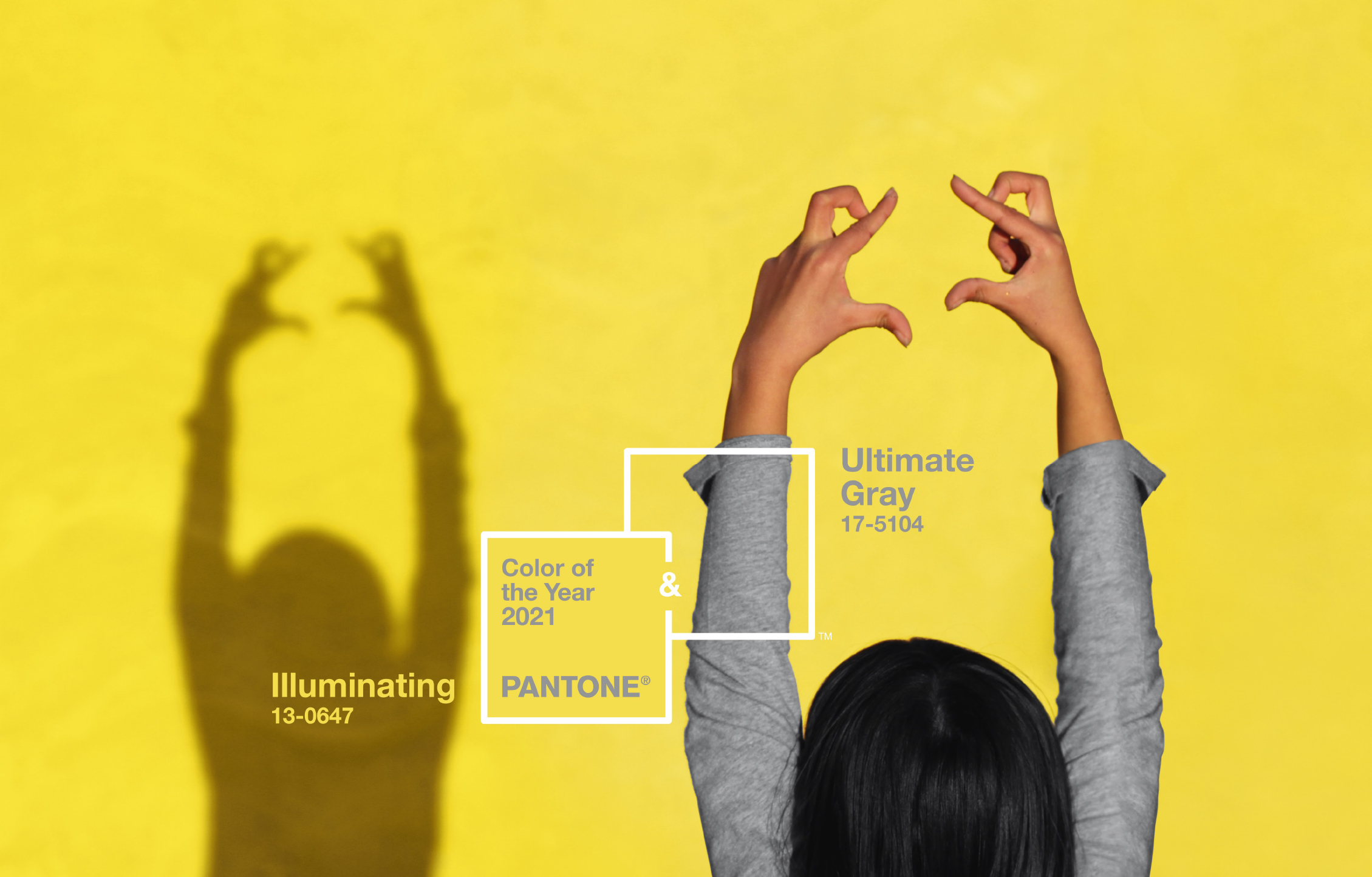
For just the second time ever, the Pantone Color Institute has named not one but two colors of the year: PANTONE® 17-5104 Ultimate Gray, a calming shade that brings to mind stable concrete foundations and serene pebbled beaches—and PANTONE 13-0647 Illuminating, a bright yellow that evokes warm sunshine, the invigorating bite of a tart lemon and cheerful spirits.
The institute’s decision to name two seemingly unrelated shades as the collective color of 2021 is a response to the unprecedented year that led up to this moment. Described by the institute as “a marriage of color conveying a message of strength and hopefulness that is both enduring and uplifting,” Ultimate Gray and Illuminating’s sunny yellow each serve a specific purpose. “Each of them has their own emotional aspect, the gray being the one that’s more supportive and solid, the practical foundation that we need, and the yellow is about hopefulness and sunshine and good cheer,” Leatrice Eiseman, executive director of the institute, told TIME.
And the combination itself makes a strong statement. The choice to include two colors this year was influenced by the pandemic and events like the Black Lives Matter protests of 2020. After a year when social distancing became par for the course and people organized en masse across the nation to call for racial justice, the importance of connection is at the forefront of many people’s minds. According to Laurie Pressman, vice president of the institute, this essential need for relationships is mirrored in Pantone’s decision to select two colors this year, which has only been done once before (in 2016, when the institute selected Rose Quartz and Serenity as a nod to the increasing fluidity around gender norms).
“Something that’s been apparent across the board is how much we need each other, that these connections with others have given us strength and fortitude, as well as the hope and the positive outlook that are essential to our moving forward,” she said. “By choosing two independent colors, that helped us subliminally convey that message.”
The pandemic affected the process of selecting this year’s color, as well. While the researchers at the institute usually spend the year traveling to research color trends around the world before making their choice, the health and safety restrictions surrounding COVID-19 meant their approach this year looked a little different—more collaboration online and a reliance on local staffers worldwide to report on trends.
But the goal in selecting the color of the year remains the same as in past years: to reflect the culture of the moment of time we’re living in. In retrospect, last year’s color, Classic Blue—a soothing deep indigo that sought to counter anxieties about a new decade—feels ironically prescient for a year that has been defined by uncertainty. And 2021’s colors feel altogether fitting as we prepare to welcome a new year brimming with possibilities: for a vaccine, for the world to open up again, for a return to some sense of normalcy—and the chance to connect.
“We know we’re living in an unusual time,” Pressman said. “Whether it’s about the pandemic or the uprisings around the world, we’re trying to imagine the future as we move into this very different time.”
More Must-Reads from TIME
- Why Trump’s Message Worked on Latino Men
- What Trump’s Win Could Mean for Housing
- The 100 Must-Read Books of 2024
- Sleep Doctors Share the 1 Tip That’s Changed Their Lives
- Column: Let’s Bring Back Romance
- What It’s Like to Have Long COVID As a Kid
- FX’s Say Nothing Is the Must-Watch Political Thriller of 2024
- Merle Bombardieri Is Helping People Make the Baby Decision
Write to Cady Lang at cady.lang@timemagazine.com