1. Consider Your Hardware

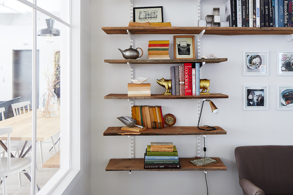
For the shelves in our library, we use a system called “standards and brackets” that you can pick up at a hardware store. They’re super strong and make for easy rearranging: You can add shelves wherever you want, but it’s no big deal to change your mind and remove one so something big will fit. I use the same brackets at home—they’re installed from the ceiling all the way to the ground, just in case!
The standard and bracket system has an industrial edge, but when it’s the same color as your wall, it seems to disappear. Using neutral hardware means our reclaimed wood shelves are just rustic enough.
2. Survey Your Wall Space

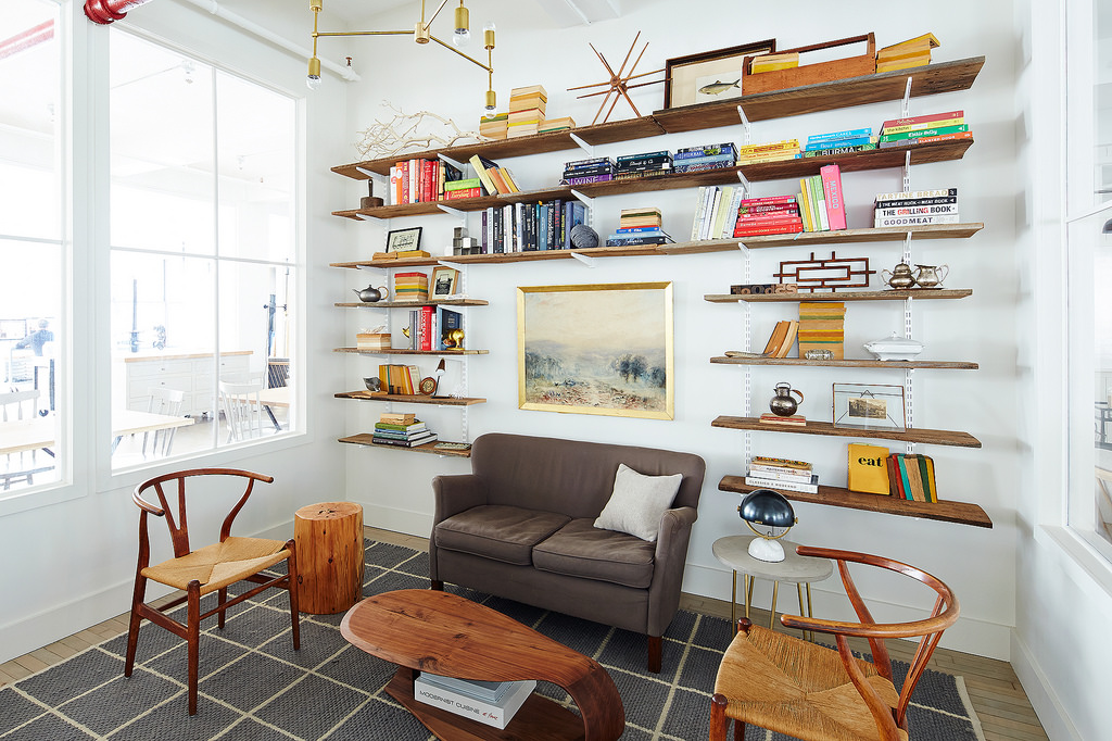
When you’re deciding how to arrange your shelves, ask yourself: Does this wall need something large that ties the whole room together, or something to tie it to the scale of a person? If there are already a lot of small objects in the room, consider just a single shelf where you have the liberty of adding large objects—or lots of shelves with more space between them. If you’d like more detail, install them closer together.
3. Add Books, Plus Placeholders
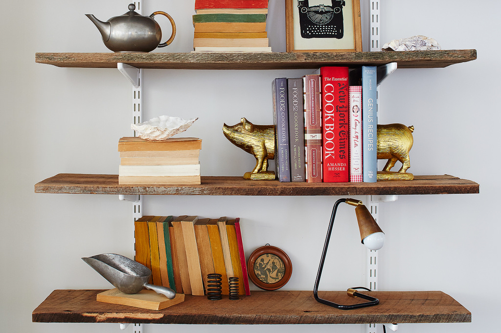
We didn’t have a lot of books to start with and I knew the collection was going to grow and grow, so I picked up some really cheap paperbacks from the thrift store to stand in as placeholders. Just turn the spines to face the wall, and then it doesn’t matter that one of them is an embarrassing title. Some paperbacks have really nice pages, like these red and green ones (pictured in previous slide). If there were any places where the cover would show, I tried to pick ones that seemed intelligent, or I just ripped off the cover to show the neutral pages underneath.
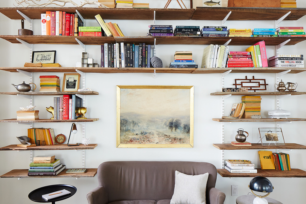
If you don’t have very many books, group them by color, which will form them into objects on the shelf. If you have a lot of books, they can be arranged in any order and your shelves will just become a beautiful field of colors. I narrowed down the books on the shelves in my living room to groups of white and neutrals and blacks, to calm a busy space, and then in the bedroom the books are all mixed up in a field of color because it felt a bit too neutral in there.
4. Decorate With Collections and Interesting Objects

I’d describe our office style (and my own) as undone vintage modern; some objects I placed in between the books are products we sell in the Shop, or tools we use in the kitchen that I find particularly beautiful as objects. For everything else, I am all about the Brooklyn Flea, and I love thrifting in Florida when I go home for a visit. Anytime you go to small town, visit the local thrift store; you can find some great things.
You might not think you collect anything, but just look around your space. Even if you just have just a bunch of objects in the same color, then you have a collection. Group together objects that you happen to have multiples of or things that share a common look—like those two silver teapots you can see on the right-side shelves (pictured)—to form a collection. You can add solo pieces, too: That part of a fence you can see above is nice because it’s graphic and takes up a lot of vertical space on a lonely shelf. Plus, it doubles as a trivet!
It might go without saying, but don’t forget to use your shelves as storage. In my house, I’m not always having formal dinner parties, but I do have a few nice platters that look great as objects on the shelves (and they don’t really have a home otherwise!). Deep shelves are good for hiding things that aren’t as attractive—leaning up a piece of art in front is an easy way to constantly be changing the look of the space without putting holes in the wall.
5. Seize the Moment

Make “moments” within your shelves: Stack books in both directions, and place objects on top of the vertical runs and horizontal piles. In my home, we use books as a way to display our collection of cameras, by varying the heights like risers. The goal is to avoid having tons of tiny objects that look cluttered: A collection displayed at varying heights and locations allows the eye to move around and appreciate each object while creating a cohesive design.
If there’s seating next to the shelves, place objects near eye height that have lots of detail or texture. And get a step stool, so you can actually reach the high shelves. Everything on your shelves should have a purpose—even if that purpose is just to make you smile. The last part is the most important part: Have a sense of humor and inject some fun or surprises into your design. Entice people to take a closer look.
This article originally appeared on Food52
More from Food52:
More Must-Reads from TIME
- Donald Trump Is TIME's 2024 Person of the Year
- TIME’s Top 10 Photos of 2024
- Why Gen Z Is Drinking Less
- The Best Movies About Cooking
- Why Is Anxiety Worse at Night?
- A Head-to-Toe Guide to Treating Dry Skin
- Why Street Cats Are Taking Over Urban Neighborhoods
- Column: Jimmy Carter’s Global Legacy Was Moral Clarity
Contact us at letters@time.com