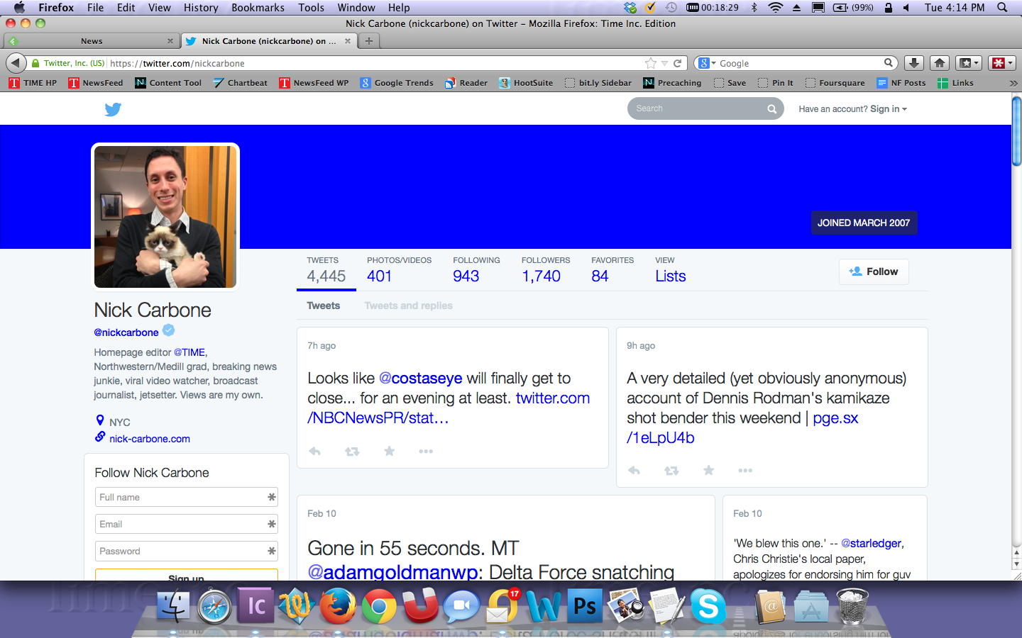
Twitter is testing a totally new design on its website that will actually make it look like rival Facebook.
An editor at Mashable first reported a major update to his Twitter profile page Tuesday, which appears to emphasize photo sharing and makes the website look more like other social media platforms. A little while later, a TIME.com editor noticed the same redesign showing up on his account as well.
Twitter declined to comment on the redesign. However, in a blog post from last September, the company wrote that it is “constantly” testing changes to its website on select groups of users.
“We are constantly evolving the product,” Twitter’s VP for engineering said. “Some changes are visible –– they may help you protect your Twitter account or make it easier to share photos; others are under-the-hood changes that help us suggest relevant content in real time and make Twitter more engaging.”
Twitter recently unveiled a separate new design to all its users, not long after the company’s Feb. 5 earnings call with analysts revealed its user base may be plateauing.
[Mashable]
More Must-Reads from TIME
- Cybersecurity Experts Are Sounding the Alarm on DOGE
- Meet the 2025 Women of the Year
- The Harsh Truth About Disability Inclusion
- Why Do More Young Adults Have Cancer?
- Colman Domingo Leads With Radical Love
- How to Get Better at Doing Things Alone
- Michelle Zauner Stares Down the Darkness
Contact us at letters@time.com