It’s hard to move through the modern world without carrying a full deck of personal cards with you: driver’s license, insurance card, credit cards, bank card, Medicare card, student ID card and more. They are the transactional visas of contemporary life and they’ve been designed with that role in mind—durable, portable, easy to use, hard to forge.
The newest addition is the U.S. Centers for Disease Control and Prevention’s COVID-19 vaccination card—and it violates almost every rule of good design: it’s made of perishable paper; it’s too big to fit in most wallets; it’s entirely analog—with small spaces for handwritten entries, which can be hard to read at best and entirely illegible at worst; it’s black and white and thus a cinch for forgers; it’s unencrypted—with information displayed on the face of the card rather than hidden in a QR or barcode—meaning that if you do misplace it, your health information is out in the world. What’s more, the card connects to no central database, making it impossible to link electronically with any of your other medical records.
“The CDC was required to move quickly and address many complexities,” says Sandy Speicher, the CEO of IDEO, a global design firm. “There’s a need for privacy, security and accuracy and there’s a need for people to understand what this card is for and how they will use it in their lives.”
The current card doesn’t really achieves any of these goals, so we asked several graphic artists to come up with alternative ideas that would respond to the 21st century scourge that is COVID-19 with a 21st century vaccination card. All of the designers believed the card should be smaller, and two of the four designed them from plastic. Not only does that make the card less destructible and easier to carry, it also serves a certain psychological function, giving it the feel of just one more card in the stack we already carry.
For example, Leana Macaya, a Brooklyn-based multidisciplinary artist, designed a hard plastic card the size of a credit card, with QR codes that enable easy scanning:
“It’s important to consider the user experience overall,” says Speicher. “The credit card is a good analogy here. Every time a restaurant or sports venue asks for proof of vaccination, that’s a health care transaction. You’re submitting your vaccine information in exchange for access.”
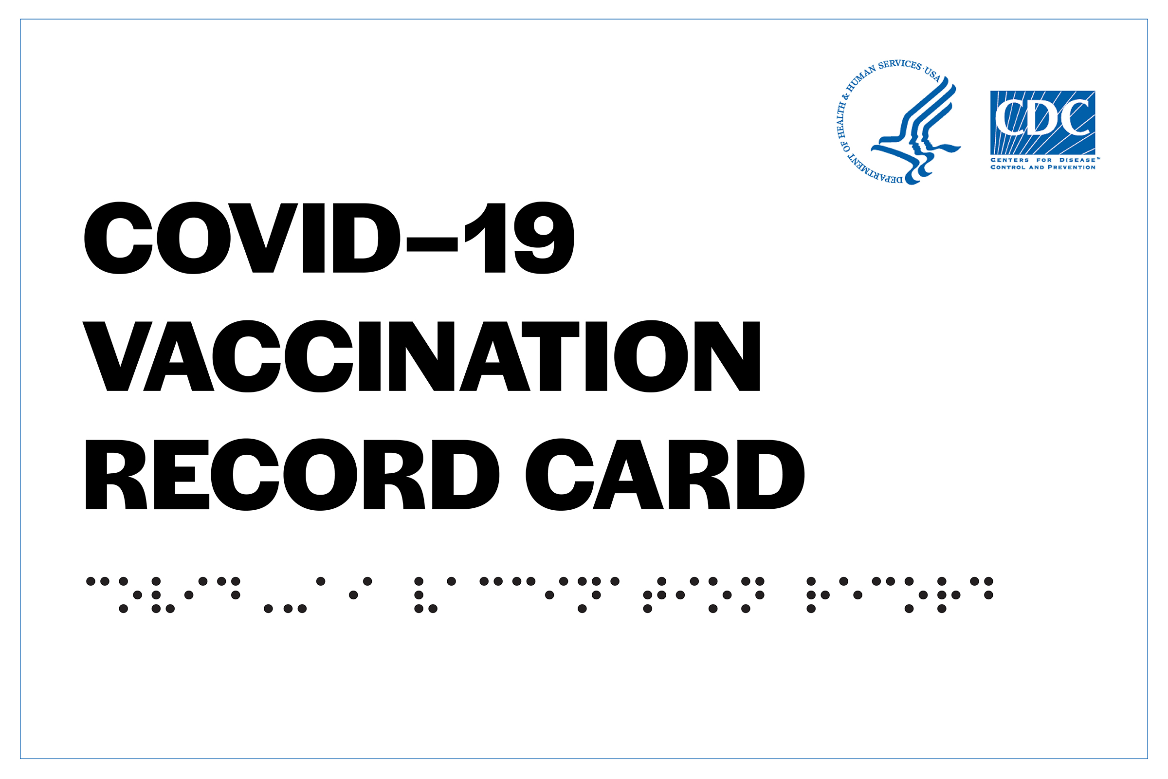
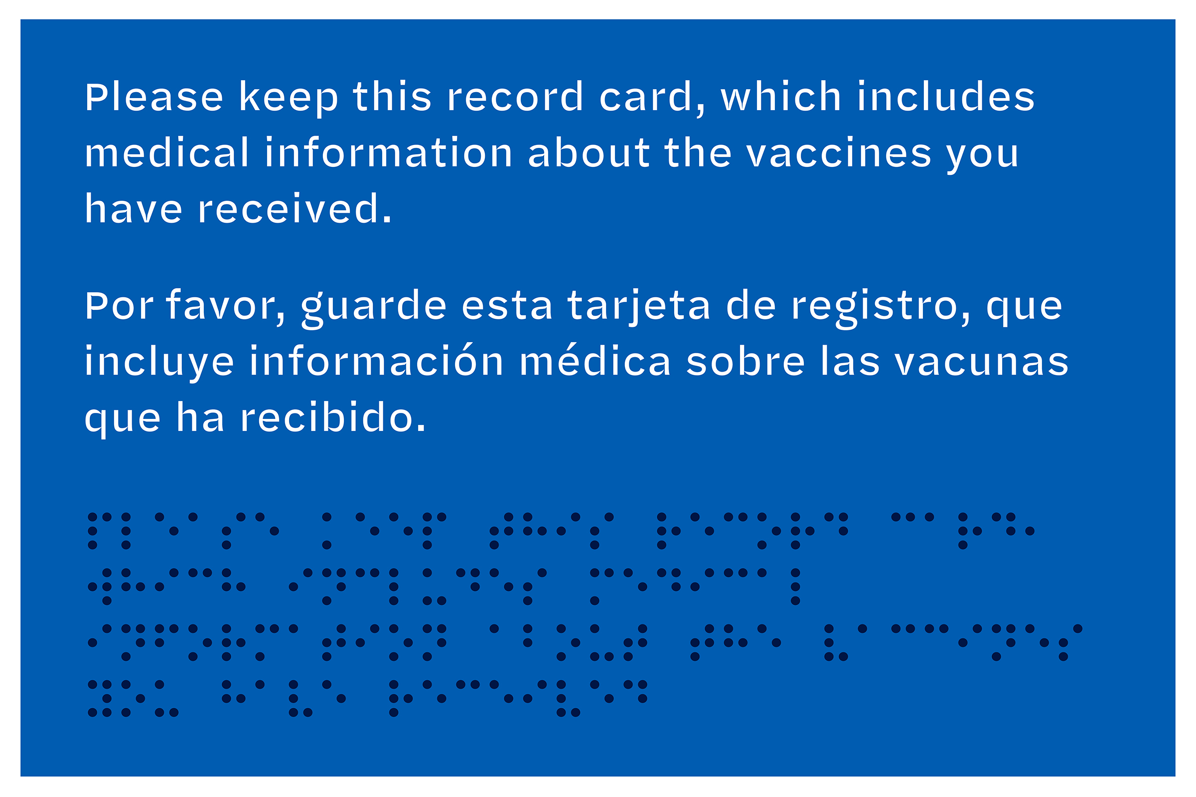
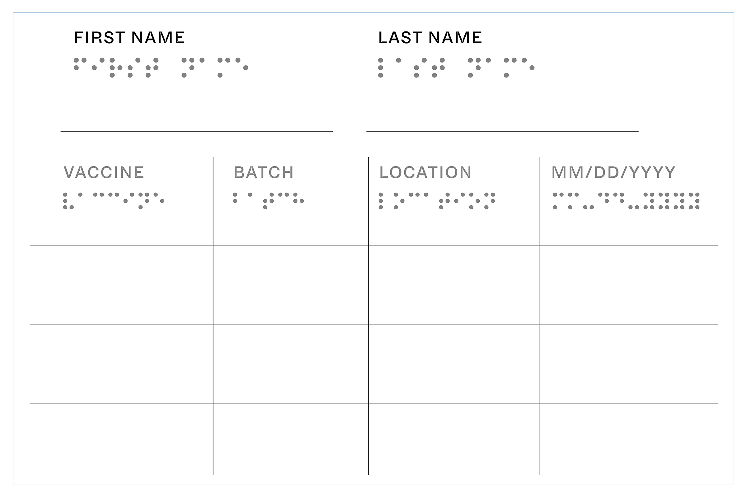
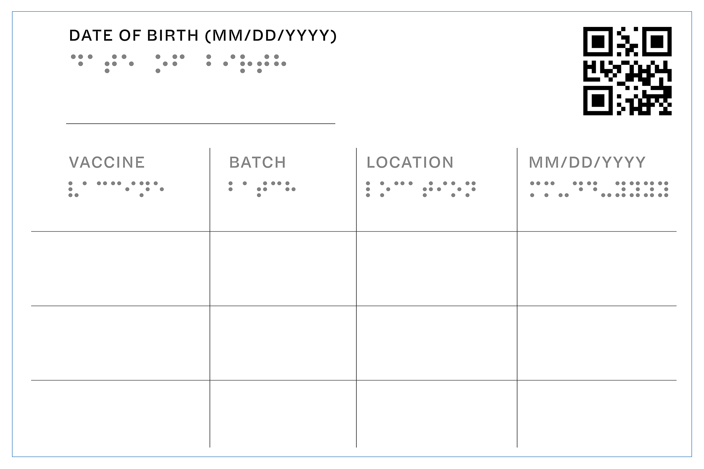
Aesthetics matter too. Adding color to the card not only makes it harder to counterfeit, says Agyei Archer, a graphic designer based in Trinidad and Tobago, but also makes it easier to identify and distinguish at a glance. The front of Archer’s card features the CDC logo in blue and the reverse is royal blue with bold white lettering. His card is also foldable, with two interior sides that provide six spaces for listing every vaccine and booster received. That allows for easy reading of vaccine history without having to scan the card, but hides that personal data on the interior faces.
A portable, plasticized card could include raised or Braille lettering—as it does on Archer’s design—for the visually impaired:
Exterior faces:
Interior faces:
St. Louis-based illustrator Carlos Zamora took the color idea a step further, decorating the back of his version of the card with a multicolor V (for “vaccine”), along with the card-holder’s name and ID number, and using the front for playful—and brightly colored—messages. In one version, he features a pair of stylized lips with the message “Kiss Me. I’m Corona Free.”
In another, he depicts the planet Earth being vaccinated, with the words “Breathe again. We are all in this together.”
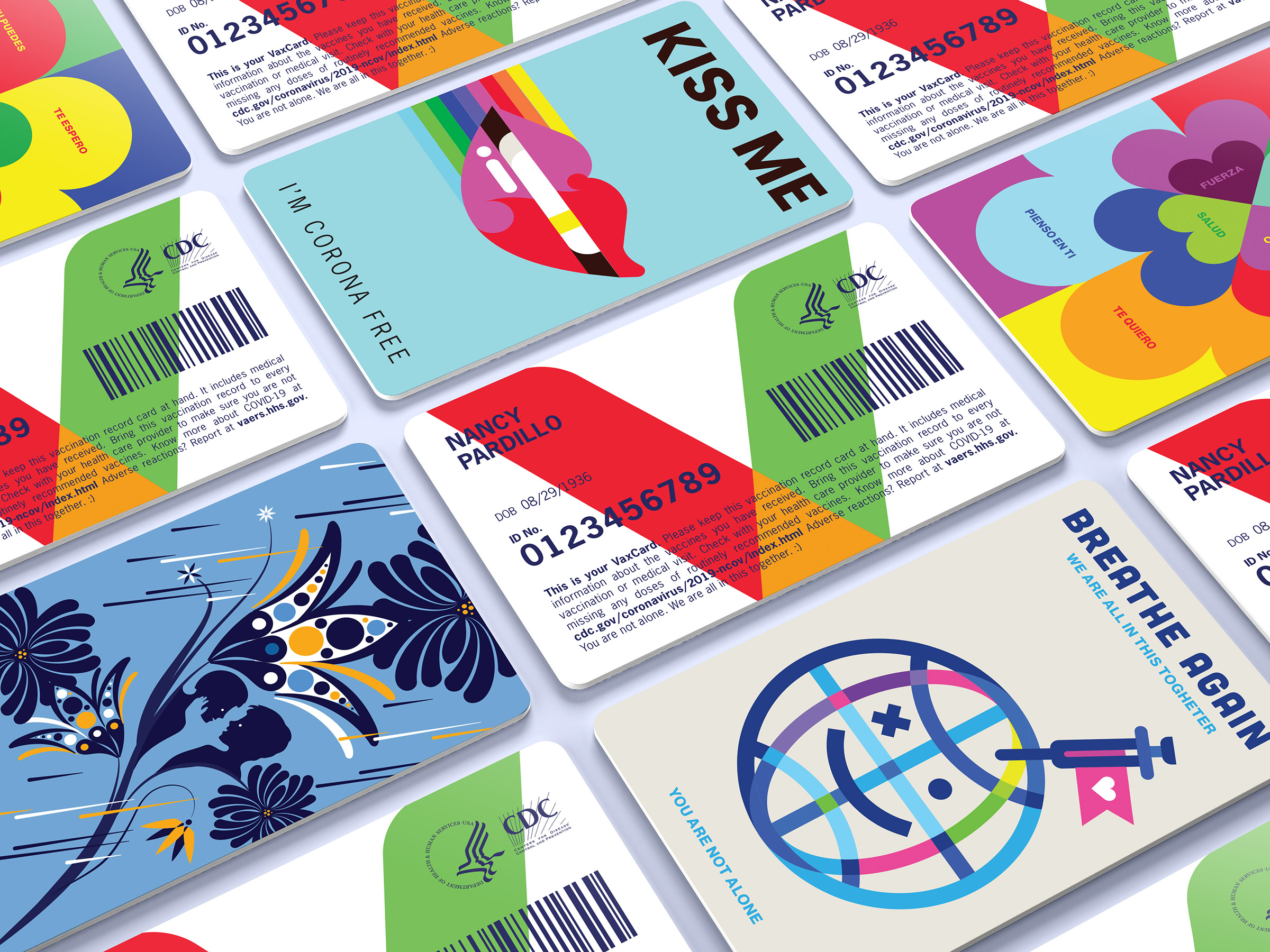
Zamora reiterates the need for a unified, electronic tracking system. “I’m basically proposing a simplified card connected to a database like a credit card and a space for public messaging to educate and promote vaccination,” he says.
Using a bar or QR code to carry information like the manufacturer of the vaccine administered, the number of shots the person has received and where they got vaccinated not only helps keep confidential medical information confidential, but could also enable the authenticity of the card to be confirmed at a swipe—and to, theoretically, tell the cardholder that it’s time for, say, a booster shot or a checkup. Of course, that would require that a nationwide network of card readers similar to payment terminals were installed at venues where vaccine status would need to be confirmed—a heavy lift, but one that could pay big dividends. With nearly 86% of physicians offices now using electronic medical records, according to the U.S. Centers for Disease Control and Prevention, vaccine data collected by such a system could flow smoothly into a patient’s overall health files.
“The real challenge is not just designing a card with a single piece of health data,” says Speicher, “but designing a system that gives us access to our information, and makes it easily accessible to share with the institutions we interact with—airlines, schools, restaurants, movie theaters. The system has to work well and be trusted in all directions.”
Los Angeles-based designer Elisa Wong kept things simple—opting for a card that would be filled out manually and does not have a QR or barcode. What it has is wallet-sized portability and a colorful look, along with being easier and cheaper to manufacture.
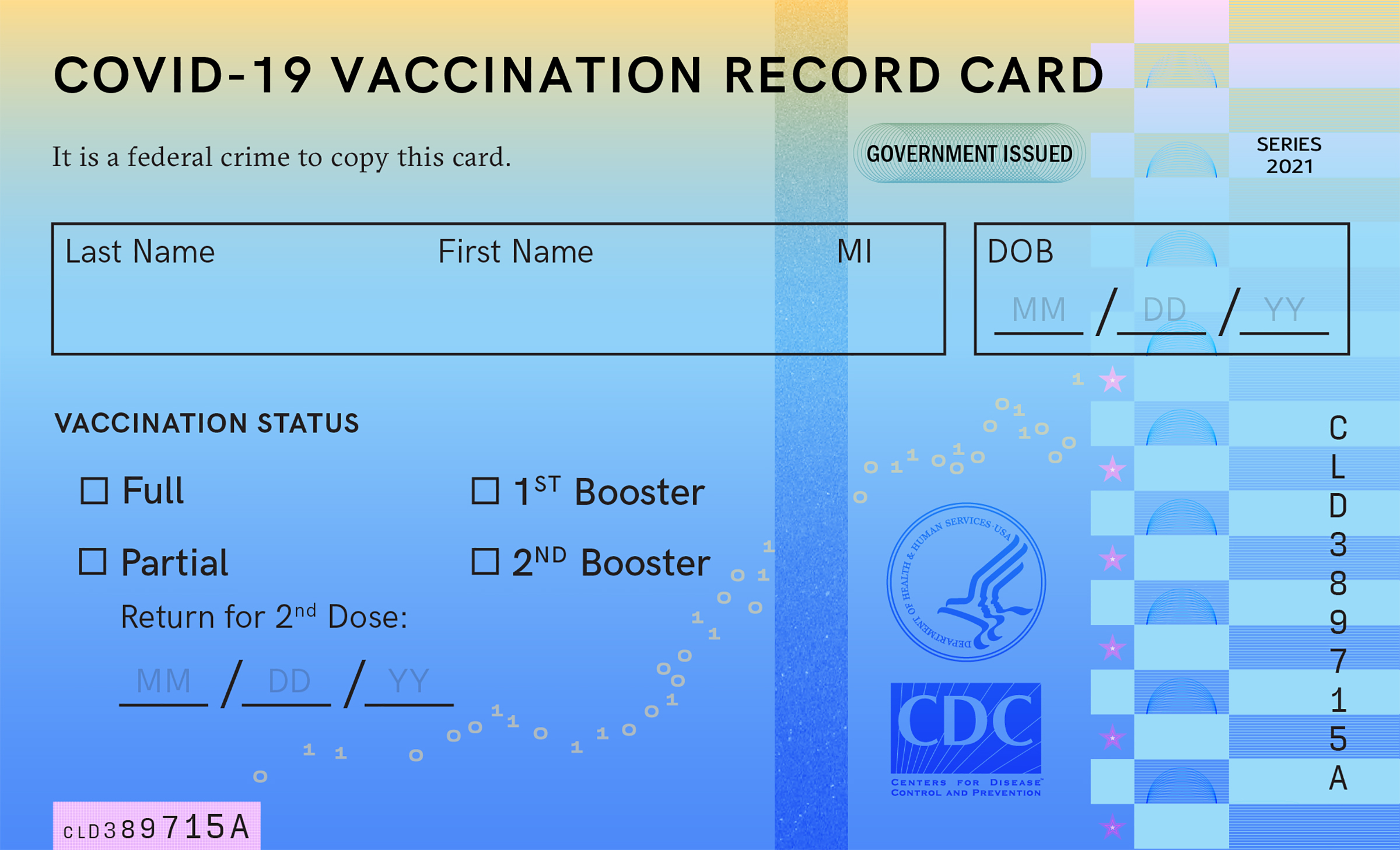
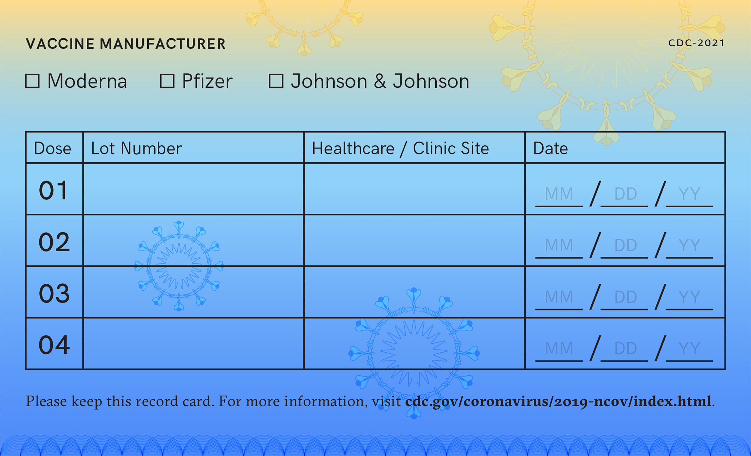
None of these changes would make for a perfect card, but all of them would decidedly make for a better card. For now it does appear we’re stuck with the cards we’ve got. (The CDC did not return an inquiry from TIME asking if it has plans to issue improved cards in the future.) Still, the lessons from this pandemic—and from this iteration of vaccine cards—could mean better things to come when the next health crisis hits.
More Must-Reads from TIME
- Donald Trump Is TIME's 2024 Person of the Year
- Why We Chose Trump as Person of the Year
- Is Intermittent Fasting Good or Bad for You?
- The 100 Must-Read Books of 2024
- The 20 Best Christmas TV Episodes
- Column: If Optimism Feels Ridiculous Now, Try Hope
- The Future of Climate Action Is Trade Policy
- Merle Bombardieri Is Helping People Make the Baby Decision
Write to Jeffrey Kluger at jeffrey.kluger@time.com