Ahead of the start of a new era that will no doubt bring intense new challenges, the Pantone Color Institute has announced that its 2020 Color of the Year is PANTONE 19-4052 Classic Blue, a deep blue shade that’s at once comforting and relatable.
The indigo hue brings to mind both the constant and the classic; the sky at dusk, an impeccably tailored suit, serene waters, or a bowl of perfectly ripe blueberries.
Pantone’s selection of Classic Blue for 2020 is richer when you consider the history of the Color of the Year franchise, which began 20 years ago in 1999. That year, the color chosen was Cerulean, a serene shade that represented the excitement of a new millennium and offered a calming visual to the anxieties that preceded Y2K. Cerulean’s impact that year permeated the cultural zeitgeist, ranging from home decor trends to high fashion; for reference, one might consider Meryl Streep’s character Miranda Priestly’s monologue in the early-aughts film, The Devil Wears Prada, where she breaks down how the color dominated a global industry.
So perhaps it should come as no surprise as a decade ends and a new one begins, that Pantone would revisit the blue color family ahead of a year that will carry plenty of changes, fears, and hopes as it ushers in a new phase.
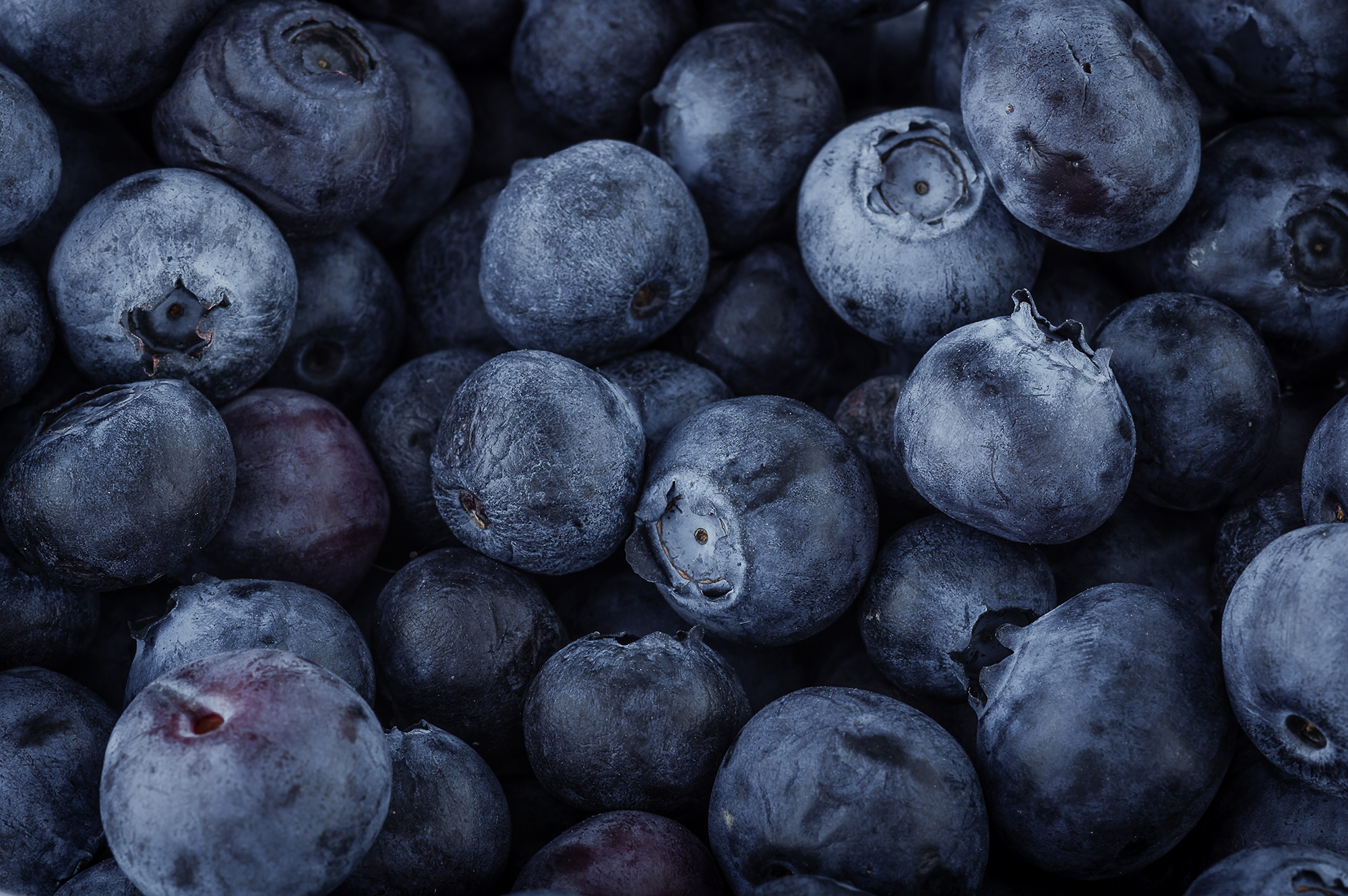
“From now and then [1999], there’s the same feeling of trepidation about the world, which is why, based on what we saw happening in our global culture, we selected Pantone 19-4052, Classic Blue, to be our color of the year for 2020. ” Laurie Pressman, Vice President of the Pantone Color Institute, tells TIME. “It’s a reassuring blue, full of calm and confidence. It builds connection.”
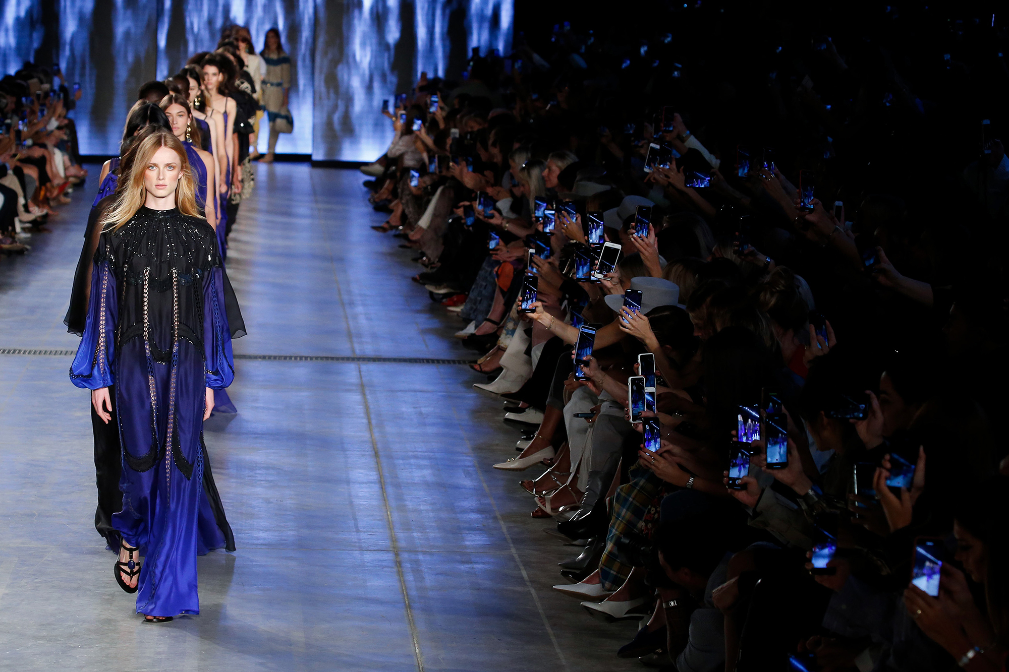
Pressman said that Pantone felt that the color highlighted dependability, trustworthiness, credibility, and constancy, all traits that are valued in the fast-paced, high-stress situations of the current world. She also pointed out that the deep blue matches that of the sky at dusk, which provides an apt example of why this color can resonate with so many people.
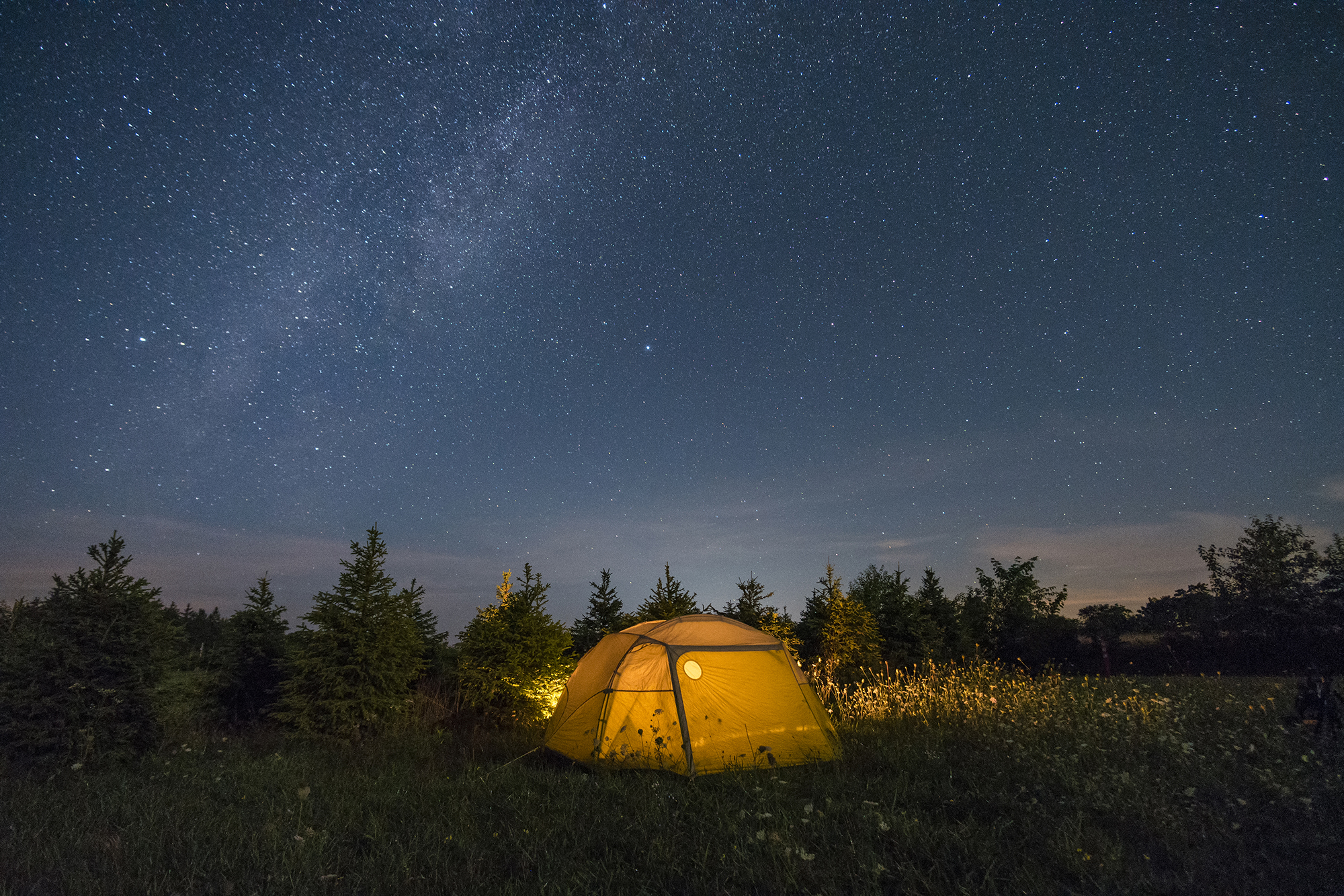
“The sky at dusk – it’s not a midnight blue, it’s thoughtful, but it’s not so deep and mysterious,” she said. “It speaks to our feelings of anticipation, when you think about the sky at dusk, the day isn’t over. You’re thinking, what’s ahead of us? It’s reassuring, but thought-provoking. It highlights our desire for this dependable, anchoring foundation on which to build as we cross the threshold into a new era. We’re living in a time that requires trust and faith and confidence. We all see this blue sky and can relate to it, it’s approachable.”
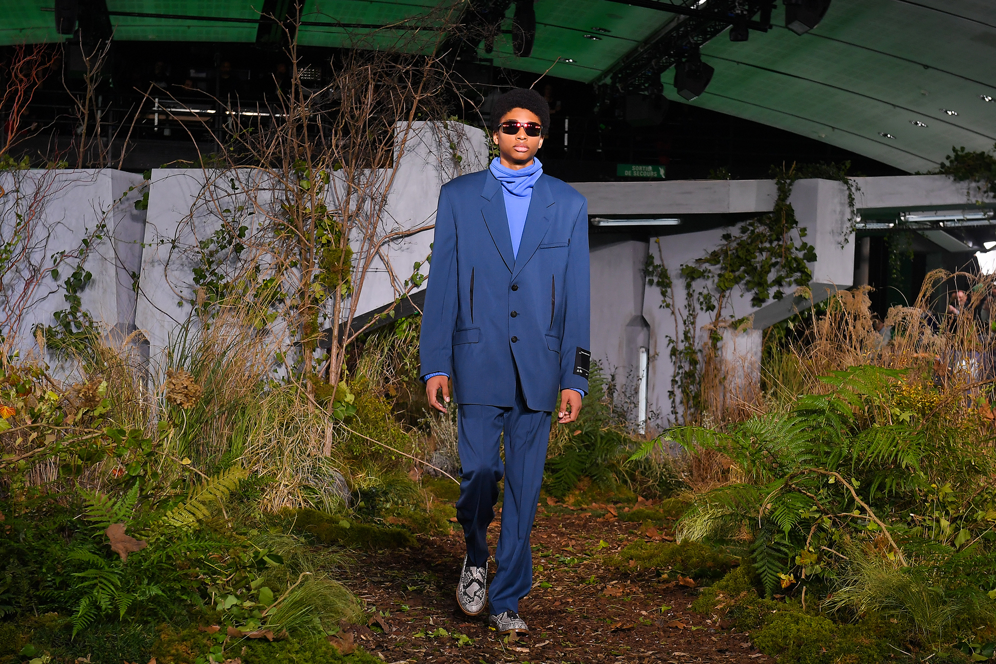
Indeed, the color seems especially fitting for this moment in time; the hue is both genderless and seasonless, making it both accessible and desirable, for people in all walks of life. Additionally, its indigo shade can be achieved naturally from plants and dyes, making it a color that aligns well with the sustainability movement, echoing last year’s concentrated focus on sustainability with the selection of Living Coral as the 2019 Color of the Year.

And while some might associate the shade with nostalgia or convention, Pressman says that Classic Blue may be emblematic of heritage, but highly contemporary, which is why it looks just as good when spotted as a hooded sweatshirt from the luxury streetwear line of the moment, Off-White, as it does with a traditional suit from American prepster Ralph Lauren.
“We’re returning to classics because everything has been chaotic in the world,” Pressman said. “It’s not about doing it like you did in the past, but reinterpreting it.”
More Must-Reads from TIME
- Cybersecurity Experts Are Sounding the Alarm on DOGE
- Meet the 2025 Women of the Year
- The Harsh Truth About Disability Inclusion
- Why Do More Young Adults Have Cancer?
- Colman Domingo Leads With Radical Love
- How to Get Better at Doing Things Alone
- Michelle Zauner Stares Down the Darkness
Write to Cady Lang at cady.lang@timemagazine.com


