As Facebook’s annual F8 developer conference kicked off Tuesday, executives outlined a litany of changes coming to the company, new features on the way to its social network, and how it’s working to address privacy and security. But Facebook’s biggest update is rolling out to users right now — and you might have already noticed a difference.
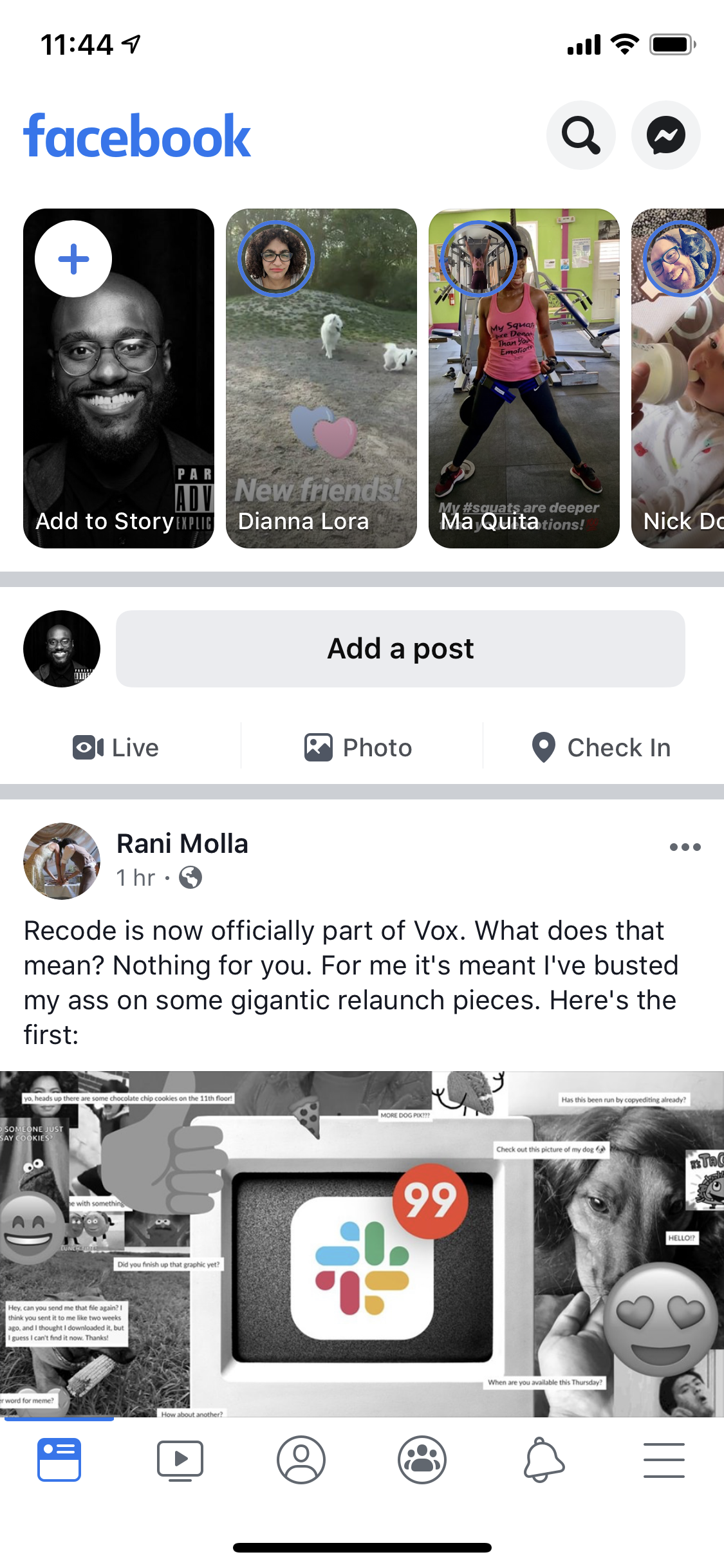
Facebook users checking the app on their smartphone might see a major change in its look. Facebook says the redesign — dubbed “FB5” by CEO Mark Zuckerberg — will hit iOS and Android apps first, with changes coming to web users in the next few months.
Here’s what to know about the Facebook redesign, and how to navigate it:
More white, even more white space

The first thing you’ll notice about the Facebook redesign is the distinct lack of blue. In fact, it ditches a majority of the company’s iconic color in exchange for a veritable ton of white space. In truth, it looks quite nice, and gives it a less cluttered feel overall. The three-column layout is still there, with content now much larger and more readable. The site’s header makes it easier to jump between site sections like Notifications, Groups, Messenger, and Facebook Watch. Don’t like all that white burning your eyeballs when the sun’s gone down? Don’t worry, there’s also a dark mode.
You’ll still have your News Feed front and center, but Facebook’s new look seeks to boost “private” interactions with people, highlighting the growing use of Facebook Groups and Facebook Messenger. “In addition to the digital town square, we also need a digital equivalent of the living room that is just as built out as a platform,” said Zuckerberg, with the implication that he hopes Facebook’s pivot to privacy will result in more meaningful conversations on the site.
Groups is gaining additional functionality as well, with categories like Health Support groups or Gaming groups adding features like anonymous questions and threaded conversations, respectively. You’ll also see more Groups content in your News Feed, as well as recommendations to join groups Facebook thinks are relevant to your interests.
The shift in focus to Groups and Messenger is apparent in the redesign, which gives both your list of Groups and your currently active friends better visibility compared to the old layout. “Overall, we’ve made it easier to find what you’re looking for and get to your most-used features,” reads a Facebook blog post announcing the features, though users will surely first have to get used to the new look.
Get ready to meet — or date — new friends

The focus on groups and private messaging doesn’t mean Facebook wants you to chat among your existing circle of friends forever. It’s also rolling out Meet New Friends, a feature which will suggest new friends for you based on your shared interests, groups, or location. It’s opt-in only, and will only connect you to other users who are also looking for new friends.
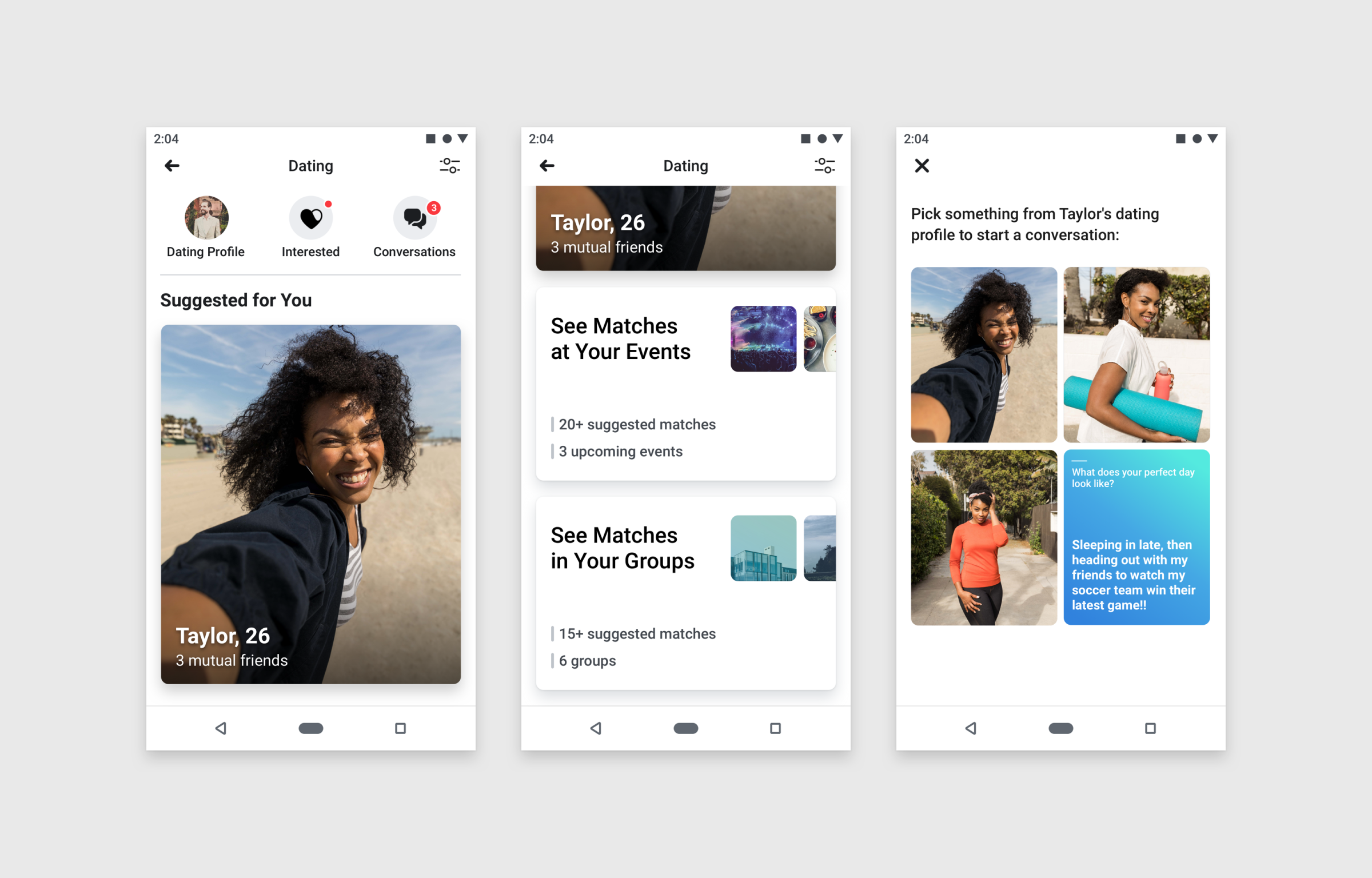
Of course, some people might be looking for more than a friend on Facebook. To that end, Facebook’s redesign is also hoping to revolutionize your dating life with feature called Facebook Dating. Like its Meet New Friends feature, Facebook Dating is opt-in only, though this particular service requires you create a Facebook Dating profile within the Facebook app. No Facebook Dating activity will be shared publicly, Facebook says, meaning your News Feed and profile page will be safe from any inadvertent or embarrassing incidents from your dating life.
Along with Facebook Dating comes the instantly polarizing Secret Crush, a feature letting users select up to nine friends with whom they’re harboring romantic feelings. Only when two people select each other as a crush will they be revealed to one another. Crush alerts are anonymous, and only available if you’re a Facebook Dating user.
More Must-Reads from TIME
- Why Trump’s Message Worked on Latino Men
- What Trump’s Win Could Mean for Housing
- The 100 Must-Read Books of 2024
- Sleep Doctors Share the 1 Tip That’s Changed Their Lives
- Column: Let’s Bring Back Romance
- What It’s Like to Have Long COVID As a Kid
- FX’s Say Nothing Is the Must-Watch Political Thriller of 2024
- Merle Bombardieri Is Helping People Make the Baby Decision
Write to Patrick Lucas Austin at patrick.austin@time.com