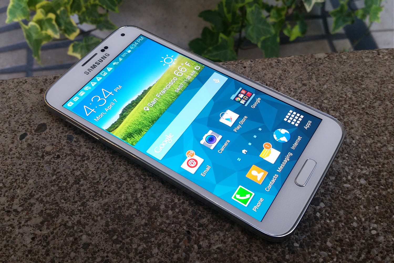
For years now, the guiding principle behind Samsung’s Galaxy S phones has been pretty obvious: More is better. Like a technological game of Jenga, each new model piled on feature after feature after feature, until it was a miracle that the whole contraption didn’t come toppling down under the weight of its own complexity.
Eventually, something had to give—and now it has.
The new Galaxy S5 is still an uncommonly feature-laden smartphone, one which will do everything from read your heart rate to replace your TV remote control. But with it, Samsung shows a new discipline that sets this phone apart from the Galaxy S4, which played up wacky gimmicks such as Air View and Air Gesture, two options that let you control your phone without touching the screen. (They’re still in the S5, along with other S4 kookiness, but mostly turned off by default.)
Much of what’s new in the S5 isn’t all that inventive, but involves stuff that every smartphone owner cares about, such as physical durability, display and camera quality and battery life. And though the overall experience doesn’t reach Apple-esque levels of polish–it melds Google’s Android 4.4 KitKat operating system with a bevy of Samsung’s own customizations—there’s less of the cacophony and clutter that’s marred many a past Galaxy device.
Like its predecessors, the Galaxy S5 will be among the most readily available gadgets on the planet. It’ll be available on every major U.S. wireless carrier as well as smaller players. Expect to pay about $650 without a contract for an S5 with 16GB of storage, or around $200 with a two-year commitment.
I tried the new phone in both its AT&T and T-Mobile versions. As you’d expect, each company loaded up the phone with some of its own apps and services (AT&T DriveMode! T-Mobile TV!). But I also noticed that the AT&T variant was missing Samsung’s new Kids Mode, which is designed to be used when you hand your phone over to your offspring. (It hides your stuff and substitutes child-friendly apps.) AT&T also replaced the integrated support for Dropbox online storage with something called AT&T Locker.
No matter who you buy a Galaxy S5 from, you’ll get a phone that’s not a radical departure, designwise, from previous Galaxy S models. It’s slightly wider, taller and thicker than the Galaxy S4, in order to accommodate a 5.1-inch Super AMOLED screen, up from the 5-incher in the S4. These days, that’s a big screen but not an enormous one, and the S5 doesn’t feel like any more of a handful than the S4 did.

However, in an acknowledgement that jumbo screens have their downsides, the Galaxy S5, like the the Galaxy Note 3, includes a bizarre one-handed mode that shrinks the amount of real estate the phone actually uses, leaving a thick black border around the the top and left side. Just in case you didn’t want a big-screen phone after all.
The screen resolution is still 1920-by-1080, but a new feature called Adapt Display automatically tweaks color saturation, sharpness and other settings in apps such as the photo album and web browser. It seems to work well: The display looked good indoors and out, and I didn’t notice the unnaturally vivid colors that OLED displays have a reputation for delivering.

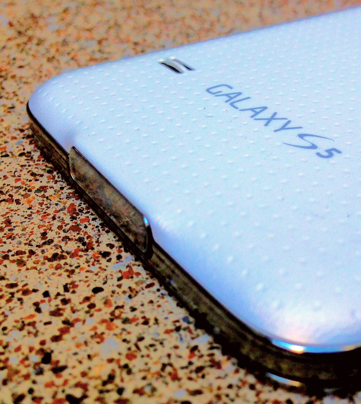
As with previous Galaxy S phones, Samsung, unlike Apple, HTC and Nokia, shows no interest in knocking out anybody through the sheer lavishness of its industrial design. The S5 has a plasticky back cover pock-marked with hundreds of tiny dimples, leaving the white model I tried looking a little like a golf ball that got flattened by a steamroller. I wouldn’t go so far as to call it ugly, but it’s a Chevy in a category full of Lexuses, Infinitis and Acuras.
The removable plastic back does have a couple of significant virtues: You can swap in a spare battery or pop a memory card into the MicroSD slot for affordable storage expansion. And although you might think that the pop-off back would leave the S5 more vulnerable to the elements than a sealed-up phone, this is also the first Galaxy S to tout a water- and dust-resistant design. Its IP67 rating means that it’s designed to survive being submerged in up to one meter of liquid for up to half an hour.
The main clue that the S5 is meant to weather the elements is the tiny door that protects the USB port; it’s easy to flick on and off, and if you forgot to nudge it back into place, you’ll get an on-screen reminder. With it in place, I left the phone lounging in a tub of water for 20 minutes. After I removed it and toweled it off, it was fine. (Apologies, but I didn’t dunk my iPhone–which makes no similar claim–for the sake of comparison.)
Less Apps, More Filling
In the past, Samsung has had a tendency to fill its phones to the brim with its own apps—S Note, S Translate, S This, S That–which let them do a lot of stuff right out of the box, though not always all that well. This time around, the company didn’t just avoid the temptation to add even more S apps. It also chopped out some of the existing ones, offering them instead as optional free downloads. They’re there if you want them, and out of your way if you don’t.
One Samsung app that did survive is S Health, a fitness assistant that lets you track your workouts, walks, calorie intake and the like. It’s still basic compared to the apps that come with wristbands such as Jawbone’s Up, but it does add the ability to read your heart rate, using a new hardware capability. You press your fingertip up against the camera flash for a few seconds to get a reading. As long as I kept my hand super-steady and there wasn’t too much in the way of background noise, it worked.
Also new in the hardware department is a fingerprint scanner. Based on technology from Synaptics, it promises to let you secure your phone with your fingerprint or thumbprint–you can register up to three of them–like Apple’s Touch ID does for the iPhone 5s. You can see why Samsung was itching to add this capability: Its whole Galaxy S marketing blitz revolves around its phones doing things iPhones can’t, so it would have been embarrassing if the S5 lacked an answer to one of the 5s’s flagship technologies.
Besides letting you unlock your phone, the S5’s fingerprint scanner is also used for a couple of features Touch ID doesn’t support right now. There’s a privacy mode that lets you protect items such as specific photos, audio recordings and files from snoops. And though it wasn’t quite ready when I tried the phone, PayPal’s Android app will let you swipe your finger to identify yourself when you pay via PayPal at brick-and-mortar stores.
Sadly, the fingerprint scanner is nowhere near as well done as Touch ID. You need to drag your finger or thumb across the entire home button in a precise, vertical swipe; if you do it carefully, the odds that the scanner will recognize your print are high, but it’s a two-handed job. With Touch ID, you can just press the thumb of the hand you’re holding the iPhone with against the home button, a far more elegant, time-saving approach to the same idea.
The news is much better when it comes to the phone’s 16-megapixel camera and its accompanying software. The Galaxy S4 tried to stand out from the photo-snapping crowd with oddball features such as the ability to overlay a front-facing selfie on top of the picture you’re taking and the ability to erase unwanted bystanders from your landscape shots. If those kinds of effects float your boat, don’t fret—they’re still there in the S5. But rather than adding even more trickery, Samsung focused on more straightforward enhancements that can make almost any sort of photo look better.
The new-and-improved HDR (high dynamic range) mode, for instance, does a better job of bringing out detail in lighting environments that would otherwise be too bright or too dim. Rather than making you guess about how HDR will impact your photo or video, it gives you a live preview in the viewfinder–something I wish the iPhone’s camera did.
Even the most gimmicky new camera feature—a pseudo-Lytro option that lets you refocus a photo after you’ve shot it—isn’t all that gimmicky by Samsung standards. Rather than accomplish the effect entirely through digital retouching, it captures multiple images with different focus points in the first place.
Some phones with cameras capable of superb image quality, such as Nokia’s Lumia Icon, still aren’t all that much fun to use: Laggy shutters and balky software gets in the way. I found the photos I took with the S5 to be a little on the soft side compared to the crispest ones I’ve seen from a smartphone, but very good overall. And the phone aced the photographic test that many competitors flunk: It let me take pictures I was happy with, as fast as I could snap them.
Here are a few of my snapshots, which are unedited except for being reduced to fit on this page.


Samsung gave the Galaxy S5 a fast quad-core Qualcomm processor, but it also beefed up the battery compared to the dual-core S4; in my wholly unscientific tests, I was able to get through a day of fairly heavy use without entirely draining the charge. But I’m smitten with the new Ultra Power Saving Mode, which you can switch on in case of dire emergencies such as your battery gauge dipping below 10% when you’re attending a conference and won’t be able to top it up for hours. It forces the handset into a minimalist grayscale display mode, shuts off energy-hogging apps and frills like Wi-Fi and Bluetooth and takes other extreme measures to eke every possible minute out of the power you’ve got left.
Samsung vs. Google
Though the Galaxy S experience has never been nicer than it is on this phone, there are nagging reminders that it’s under the joint custody of Samsung and Android’s creator, Google. For instance, it has two, count ‘em, two Siri-like voice assistants—Samsung’s S Voice and Google’s Google Now — each of which has useful capabilities that the other lacks. (S Voice handles practical commands such as “turn Wi-Fi off,” while Google Now is amazing for stuff like “Did the Red Sox win yesterday?”) One such feature that did it all would be so much better.
Bottom line: If you want a phone that shows as few technological seams as possible, you want an iPhone or a Windows Phone. Or maybe an Android phone in a Google Play edition, offering Google’s operating system in unvarnished form. (No word yet on whether there will be a Google Play Galaxy S5.)
All in all, though, the Galaxy S5’s emphasis on everyday benefits and its streamlined software shows that Samsung has been listening to its critics, and learning. Until now, it’s always been a safe assumption that next year’s Galaxy S phone would be bigger and more bloated than the one before it. But judging from all that’s pleasing about the Galaxy S5, it doesn’t seem irrational to hope that the Galaxy S6 might follow this phone’s example of self-control. Better still if it fixes that clunky fingerprint reader.
More Must-Reads from TIME
- Donald Trump Is TIME's 2024 Person of the Year
- Why We Chose Trump as Person of the Year
- Is Intermittent Fasting Good or Bad for You?
- The 100 Must-Read Books of 2024
- The 20 Best Christmas TV Episodes
- Column: If Optimism Feels Ridiculous Now, Try Hope
- The Future of Climate Action Is Trade Policy
- Merle Bombardieri Is Helping People Make the Baby Decision
Contact us at letters@time.com