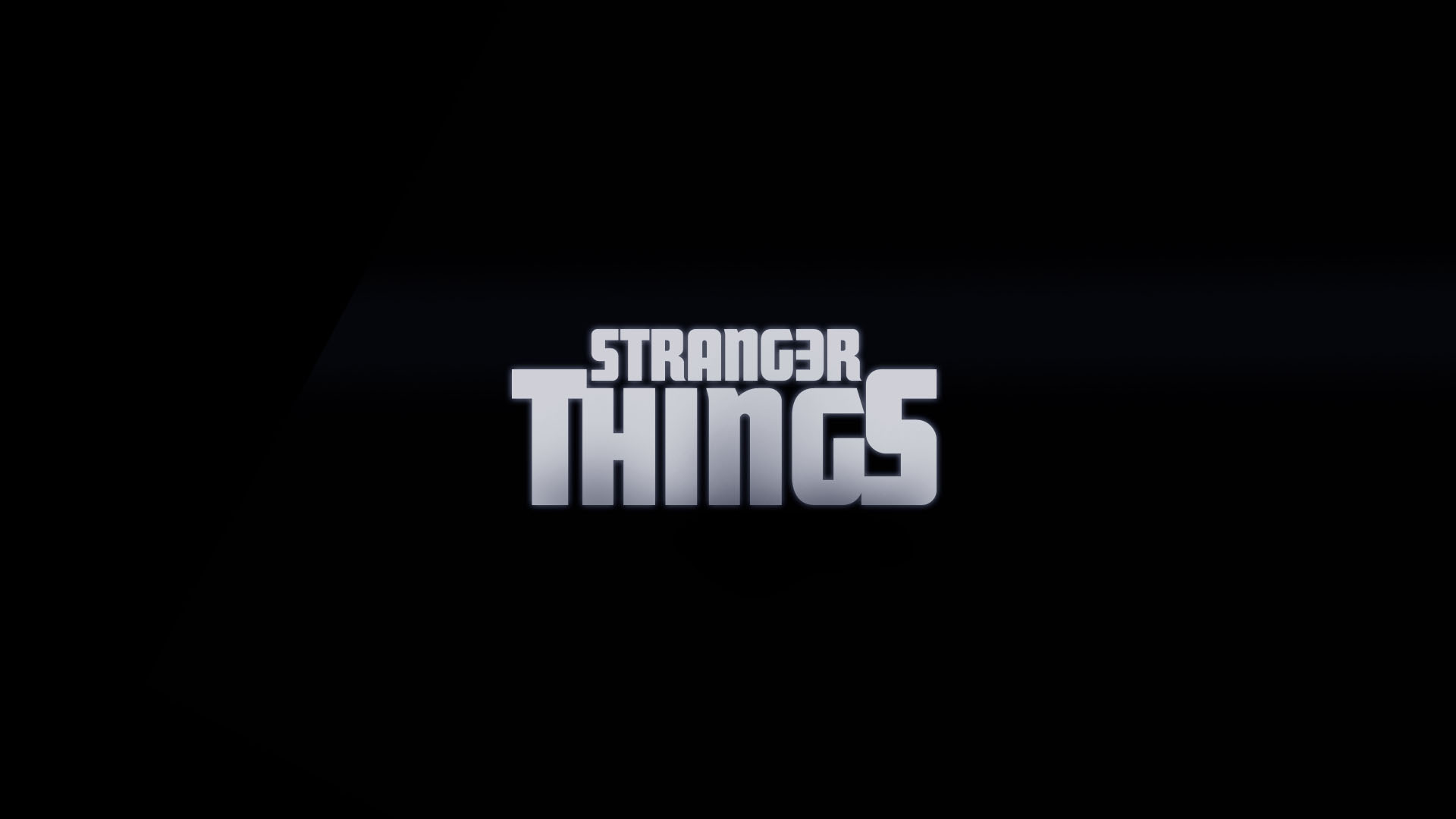
In the summer of 2016, the hypnotic glowing red Stranger Things font lured fans into every new episode of the Netflix series like it was a chapter in their own personal paperback. Stranger Things’ creators Matt and Ross Duffer collaborated with the creative studio Imaginary Forces on the now-iconic title sequence to make it happen. But Stranger Things logo fanatics might be surprised to know there’s a long history behind the chosen font, and that the title sequence could have looked drastically different.
Here’s the story of the evolution of the Stranger Things font.
Stranger Things Font History
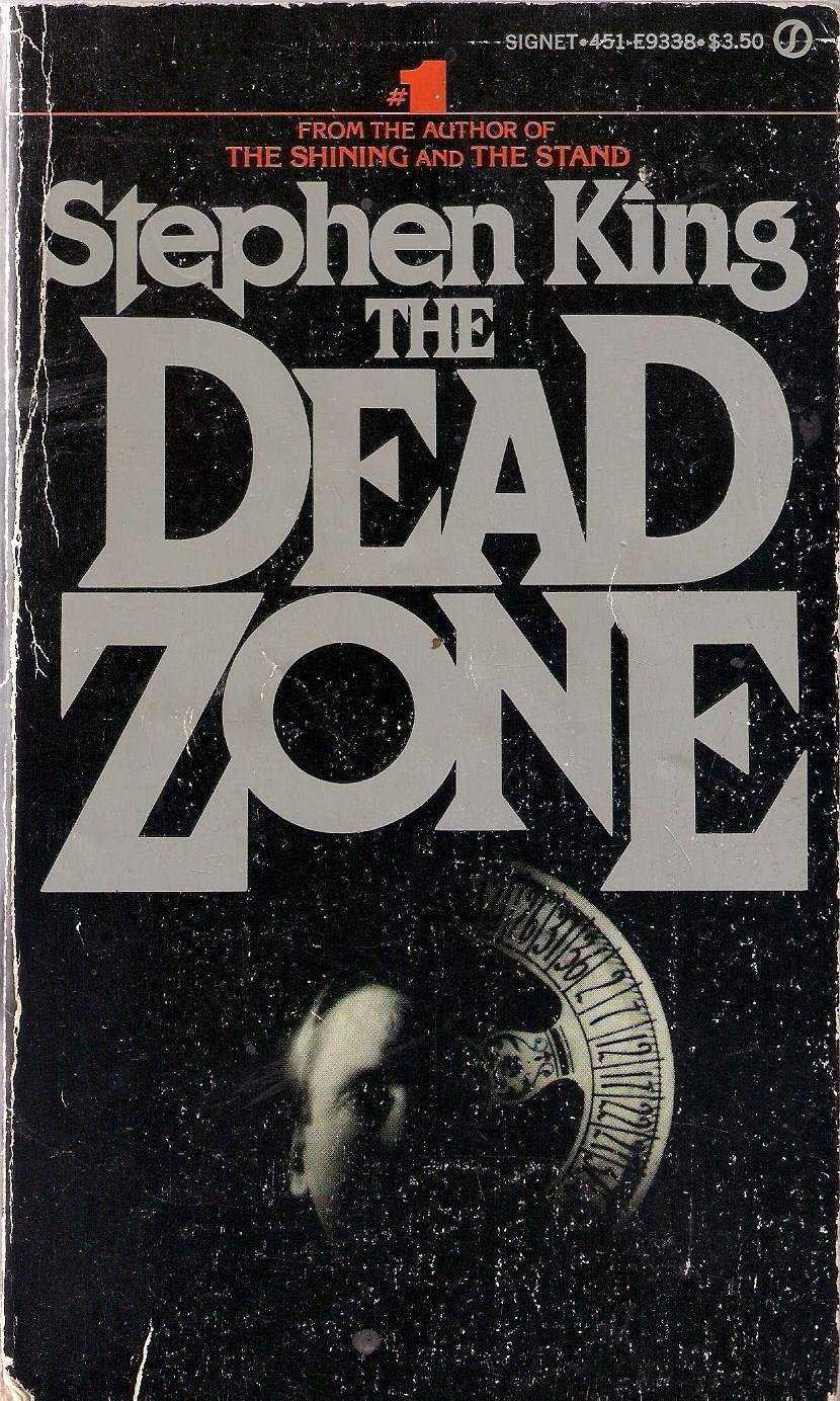
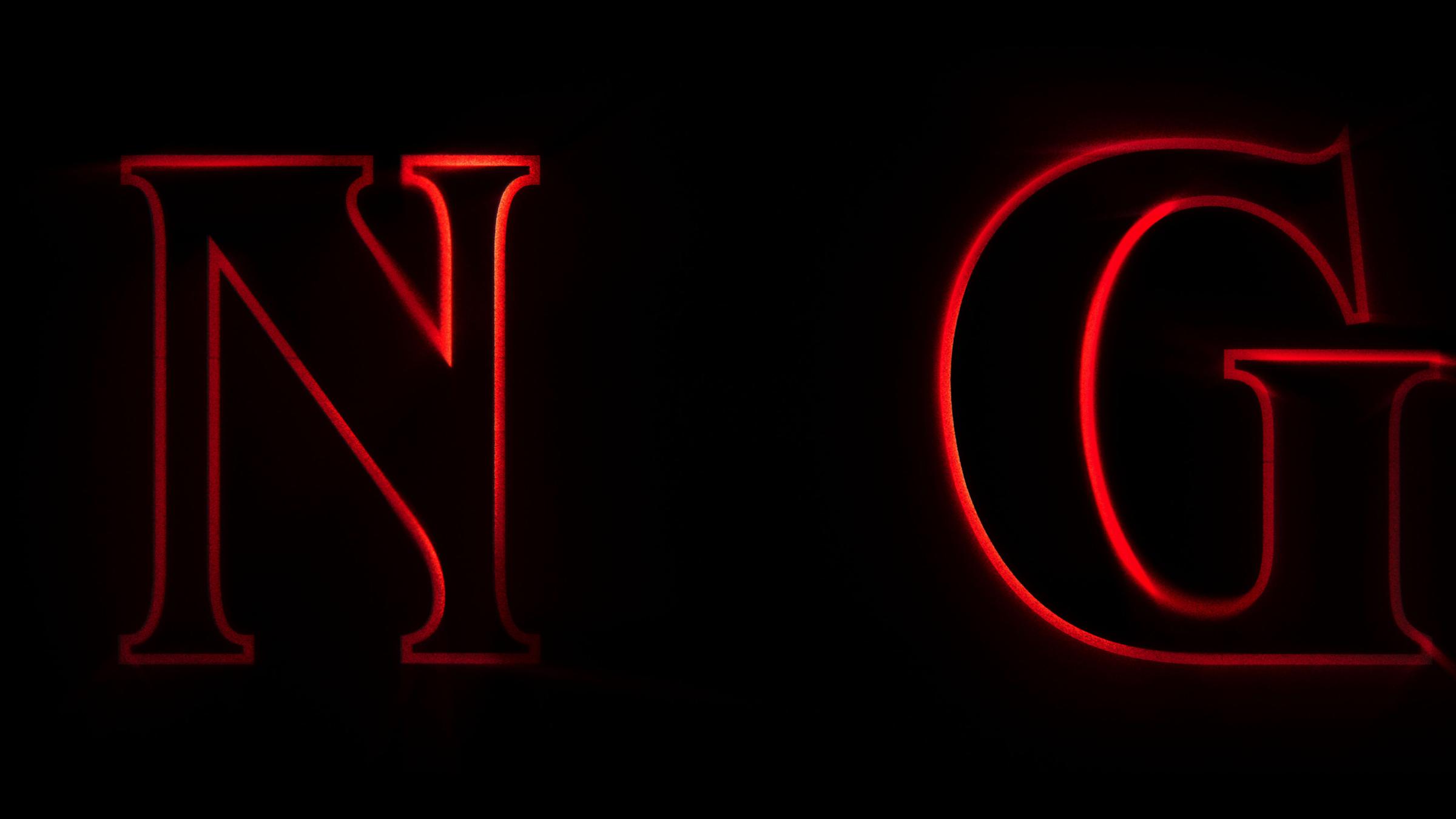
The Stranger Things font name, ITC Benguiat, was created by legendary typographer Ed Benguiat. Although Imaginary Forces originally started their research for the Stranger Things font with more modern typefaces, the creative studio ended up settling on the Art Nouveau-inspired style. Imaginary Forces’ creative director Michelle Dougherty said the Duffers led the creative studio to the retro typeface because it was the same one that covered the Stephen King novels of the era they wanted to evoke.
“It was really surprising that they had such a love for title sequences,” she said about working with the Duffers on the Stranger Things logo. In another nod to the show’s obsession with pop culture of that era, the Duffers looked to Richard Greenberg, who created the ghostly screen title for Alien, another major influence on the series.
But it took more than a few tries. Below, a few fonts that didn’t make the cut.
Synchronized Synth
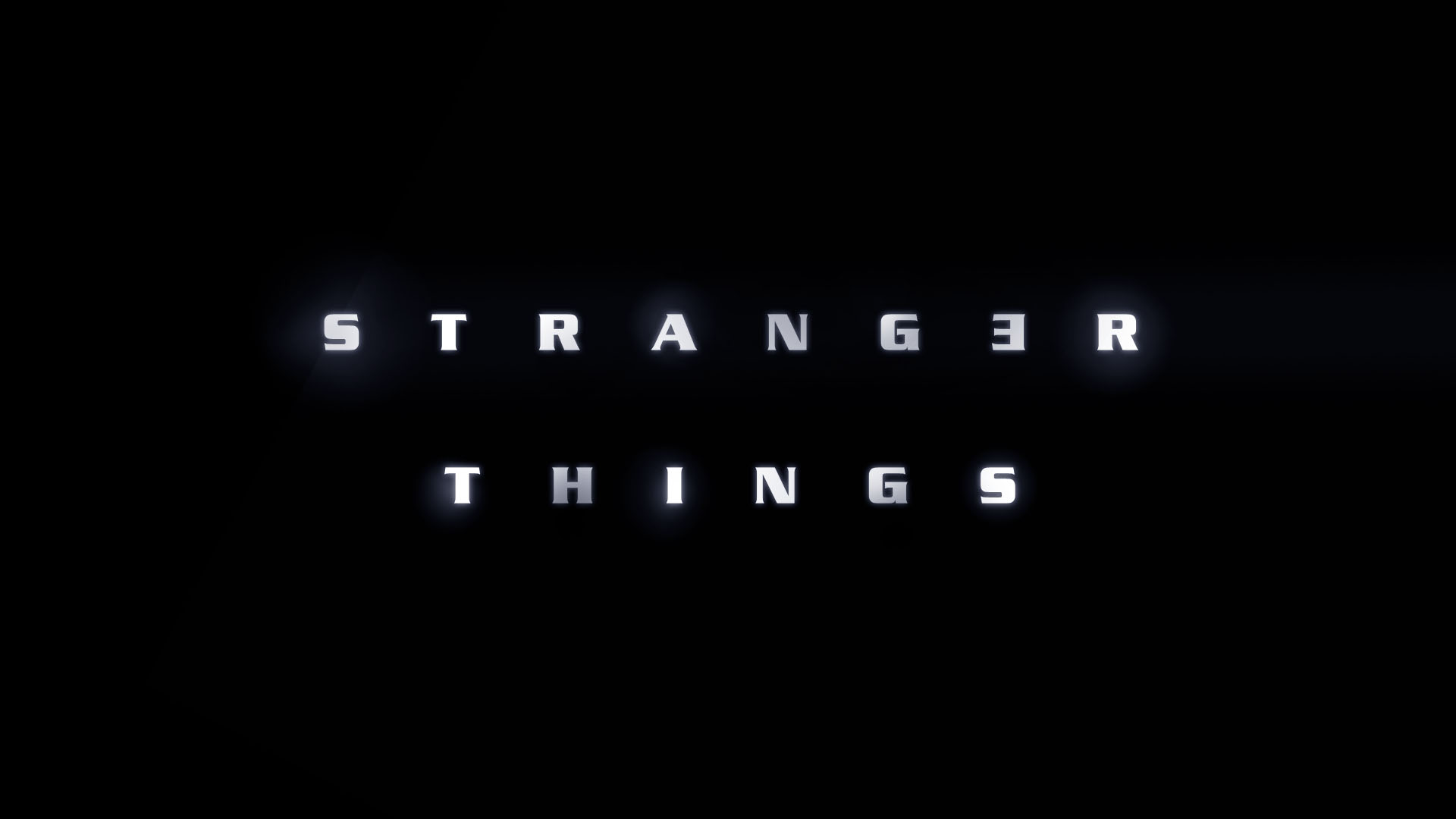
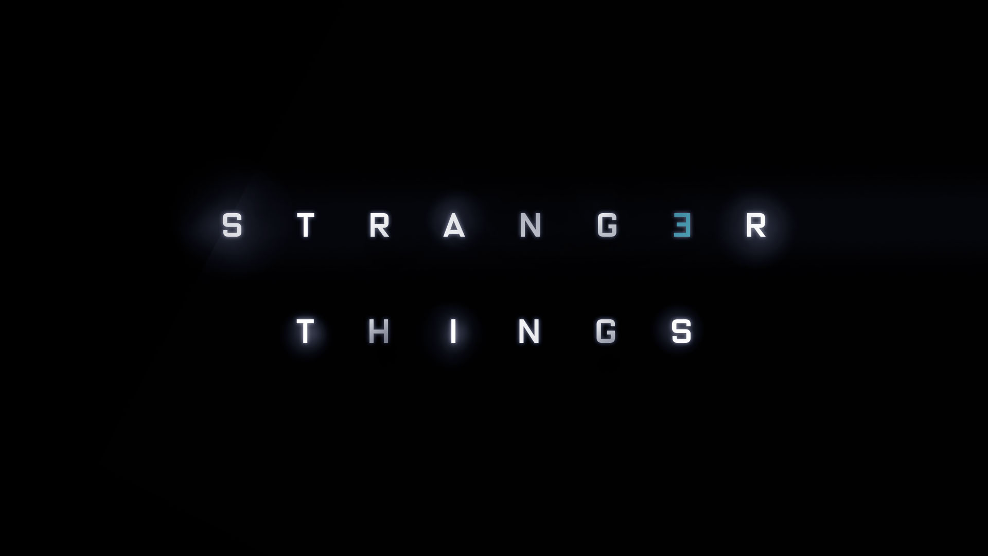
When you first see the letters drift on screen to the synth sounds of the band Survive, they’re so close up you don’t know the endgame until they finally slide into place. But it wasn’t just about looking cool. Dougherty says the letters were intentionally choreographed to come together like that to mirror the plot.
But in order to make the sweeping movement of the letters work, there were changes. Every last letter in the first visual that creative director Nate Sherman and designer Jacob Boghosian came up with had to be curved so they’d all lock into each other like puzzle pieces. Then they added the double bars and made the S and R bigger, for impact.
Timing was key too. Stranger Things always cuts to the title sequence right after the opening’s most jolting moment for a thoughtful reason. The Duffers figured you deserved a break. “Your body and your eyes wanted this place to rest, so it’s quite genius where they put it,” she said.
Movement and Color
The creative studio also toyed with other ways the title could animate onto the screen. In one discarded version, the Stranger Things logo emerged through static from a television screen. Another take: the letters slotted into place much quicker, but that didn’t make the cut. “The Duffers didn’t really respond to that, and I think it was because it felt too modern,” Dougherty said.
It wasn’t always going to have that red on black dramatic effect either. They tried blue, purple and white before landing on red. “Something about the red felt right to us. It actually raises blood pressure,” Dougherty explained.
“Happy mistakes”
If the show’s opener had to be one thing, it was ‘80s enough to hook their target audience. So they created an effect where it looked like light was passing through the film for a pre-digital technology vibe. That meant glitchy.
So if you look closely, you’ll see what Dougherty calls “happy mistakes” like the color pink bleeding through the lettering. “That was the beauty of film then. A human touch that gave it texture,” she said.
Screen title designer Dan Perri, best known for designing screen titles for 1980s Star Wars movies, had helpful feedback. He thought it looked like something you’d see when a movie went with the cheap optical house, and whoever made the sequence would have been fired for it.
It was exactly what Dougherty wanted to hear.
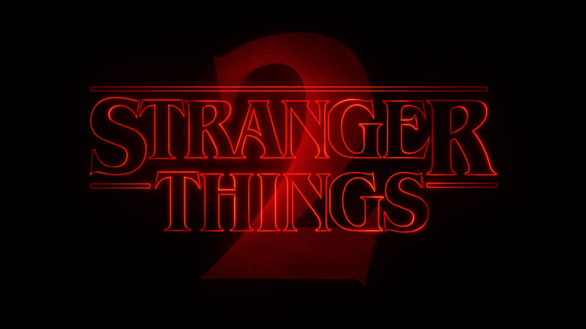
Stranger Things font for Season 2
Dougherty’s team updated the opening titles for the second installment with a striking “2” in the style of sequels of the time. “When the Duffers came to us, they wanted it to feel like Halloween in the 80s,” she said. “Like Jaws 2 and Mad Max 2. They all have that big 2 on there.” But true to vibe of the show, this numeral is formed by beams of light.
Stranger Things Font Generators
And these aren’t just any titles. The opener was a breakout star. What other TV title pops up on the Congress floor to make a point or spreads across the internet thanks to a viral meme generator?
It quickly took on a humorous life as people kept busy Strange-ifying anything they wanted with the Nelson Cash Stranger Things font generator, MakeItStranger.
And the show scored superfans in high places. In February, Rhode Island Democrat Rep. David Cicilline showed up to the House Floor with a “Trump Things” poster to argue the world under President Donald Trump was America’s own personal Upside Down, the terrifying parallel universe where a monster traps cute kids on the series.
“We have a President unlike any we have ever known and like Mike, Dustin, Luke and Eleven, we must remain focused on the task at hand and hold this administration accountable so we can escape from our own version of the Upside Down,” he said.
The politician may have warned that Chief Jim Hopper wasn’t coming to save the country, but the actor who plays him did respond.
Dougherty will tell you that witnessing the spread was the highest honor. “Obviously, it was hilarious to see the Congressman. It’s really thrilling to see a piece of design being adopted by humankind into the zeitgeist,” Dougherty said.
More Must-Reads from TIME
- Caitlin Clark Is TIME's 2024 Athlete of the Year
- Where Trump 2.0 Will Differ From 1.0
- Is Intermittent Fasting Good or Bad for You?
- The 100 Must-Read Books of 2024
- Column: If Optimism Feels Ridiculous Now, Try Hope
- The Future of Climate Action Is Trade Policy
- FX’s Say Nothing Is the Must-Watch Political Thriller of 2024
- Merle Bombardieri Is Helping People Make the Baby Decision
Contact us at letters@time.com