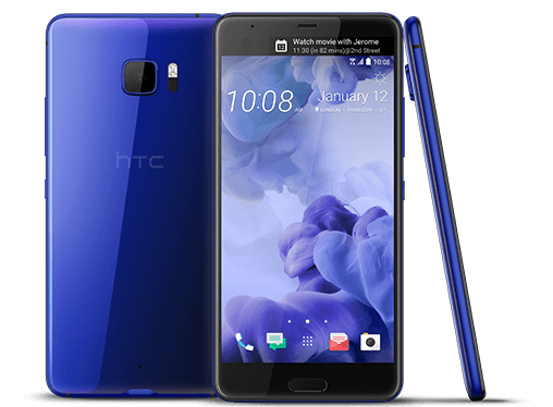
The good: Sharp screen, Excellent front-facing camera, Great audio
The bad: Too large to hold comfortably, Battery life could be better, Second screen doesn’t improve the experience, Expensive
Who should buy: Android fans who want an exceptionally large phone with a nice screen — but those who prioritize portability and battery life should look elsewhere.
A little more than four years ago in 2013, HTC made my favorite Android smartphone: the One.
Its sleek metal design set it apart from competing Android phones at the time, many of which felt like they were made of chintzy plastic. The One also had an excellent screen and the best speakers of its class. But while the One’s successors brought mild improvements, they have largely felt like the same phone repackaged with upgraded internals and slightly altered looks.
That’s why I was excited to get my hands on the $749 U Ultra, which HTC began shipping in March. The U Ultra marks the first time in years that HTC has released a high-end smartphone that feels dramatically different, eschewing the company’s long-favored metal build for a glossy colored back and a larger frame. The U Ultra also works with HTC’s virtual assistant, called the Sense Companion, and includes a secondary screen that sits atop the main display.
Unfortunately, while the One pushed Android smartphone design forward, the U Ultra is a step backwards. The massive 5.7-inch screen is visually impressive, but the phone is so big that it’s unwieldy to actually use. It’s a particularly apparent problem given that rivals like Samsung and LG are finding ways to offer bigger screens without making their phones physically larger, usually by eliminating the bezel around their displays.
Part of the problem lies with the HTC Ultra’s new dual display, which sits atop the device’s screen and displays information like calendar alerts, reminders, and weather forecasts. While it sounds useful, I found it to be more distracting than helpful. (LG and Samsung have explored similar features before on their V20 and Galaxy Edge phones, respectively.)
The U Ultra’s other headline feature is the Sense Companion virtual aide. HTC promotes it as a proactive digital helper that makes suggestions throughout the day, similar to Google Now. But it’s designed to get to know users better over time, so I couldn’t really get a feel for how well it works during my limited testing period. The U Ultra also features another virtual aide, the Google Assistant, and most users probably won’t find a need to use both.
The U Ultra’s 12-megapixel main camera captures crisp images, but the color wasn’t as vibrant as those taken on the iPhone 7 Plus or the Google Pixel. The 16-megapixel front camera was more impressive, balancing the right amount of detail and skin smoothing so that selfies looked polished but not over-processed.
Like the iPhone 7 and Moto Z, the U Ultra lacks a headphone jack, but it comes with a pair of earbuds that fit into the phone’s charging slot. That might be a deal breaker for those who have a favorite pair of wired headphones they’re not willing to give up. Another bummer: The U Ultra isn’t as water resistant as the iPhone 7 or Samsung Galaxy S8, both of which can withstand being dipped in water. HTC’s new phone, by comparison, can only endure light sprays such as rain.
I also wish the U Ultra better delivered on battery life, as I was only able to get through one full day of usage on a single charge. That’s acceptable, but given its size, I was hoping I’d get a bit more mileage, especially considering the iPhone 7 Plus and Google Pixel typically last me more than a day. (Better battery life is a common benefit of larger phones, which tend to sport bigger, longer-lasting batteries.)
There are some things to like about the U Ultra. Its 2,560×1,440 screen is sharp and colorful. The BoomSound speakers offer rich audio that’s louder and clearer than the Google Pixel’s. It also supports up to 2TB of expandable storage, which is rare, as most smartphones top out at 256GB. And the phone certainly sounds promising on paper, with a new virtual assistant, a second screen that lets you see more information at a glance, and a sharp front-facing camera.
Unfortunately, most of these features aren’t as useful in practice as they sound. Nor are they compelling enough to keep up with the brisk competition from rivals like Apple, Samsung, and Google, especially at $749. But most of all, the U Ultra is done in by its unwieldy design, which simply makes it too difficult to use in daily life.
2.5 out of 5 stars
More Must-Reads from TIME
- Cybersecurity Experts Are Sounding the Alarm on DOGE
- Meet the 2025 Women of the Year
- The Harsh Truth About Disability Inclusion
- Why Do More Young Adults Have Cancer?
- Colman Domingo Leads With Radical Love
- How to Get Better at Doing Things Alone
- Michelle Zauner Stares Down the Darkness
Contact us at letters@time.com