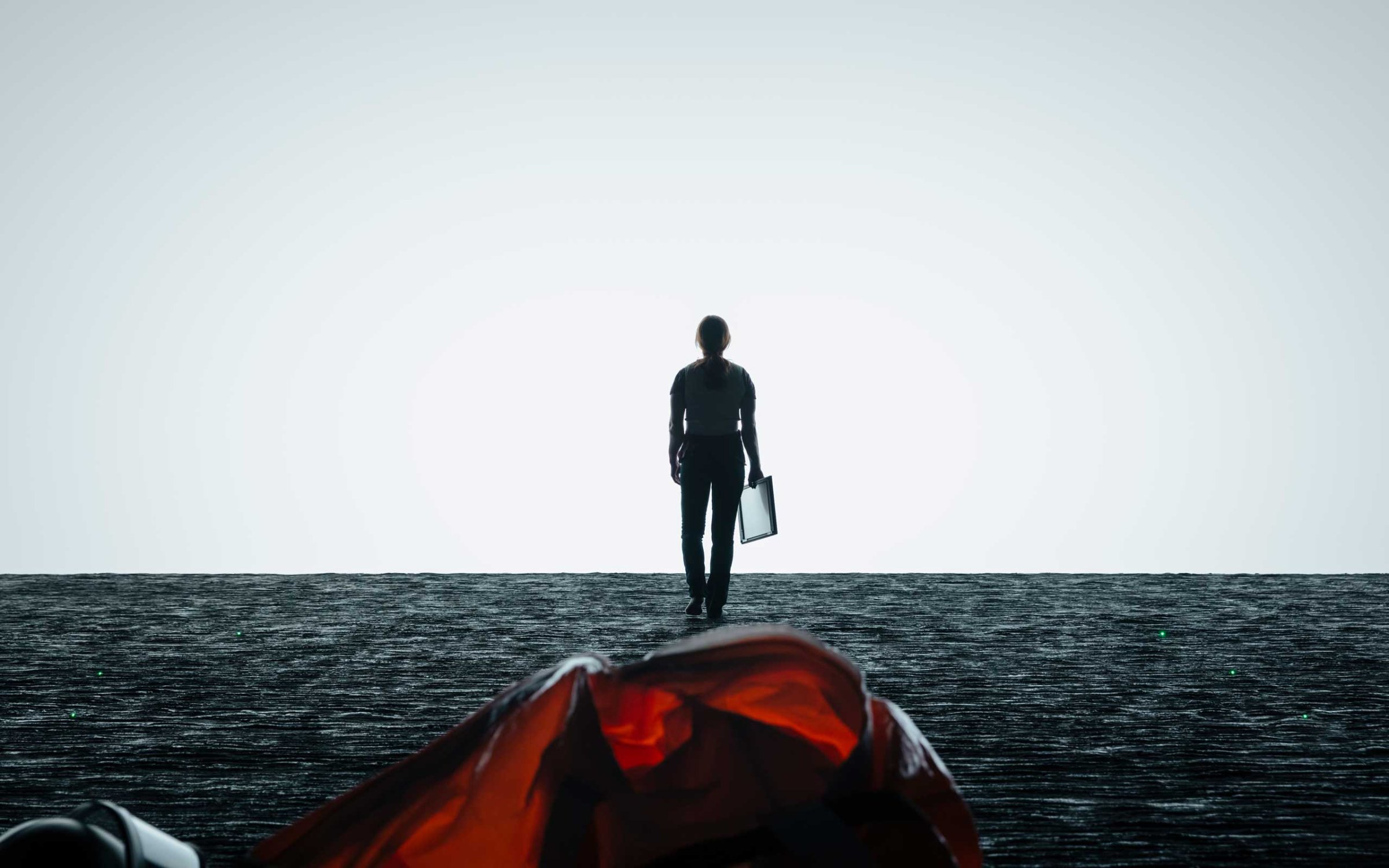
“Cautious, yet mystified, Louise takes another bold action: She steps for the boundary. The light from that mist on the other side of that glass illuminates her face, showing her wonderment.”
In the surprise hit movie Arrival, which is nominated for eight Academy Awards, linguistics professor Louise Banks (played by Amy Adams), is tasked with interpreting the language of a race of visiting aliens. In a dark, cavernous chamber aboard their spaceship, Louise moves from the shadows to the light – a dance that’s mirrored throughout the movie as the character slowly comes to terms with the true lessons the arrival brings.
“I think that journey from darkness to light is her journey,” says Bradford Young, Arrival’s cinematographer. Born in Louisville, Ky., Young has made his reputation with like A Most Violent Year and Selma, in which his mastery of available light helped convey the stories’ intimate natures. And that’s what Arrival’s director Denis Villeneuve was looking for when he embarked on his first science-fiction film.
“I was looking for a cinematographer with a very precise sensibility towards natural light,” Villeneuve tells TIME. “I wanted the movie to have strong roots in realism. I wanted a cinematographer who would not be afraid to deal with intimacy. It’s a very specific sensibility that I felt in Bradford’s previous work.”
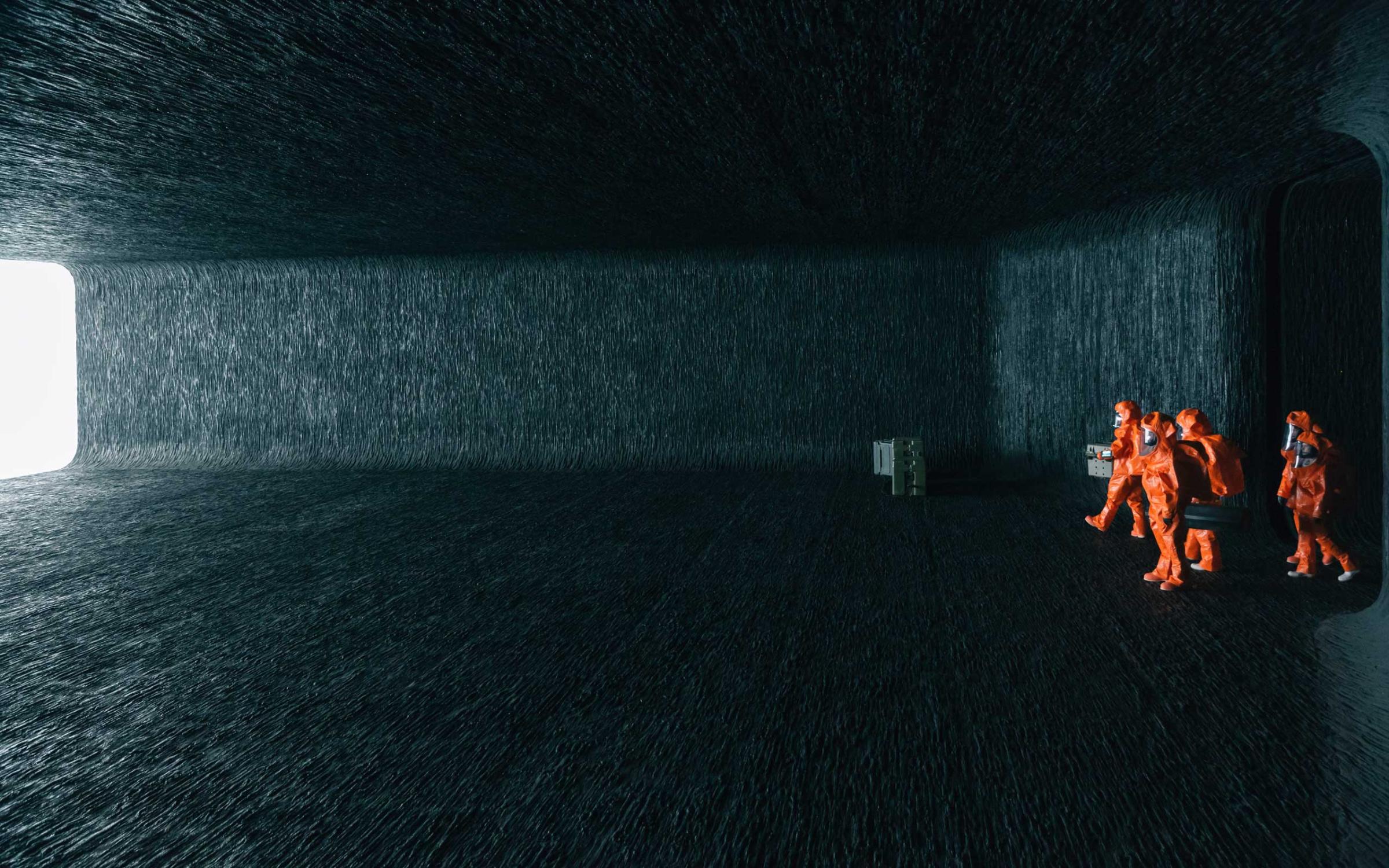
Nowhere else is this play on light more apparent then aboard the spaceship, in the gloomy chamber where Louise spends much of her time. Villeneuve says that the set was specifically designed to be ominous and dark, a place where light is absorbed rather than reflected, a place that subliminally represents death. “The main character is in a relationship with death,” says Villeneuve. “The more she learns about the Heptapod [alien] culture, the more it changes her perception of life, death and time.”

That’s where Patrice Vermette, the film’s production designer, comes in. “With any movies I do, my process is very similar,” Vermette tells TIME. “I start by creating mood boards and collections of images that are only emotional reactions to the script. It could be colors, lights, marbles, rocks.” Then, he and the director work out where to go with that inspiration. In this case, both men were deeply influenced by the artist James Turrell’s Shallow Space Constructions, a series of artworks that use light and space to question the nature of human perception. “When I saw hundreds of people being hypnotized by James Turrell’s light, I had an epiphany,” says Villeneuve.
The cavernous chamber was born out of that experience. It is designed like a dark temple where the film’s characters come to see the light – in this case, the aliens who remain semi-hidden behind a blinding rectangular white screen. Instead of using green screens, Vermette and his team actually built the ship’s chamber. The physical space was humbling and also helped the director and cinematographer set up their shots, Villeneuve days, but the chamber’s bright screen was a challenge for Young.
“We had to be fearless,” he says. “We had to accept the fact that when Louise’s very far from the screen she would be quite dark, and when she’s right up on the screen, we would, for lack of a better term, overexpose her.” But that was the point, he adds. “This movie is about Louise’s personal enlightenment. So you just submit to what the light offers and let that tell the story. It gave us the opportunity to let the lighting of the film mirror the journey of the character.”
That concept is replicated in two other locations throughout the movie. In Louise’s home, a large wall-to-wall window opens up to a blinding, yet hazy, lake, contrasting with the deliberate darkness of her living room. And inside the brutalist, fortress-like architecture of Louise’s university, she faces a rectangular white board that opens up to a television announcing the aliens’ arrival. Again, light and darkness are at play, informing Louise’s journey.
“The structure of all these places work together,” says Young. “Those places make the spaceship that much more important and the spaceship makes those places that much more important. They are in a conversation with one another. They remind us of where Louise came from and where she’s headed.”
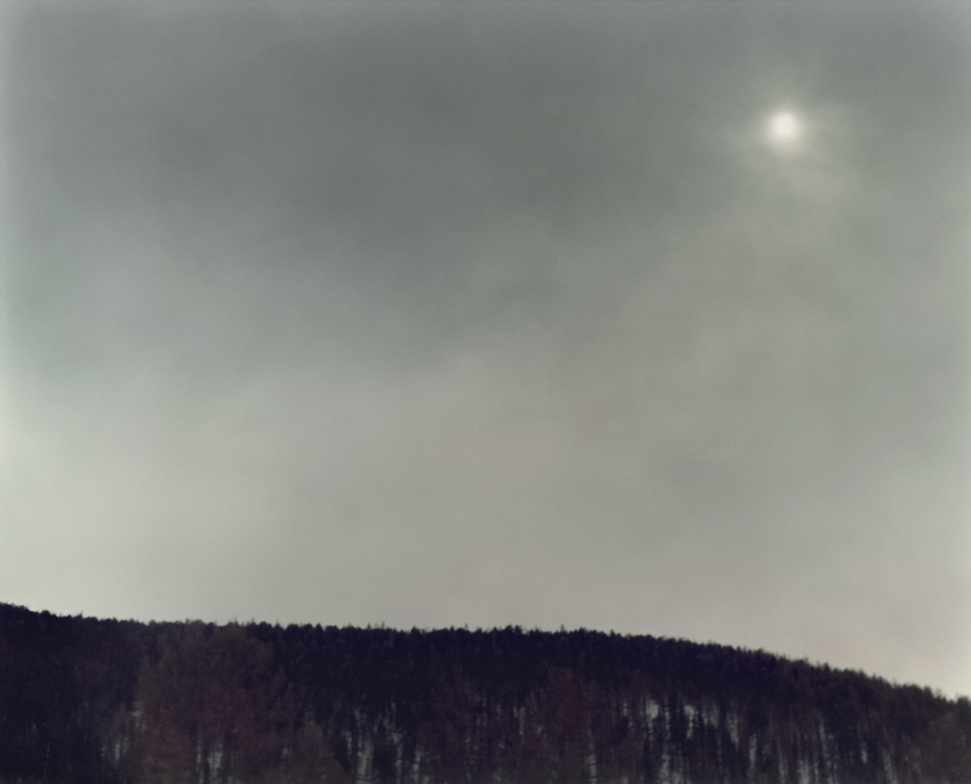
Outside of the spaceship, Young was inspired by the work of photographer Martina Hoogland Ivanow to create a sense of dread and chaos in direct opposition to the Zen-like nature of Louise’s safe and sacred zones. In her book, Speedway, Ivanow creates gloomy, ominous images from mundane situations: a simple landscape becomes a Twin Peaks-like world where the unknown could be lurking in the dark; a motorcycle pilot is transformed into a shadowy, threatening figure.

In Arrival, this is in play when we enter the military’s compound set up near the spaceship. “The calmness of the ship’s chamber is in contrast with the interior of the tents,” says Vermette. “We realize that it’s the human beings that are disturbing the peace and we can’t wait to get back inside the spaceship.” Toward the light – the one controlled by the aliens and the one under Young’s spell. “A light that brings a lot of intimacy, sensuality, fragility and humanity to the project,” says Villeneuve.
Olivier Laurent is the editor of TIME LightBox. Follow him on Twitter and Instagram @olivierclaurent
More Must-Reads from TIME
- How Donald Trump Won
- The Best Inventions of 2024
- Why Sleep Is the Key to Living Longer
- Robert Zemeckis Just Wants to Move You
- How to Break 8 Toxic Communication Habits
- Nicola Coughlan Bet on Herself—And Won
- Why Vinegar Is So Good for You
- Meet TIME's Newest Class of Next Generation Leaders
Contact us at letters@time.com