Less is more. That’s the philosophy behind Instagram’s first complete redesign since the image-sharing app’s launch more than five years ago.
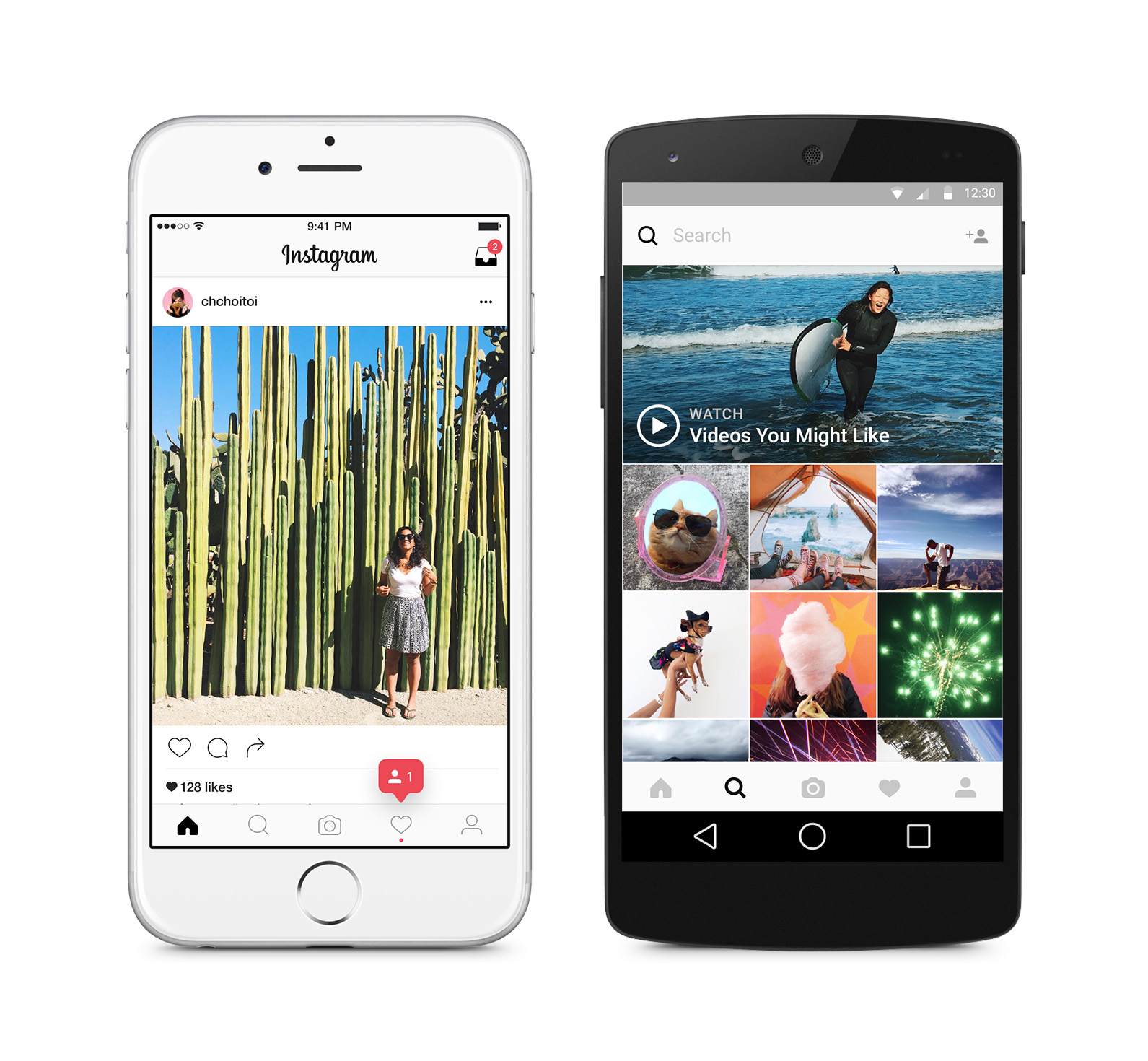
The app with 400 million users has gone back to the basics, privileging a minimalistic black-and-white design that gives more space to the photos, videos, boomerangs and hyperlapses shared on Instagram.
In fact, apart from in-app notifications, which retain their reddish hue, the only spots of color will come from users’ content.
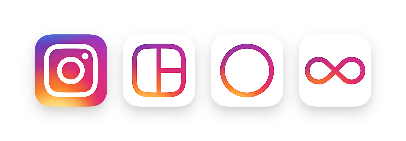
The move mirrors iOS 7’s overhaul when Apple dumped skeuomorphism–where apps look like their real-life counterparts–in favor of a sleek, pared-down layout. In fact, Instagram’s new icon leaves behind the retro look of yesteryear’s instant cameras. Instead, the rainbow colors that came to define the app now dissolve into one another in a seamless display of colors; and only a white outline of a camera remains.
The change is purposeful as Instagram is increasingly moving away from simple still imagery in favor of videos. As Instagram’s head of design Ian Spalter writes, the new logo “sets the groundwork for years to come.”

“When Instagram was founded over five years ago, it was a place for you to easily edit and share photos,” he continues. “Over those five years, things have changed. Instagram is now a diverse community of interests where people are sharing more photos and videos than ever before, using new tools like Boomerang and Layout, and connecting in new ways through Explore.”

Instagram has also transferred its minimalistic aesthetics to its secondary apps–Hyperlapse, Layout and Boomerang. They all retain their white background, with their respective logo adopting the rainbow blend of colors that will now define Instagram. Boomerang and Layout both sport a new logo, though, that closely reflect what they’re supposed to do–one now features an infinity loop while the other shows a collage of three rectangles.
Olivier Laurent is the editor of TIME LightBox. Follow him on Twitter and Instagram @olivierclaurent
More Must-Reads from TIME
- Donald Trump Is TIME's 2024 Person of the Year
- TIME’s Top 10 Photos of 2024
- Why Gen Z Is Drinking Less
- The Best Movies About Cooking
- Why Is Anxiety Worse at Night?
- A Head-to-Toe Guide to Treating Dry Skin
- Why Street Cats Are Taking Over Urban Neighborhoods
- Column: Jimmy Carter’s Global Legacy Was Moral Clarity
Contact us at letters@time.com