
For years, Seattle-based author David Shields made a point of subscribing to the paper edition of the New York Times, paying a small premium to have it delivered to his West Coast home. He simply could not start his day without it. As time passed, he grew uneasy with his dependency. “I was quite struck, over and over again by these really beautiful war photographs that appeared on the front page. And I found myself yearning, almost pornographically, for these pictures every morning,” he says.
As he came to that realization he sought to question his own reaction and deconstruct the patterns that prompted it. And so, he took on the painstaking task of poring over more than two decades worth of the Grey Lady’s A1, from the start of the first Gulf War to mid-2014. He recalls the moment when, huddled in a basement classroom with the students helping him and surrounded by piles and piles of newspapers, they all looked at each other, thunderstruck.
“I thought I’d find a few photographs that were harsh in their depiction of war and capture some of its cost,” he says. “Yet, I found virtually none that you wouldn’t be able to swallow easily with your breakfast. It seems like an institutional policy to choose pictures that you could hang on your living room wall. Journalism is supposed to afflict the comfortable and comfort the afflicted. The Times does neither.”
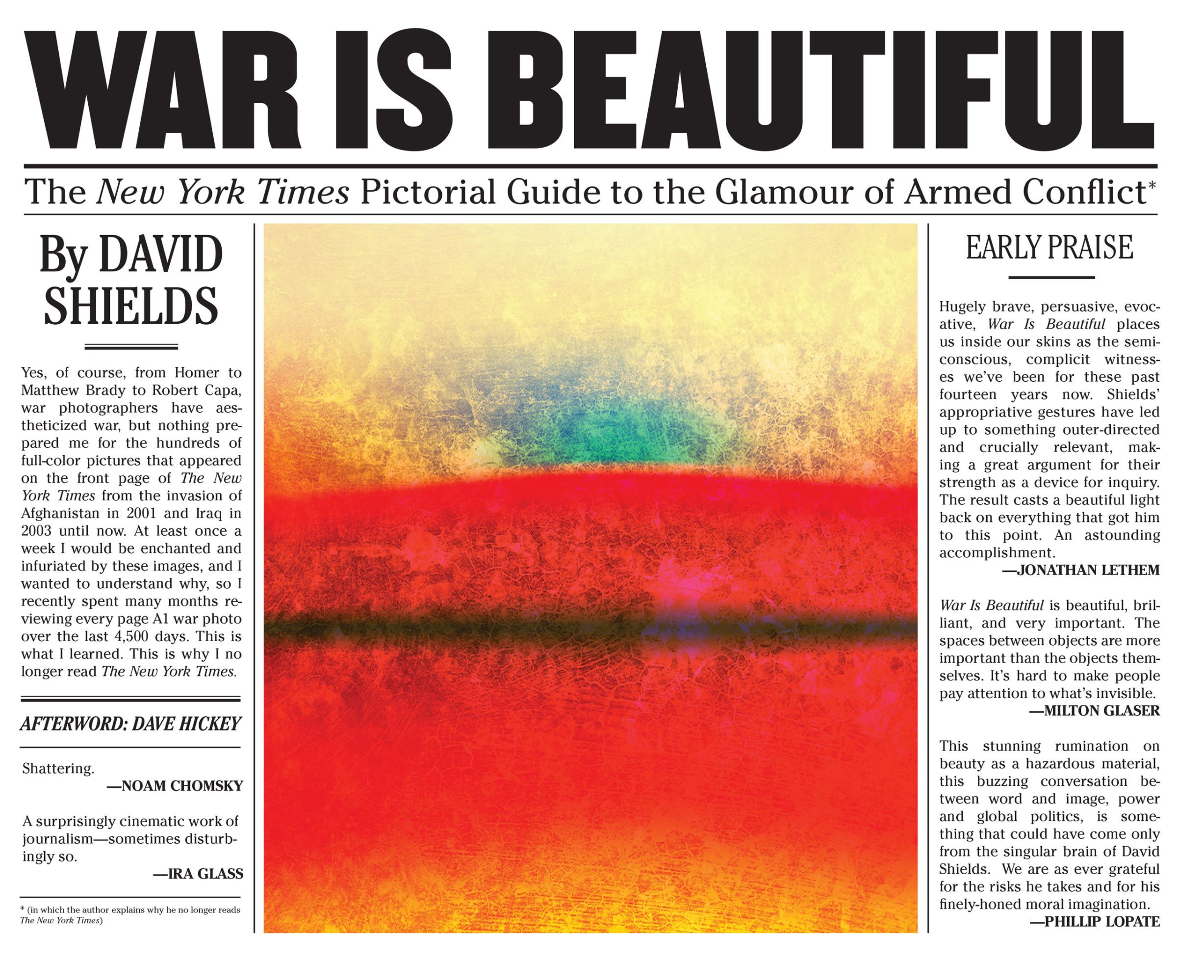
Through War Is Beautiful, his tirade against the leading U.S. daily, he hoped to guide readers toward a similar sense of indignation. With only 64 photographs to illustrate his case, his demonstration falls short.
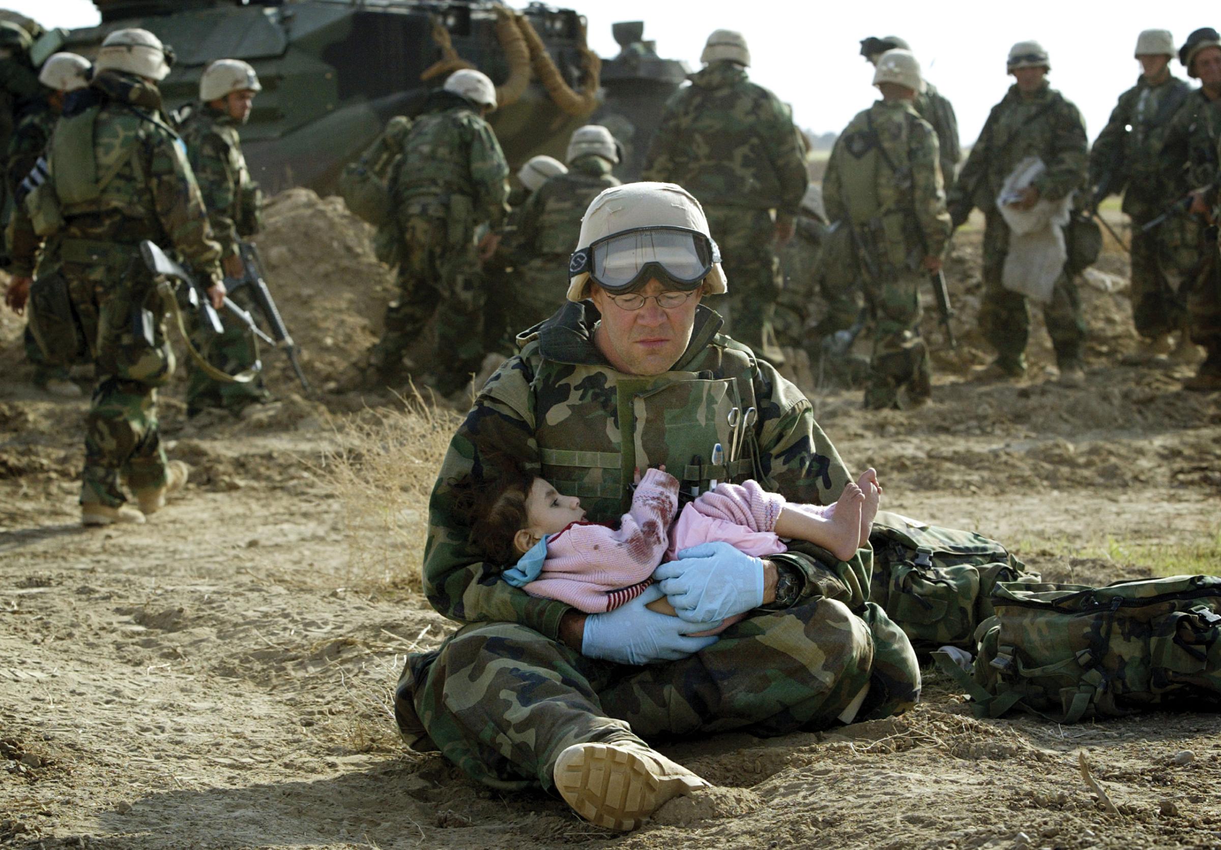
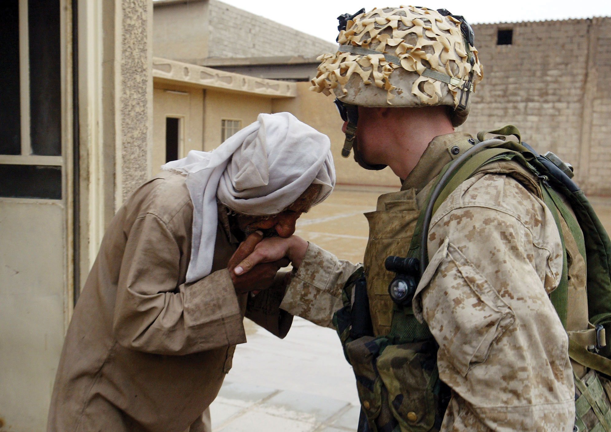
His argument rests on the conviction that Sulzberger’s journal runs “military recruitment posters” and its photo editors are “trapped in clichés and tropes” belonging more to the art world than journalism. Shields lays down the 10 rules he’s convinced they play by – nature, playground, father, God, pietà, painting, movie, beauty, love and death – and offers examples for each. Chris Ison’s capture of British soldiers practicing driving in Kuwait ahead of the Iraqi invasion epitomizes “playground” – understood as depictions of battlegrounds as spaces for play. Wathiq Khuzaie’s shot of a barefoot woman fleeing the scene of a car bomb in Baghdad, fits within “beauty” – wherein pleasing-to-look-at-Madonnas are pictured as victims to be saved.
If it’s true that there’s a beguiling aesthetic to the photos that appear on the New York Times’ front page, Shields’ demonstration is weakened by its broadness. Any war image, bearable or not, could fit within one of the tropes he outlines. Nick Ut’s portrait of a naked girl running away from a napalm attack, which appeared in the June 9, 1972, issue and galvanized opinion against the Vietnam War, bears similarities to the religious imagery that makes up the “pietà” category. But that doesn’t make the photo any less disturbing. In fact, its resemblance to the Christ on the cross most likely contributed to making it such an icon.
That said, there’s nothing groundbreaking in revealing that photographers and their editors use visual motifs or conjure known historical artworks to stir emotions in readers. Shields dismisses the idea that such patterns are recurrent because they have proven efficient in creating empathy. “That would be a generous reading of it,” he responded when that argument was brought up. “There’s so little reality in these pictures. They are empty, airless, third-rate abstract photo paintings that never break through to anything that feels gritty, visceral and bloody,” he claims.
A provocative statement that even some of the pictures he chose to include in his book disprove. Yes, Gleb Garanich’s photo of a Georgian man weeping over the body of his relative after a Russian air strike in August 2013 is neatly composed, with pleasing diagonals and harmonious divisions, but it’s not less heart-wrenching, offering an authentic rendition of warfare. At once, it shows death, loss, destruction as well as distraught soldiers. It is gritty, visceral and bloody.
Michele McNally, the New York Times director of photography, also raises a red flag: “I feel it is impossible to respond without looking at the thousands of front pages through those years that are not represented here,” she says. Some of these might be anodyne, but others will be unsettling. For instance, following the publication on July 19, 2014, of an image showing part of a corpse from MH 17, the paper’s editors had to defend their choice to readers calling their A1 “gratuitous” and “unthinkable.”
Though Shields’ desire to make clear the partisan nature of the Grey Lady is commendable – one should never take media reports at face value – he makes the mistake of being as colored as he accuses the New York Times to be.
David Shields’ War Is Beautiful: The New York Times Pictorial Guide to the Glamour of Armed Conflict is published by powerHouse Books and available for pre-order now.
Laurence Butet-Roch is a freelance writer, photo editor and photographer based in Toronto. She is a member of the Boreal Collective.
Follow TIME LightBox on Facebook, Twitter and Instagram.







More Must-Reads from TIME
- Cybersecurity Experts Are Sounding the Alarm on DOGE
- Meet the 2025 Women of the Year
- The Harsh Truth About Disability Inclusion
- Why Do More Young Adults Have Cancer?
- Colman Domingo Leads With Radical Love
- How to Get Better at Doing Things Alone
- Michelle Zauner Stares Down the Darkness
Contact us at letters@time.com