
It should come as no surprise that the search giant, now owned by holding company Alphabet, takes its letters very seriously.
Those iconic, multi-colored six characters have to look good anywhere, everywhere—”even on the tiniest screen,” writes product management vice president Tamar Yehoshua and user experience director Bobby Nath on the corporate blog. That means the symbols have to shine on your desktop computer, pop in your car, dazzle on your watch, gleam on your phone, sing in your smart contact lenses, and please eyes everywhere in between.
“G-o-o-g-l-e” can’t get old. And so, to stay current in the multi-screen age, the company has decided to introduce a brand new logo.
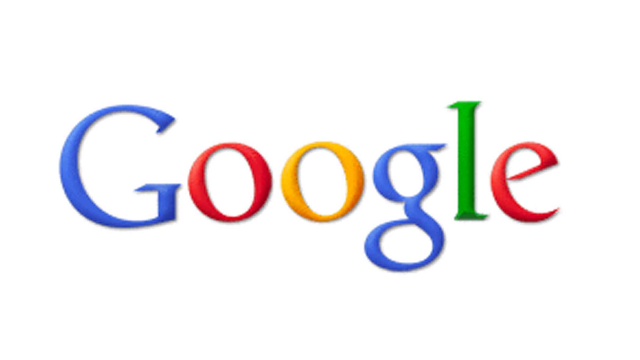
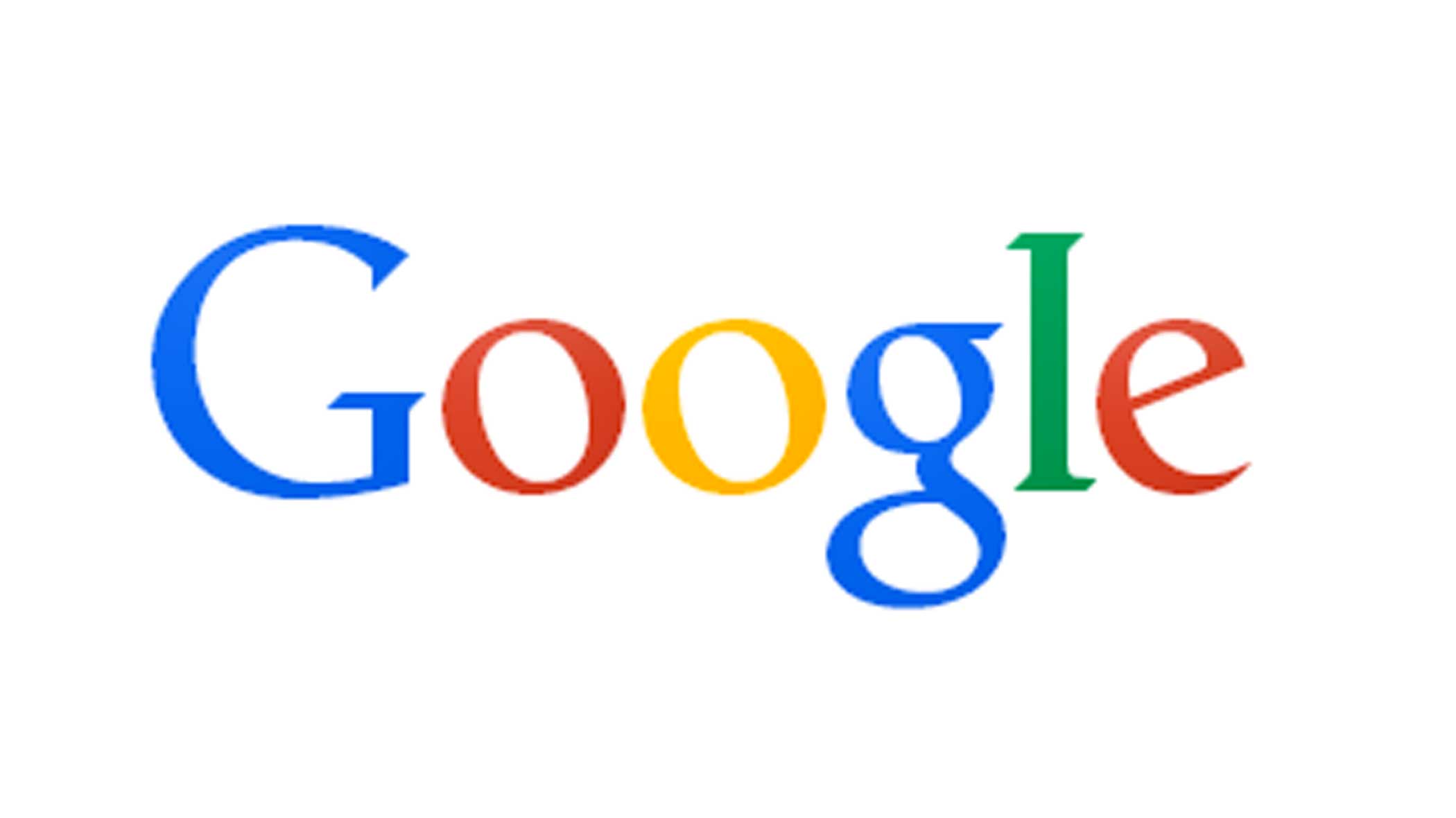
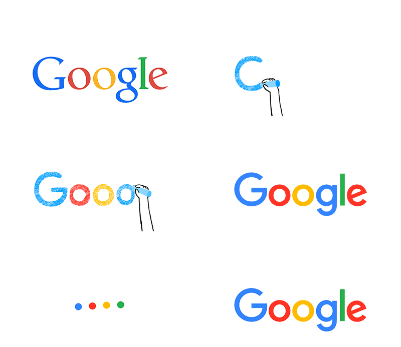
The update flattens out the letters into a sans-serif typeface, and softens their color palette. For the search giant, it’s a more modern look—one that seems to take its cue from Alphabet’s own unfussy wordmark.
You can learn more about the evolution of Google’s logo in a video on the company’s blog. As Yehoshua and Nath say, the design is an ever-iterating process.
This isn’t the first time we’ve changed our look and it probably won’t be the last, but we think today’s update is a great reflection of all the ways Google [fortune-stock symbol=”GOOG”] works for you across Search, Maps, Gmail, Chrome and many others. We think we’ve taken the best of Google (simple, uncluttered, colorful, friendly), and recast it not just for the Google of today, but for the Google of the future.
You’ll see the new design roll out across our products soon. Hope you enjoy it!
Earlier this year, Facebook [fortune-stock symbol=”FB”] introduced a new lightweight, mobile-optimized logo as well. German automaker BMW [fortune-stock symbol=”BMW”], restaurant chain IHOP [fortune-stock symbol=”DIN”], and Airbnb are among those who have recently done the same.
Appearances, names, looks, mediums—they come and go. That won’t stop Google from bleeding blue, red, yellow, and green.
Subscribe to Data Sheet, Fortune’s daily tech-business newsletter.
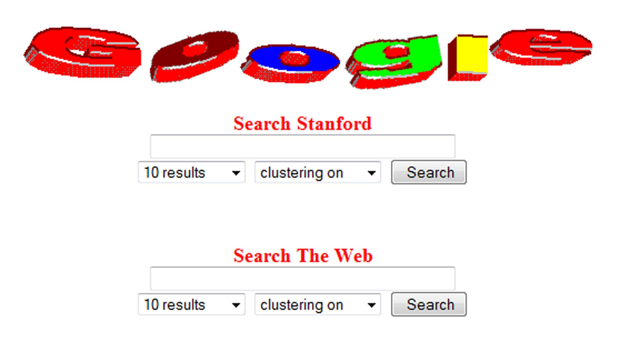
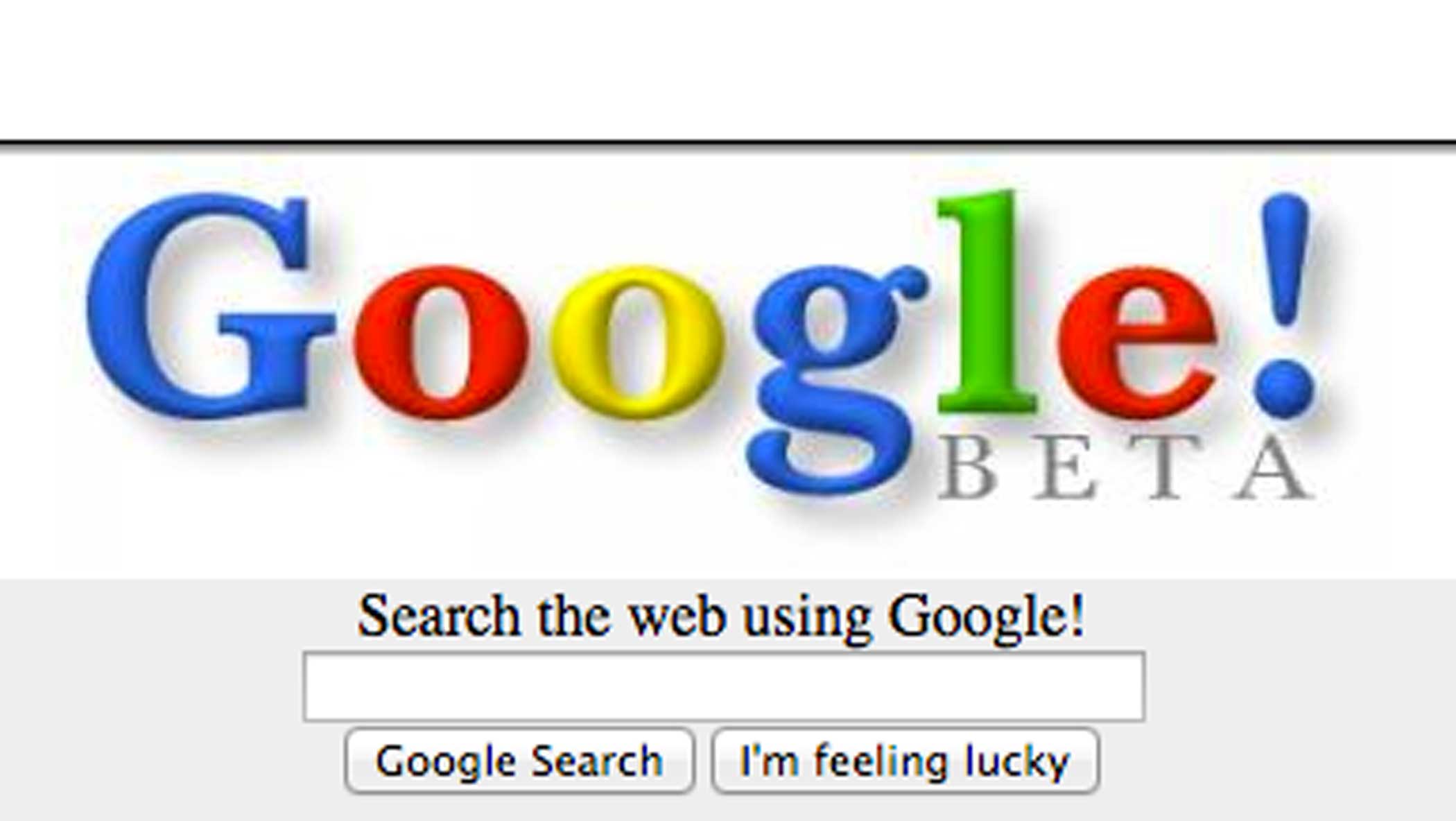
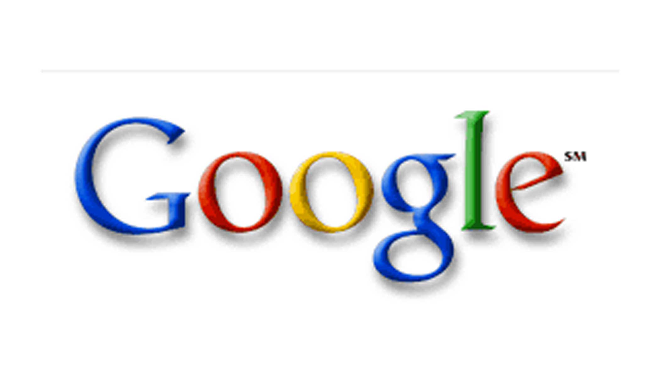
See How Google’s Logo Has Evolved Over the Years
More Must-Reads from TIME
- Donald Trump Is TIME's 2024 Person of the Year
- Why We Chose Trump as Person of the Year
- Is Intermittent Fasting Good or Bad for You?
- The 100 Must-Read Books of 2024
- The 20 Best Christmas TV Episodes
- Column: If Optimism Feels Ridiculous Now, Try Hope
- The Future of Climate Action Is Trade Policy
- Merle Bombardieri Is Helping People Make the Baby Decision
Contact us at letters@time.com