Chances are you missed a subtle change to Facebook’s logo Tuesday.
The company has refreshed the logo, which displays the full spelling of the brand. The most conspicuous amendment lies in the shape of the ‘a’: it’s now rounded off to a single-story as opposed to its previous double-story version. The letters are also slimmer, and there’s also more white all round.
“We set out to modernize the logo to make it feel more friendly and approachable,” Facebook creative director Josh Higgins told Brand New.
The new logo is also apparently better suited to viewing on mobile devices. “This is actually a huge change and it’s much more than the ‘a,’” Howard Belk, co-chief executive and chief creative officer of branding firm Siegel+Gale, told the Wall Street Journal. “It’s driven by mobile.”
The result of a collaboration between Facebook’s in-house team and Process Type Foundry’s Eric Olson, the new Facebook logo will be showing up across Facebook sites and apps soon. The familiar ‘f’ stand-alone logo on the upper corner of Facebook’s main site – also called a favicon – will stay as it is.
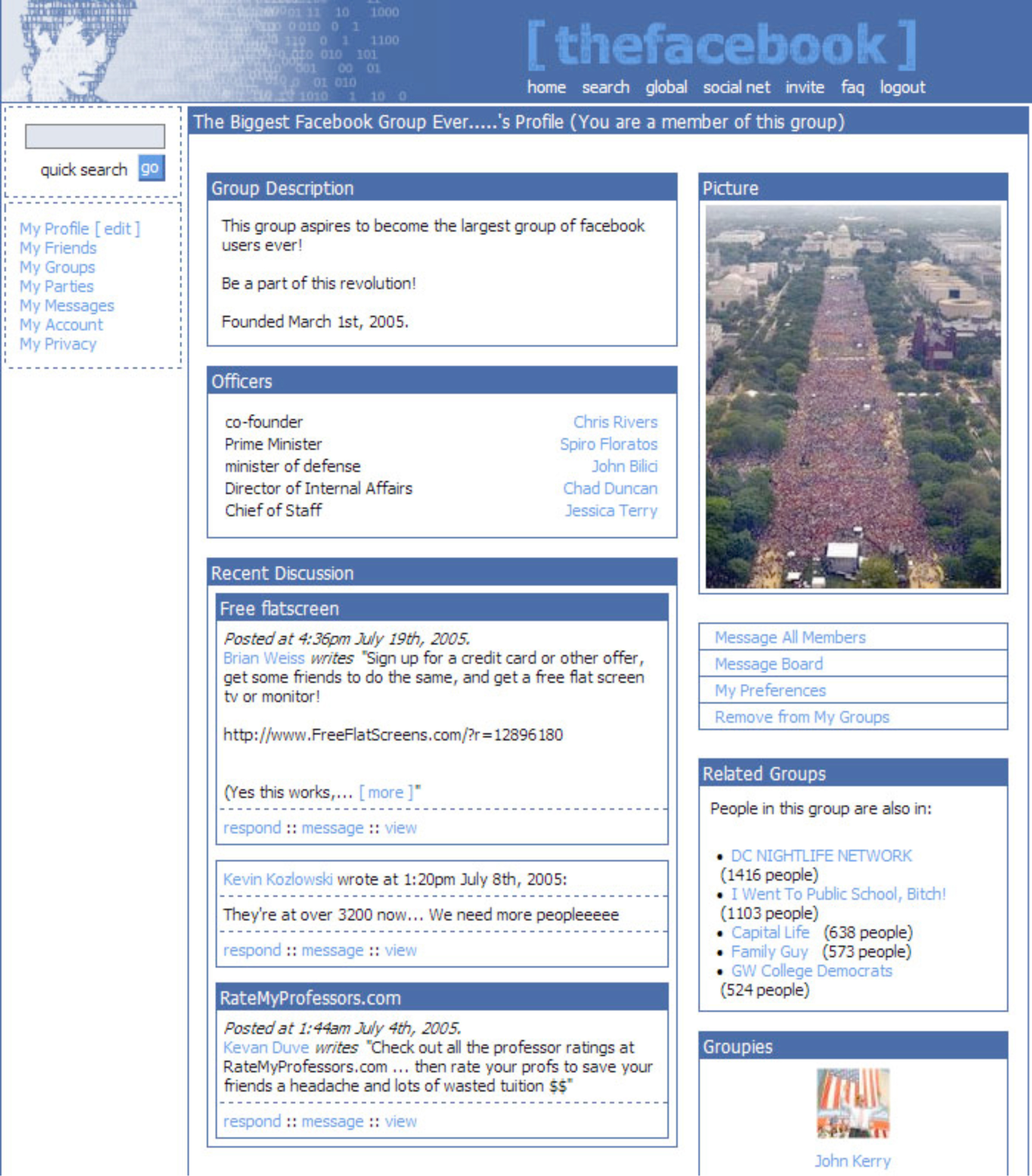
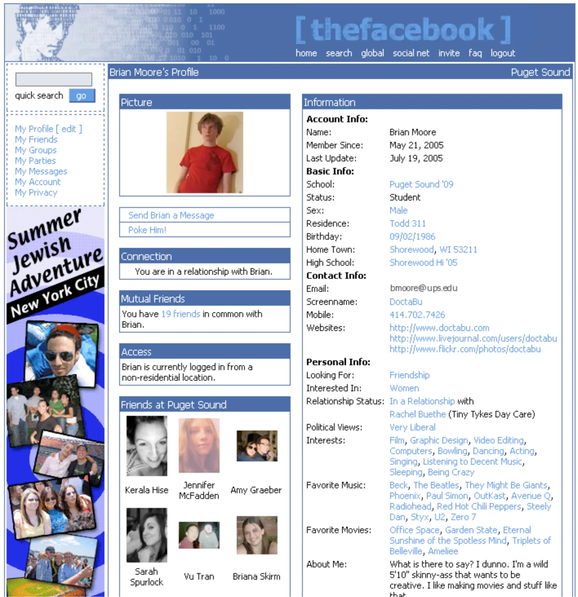
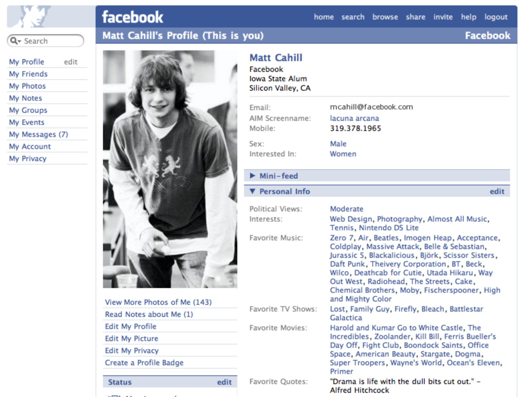
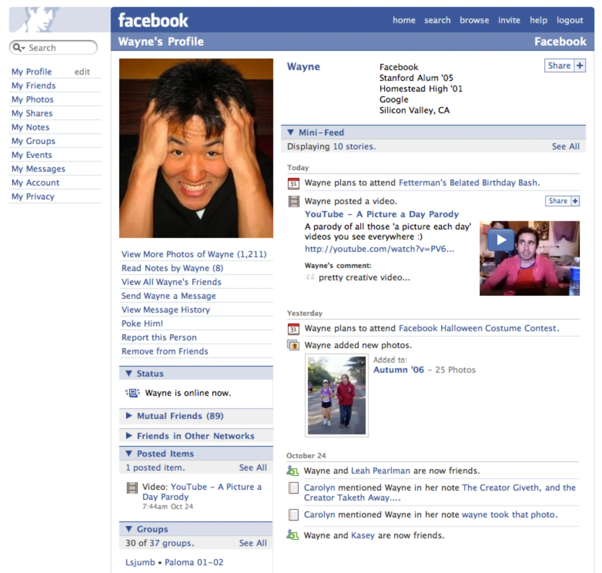
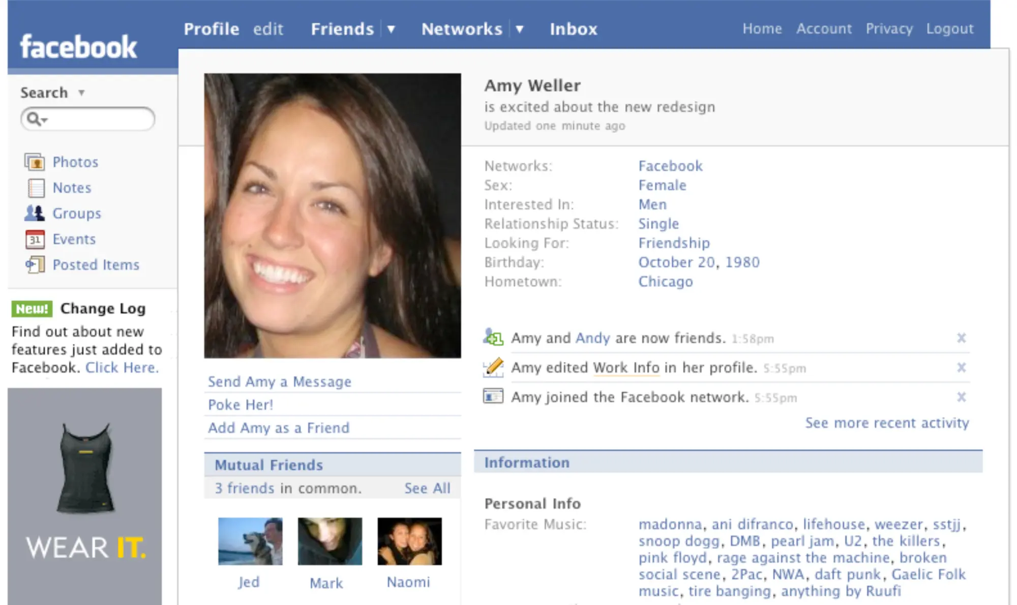
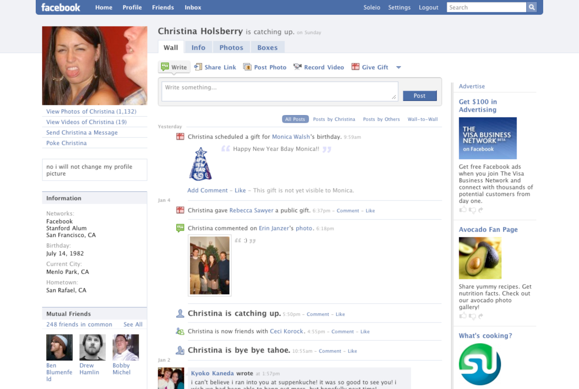
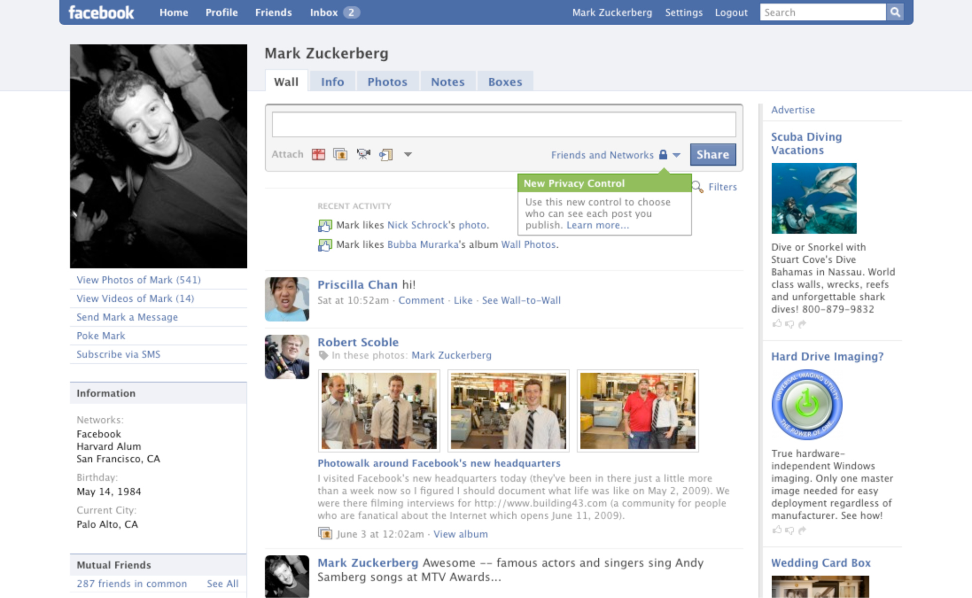
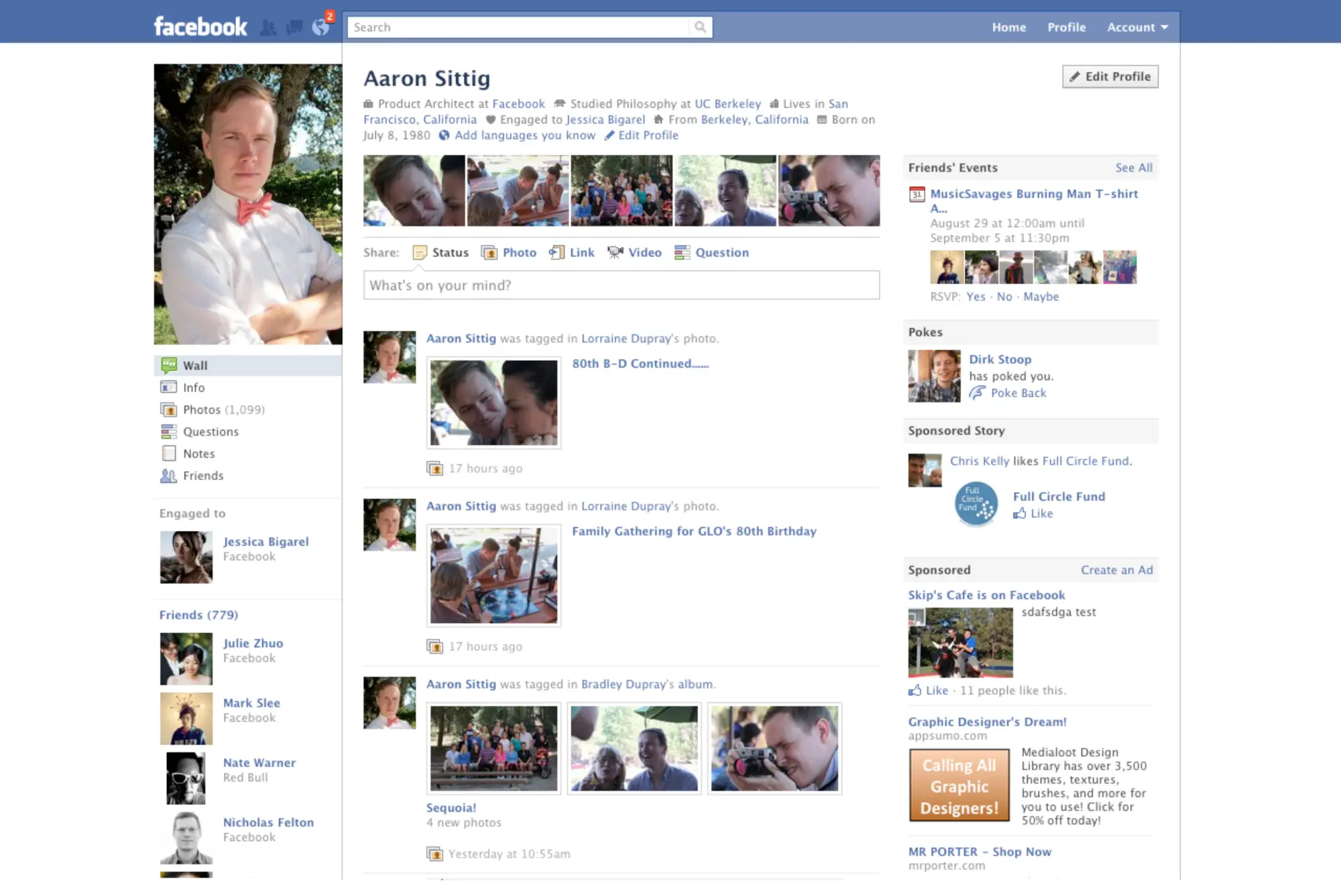
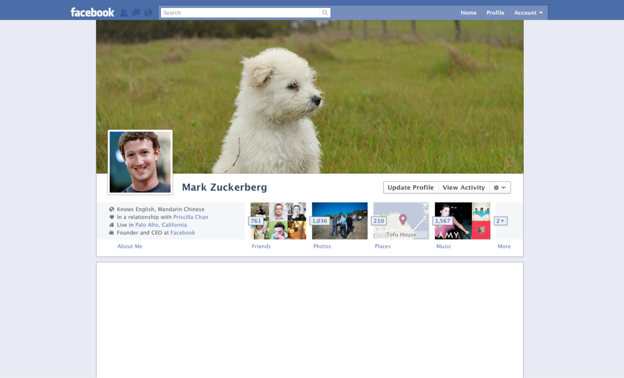
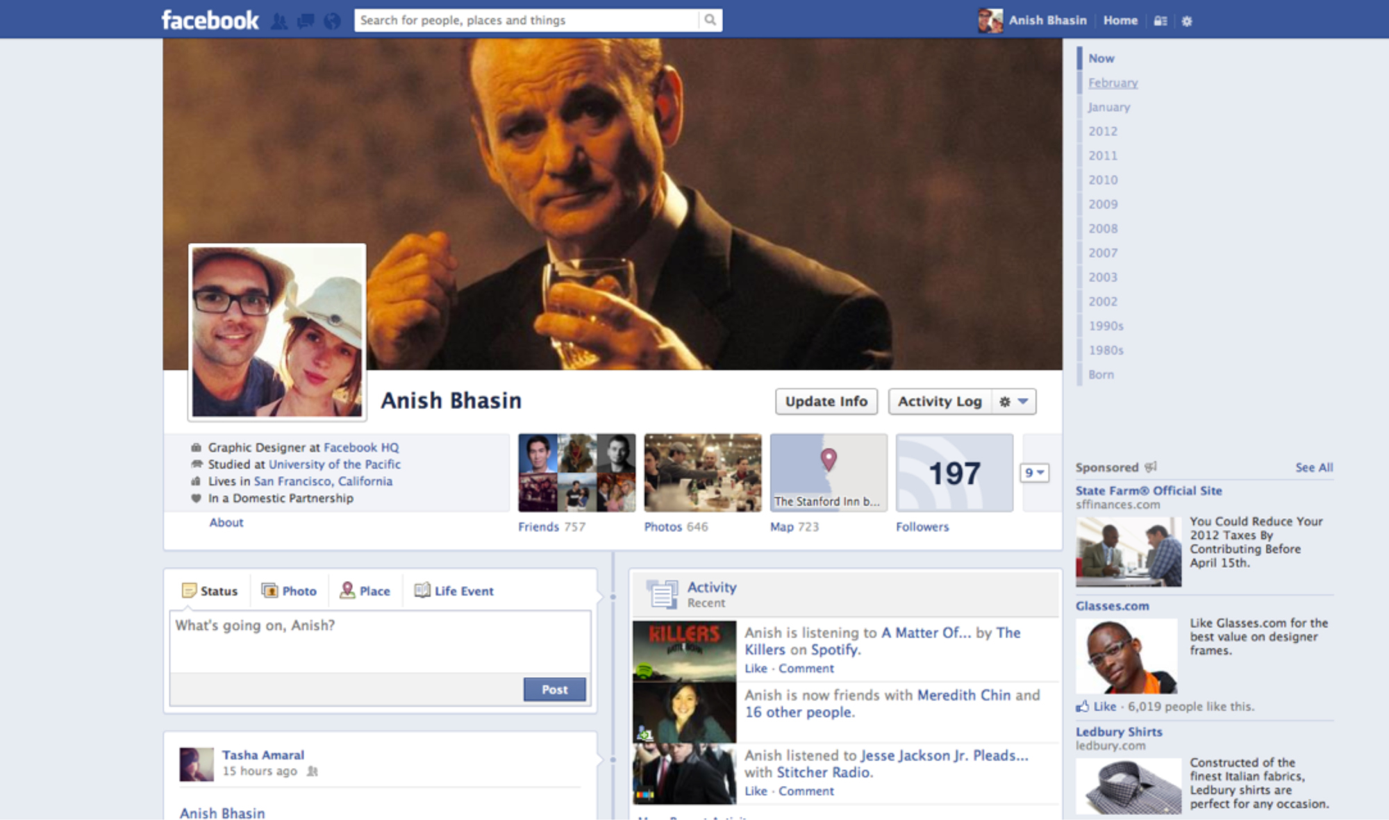
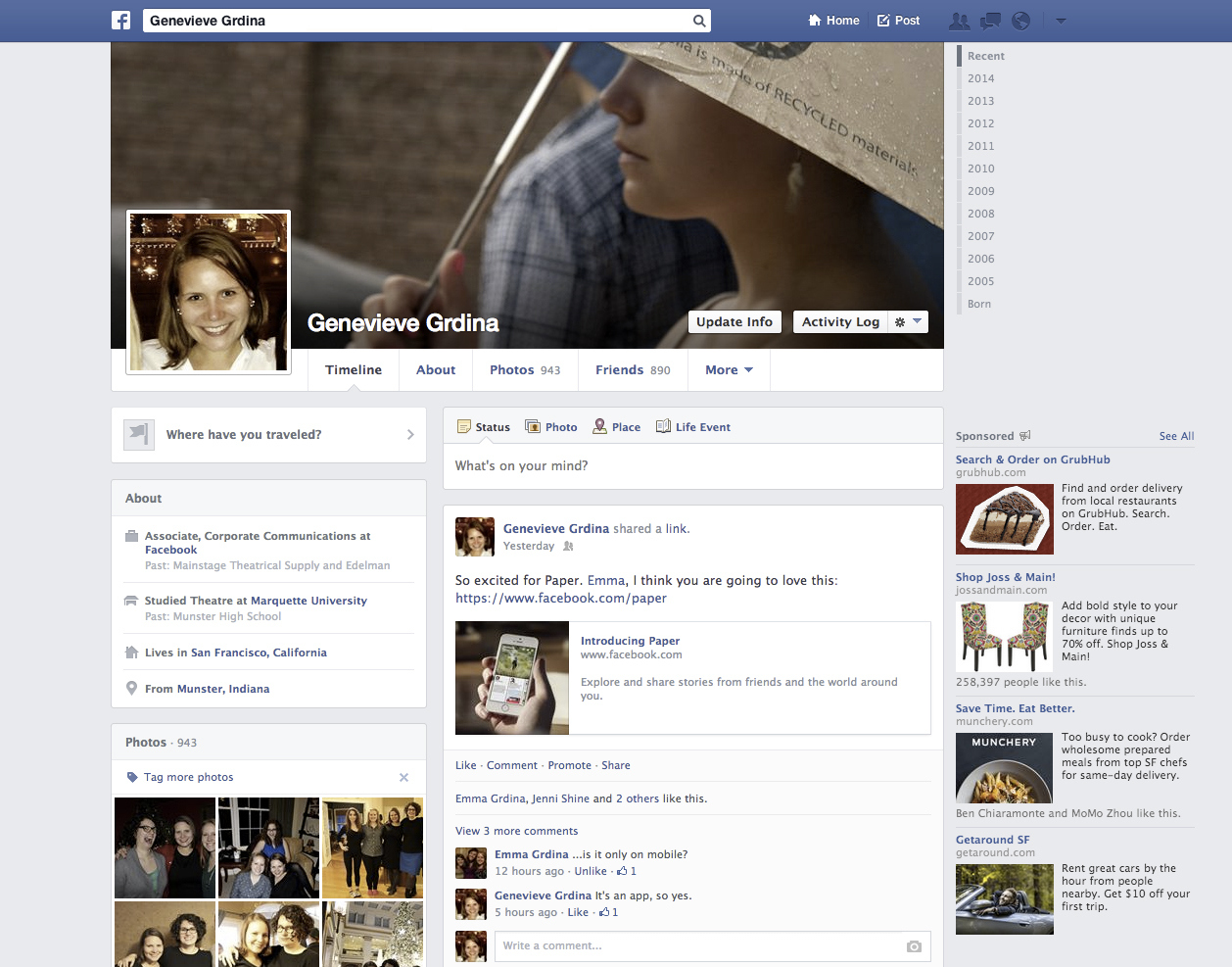
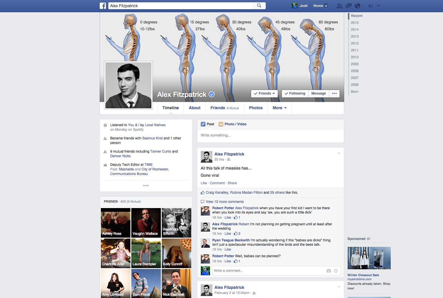
This Is What Your Facebook Profile Looked Like Over the Last 11 Years
More Must-Reads From TIME
- The 100 Most Influential People of 2024
- Coco Gauff Is Playing for Herself Now
- Scenes From Pro-Palestinian Encampments Across U.S. Universities
- 6 Compliments That Land Every Time
- If You're Dating Right Now , You're Brave: Column
- The AI That Could Heal a Divided Internet
- Fallout Is a Brilliant Model for the Future of Video Game Adaptations
- Want Weekly Recs on What to Watch, Read, and More? Sign Up for Worth Your Time
Contact us at letters@time.com