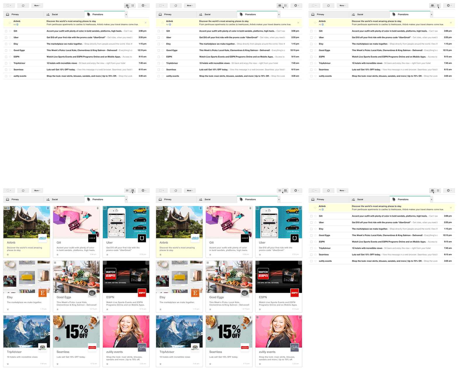
If you use the new-ish Promotions tab in Gmail to corral all your daily deals, ads and other marketing detritus, Google is field-testing a more aesthetically pleasing presentation of such material.
Basically, instead of seeing standard-looking email messages when clicking the Promotions tab, you can opt to have everything presented in a grid of Pinterest-like cards that emphasize images over text.
Google has cobbled together this animated GIF, which I’ve had in my peripheral vision the entire time I’ve been writing this post. It’s driving me nuts for some reason. I’m pleased to share it with you, however:

Don’t stare at it too long or your brain will start to play tricks on you. It’s like the Zulily lady in the lower right-hand corner is laughing just at me. Leave me alone, lady!
If this newfangled method of perusing commercial email messages is appealing to you, you can sign up to participate in the trial. Google makes no promises that you’ll be chosen, except to say that “if you’re selected, a new grid view will bring to the top of your inbox key images from deals, offers, and other marketing emails if you have the Promotions tab enabled.”
More Must-Reads from TIME
- Inside Elon Musk’s War on Washington
- Why Do More Young Adults Have Cancer?
- Colman Domingo Leads With Radical Love
- 11 New Books to Read in February
- How to Get Better at Doing Things Alone
- Cecily Strong on Goober the Clown
- Column: The Rise of America’s Broligarchy
- Introducing the 2025 Closers
Contact us at letters@time.com