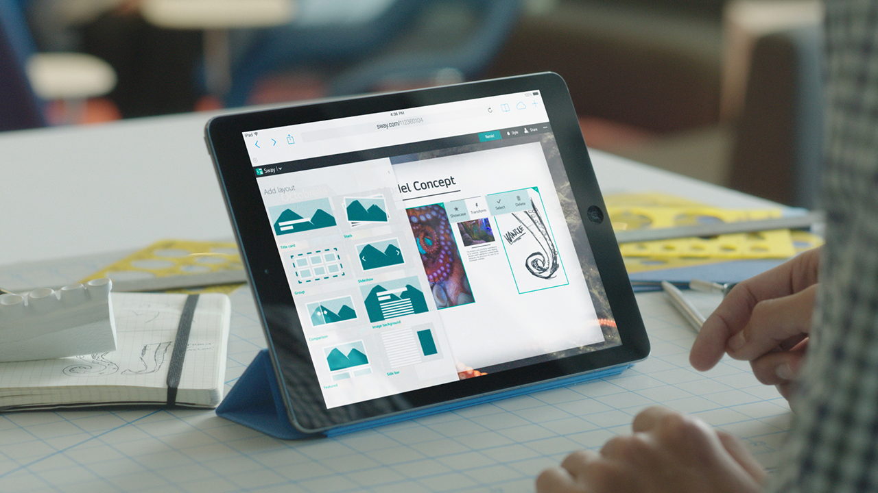
Microsoft gave PowerPoint a mobile-friendly twist Tuesday with a wider public release of Sway, a new presentation app designed for the confines of mobile phones and tablets. The preview version of the app is now available without signing up for a waiting list, though Microsoft hasn’t announced a release date for the finished product yet.
Microsoft is hoping Sway will appeal to a new set of users: Movers and shakers who want to whip together presentations across a slew of devices, from their 20-inch desktop to their 4-inch smartphone. Squeezed for time and screen space, these users could easily dispense with PowerPoint’s more esoteric features — Its seemingly endless selection of fonts, for instance, includes three species of Wingdings.
The question for Microsoft’s design team was where to make the cuts — and it’s clear from the first glance at Sway that they haven’t just debuted a new PowerPoint with a few nips and tucks. They’ve done reconstructive surgery.
Gone are the dropdown menus nestled within more dropdown menus. Gone are the finicky buttons regulating every square inch of your slides. Gone, even, are the slides. In their place is an interface so spare that experienced PowerPoint users may feel a momentary loss of control.
But that’s actually the point, says David Alexander, senior product manager at Sway.
“Candidly, what we did with Sway was we took the design instincts of real designers and encoded them into algorithms,” says Alexander. The result is a digital design assistant that does the heavy lifting for you. Instead of scrolling through font menus, an icon labeled “Remix!” instantly switches out the font and matches it against a new background. Instead of nudging around headlines, bullet points and images, each item can be created individually, and the program stitches them together into a neat little slide. And that word “slide” is no longer an apt description of the finished product. If anything, Sway’s results resemble a very long webpage, fit for scrolling rather than flipping.
“Docs and Powerpoint were originally designed with an eye toward emulating an analog form of content: A piece of paper for a document. A flip chart for a presentation,” Alexander says. “We wanted to create a new, digital-oriented output that doesn’t try to emulate a paper-based environment.”
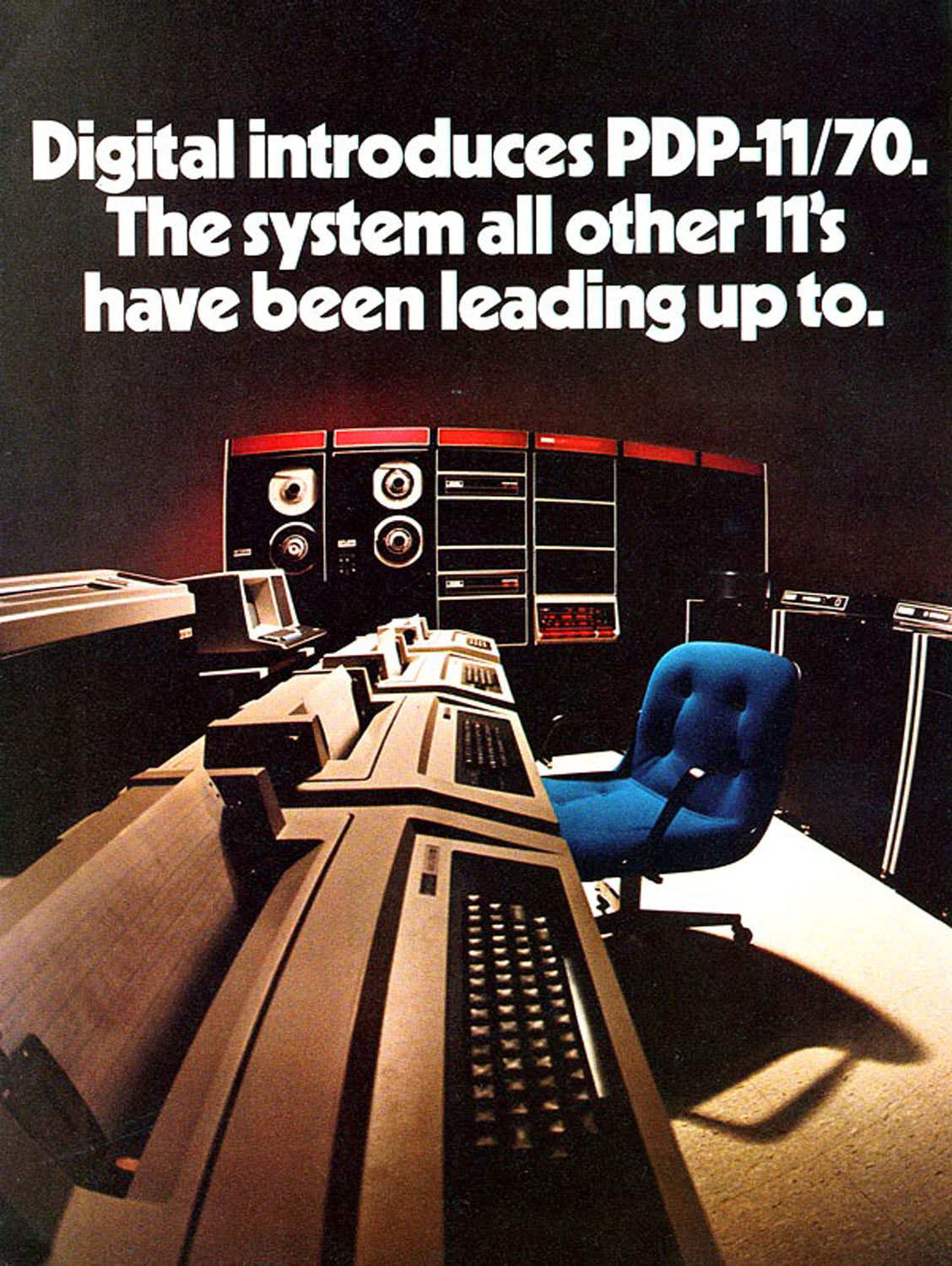
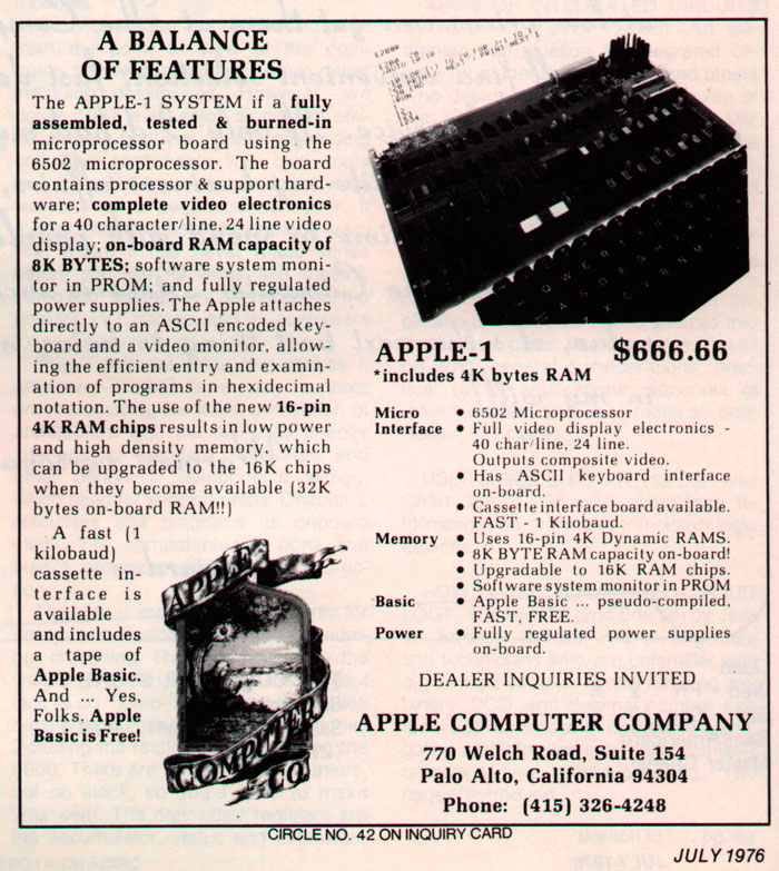
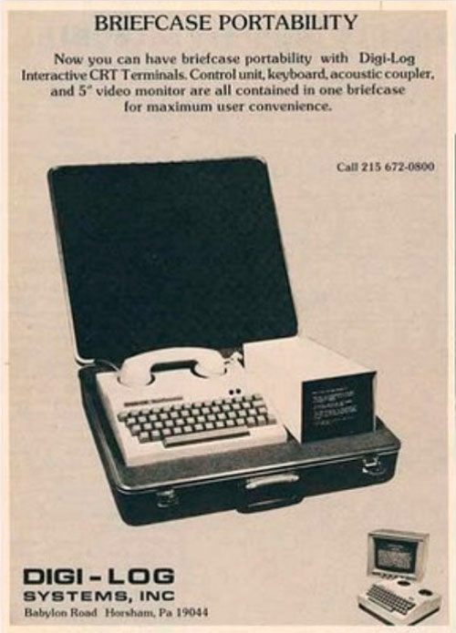
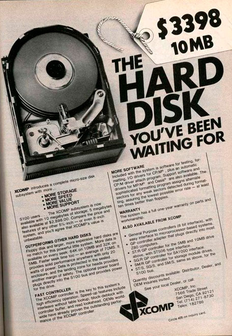
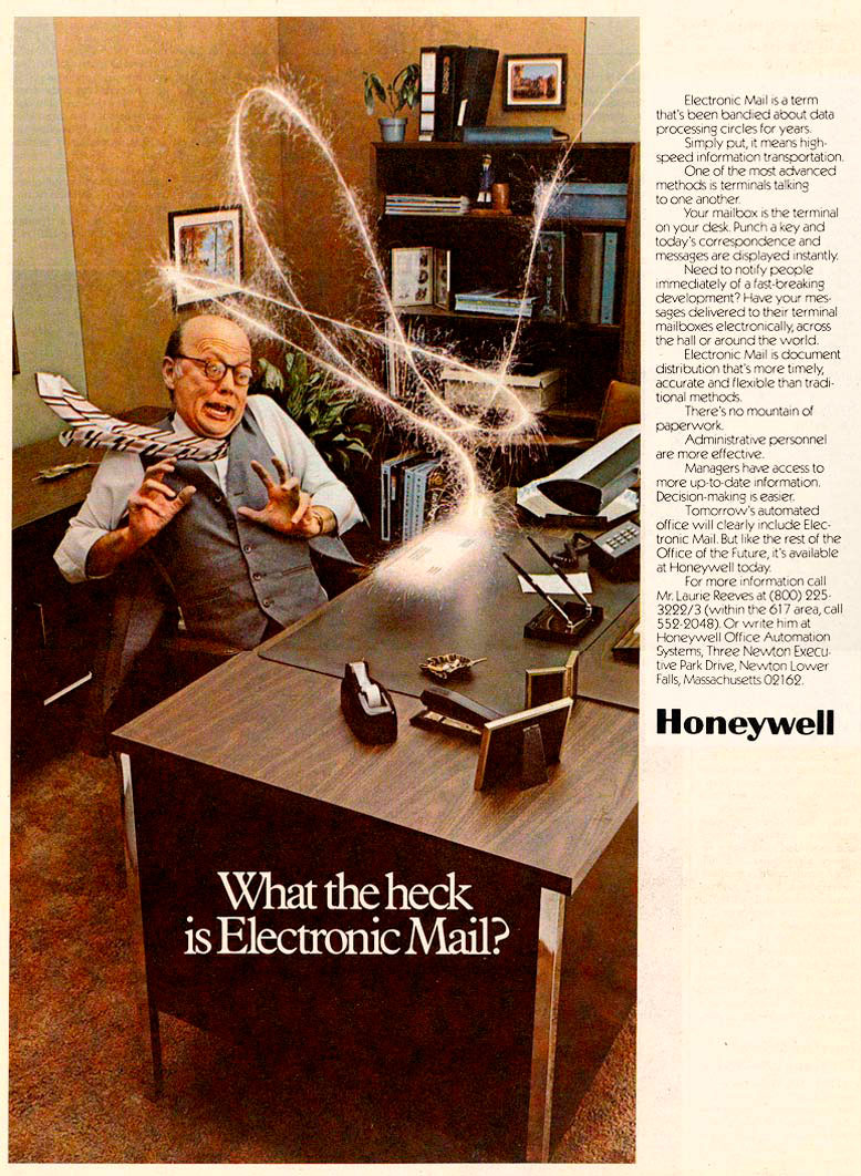
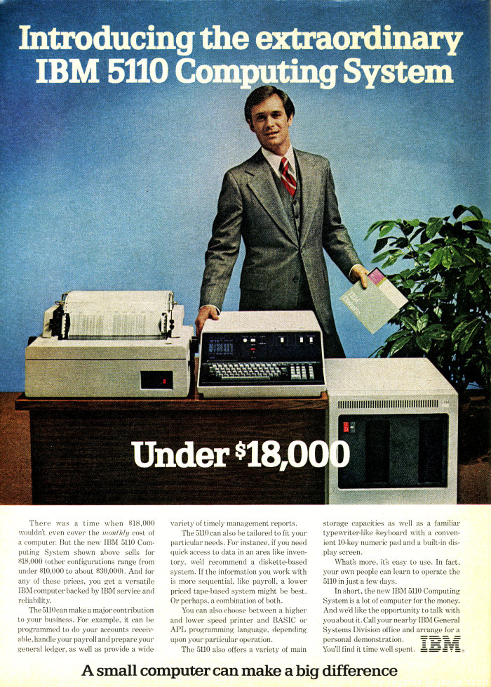
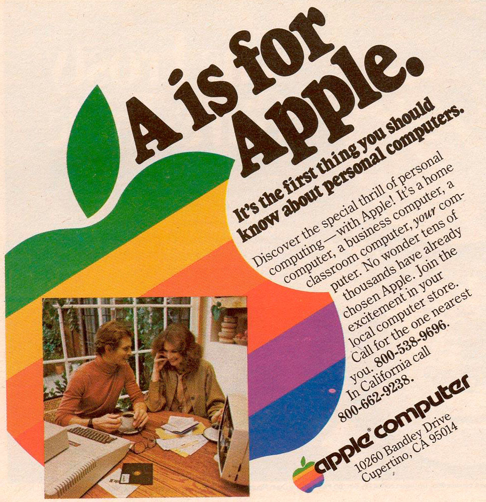
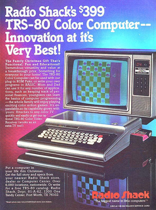
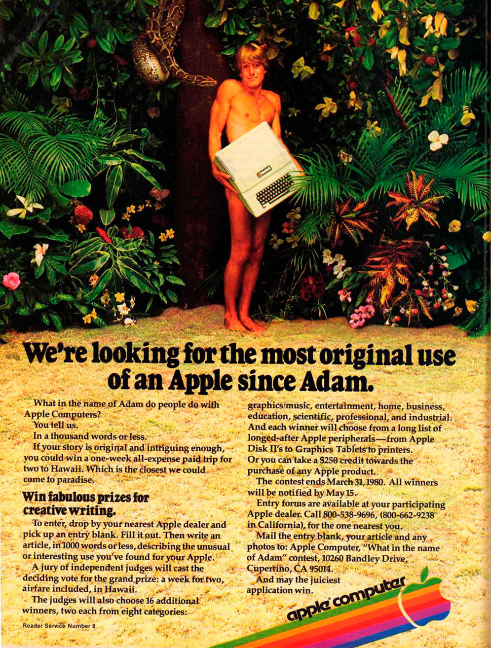
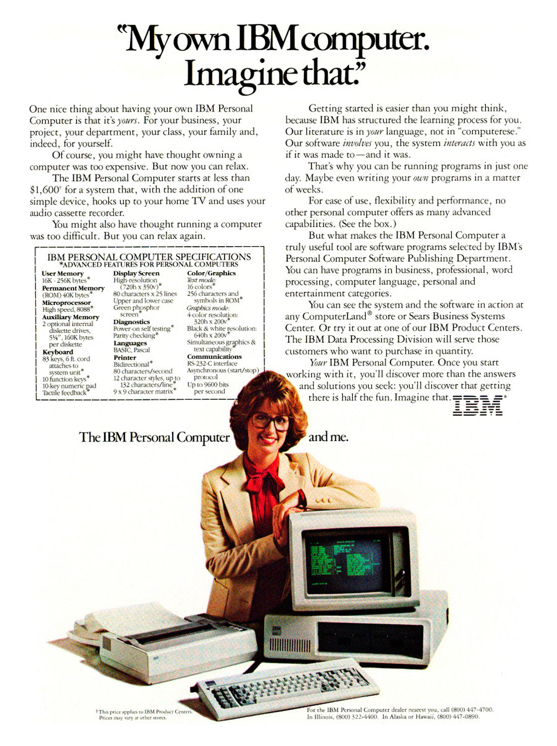
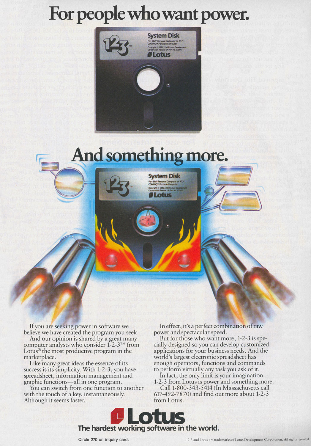
These Vintage Computer Ads Show We've Come a Long, Long Way
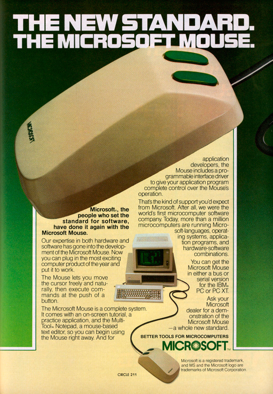
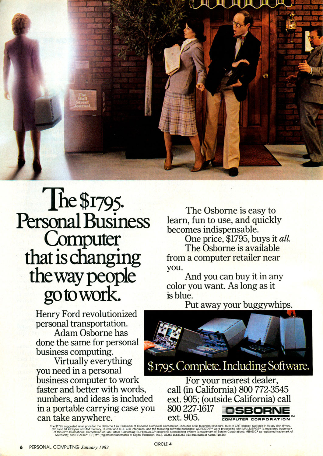
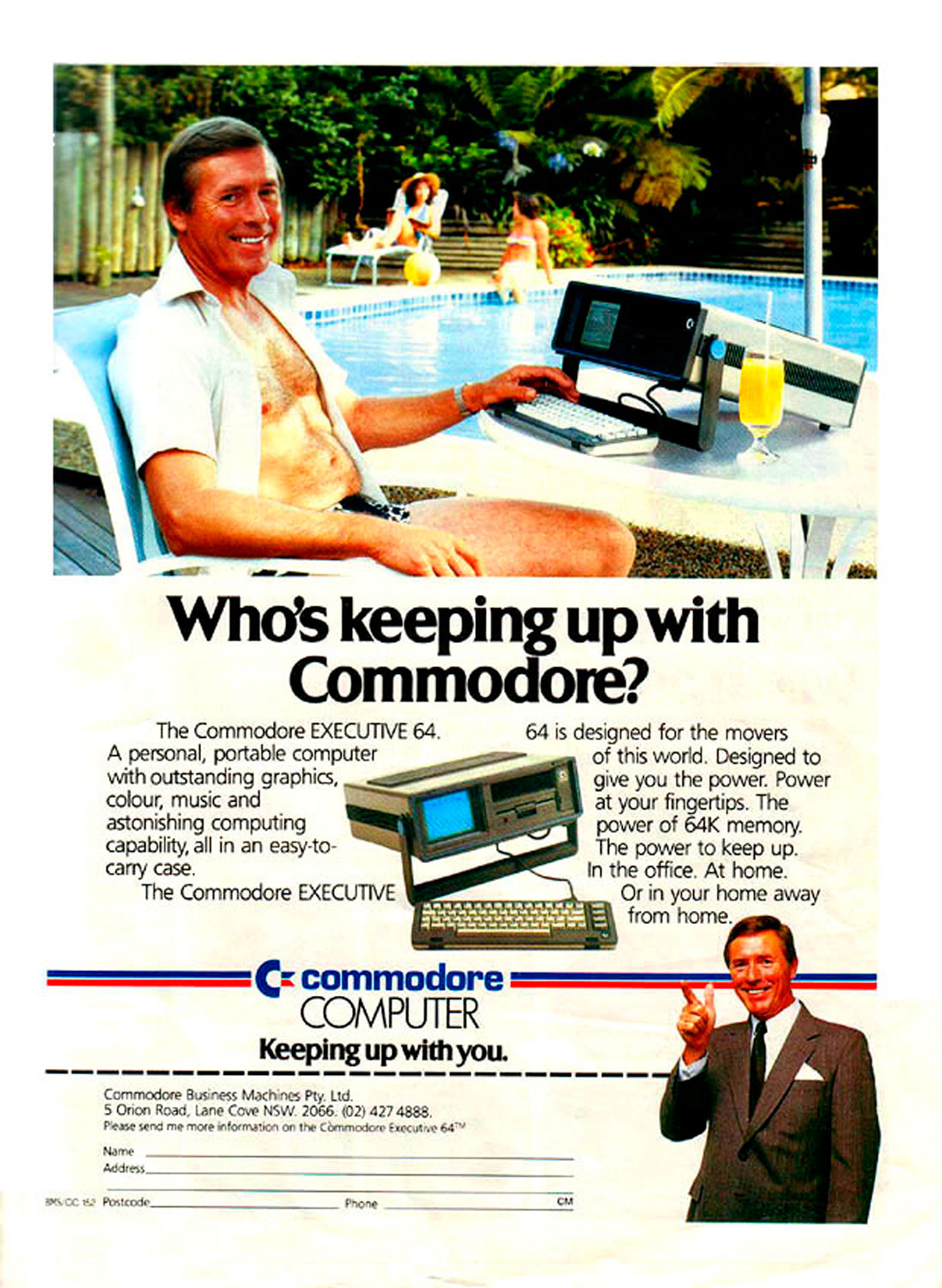
Sway also makes embedding media from Twitter, Facebook, or photos from personal devices a seamless experience. A search field built into the app can fetch content from any of these dispersed sources and load it directly into the presentation. No more copying, saving and pasting.
The question remains whether people used to PowerPoint’s total customization features will sacrifice a measure of control to a slightly pushier program. Sway’s Alexander concedes it isn’t for everyone, and focus groups are sometimes split over the new features. “Two women sitting next to each other had the exact opposite reaction to Sway,” Alexander said. One loved the ease of use. The other hated the stripped down controls and vowed never to use it.
In either case, Microsoft hopes to appeal to both users. The company has excelled at creating power tools for the office, but an explosion of mobile devices and apps from rival tech giants has chipped away at its market share beyond the workplace. It’s one reason Microsoft’s new CEO, Satya Nadella, has made “mobile-first, cloud-first” a company mantra. One result is a standalone app that marks a departure not only from PowerPoint, but from Microsoft’s old ball and chain, the office PC.
More Must-Reads from TIME
- How Donald Trump Won
- The Best Inventions of 2024
- Why Sleep Is the Key to Living Longer
- Robert Zemeckis Just Wants to Move You
- How to Break 8 Toxic Communication Habits
- Nicola Coughlan Bet on Herself—And Won
- Why Vinegar Is So Good for You
- Meet TIME's Newest Class of Next Generation Leaders
Contact us at letters@time.com