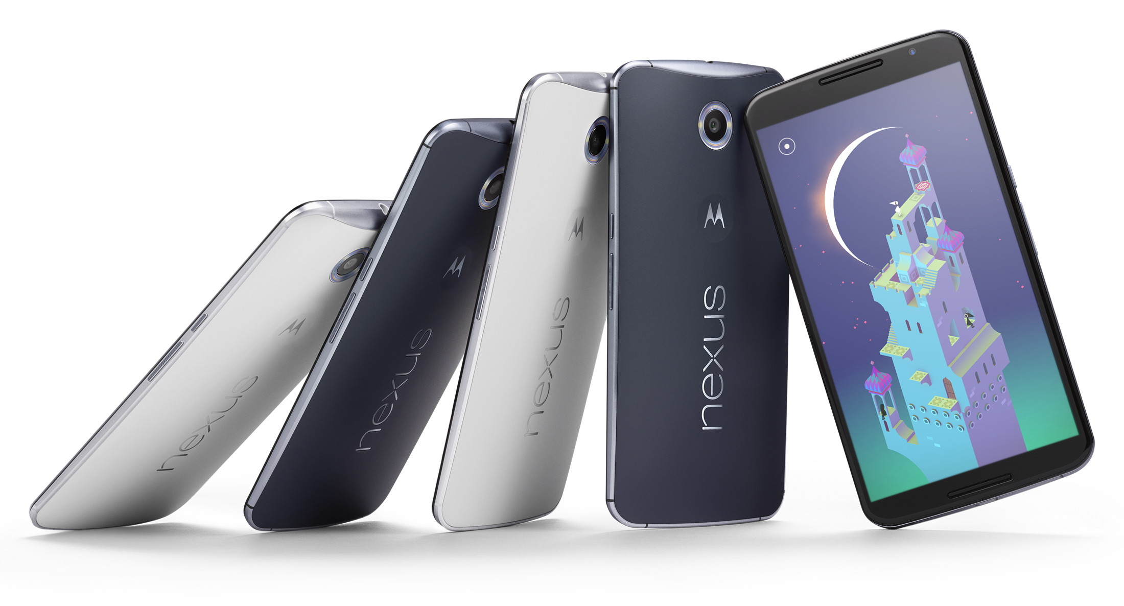
This review originally appeared on Trusted Reviews
Android 5.0 Lollipop is the latest version of the Google mobile OS. It takes over from Android 4.4 KitKat and is likely to be the last major revision we see of the system until well into 2015.
Lollipop is the future, in other words, but is it really worth getting worked-up about? We’ve been using Android 5.0 with the Nexus 9, one of the devices launched alongside the software. Here’s what we think.
Android 5.0 Lollipop: Material Interface
Having used Android 5.0 Lollipop for a while now, we think perhaps the most significant change for now is the way the software looks. Not every change made offers a dramatic shift in the way Android feels, but the interface design does.
Google calls it Material, and aside from freshening-up the look, it’s meant to add “responsive, natural motion, realistic lighting and shadows.”
First, let’s take a look at the new design. Here are your home screens:
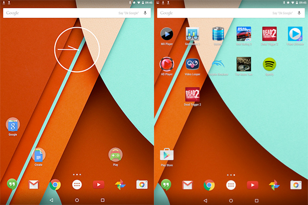
You’ll notice everything is looking familiar, but a little different. Google has redesigned the soft keys — which now have a PlayStation-like flavor— and the Google app icons are different now.
It’s innocuous stuff, but tells you a lot about the aesthetic direction in which the system is heading. Android 5.0 Lollipop is all about friendly curves and shapes that have no intrinsic or obvious relationship with technology. They’re a circle, a square and a triangle: you don’t get much more basic than that.
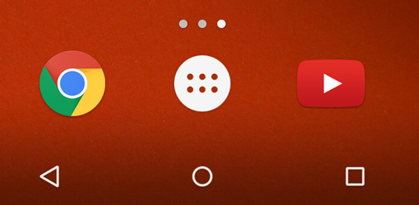
We assume the idea is that they’re friendly compared with the rather more complicated soft keys of Android 4.4 KitKat. Despite their simplicity, the functions of two are pretty obvious even to relative technophobes.
The triangle already forms an arrow sign, and the circle is just like the Home button on an iPhone. When in doubt, copy Apple. The one on the right is called Overview these days, but it has much the same function as before: it brings up the multi-tasking menu.
The movement of the homescreens has changed. The animations are a bit less severe, with greater variance in their speeds and a greater sense of inertia. Android 5.0 Lollipop is all about shaving off that geeky exterior Android is still seen as having in some quarters.
You’re also likely to see a whole lot of the two headline backgrounds of Android 5.0. These are designed to look as though they’re made from real materials with clever use of textures. Once again, it’s a step away from the sharp technical refinement that has been more a clearer visual feature in previous Android UI elements. These backgrounds are still precise and geometric, but the textures are intended to ground them in the “real.”
It’s not so much “less geek, more chic,” but “less geek, more family-friendly.” Its no wonder Google has opted for this style, with tablets like the Tesco Hudl 2 plugging away at family buyers hard.
Is the new look good? Yes, it’s great. We already liked the Google Now interface used in some Android 4.4 phones, though, including the Nexus 5 and Moto G 2014.
The use of the real-time shadows/lighting promised on Google’s website is pretty subtle too. Those expecting jaw-dropping visual flashiness may be disappointed by this lack of bravado. Where you see the these live shadows most obviously is in the multi-tasking menu, which, as usual, is accessed using the right (square) soft key. Multi-tasking has gone 3D, folks, and each pane casts its own shadows. These are “design” shadows rather than realistic ones, mind you, and again are pretty diffuse. We like the look…
For the full Android 5.0 Lollipop Review, visited Trusted Reviews.
See more from Trusted Reviews:
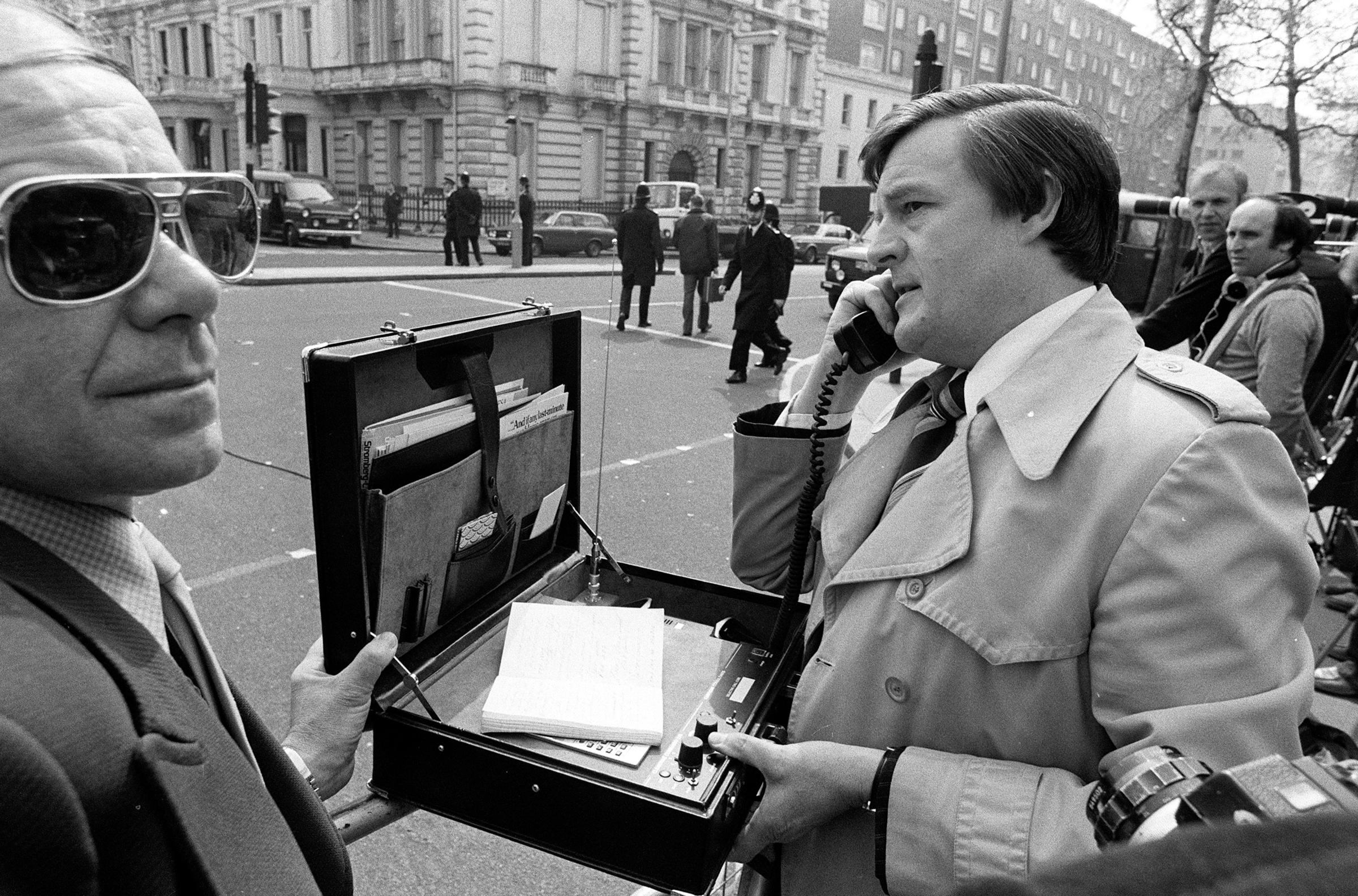
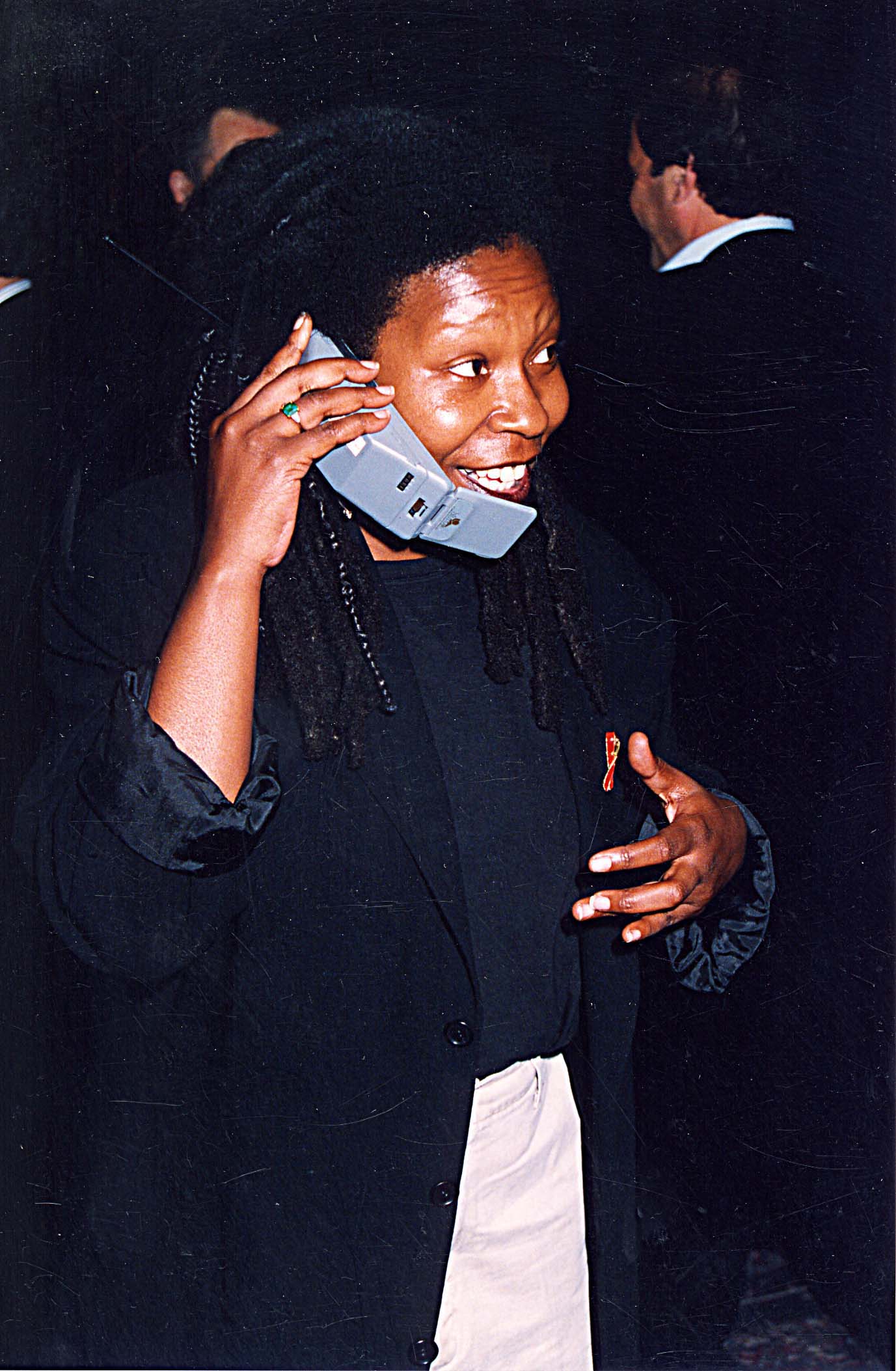
PHOTOS: The Rise of Mobile Phones from 1916 to Today






More Must-Reads from TIME
- Donald Trump Is TIME's 2024 Person of the Year
- TIME’s Top 10 Photos of 2024
- Why Gen Z Is Drinking Less
- The Best Movies About Cooking
- Why Is Anxiety Worse at Night?
- A Head-to-Toe Guide to Treating Dry Skin
- Why Street Cats Are Taking Over Urban Neighborhoods
- Column: Jimmy Carter’s Global Legacy Was Moral Clarity
Contact us at letters@time.com