This article originally appeared on Lost at E Minor.
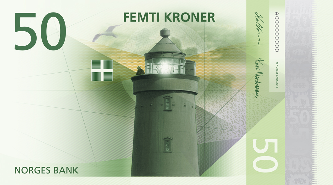
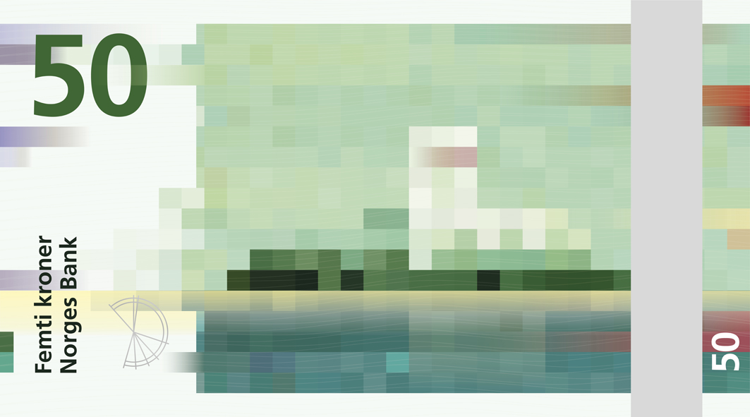
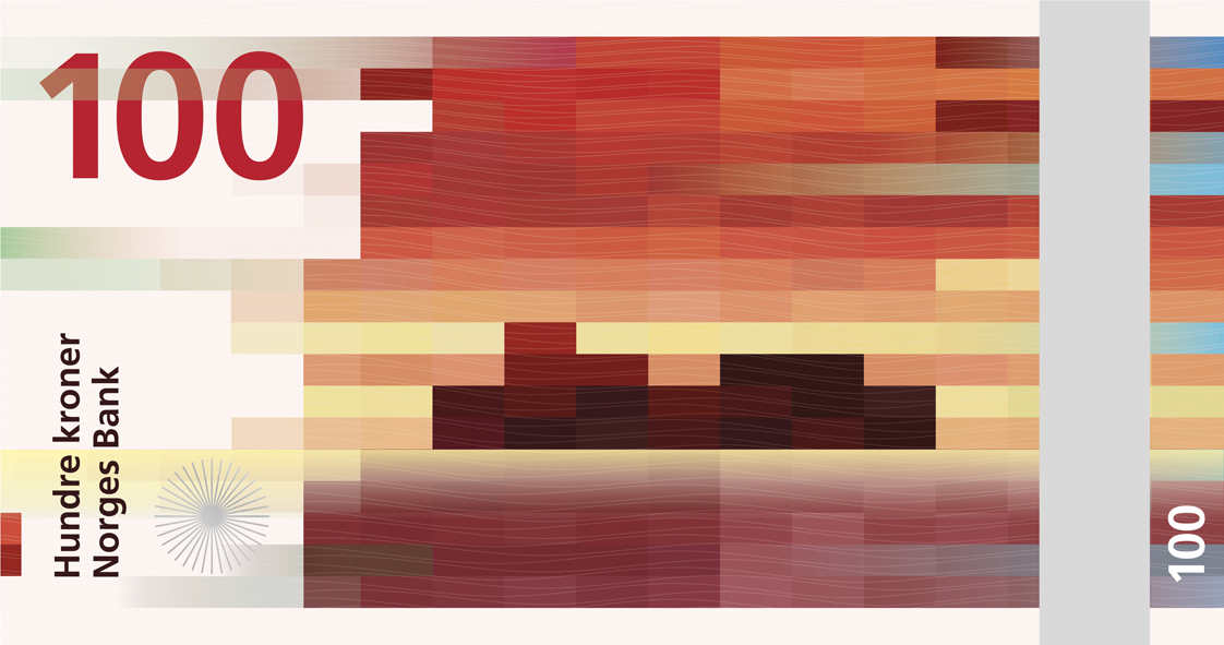
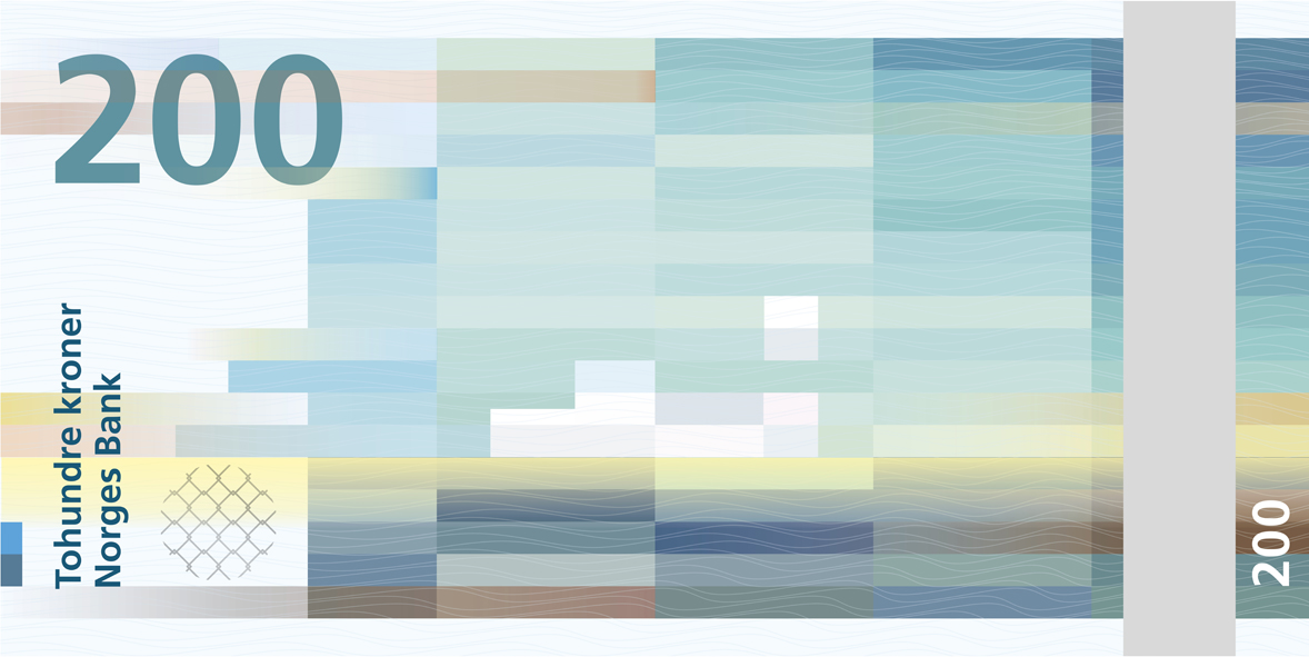
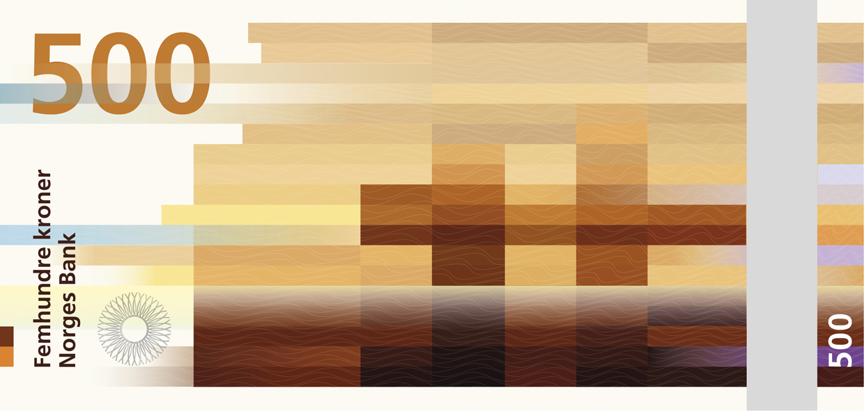
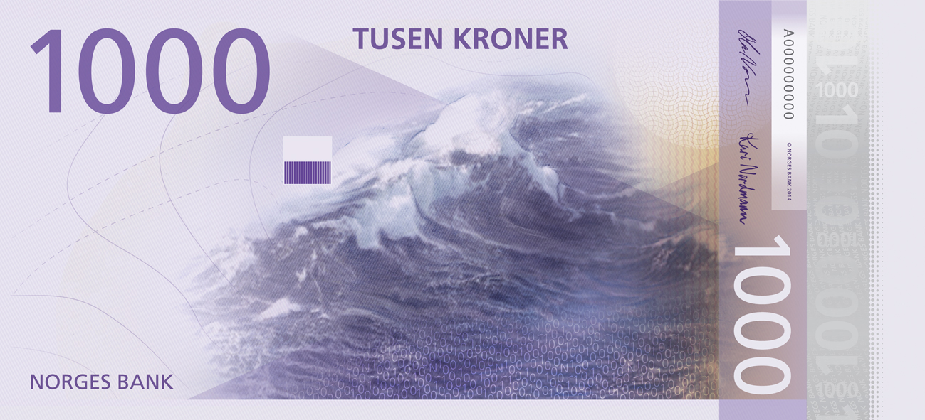
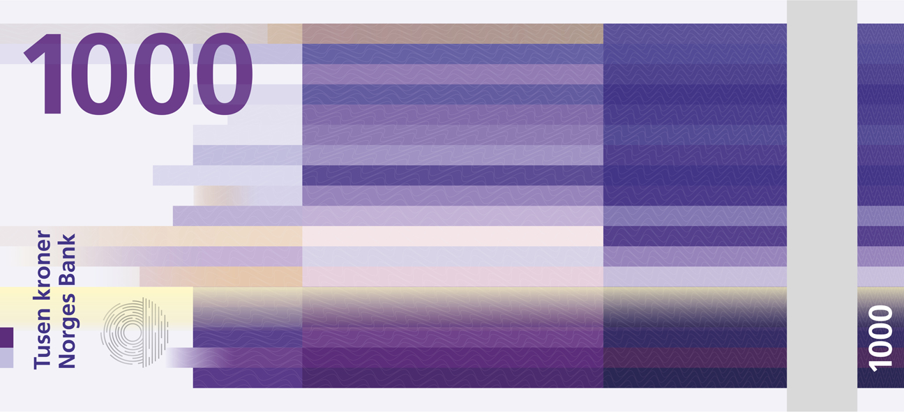
Nope, you are not seeing a pixelated image of Norway’s new currency. That is the real deal right there! Last spring, the central bank of Norway, Norges Bank, held a nationwide design competition to replace their look of their currency. Their theme: ‘The Sea.’
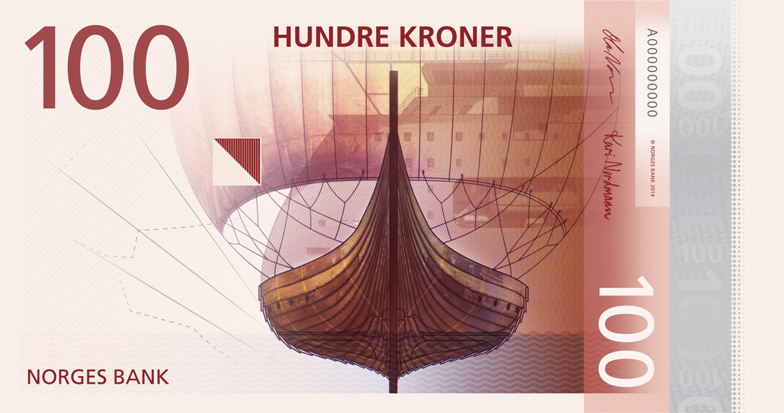
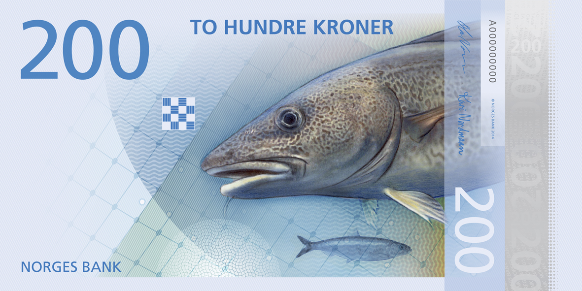
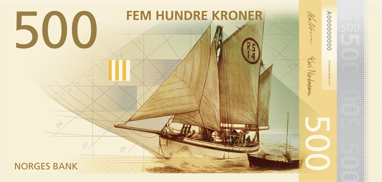
Instead of choosing just one winner, they chose two – one design for each side. The front side features a series of artworks from design studio The Metric System, called ‘Norwegian Living Space.’ Beautiful and timeless this front design might be, it doesn’t hold a candle to the attention the back design is getting. The back side features an abstract motif of pixels called ‘Ripple Effects’ by Enzo Finger.
“The obverses from The Metric System are very well suited to the incorporation of necessary security elements. The expression is open, light and typically Nordic,” says Norges Bank. “Using the pixel motifs from Snøhetta Design as the reverse will give the notes both a traditional and a modern expression.”
The bank notes are set to be released in 2017.
(via Visual News)
More Must-Reads from TIME
- Why Trump’s Message Worked on Latino Men
- What Trump’s Win Could Mean for Housing
- The 100 Must-Read Books of 2024
- Sleep Doctors Share the 1 Tip That’s Changed Their Lives
- Column: Let’s Bring Back Romance
- What It’s Like to Have Long COVID As a Kid
- FX’s Say Nothing Is the Must-Watch Political Thriller of 2024
- Merle Bombardieri Is Helping People Make the Baby Decision
Contact us at letters@time.com