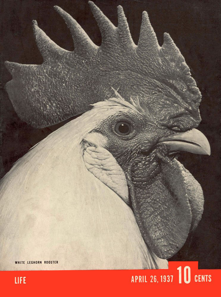
When digging through the archives of a magazine that published as many issues as LIFE did through the years, one occasionally encounters something so surprising that it simply has to be shared. And so—behold: the only cover among the thousands published by the venerable weekly, across five decades, that did not feature the red-and-white LIFE logo in the upper left-hand corner.
In a brief note on the issue’s contents page, the editors provided a memorable reason for excluding the logo: “LIFE’s title,” they wrote, “is not boldly superimposed on this week’s cover because that would have spoiled the composition” of photographer Torkel Korling’s portrait of the white leghorn.
The full story of the logo’s exclusion, meanwhile, can be found in a letter from a retired Time & Life employee named Al Zingaro that ran in the Jan. 5, 1987, issue of an in-house Time Inc. newsletter, F.Y.I.:
To me, the most memorable LIFE cover appeared around 1937 [Mr. Zingaro wrote]. My memory cannot pinpoint the exact date. Permit me to tell this story as it actually happened.
I was a layout artist working on the night side, when at about 11:30 p.m. a nice gentleman of about 40 appeared and introduced himself as Henry Luce. He showed me an extraordinary black-and-white photo of a rooster’s head with a beautifully detailed cockscomb. Mr. Luce, who seemed somewhat shy, asked if I could please make up this photo into a LIFE cover.
About 30 minutes later I showed him the finished cover. He shook his head; something displeased him. “I do not like the LIFE logo covering the bird’s cockscomb.” I tucked the logo back of the cockscomb. Again he shook his head. He did not like the word “LIFE” covered even partly. I said, “Mr. Luce, we are at an impasse.” He was silent for all of 30 seconds—then the thunderclap! “Let us omit the logo entirely. This fine photo must not be tampered with,” he said. “We’ll put LIFE in the red banner below in small type.”
“WOW.”
Granted, this was still fairly early in LIFE’s existence: in April 1937, Luce’s magazine had been around for less than two years. Nevertheless, there’s something to be admired about a publisher who would forgo, even temporarily, his magazine’s distinctive logo simply because he felt it would impinge on the integrity of a photograph . . . of a rooster.
Nicely played, Mr. Luce. Nicely played, indeed.
[MORE: “When Cover Lines Collide: Mixed Messages From LIFE Magazine”]
[MORE: “Walter Mitty and the LIFE Magazine Covers That Never Were”]
Ben Cosgrove is the Editor of LIFE.com

More Must-Reads from TIME
- Why Trump’s Message Worked on Latino Men
- What Trump’s Win Could Mean for Housing
- The 100 Must-Read Books of 2024
- Sleep Doctors Share the 1 Tip That’s Changed Their Lives
- Column: Let’s Bring Back Romance
- What It’s Like to Have Long COVID As a Kid
- FX’s Say Nothing Is the Must-Watch Political Thriller of 2024
- Merle Bombardieri Is Helping People Make the Baby Decision
Contact us at letters@time.com