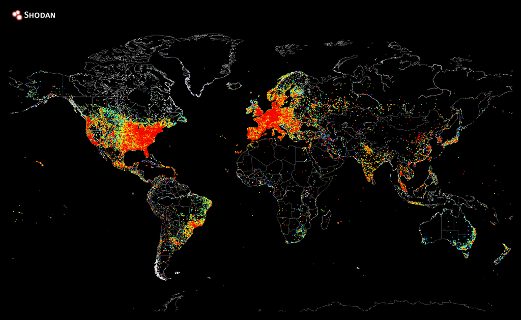
A map of every device connected to the Internet shows the wealthiest parts of the world flush with connections, while poor and sparsely populated parts of the world are blacked out — as well as a few head scratchers in between.
The map was created by John Matherly, founder of Shodan, a search engine that probes the Internet’s backend for connections to all sorts of devices from routers to refrigerators. Matherly said it took about five hours to ping every IP address on the Internet and store every positive response. It took another 12 hours to plot the responses on a heat map which glows bright orange in densely connected areas and blue and black in sparsely connected areas.
The U.S. and Western Europe are, not surprisingly, awash in connectivity. Africa and central Asia have islands of connectivity centered on urban areas. Then there are head-scratchers like Greenland, which has a single isolated dot smack in the island’s center. A Reddit user speculated it was an NOAA observatory on the summit of the Greenland Ice Sheet.
“Oh my f***ing God!! You’re the guy!!!,” wrote another Reddit commentator, ForceBlade, who detected a mysterious ping request around the time of Matherly’s project. “You touched my heart, and my server.”
More Must-Reads from TIME
- L.A. Fires Show Reality of 1.5°C of Warming
- Home Losses From L.A. Fires Hasten ‘An Uninsurable Future’
- The Women Refusing to Participate in Trump’s Economy
- Bad Bunny On Heartbreak and New Album
- How to Dress Warmly for Cold Weather
- We’re Lucky to Have Been Alive in the Age of David Lynch
- The Motivational Trick That Makes You Exercise Harder
- Column: No One Won The War in Gaza
Contact us at letters@time.com