
This post is in partnership with Fortune, which offers the latest business and finance news. Read the article below originally published at Fortune.com.
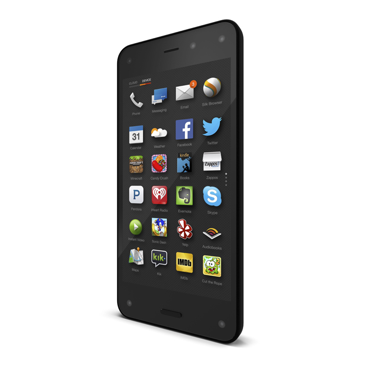
Amazon made a big splash in unveiling a smartphone on Wednesday that it hopes will challenge Apple and Samsung’s years-long dominance. The device is packed with an arsenal of futuristic features that are intended to make it easier for people to navigate apps, shop and use Amazon services like video and music streaming.
But after a half-hour using the phone, called Fire, I didn’t really find that it lived up to the hype. While clever, those futuristic features didn’t entirely convince me that I absolutely needed the phone – or that it is better than the iPhone I already own.
Fire felt light but solid as I held it just hours after watching from the audience as Jeff Bezos, Amazon’s chief executive, showed the phone in public for the first time. It seemed well-built and had an understated look that contrasted with Apple’srigorously polished aesthetic.
Tilting to the left brings up a window with categories like “apps,” “games,” and Amazon Prime. Photo by JP Mangalindan/Fortune.com
What sets the Fire Phone apart are several new features, starting with “Dynamic Perspective,” Amazon’s take on 3-D. To be clear, it’s not the kind of 3-D most people are used to. Images and video don’t pop off the screen. Instead, the phone has four cameras built into it that keep track of a person’s head movements and adjusts the angle of what ever is on the screen accordingly. Tilt your head a few degrees to the left or right, and the phone subtly angles what’s onscreen to create the illusion that you’re peering around it.
Indeed, Amazon wants users to do less finger swiping and a lot more tilting to navigate around the device’s menus and apps. Tilting the phone left brings up a pane of shortcuts to categories like apps, games, photos and the Web browser. A tilt to the right summons another pane that displays different functions based on what you’re doing, like email attachments in the email app. If surfing the Web or reading a book, you can tilt the phone down to slowly scroll down the page. The phone also recognizes subtle flicks of the wrist, or gestures the company calls “peeks.” A peek to the left or right in the Maps app while searching for nearby restaurants brings up small pop-up windows with restaurant names and Yelp ratings.
Tilting is something users will have to get used to. The learning curve isn’t steep – it took me 5 minutes to get the hang of it – but tilting doesn’t come as naturally as learning to swipe when the iPhone launched in 2007 or or when Android devices arrived the following year. I’m not convinced tilting accomplishes anything materially better or feels any more comfortable than a finger swipe or tap. And I can’t shake the feeling that after a few days, I’d want to go back to swiping instead of tilting my phone every which way.
More Must-Reads from TIME
- Cybersecurity Experts Are Sounding the Alarm on DOGE
- Meet the 2025 Women of the Year
- The Harsh Truth About Disability Inclusion
- Why Do More Young Adults Have Cancer?
- Colman Domingo Leads With Radical Love
- How to Get Better at Doing Things Alone
- Michelle Zauner Stares Down the Darkness
Contact us at letters@time.com