Apple’s Worldwide Developer Conference concluded with hardly any new updates about it’s mysterious “wearable” device which should debut in the fall, and perhaps will be shaped like watch, and just maybe will include a curved touchscreen 1.3 to 1.5 inches across — all of which is conjecture, really. The iWatch is still a riddle wrapped in a mystery.
Fortunately, a growing number of designers have drawn up their own fantasy designs, some of which are smart, eye-catching and a lot more interesting than the latest gossip from an anonymous parts manufacturer in China. Here are five designs that may help fill that little iWatch-shaped hole in your heart.
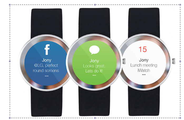
Classic – Netherlands-based designer Nermin Hasanovic kept all of the classic features, right down to the little turn-dial for mechanical hands, while revamping the watch face with clean, solid colors that are immediately recognizable as Facebook blue, iMessage green and iCalendar white.
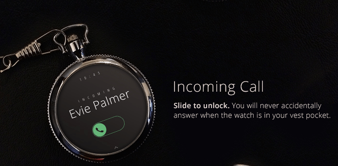
Really Classic – Steampunks, your prayers have been answered with this pocket iWatch on a gold chain, compliments of designer Leonardo Zakour in Germany.
Blindingly Cute – From Texas-based designer Edgar Rios, a watch that you could practically eat.

Seamless – Credit goes to Berlin-based designer Thomas Bogner for eliminating the watch face entirely and embedding the screen in a seamless wristband. Just one problem: the text scrolled vertically. Todd Hamilton in San Francisco right-sided the text and debuted his design, one of the slickest ones to date, in an animated video that nearly brings the iWatch fantasy to life.
iWatch Concept from Todd Hamilton on Vimeo.
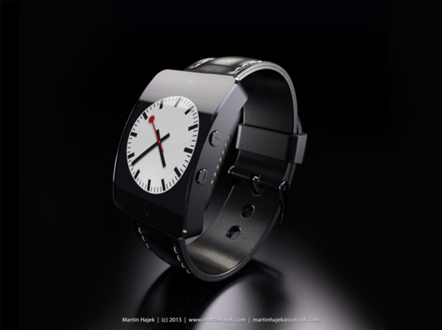
Boxy But Good – Designer Martin Hajek‘s incarnation of the iWatch and iWatch C mimic the design cues of the current iPhone range (metal on the high end, plastic on the low).
More Must-Reads from TIME
- Why Trump’s Message Worked on Latino Men
- What Trump’s Win Could Mean for Housing
- The 100 Must-Read Books of 2024
- Sleep Doctors Share the 1 Tip That’s Changed Their Lives
- Column: Let’s Bring Back Romance
- What It’s Like to Have Long COVID As a Kid
- FX’s Say Nothing Is the Must-Watch Political Thriller of 2024
- Merle Bombardieri Is Helping People Make the Baby Decision
Contact us at letters@time.com