I took a look at The Weather Channel’s free mobile app for iOS back in May 2012, just after the company overhauled and streamlined its interface, adding visual elegance to functionality and helpful swipe gestures to complement button tapping. The only ad-related concession was to a strip that ran along the top, though the ads tended to clash with the app’s often pastel sky hues and picturesque weather-related phenomena.
I liked it a lot — enough to make it my primary mobile weather-checking tool. But at the same time, speaking as a guy who likes to commit cross-platform, I’ve been a little less than satisfied with the company’s web approach. Visit it these days and you’re as liable to encounter stories like “Your Kids May Never See THIS,” or “World’s Scariest Airport Runways (PHOTOS),” or “How I Lost 115 Pounds!” or “Don’t Miss Out on THIS” (with a shot of a giant potato on a flatbed) as genuine weather news. It’s obviously the company trying to pay the bills, if at the expense of offering a focused, informationally consistent experience.
You may also have heard about The Weather Channel’s shift toward infotainment if you watch the cable channel, and non-weather-related shows like Prospectors or Loaded or Reel Rivals. That, and in recent years, The Weather Channel’s taken to giving moderate to large winter storms names like “Athena,” “Brutus,” “Gandolf,” “Iago,” “Khan” and so forth. Even the National Weather Service took umbrage with that, refusing to recognize the channel’s questionable dubbing. You could argue The Weather Channel’s been following in MTV’s footsteps, gradually diversifying its content to broaden its viewership, but to the point that the channel’s name becomes a misnomer.
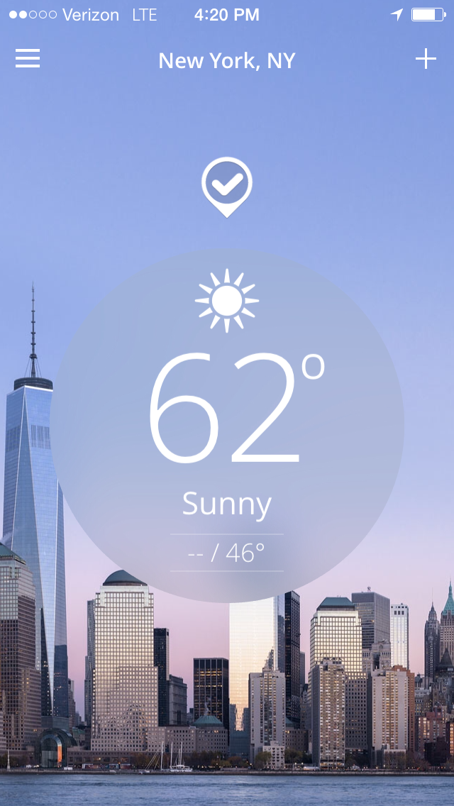
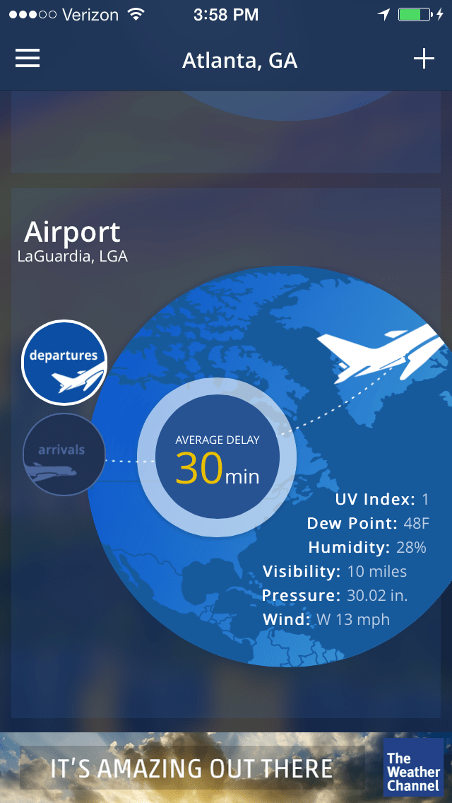
The way to avoid most of that is to use The Weather Channel’s mobile app, which the company overhauled significantly last night, trading its left-right, tab-based interface for a seamless scrolling column of information packed with visually polished meteorological data. Now, instead of one screen sporting multiple levels of left-right tabbed information you’d have to shuffle through like a deck of cards, you simply scroll down from the default temperature view through a parade of features: hourly weather, the 10-day forecast, a radar square (The Weather Channel claims radar is “faster than ever” now), a carousel of video stories, a feature called “social weather” (more on this below), a news carousel, a pollen index, another story carousel called “Our Favorite Things,” current airport conditions for your area and a flu report. The column’s intercut by a few tastefully unobstrusive banner ads, and that’s it: as I’m looking this morning, there’s one for a show on The Weather Channel, one for Microsoft Cloud, and a repeat of the show ad at bottom — so just three in all.

A few of the subsections offer “more” links, which slide you over one page to an expanded view, say you want to see hourly predictions — accuracy notwithstanding — that run out three full days instead of just five or six hours. Other subsections, like the 10-day forecast, let you slide those days left or right to see further ahead without leaving the up/down column interface. And instead of waiting for the app to update at intervals, as so many apps force you to, you can get this version to refresh by gently tug-swiping downward (from the default view). It’s all very slick and beautifully designed — leaps and bounds better than the last version, which was already headed in the right direction.
By default, The Weather Channel’s app uses your phone’s location-tracking capabilities to provide forecasts, taking its best guess at a street address and displaying it up top (as I sit here in my home office, the app shows the address for the home next door, which is close enough for me). This can be disabled, of course, and the app still supports adding locations manually, after which you just have to swipe left or right to view them. And if severe weather’s occurring nearby, the app now displays a prominent banner along the top, whereas before, alerts were tiny icons you had to slide out for details.
If you live in a major metropolitan area, say New York City, the default screen will display a shot of downtown Manhattan that’s also indicative of the weather (sunny, cloudy, raining, etc.). If, on the other hand, you live in a tiny Michigan village like me, you’ll see a nondescript photo that matches the local weather conditions. All that’s missing at this point is a mechanism that’d let you take your own photos of various local weather conditions and map them to local weather states that the app would know to display (in lieu of the generic ones) for the relevant location. Now that would be cool.
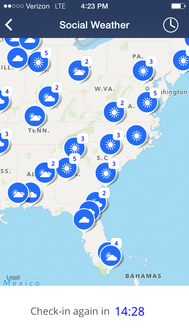
One of the more intriguing new features is something The Weather Channel calls “Social Weather,” which eschews the prior version’s social networking hooks to platforms like Facebook and iWitness in favor of a native, Waze-like weather reporting service. Click a checkmark icon that hovers above the temperature circle in the default view and you’re taken to Apple’s Maps app overlaid by a tagging interface: a row of icons at bottom reflecting general weather conditions, e.g. sunny, cloudy, partly cloudy and so forth. Tap the one that best represents what you see outside and you’ll automatically submit your report to The Weather Channel, then have the option to take a photo and submit that as well, after which an icon appears on the map over the submission location above a timer that counts down from 15 minutes before allowing you to report in again.

I expected to be able to see my photo by tapping the map icon, but if that’s the intention, it wasn’t working when I tested it, and tapping other nearby icons failed to conjure pictures as well, so perhaps the photos are just for your benefit (you can email them on, or attach them to a text message). In any event, the social weather report interface could be huge if enough people use it and do so accurately, potentially offering a far more immediately accurate survey of local weather conditions than The Weather Channel’s own sometimes-delayed reports (in a promotional video for the new app, The Weather Channel says it intends to use the data “to identify hard to predict spots, to help improve the forecasts”).
If you’re looking for the what might be the prettiest weather app on the market, as well as one that wisely keeps ads and non-weather-related stories to a minimum — speaking as someone who routinely uses or keeps tabs on apps ranging from Apple’s own iOS Weather to Intellicast, NOAA Hi-Def Radar, WeatherBug, Weather Underground, AccuWeather, MyRadar and Weather Radar — The Weather Channel’s latest is my new favorite, and it’ll even work with slightly older devices: while it’s designed with iOS 7 in mind, The Weather Channel says it’ll load on anything running iOS 6 and above.
More Must-Reads from TIME
- Cybersecurity Experts Are Sounding the Alarm on DOGE
- Meet the 2025 Women of the Year
- The Harsh Truth About Disability Inclusion
- Why Do More Young Adults Have Cancer?
- Colman Domingo Leads With Radical Love
- How to Get Better at Doing Things Alone
- Michelle Zauner Stares Down the Darkness
Write to Matt Peckham at matt.peckham@time.com