Once upon a time — it was back in October of 1994 — a Microsoft type engineer named Vincent Connare got a sneak peek at an upcoming product called Microsoft Bob. Though meant to be a friendly and unintimidating way for newbies to interact with PCs, Bob had its onscreen characters talking in word balloons set in a rather staid typeface, Times New Roman.
Connare was moved to try to capture Bob’s casual spirit in a typeface. His creation was called Comic Sans. It didn’t make its way into Bob when it shipped in 1995, but it was later bundled with Windows itself. Regular people seemed to like Comic Sans just fine — it seems like half the amateur desktop-publishing projects ever done on a Windows computer use it — but the typeface became legendary for being…well, hideous.
(I’ve used it for this article just so you can judge for yourself, but I promise never to do it again.)
There are countless ugly fonts out there, but most languish in obscurity. Only Comic Sans inspires people to band together in shared hatred. Like Carrot Top and Cheez Wiz, it long ago became its own punchline; it no longer matters much whether it’s good or bad, and if you don’t despise it, you’d best keep that fact to yourself.
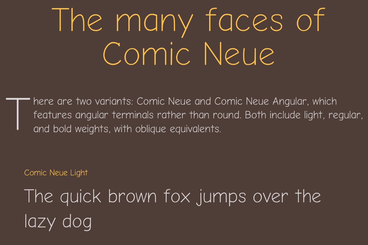
Recently, though, another designer, Craig Rozynski, undertook an idiosyncratic project: He set out to create a new and improved informal typeface — something like Comic Sans, but without a Comic Sans-like tattered reputation. He calls his handiwork Comic Neue, and you can download it for free here. I like it enough that I just installed it on my iPad.
I learned about Comic Neue over at News From Me, where Mark Evanier gives it a so-so review. Unlike most people who revel in their distaste for Comic Sans, Mark actually knows something about lettering comic strips and comic books, and his conclusion about both Sans and Neue is that they’re too amateurish for that purpose.
If you want a font that is great for use in comics, check out the embarrassment of riches at Comicraft. Note that many of them are digitized versions of the hand-written lettering of professional cartoonists. Which, it turns out, is a better way to add personality to the text in your word balloons than borrowing a typeface from Windows 95…or anything inspired by one.
More Must-Reads from TIME
- Cybersecurity Experts Are Sounding the Alarm on DOGE
- Meet the 2025 Women of the Year
- The Harsh Truth About Disability Inclusion
- Why Do More Young Adults Have Cancer?
- Colman Domingo Leads With Radical Love
- How to Get Better at Doing Things Alone
- Michelle Zauner Stares Down the Darkness
Contact us at letters@time.com