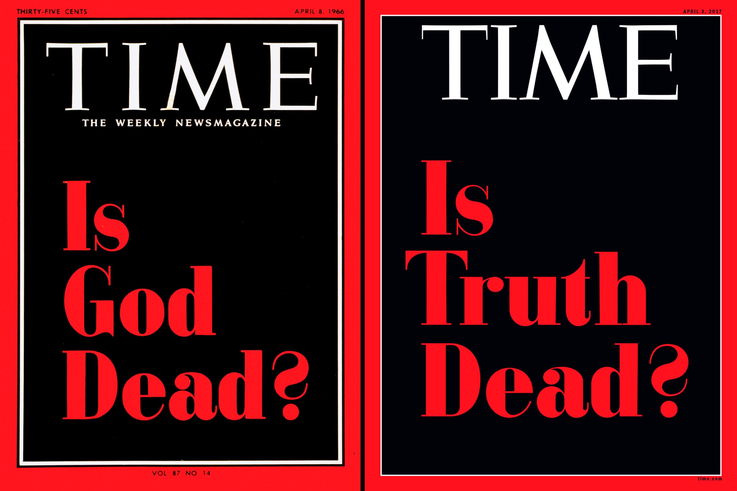
To illustrate this week’s cover story on President Trump and the truth, we took inspiration from one of the most iconic covers in TIME’s history. Set on a stark black field and inside the red border, the headline “Is Truth Dead?” is a typographical homage to our “Is God Dead?” cover from April 8, 1966.
That famous issue was the first TIME cover to appear without any image—a span of more than 40 years since TIME’s founding in 1923. Not that Time’s editor Otto Fuerbringer didn’t have any visual options available—from classic works of religious art to contemporary paintings like Abraham Rattner’s Window Cleaner to a commissioned collage by pop artist Larry Rivers. But in the end as Time Inc. founder Henry Luce wrote in a letter to Fuerbringer, “the only artist who could paint a portrait of God is God.” So type only it was.
“The [Is God Dead?] cover concept is breathtakingly simple and effective,” said Pentagram partner Luke Hayman, who was instrumental in producing TIME’s redesign in 2007. “It is typographically under-designed, yet the red type appearing through the full rectangle of black gives full impact and gravitas to the provocative (and for many, shocking) question.”
(Some readers had a slightly different reaction to the story itself. “TIME’s story is biased, pro-atheist and pro-Communist, shocking and entirely un-America,” R.A. Ellsworth of Laguna Hills, Calif. wrote in a letter to the editor in April 1966. Time Editor Nancy Gibbs writes in this week’s magazine that just like many said they believed in God in 1966, many today “would say they believe in Truth, and yet we find ourselves having an intense debate over its role and power in the face of a President who treats it like a toy.”)
The original typography used on the cover was based on Bodoni Poster, designed by Chauncey H. Griffith in 1929. The bold contrasting strokes, strong verticality and easily recognizable serifs and ball terminals were perfectly suited for advertisements, posters and signs in the early 20th century.
“It is no less ironic today than it was a half-century ago to use such brashness in a stark TIME setting to pose this timely and thought-provoking question,”says typographer Kent Lew, who developed the body copy typeface used in the magazine today. “A fitting homage.”
In order to produce an exact rendition of the typeface for this week’s cover, TIME graphic artist Lon Tweeten hand drew each letter form with fine precision, as we could find no modern type foundry which has an exact interpretation of the one used on the original cover.
More Must-Reads from TIME
- Inside Elon Musk’s War on Washington
- Meet the 2025 Women of the Year
- Why Do More Young Adults Have Cancer?
- Colman Domingo Leads With Radical Love
- 11 New Books to Read in Februar
- How to Get Better at Doing Things Alone
- Cecily Strong on Goober the Clown
- Column: The Rise of America’s Broligarchy
Contact us at letters@time.com