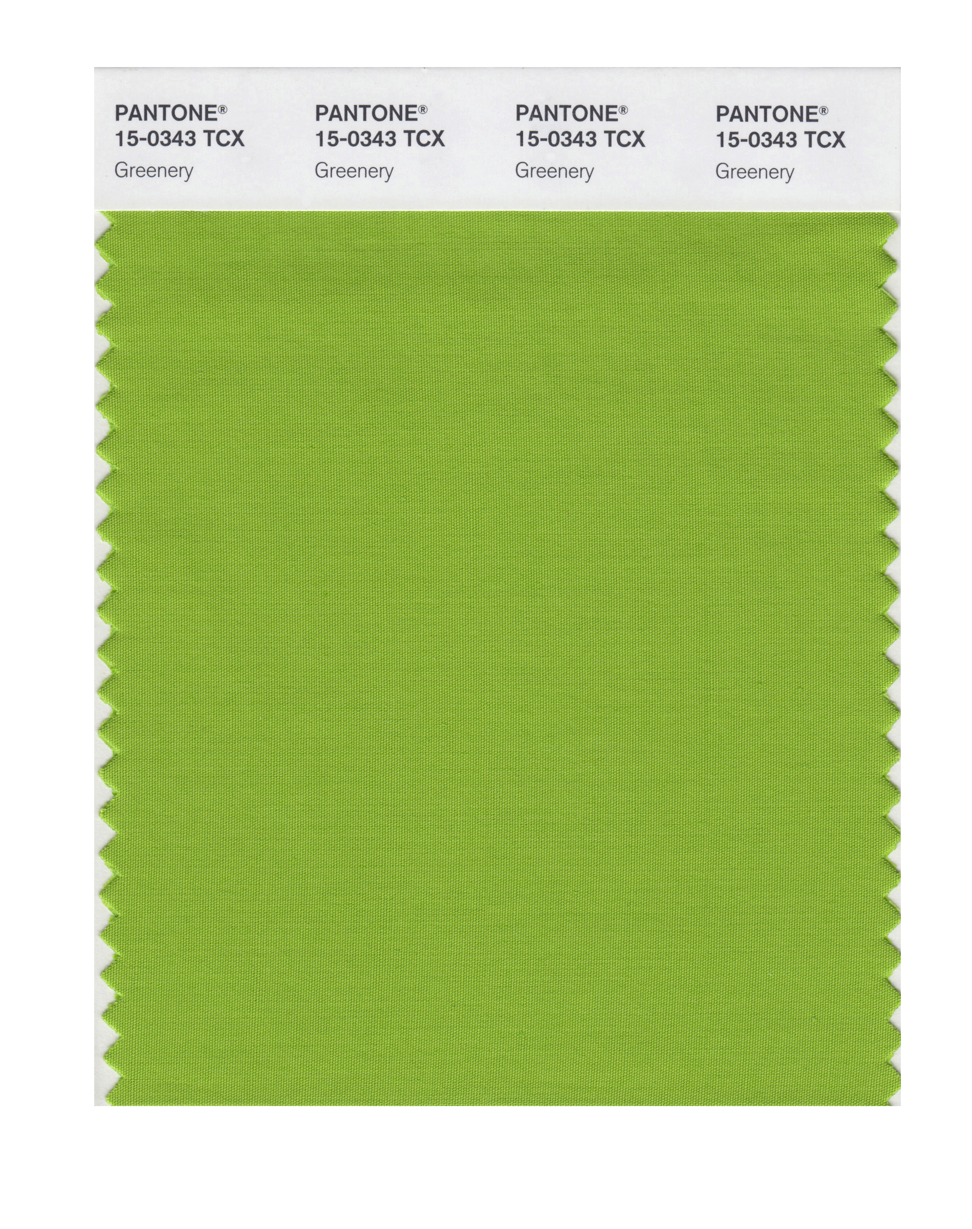
The Pantone Color Institute has spoken: at a time when it seems everybody is in need of some hope, the bright “greenery” should help provide some as the 2017 Color of the Year.
The idolized color authority announced its choice of the shade Pantone 15-0343 (generally called “greenery”) on Thursday. Pantone chooses a color each year that it expects to appear prominently in fashion, products, design and life—as well as reflect prevailing mood or sentiments, CNN Money reports.
“We know what kind of world we are living in: one that is very stressful and very tense,“ Leatrice Eiseman, Pantone Color Institute executive director, told the New York Times. “This is the color of hopefulness, and of our connection to nature. It speaks to what we call the ‘re’ words: regenerate, refresh, revitalize, renew. Every spring we enter a new cycle and new shoots come from the ground. It is something life affirming to look forward to.”
The color forecasters examine manufacturing and design trends, from fashion to street art, to determine the upcoming color, Laurie Pressman, vice president of Pantone Color Institute, told CNN. The “fresh and zesty yellow-green shade” has started appearing in technology such as a Mercedes model, and also symbolizes interest in protecting the environment.
More Must-Reads from TIME
- Donald Trump Is TIME's 2024 Person of the Year
- Why We Chose Trump as Person of the Year
- Is Intermittent Fasting Good or Bad for You?
- The 100 Must-Read Books of 2024
- The 20 Best Christmas TV Episodes
- Column: If Optimism Feels Ridiculous Now, Try Hope
- The Future of Climate Action Is Trade Policy
- Merle Bombardieri Is Helping People Make the Baby Decision
Write to Julia Zorthian at julia.zorthian@time.com