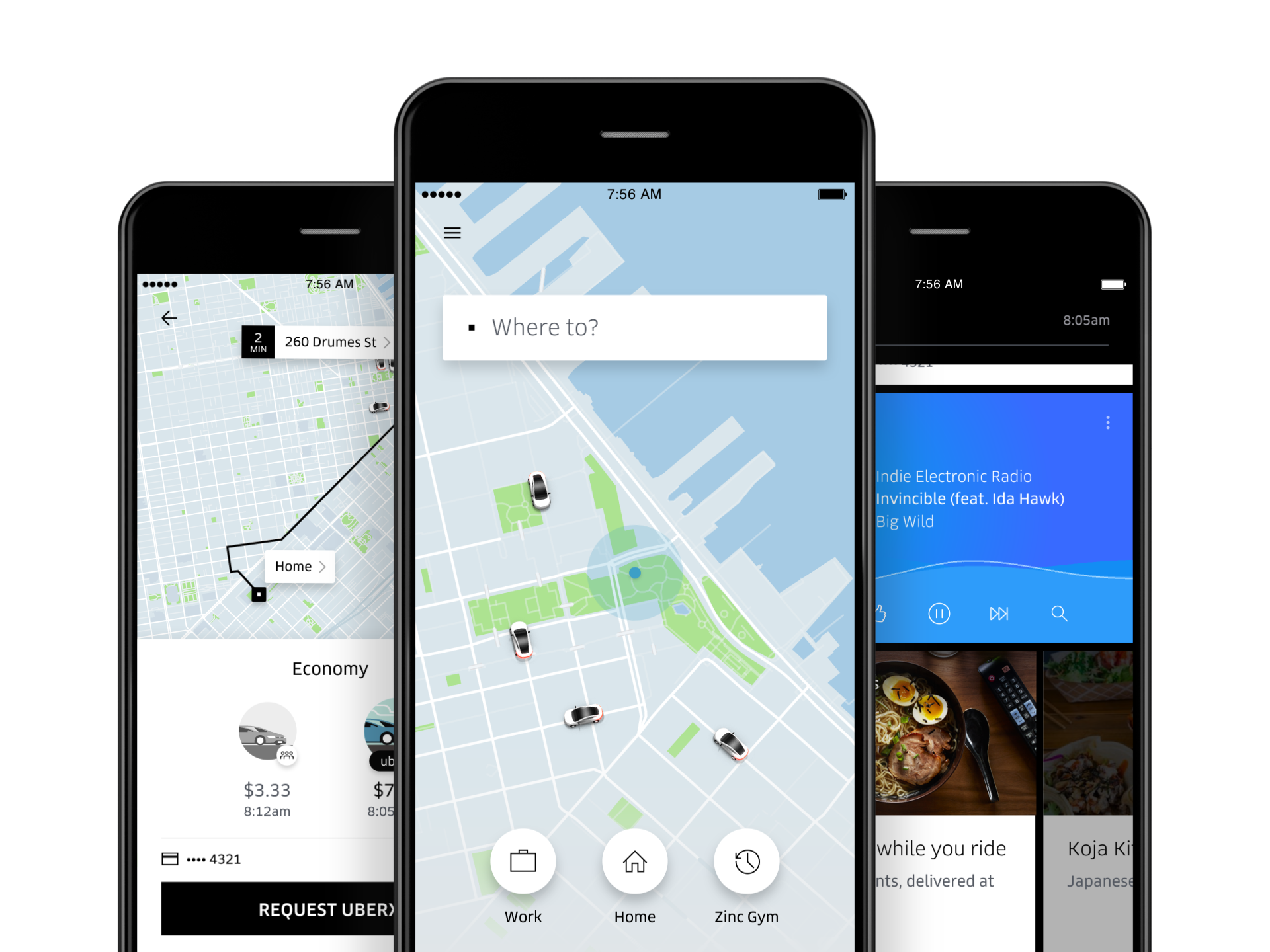
Uber is announcing the first big redesign of their rider app since 2012 on Wednesday, a combination of optimized basics and totally new features that will roll out to users around the world over the next two weeks. Their product and design team described the makeover as a necessary overhaul, as the pile of options Uber has added over time have cluttered the experience and machine learning has given them a more robust ability to predict what people want. CEO Travis Kalanick says he was “deeply in the game” on this one.
Here are the main takeaways.
It’s streamlined. Uber is going back to black on the logo, getting rid of that gaudy splash screen that the Internet liked about as much as Steph Curry’s all-white sneaker line and promising near-instant launch times. A primary theme of the update, which Uber has been working on for most of the year, was to “shave every millisecond possible” off the experience, says product manager Yuhki Yamashita, and give the app a simpler feel.
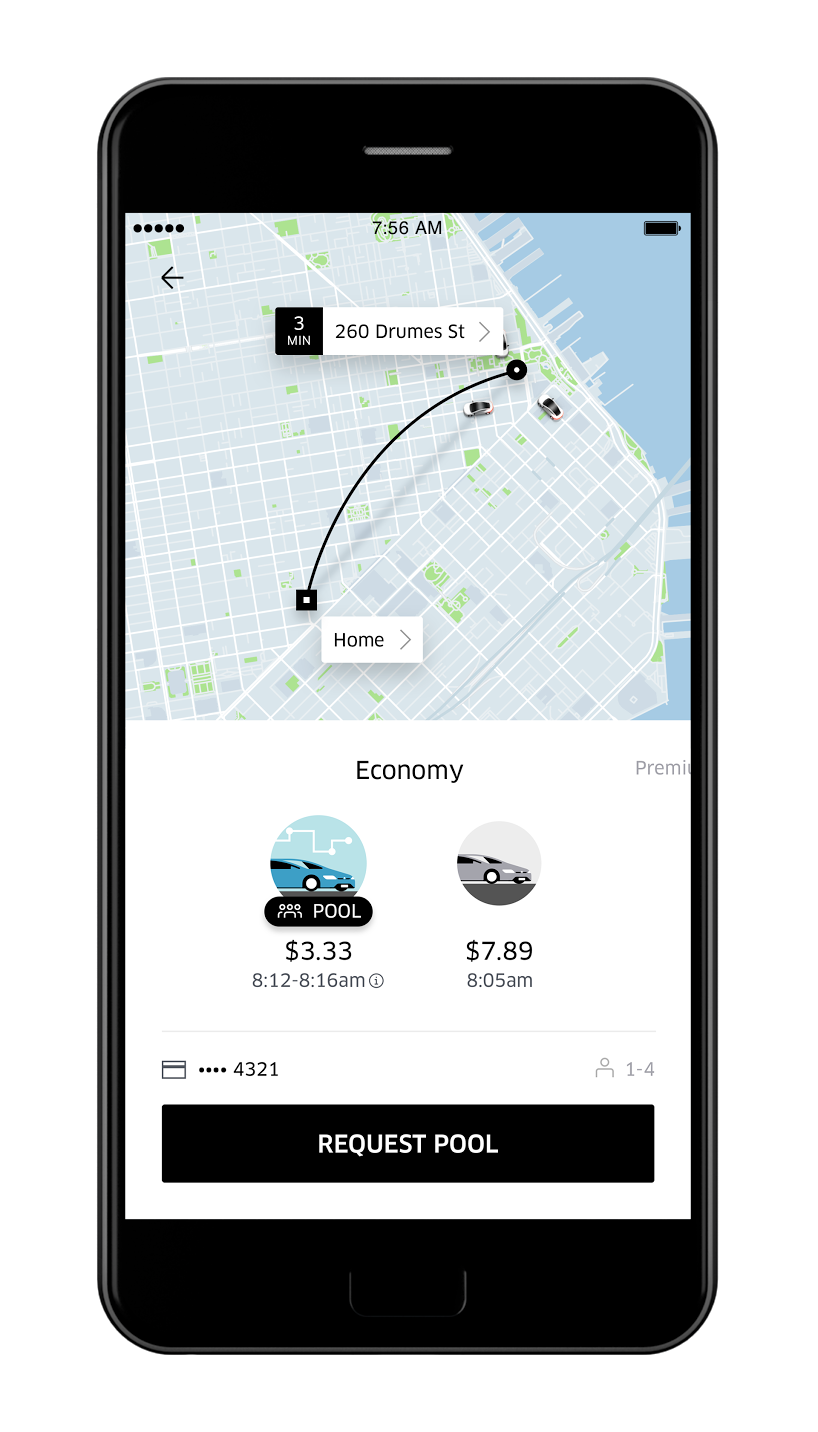
That’s why the slider is gone. That toggle on the bottom of the screen that had gotten overloaded with options in some cities (UberPool? UberX? Select? Black? SUV? Delivery?) has been divided into categories. Riders can now find options like UberX and UberPool grouped together under an “Economy” slide, or swipe over to get a fancier car on a “Premium” one, and so forth.
Users will be asked “Where to?” instead of where you are. About half of people open the Uber app and don’t adjust the pin that immediately makes a best guess about where they are. The GPS gets better as it warms up, the Uber team says, so moving to a “destination first” model will improve the accuracy of that guess and lessen those awkward instances when a rider and driver can’t locate each other.
Uber will be offering suggestions about likely destinations. “It wasn’t particularly smart,” design director Didier Hilhorst says about the previous versions of the app. “We wanted to get into a mode where we don’t even have to ask you what you want.” To that end, frequent riders will find “shortcut” suggestions for destinations that get smarter over time based on data about their habits, Uber says. At home in the morning? It might suggest a ride to the train station you take each day to work. At work in the evening? It might suggest a gym you frequent around that time. Riders can set their own shortcuts as “favorite” destinations, too.
Your calendar will help the app know where you want to go. Users will also be able to integrate the native calendars of iOS or Android devices (which includes the other calendars that have been synced with those) to suggest destinations that the app couldn’t know from machine learning, like a restaurant you’re due to be at in about 20 minutes or an airport where you will soon be hopping on a flight.

There will be no more guesses about price, and there will be additional estimates about arrival times. The updated app will be giving riders information about the cost of a trip up front, as well as estimated arrival times for UberX and UberPool. That way users can comparison shop between those options, seeing if the money they’ll save outweighs the time they’ll lose if they choose to share the ride with others.
Pickups will get smarter too. Riders in some places have already experienced pickup suggestions, visuals that tell riders precise spots to stand on this street corner or that one to better connect them with their driver. Uber will use machine learning to offer these as options “all around the world,” says Yamashita, in pursuit “of the most stress-free pickups.” Say you’re inside a mall: there might be four suggested spots for you to stand, depending on where you plan on exiting. Icons on the app will also be colored to match the driver’s car.
Welcome to the “Uber feed.” Once you’re in the car and on the move, rather than offering only a map for riders to look at inside the app, there will be a feed that will contain content from Uber and third parties. For now, that will mean access to food delivery service Uber Eats. (The company promises the options will be smart, suggesting eateries that might deliver your Thai food to your home the same time you’ll be arriving.) And beyond that, there won’t be ads, only “relevant” partnerships, Uber says, like information about train times from app Transit if you’re headed for a station or Yelp reviews of popular dishes for the restaurant you’re in route to.
You can also choose to be routed to people rather than places. Have you ever tried to meet up with friends who are going bar-hopping? With the update, you’ll be able to ping your bar-hopping friend through the app, they’ll be asked if they want to share their location, and if they choose to do so, the app with route you to wherever they are. (It shares only the location where they are at that point and does not update should they physically move to another one, at least for now.) The “people as places” feature is one that Uber describes as more of an experiment than the new normal, but it’s all in the same name of making things easier on the rider.
More Must-Reads from TIME
- Why Trump’s Message Worked on Latino Men
- What Trump’s Win Could Mean for Housing
- The 100 Must-Read Books of 2024
- Sleep Doctors Share the 1 Tip That’s Changed Their Lives
- Column: Let’s Bring Back Romance
- What It’s Like to Have Long COVID As a Kid
- FX’s Say Nothing Is the Must-Watch Political Thriller of 2024
- Merle Bombardieri Is Helping People Make the Baby Decision
Contact us at letters@time.com