When Microsoft released the touchscreen-friendly Windows 8 about four years ago, just about every PC manufacturer started making computers with displays we could poke and prod. But not Apple. When it came to touchscreens for desktops and laptops, Apple CEO Tim Cook once famously called Windows PC vendors “confused.”
Now, Apple has finally began to gravitate towards touch for its PCs. Just not in the way most people would have imagined.
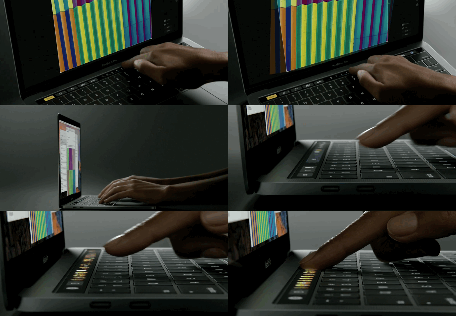
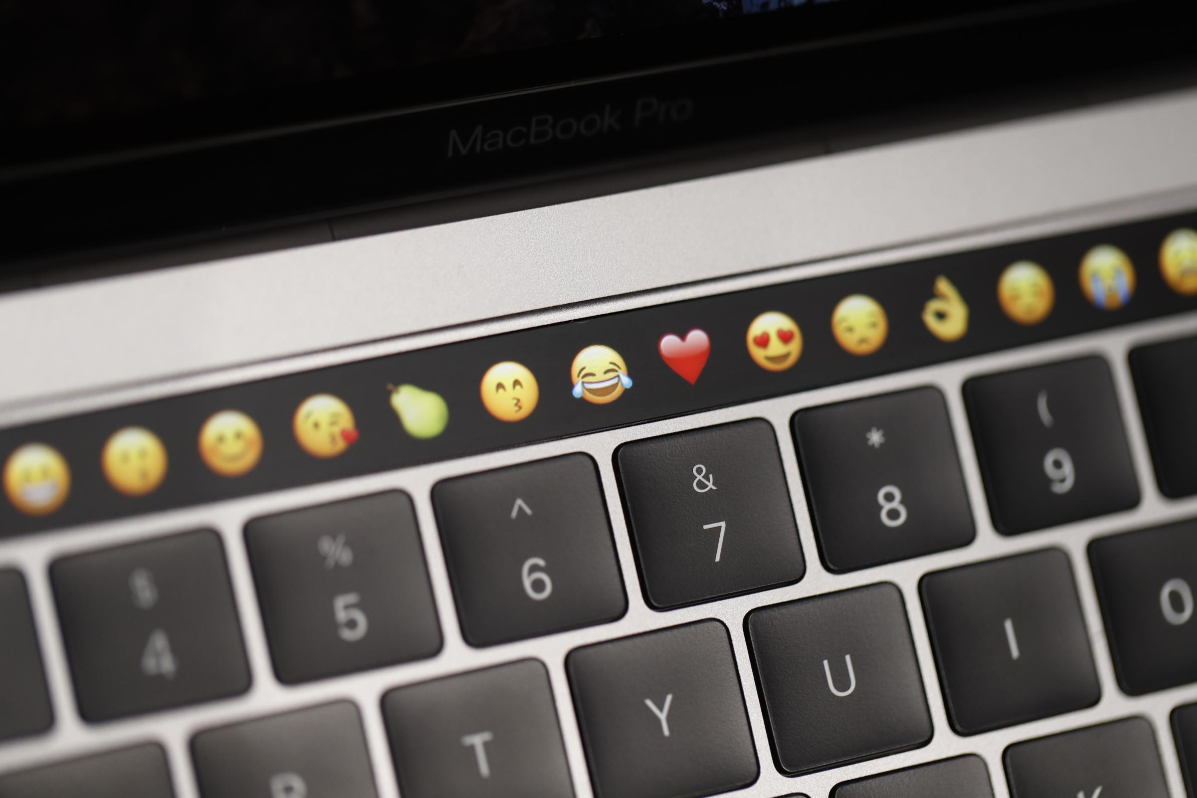
The Cupertino, Calif. firm’s new MacBook Pro includes a new slim touchscreen strip that sits just above the keyboard. This area, called the Touch Bar, is meant to replace the traditional row of function keys. Unlike regular keys, the Touch Bar can change the buttons it’s displaying depending on the app you’re using, or task you’re trying to get done. The new laptop also has Touch ID, enabling lightning-fast user profile switching and Apple’s Apple Pay payment service. (The new MacBook Pro with the Touch Bar starts at $1,799 for the 13-inch model.)

I briefly spent some time trying the new MacBook Pro after Apple unveiled it Thursday. Based on that experience, I can say the Touch Bar is an inventive new way to get work done more quickly.
Apple’s desktop apps, like Maps, Photos, Safari and more, have all been optimized to work with the new feature. The Touch Bar shortcuts Apple added for Safari and Photos are particularly helpful. While using Safari, the Touch Bar will display your recently opened tabs, which you can jump between by tapping each individual tab or scroll through by sliding your finger across the strip. There’s no lag between your finger hitting the touch strip and the MacBook Pro’s reaction. Swiping through tabs in Safari felt fluid, and certainly much faster than clicking the trackpad or using traditional keyboard shortcuts.
My main criticism so far is that since the Touch Bar is so small, it can be hard to see which tab is which on the Touch Bar. It would be easier to differentiate between tabs if the Touch Bar showed the logo for the website instead of a miniature version of the page. (During a demo on Thursday, Apple showed off a DJ app using the Touch Bar that also seemed like it would suffer from the lack of touchable real estate.)
The Touch Bar is helpful with the Photos app, too. When in the app, you can swipe through photos and albums by sliding a finger across the strip, similar to the way you can flip through tabs in Safari. When editing photos, you can tap a button on the Touch Bar to choose aspect ratios for cropping, or to cycle through filters. A before-after style button lets you compare your edits to the original image.
Apple’s new Touch Bar might mean faster typing, too. As I typed in Messages, the Touch Bar offered autocomplete suggestions. While I drafted a document in Pages, it presented text formatting options. Between the Touch Bar and the MacBook Pro’s new, flatter keyboard, writing in macOS feels faster than ever before.

The new MacBook Pro has improvements besides the Touch Bar, too. It has faster internals, more powerful speakers, a brighter screen, and an overall slimmer, lighter body. Still, it was difficult to assess these qualities in a brief hands-on, so look for my full review in the near future.
When it comes to the new MacBook Pro, the Touch Bar and the addition of Touch ID are the most immediate draws. How useful Apple’s new touch interface will actually be will largely depend on outside developers, and how they incorporate the feature into their apps. It’s an open question whether these new features will convince existing MacBook owners to upgrade — but they’ll be a nice benefit for those in the market for a brand new Apple laptop. You can pre-order the MacBook Pro here.
More Must-Reads from TIME
- Inside Elon Musk’s War on Washington
- Why Do More Young Adults Have Cancer?
- Colman Domingo Leads With Radical Love
- 11 New Books to Read in February
- How to Get Better at Doing Things Alone
- Cecily Strong on Goober the Clown
- Column: The Rise of America’s Broligarchy
- Introducing the 2025 Closers
Contact us at letters@time.com