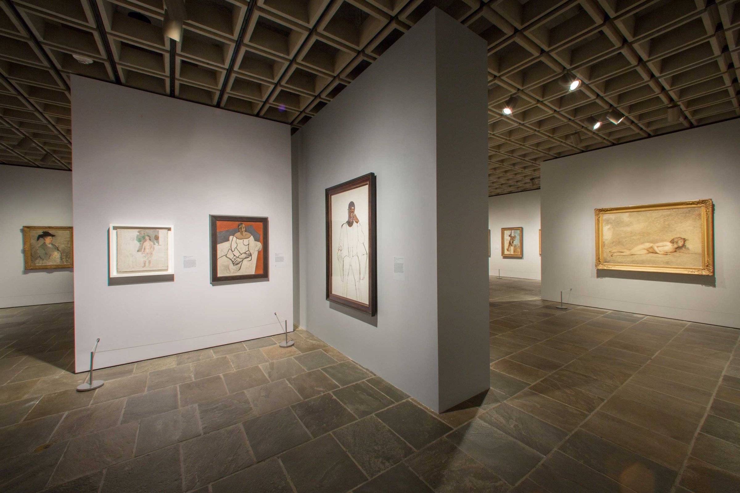
The Metropolitan Museum of Art in New York City is the American Louvre, one of the world’s greatest “encyclopedic” museums, the kind that have deep holdings from all periods and regions. But the Met’s encyclopedia always became a bit thin when you arrived at the last volume, meaning the art of the 20th and 21st centuries, areas where its collections aren’t nearly so comprehensive as they are for, say, Impressionism or Japanese screen painting. So when the Whitney Museum of American Art decided to move out of its longtime home on the Upper East Side of Manhattan and into a larger new building downtown, the Met saw a chance to operate more aggressively in the realm of “the new.” It arranged to rent the old Whitney for at least eight years as a venue for its own shows of modern and contemporary art. It reopens the building on March 18 as the Met Breuer–a place the revered old dowager museum hopes to make its edgier outpost.
The Breuer in that name is a tribute to the former Whitney’s celebrated architect, Marcel Breuer, a Hungarian émigré and onetime teacher at the Bauhaus, the great laboratory of 20th century modernism. Breuer, who died in 1981, had a taste for hard-edged sculptural buildings in raw concrete. That would be one way to describe the Whitney. From the time it opened in 1966, it was plain that Breuer’s irregular castle keep, with its cantilevered upper floors and trapezoidal windows, would take some getting used to–but also that it would be worth the effort. Ada Louise Huxtable, then the redoubtable architecture critic of the New York Times, called it “the most disliked building in New York.” She went on to give it a rave review.
After the architecture of the past 20 years or so–all those flights of fancy from Frank Gehry and Zaha Hadid–Breuer’s war wagon of a museum is no longer the curiosity it seemed half a century ago. And now, thanks to a gentle but meticulous restoration by the architecture firm Beyer Blinder Belle, the muscular beauty of the building is redeployed with force. In the lobby, the tight grid of Breuer’s shallow dome ceiling lights has been restored to full register. The hammered concrete he used for some interior walls has been spruced up, the better to show how powerfully its coarse surface offsets the elegant mahogany stairway handrails. And the interior sills of those trapezoidal windows now have a crisper edge, which nicely amplifies their irregular geometry.
Maybe with time the Met can even fix Breuer’s one indisputably bad idea, a below-street-level concrete enclosure intended as a sculpture court. It’s viewable through the glass wall of the museum’s basement-level restaurant, but who wants a view into a barren gray tank, even if there’s a merry Calder in there? As a first gesture, the Met has added a border of quaking aspens. It’s a start.
The two opening exhibitions at the Met Breuer are designed to show what the museum can do in its new home (eight blocks) away from home. One features drawings and photographs by Nasreen Mohamedi, a late 20th century Indian abstractionist little known in the West. It’s a way of announcing that the Met Breuer has gotten the news that modern art isn’t strictly a European-American co-production. But the other and much larger show is the kind of blockbuster old-master exhibition that has always been the Met’s comfort zone. “Unfinished: Thoughts Left Visible” is a meditation across the centuries, from the Renaissance to the present, on the ways that unfinished works have shaped our notions of what painting or sculpture has to look like. Some of its 197 works were left incomplete when their creators died and some were simply abandoned in progress, but many were deliberately produced with an indifference to any notions of a final touch.
Sumptuously curated, chiefly by Kelly Baum, Andrea Bayer and Sheena Wagstaff of the Met, the show can be fascinating as it demonstrates how the fuzzy storm of Titian’s late brushwork offended Renaissance expectations of high finish but opened the way to an expressive new kind of paint handling. Or how Paul Cézanne’s willingness to leave flickering patches of bare canvas showed Picasso that whole stretches of a picture could be left blank, the better to intensify what’s there. Yet it’s also a show organized along the strictly chronological lines that museums tend to favor. More smart juxtapositions of work from different eras would have been welcome. Anyone hoping that the Met Breuer will be a place that really shakes things up, that embeds new art within its vast troves of older work, will have to keep waiting. But be patient–sometimes even the new can take a while.
More Must-Reads from TIME
- Why Trump’s Message Worked on Latino Men
- What Trump’s Win Could Mean for Housing
- The 100 Must-Read Books of 2024
- Sleep Doctors Share the 1 Tip That’s Changed Their Lives
- Column: Let’s Bring Back Romance
- What It’s Like to Have Long COVID As a Kid
- FX’s Say Nothing Is the Must-Watch Political Thriller of 2024
- Merle Bombardieri Is Helping People Make the Baby Decision
Contact us at letters@time.com