
Samsung’s new flagship Galaxy S6 was announced Sunday amid trouble for the company’s smartphone division. The Galaxy S5 didn’t sell as well as expected, and competition from HTC and Chinese manufacturers like Xiaomi and OnePlus has also had an impact on sales. To rub salt in the wound, Apple has gone from strength to strength since the release of its iPhone 6 and iPhone 6 Plus.
It’s unsurprising, then, that Samsung went to great pains during its Mobile World Press press conference in Barcelona, Spain to convince the world the Galaxy S6 is better than the iPhone 6 and iPhone 6 Plus. A reference to Apple’s possibly overstated troubles with bending iPhone 6 Plus units and side-by-side comparisons of photos taken with the iPhone 6 Plus and Galaxy S6 were heavy-handed examples of Samsung’s efforts here.
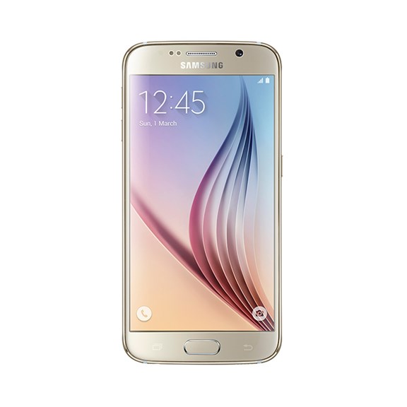
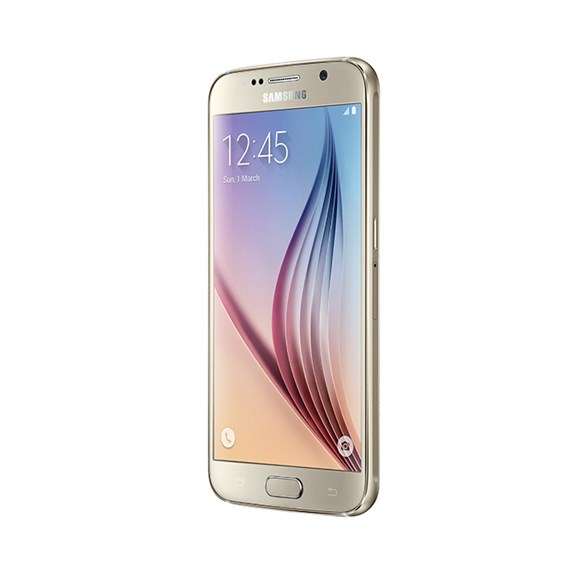
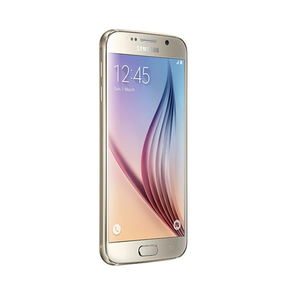
So the Galaxy S6 is Samsung’s great white hope – well, it comes in “Gold Platinum,” “Black Sapphire” and “Green Emerald” as well. And this time around, Samsung has changed its approach. Instead of packing every feature under the sun onto its flagship smartphone, Samsung has focused on design and desirability.
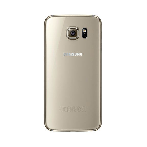
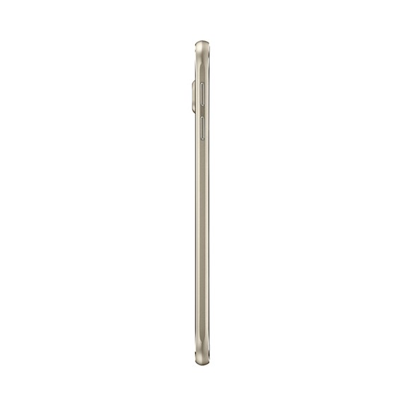
That’s not a totally unexpected move. Both last year’s metal-framed Galaxy Note 4 and Galaxy Alpha hinted at things to come. There’s no denying it — the Galaxy S6 is a good looking phone, far nicer to hold and look at than any of its predecessors, although it feels a little too light. It looks like a cross between the iPhone 6 and iPhone 4 – two design classics, but it doesn’t quite have the right heft and feel. It’s undoubtedly made of high-quality materials, but like previous Galaxy phones it doesn’t exude class when you hold it.
Samsung has realized that people want more than a functional phone: They want a desirable one, too. But has it gone too far? The S6 is handsome. A smooth metal frame is sandwiched between two pieces of the latest and toughest Gorilla Glass 4. The back is surprisingly grippy for glass, but it’s also a magnet for fingerprints. Every use required a wipe to remove the fingerprints while we were filming. That’s not something you want to see on such an expensive handset.
With the Galaxy S6, plenty has been sacrificed in the name of design. Gone is the removable back cover and with it the replaceable battery. That won’t be missed by too many. What will be missed is the microSD slot. This is one differentiating feature that Samsung fans had to lord over iPhone owners, but no longer. Instead, the Galaxy S6 comes in three storage variants: 32GB, 64GB and 128GB.
There’s a lot more to talk about than the design. A brand new camera has been fitted to the back that packs 16 megapixels and optical image stabilization – a feature that helps you get better shots in the dark. Selfie-lovers are well catered-for too, with a five-megapixel front-facing camera.
The front camera has larger pixels, like the HTC One M9, and we were pleased by the test shots we took. Less convincing was the rear camera that protrudes significantly from the rear of the phone. The image quality of our shots was a little blurry – on first impressions the HTC One M9 may well have the better camera.
We haven’t had a chance to fully test the capabilities of the Galaxy S6 yet, but early signs are promising. A brand new eight-core processor manufactured by Samsung powers the S6, helping it zip through menus and opens apps instantaneously. It’s probably quicker in benchmark tests than Apple’s iPhone 6, and perhaps quicker than its other great rival announced just hours before – The HTC One M9.
(Read more: The HTC One M9 Could Be One of the Best All-Around Phones of the Year)
It’s efficient, too. Samsung claims the S6’s guts are 30% more efficient than the Qualcomm Snapdragon 805 processor on the Galaxy Note 4. Combine that with quick charge technology — Samsung says the S6 will fully charge in half the time it takes the iPhone 6 to do the same — and wireless charging, and the S6 should last a while and be easy to charge on the go.
One area that makes the Galaxy S6 stand out is its glorious screen. With a pixel-packing 2K resolution, it’s far sharper than the iPhone 6 or HTC One M9. Is all that sharpness necessary? Arguably not. But both its competitors are plenty sharp. Where the S6 really pulls ahead is with dark scenes and colors. These look fantastic on the S6’s 5.1-inch AMOLED screen – far better than the LCD screens on the One M9 and iPhone.
The fingerprint scanner is now a match for Apple’s Touch ID, too. On the Galaxy S5, it was a clunky affair that only worked with precise swipes. Now simply resting your thumb on the home button springs the S6 to life. We didn’t get a chance to see quite how well it works for ourselves, though.
The Galaxy S6 also packs Samsung Pay, a variant on Apple Pay that looks like a winner. It allows payment through the magnetic strip used in older card readers, so doesn’t just rely on Near-Field Communication (NFC) like the iPhone and Apple Watch.
And now to an area that has traditionally held Samsung back: TouchWiz. TouchWiz is Samsung’s interface – a layer that goes over Android (5.0 Lollipop, in this case) to make Samsung phones look and feel unique. It’s not bad, but it’s never been as slick as Apple’s iOS operating system or HTC’s Sense layer.
Samsung has rebuilt TouchWiz from the ground up, attempting to make it a better all-around experience. Has it succeeded? It looks a lot better. Once again, Samsung has emulated Apple, so icons have become text buttons. Unfortunately, after about 15 minutes of use, we got a faint indication of the annoying momentary lag we’ve experienced with TouchWiz on previous Galaxy phones. It’s too early to reserve judgment now, though.
Has Samsung done enough with the Galaxy S6? That’s the big question. It may have gone too far in its attempt to emulate Apple, and could alienate the very fans that bought a Galaxy phone for the sheer amount of features they provide. The behemoth Samsung marketing machine will go into overdrive to ensure the S6’s success, and on first impressions there’s no reason it shouldn’t do well. This is a good-looking phone that packs top-notch specs.
Finally, Samsung also announced a Galaxy S6 Edge variant at Sunday’s event. The Edge packs the S6’s features into a phone with a screen that curves around the edges. It’s pretty, but the side screens aren’t as useful as they are on Samsung’s Galaxy Note Edge. It’s a little difficult to hold a phone with narrow sides, and the extra functionality the edges provide here – notifications when the phone screen is off and quick access to up to five contacts – feel like a solution waiting for a problem. Add a few hundred dollars to the cost and there’s no reason to opt for the Edge over the S6, unless you really want to be different.
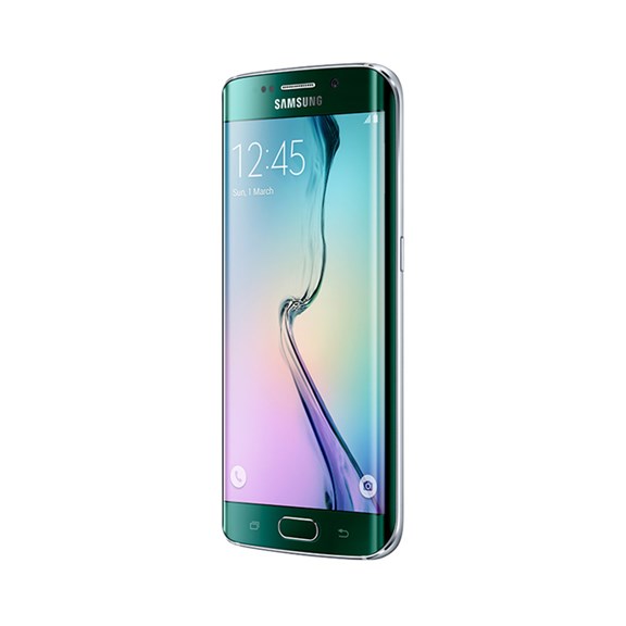
Both devices will be released in the U.S. and 25 other areas on April 10. Pricing has not yet been confirmed, although rumors suggest the S6 Edge will cost significantly more than the S6.
For Trusted Reviews’ full hands-on with the Samsung Galaxy S6, visit Trusted Reviews.
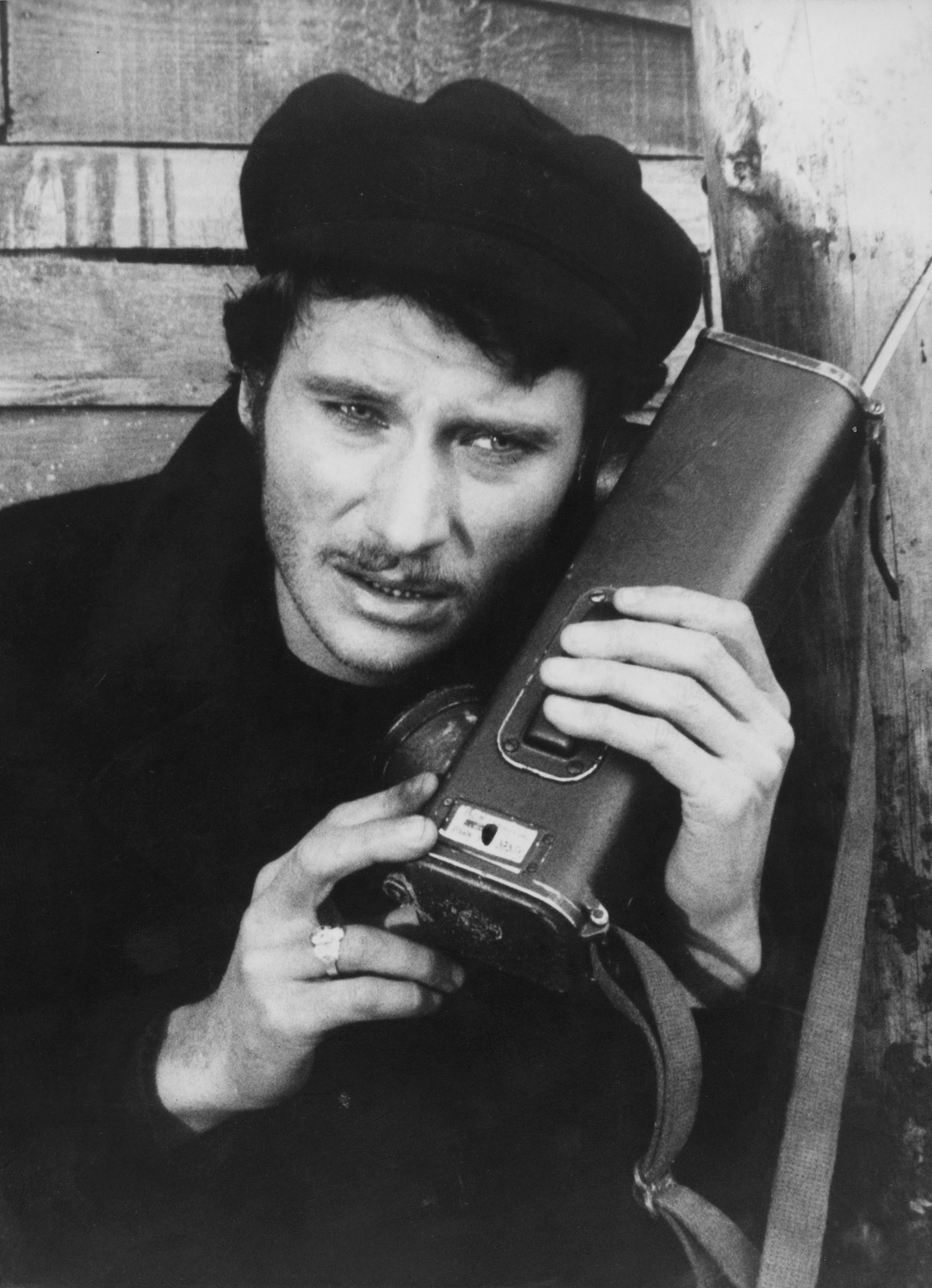
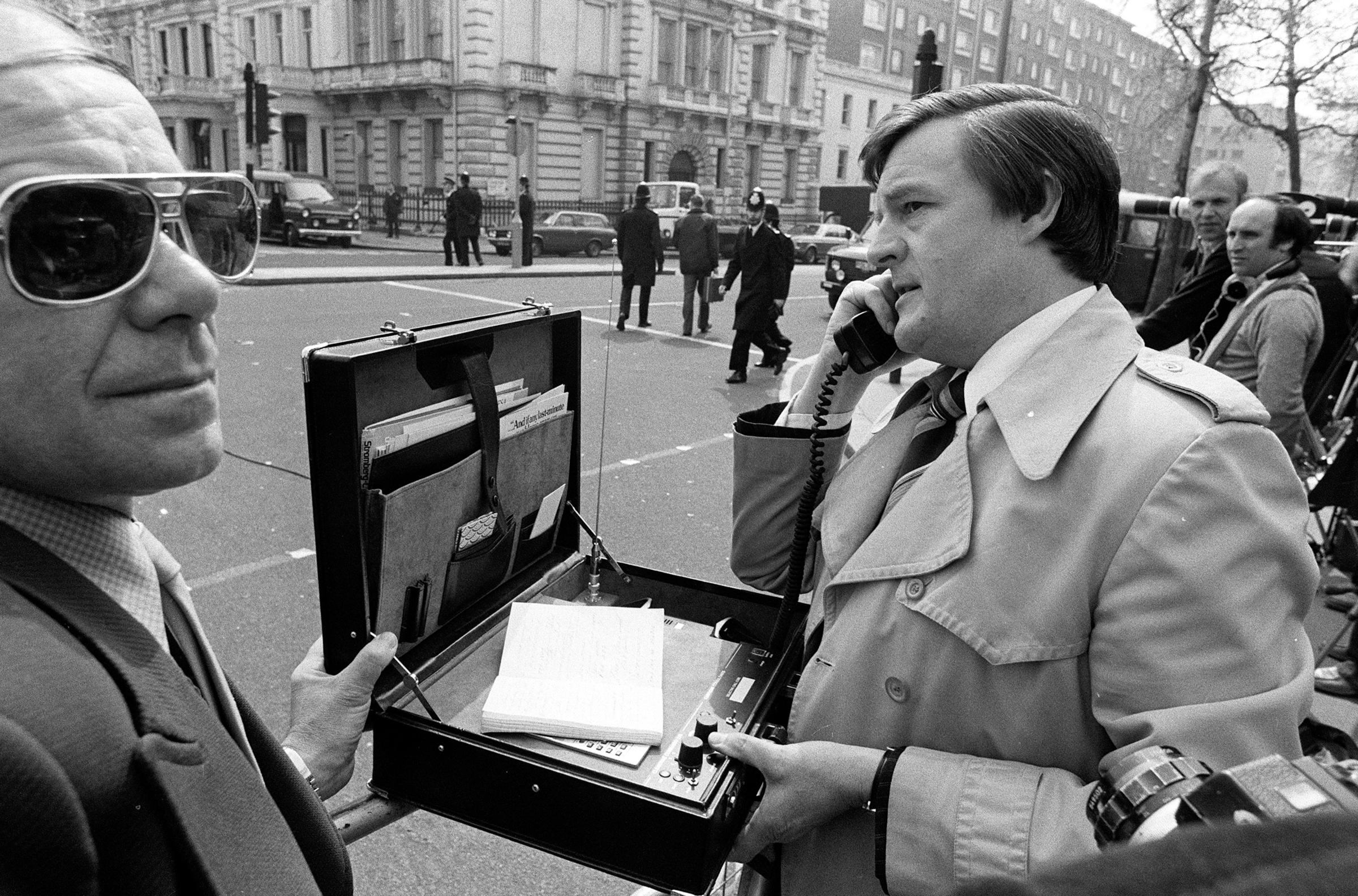
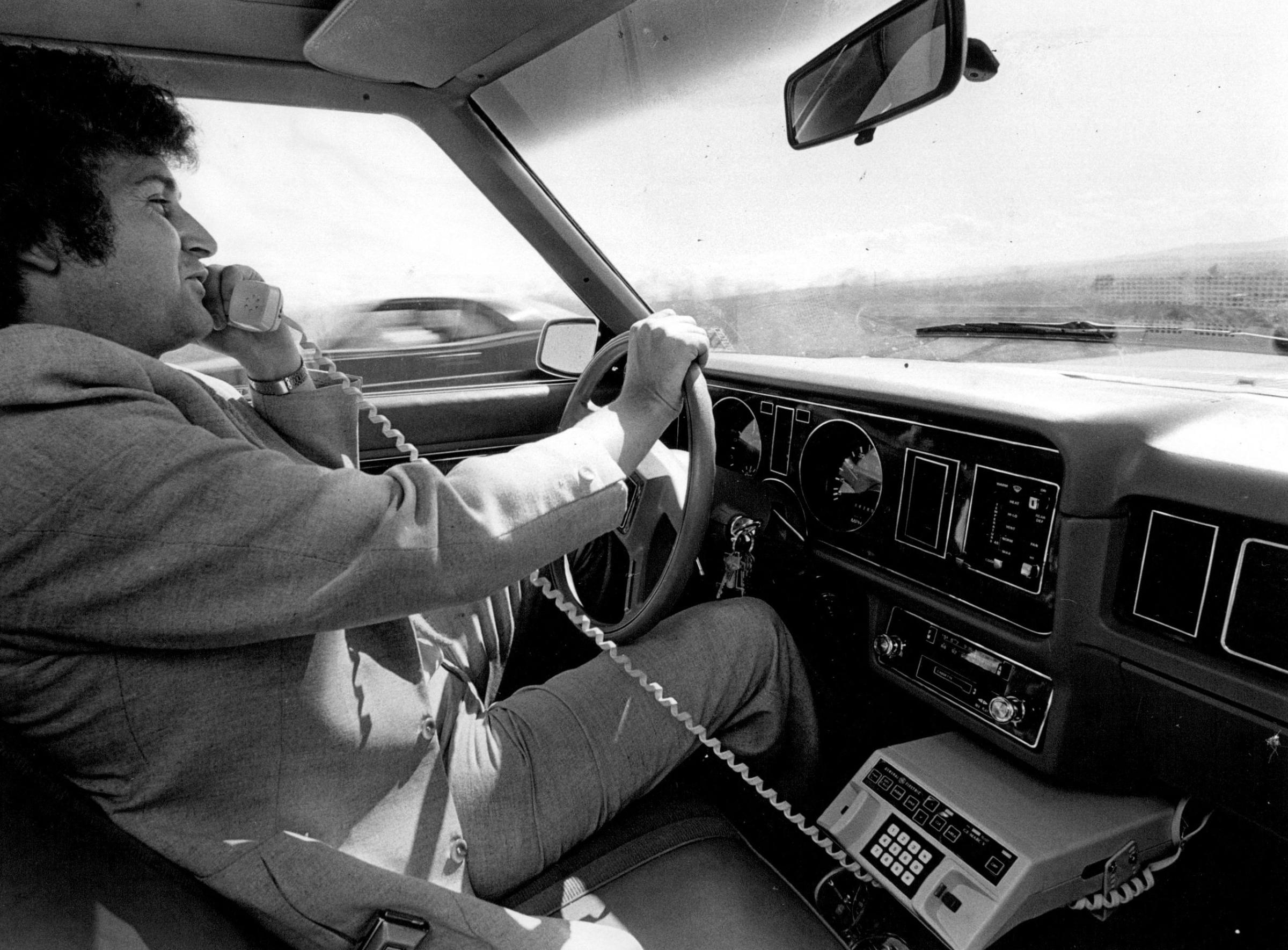
PHOTOS: The Rise of Mobile Phones from 1916 to Today





Read next: How to Slash Your Cell Phone Bill in 7 Minutes or Less
Listen to the most important stories of the day.
More Must-Reads from TIME
- Cybersecurity Experts Are Sounding the Alarm on DOGE
- Meet the 2025 Women of the Year
- The Harsh Truth About Disability Inclusion
- Why Do More Young Adults Have Cancer?
- Colman Domingo Leads With Radical Love
- How to Get Better at Doing Things Alone
- Michelle Zauner Stares Down the Darkness
Contact us at letters@time.com


