Whether through digital channels, print or on exhibit, the impact, influence and reach of the still image has never been greater. But with so many images fighting for our attention, how do photographers make work that most effectively stands out and connects with an audience. In this seven-part series, TIME looks back over the past 12 months to identify some of the ways of seeing—whether conceptually, aesthetically or through dissemination—that have grabbed our attention and been influential in maintaining photography’s relevance in an ever shifting environment, media landscape, and culture now ruled by images.
Books Within Books Publications and Presentation
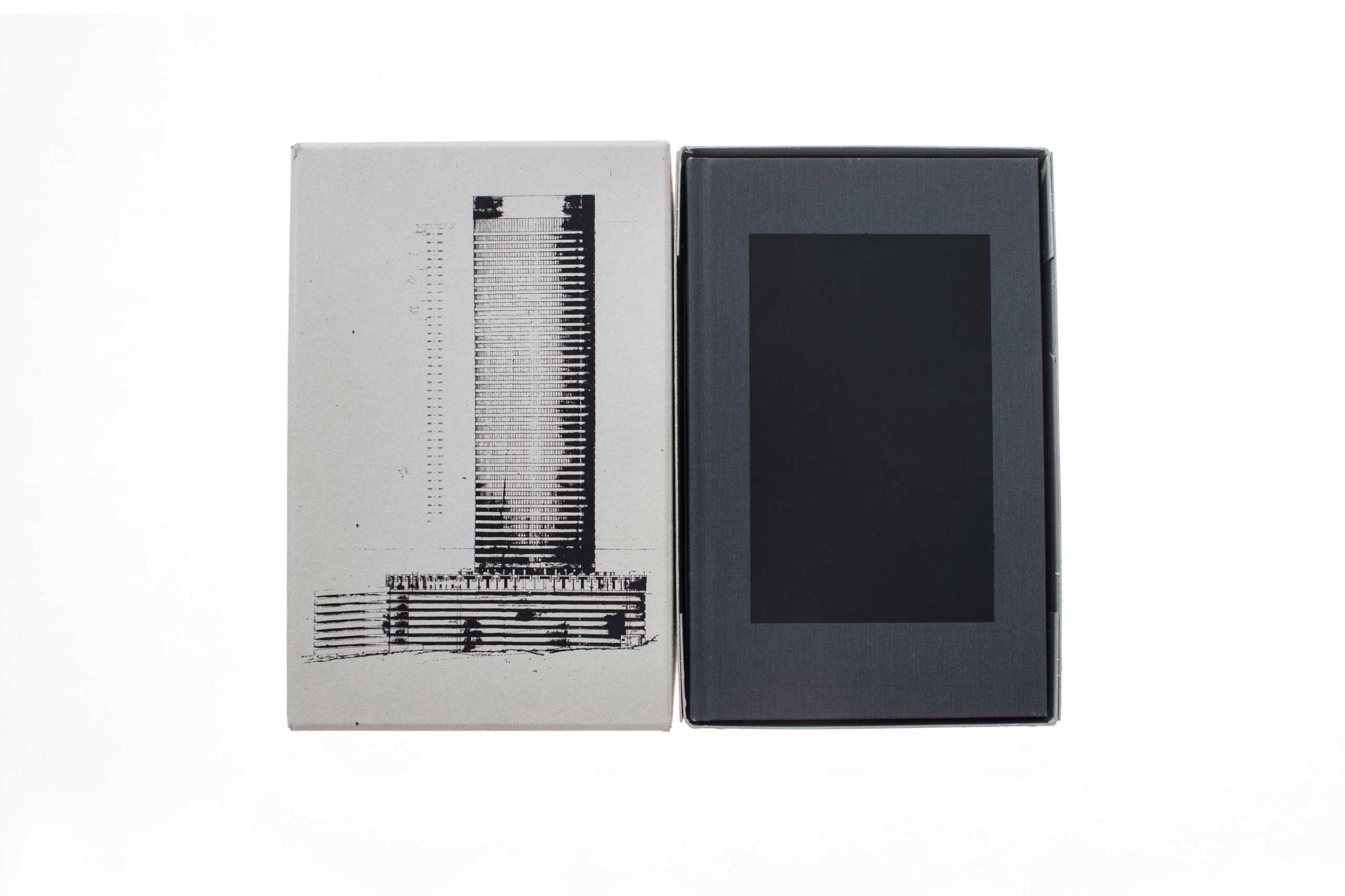
Books come in all shapes and sizes but their design aesthetics are often dictated by the latest trends. This year, we saw countless cloth-bound books with tipped in images—Peter van Agtmael’s Disco Night Sept. 11, Dan Budnik Marching to the Freedom Dream were among them—as well as books in cardboard boxes; Congo by Paolo Pellegrin and Alex Majoli or Ponte City by Mikhael Subotzky and Patrick Waterhouse to name just two.
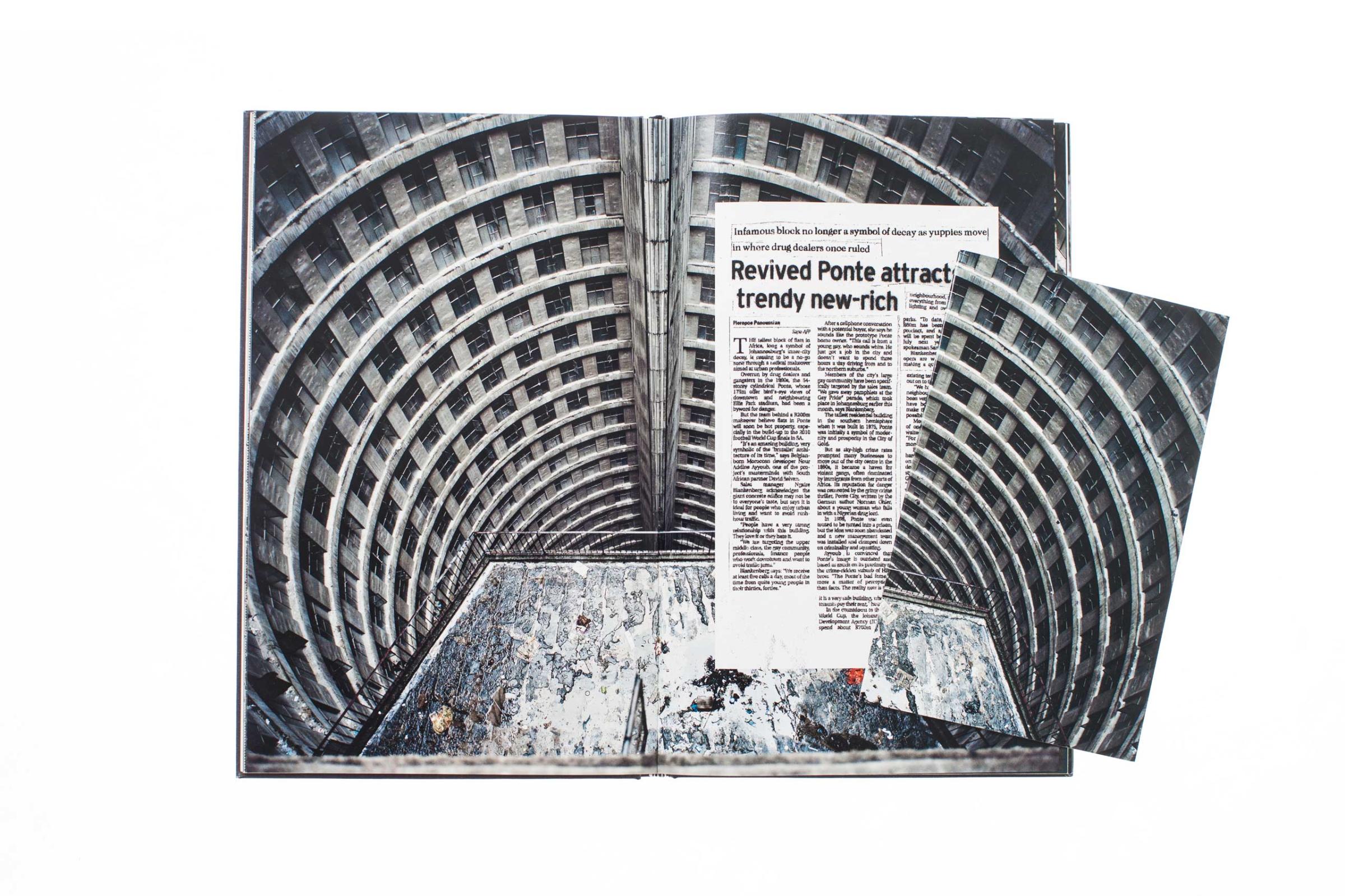
There was also a penchant for small photobooks from Does Yellow Run Forever?, Waters of Our Time and War Porn. And another iteration on the small book was used to good effect this year. The aforementioned Ponte City was the most elaborate example of this year’s most interesting publishing concept—a book within a book.
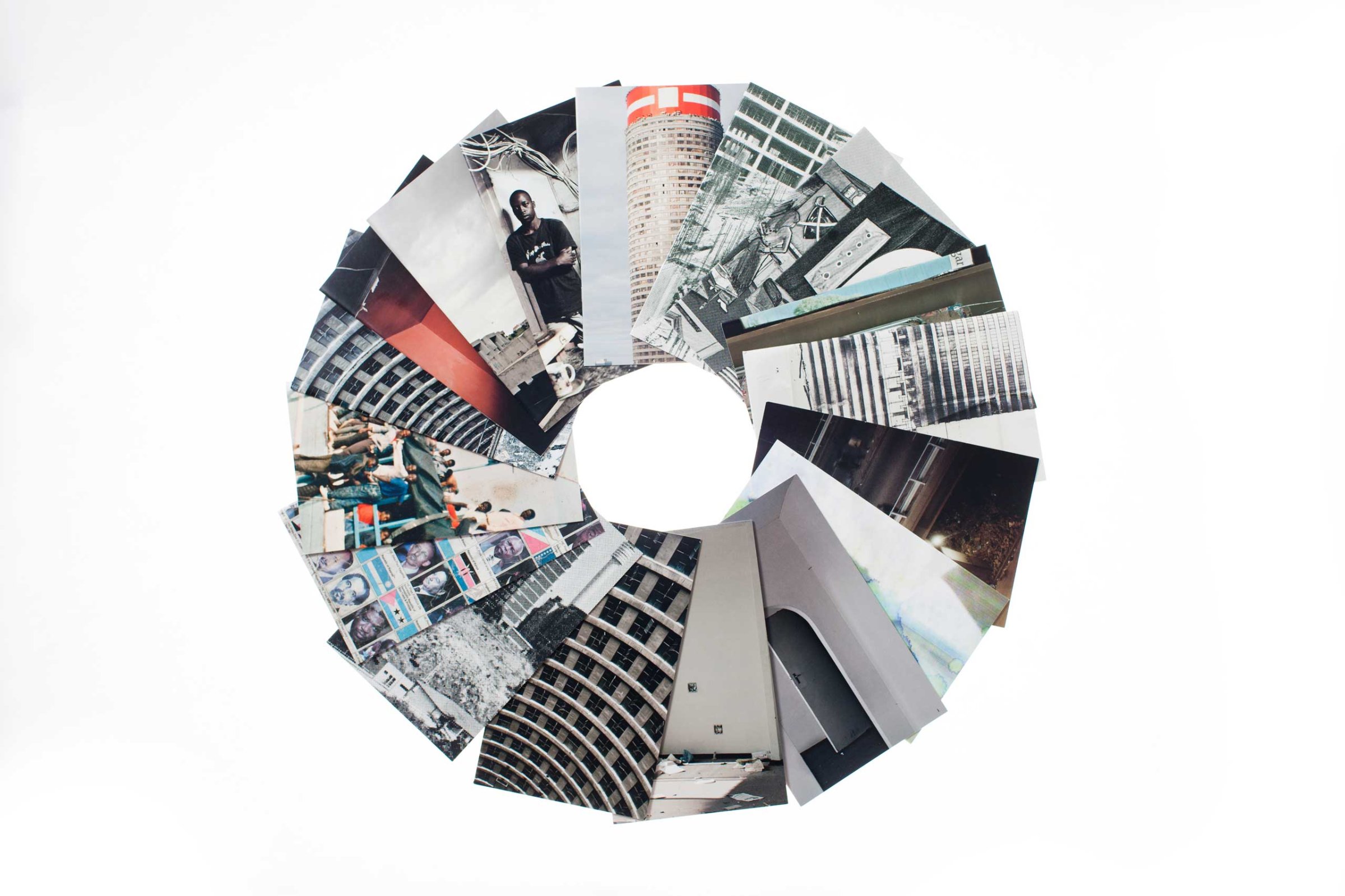
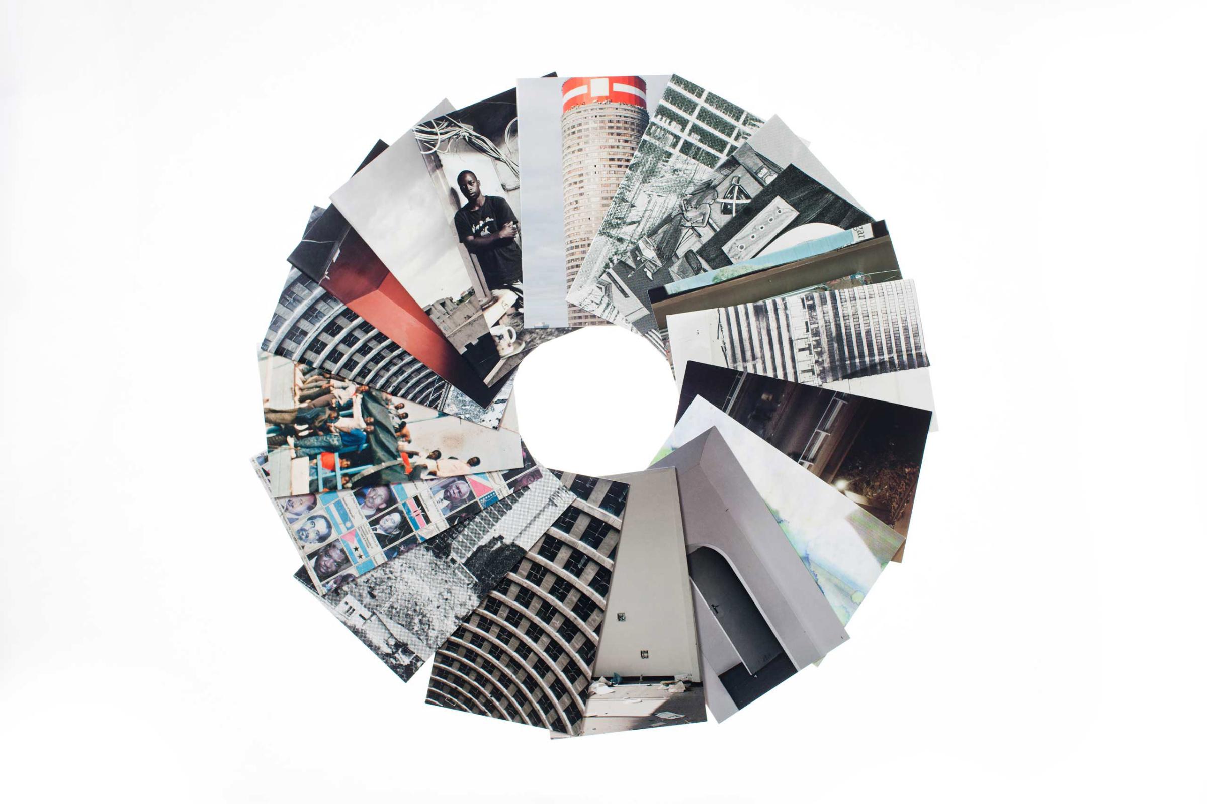
Ponte City documents the checkered history of Africa’s tallest residential high-rise through an array of photographic materials and texts —including the artists’ photographs of the building, its inhabitants, found ephemera, and archival publicity materials—within a hardbound volume and a series of 17 small individual saddle-stitched paperback supplementary booklets designed to be inserted by the reader—and to expound on specific content—at various points in the main hardbound edition.
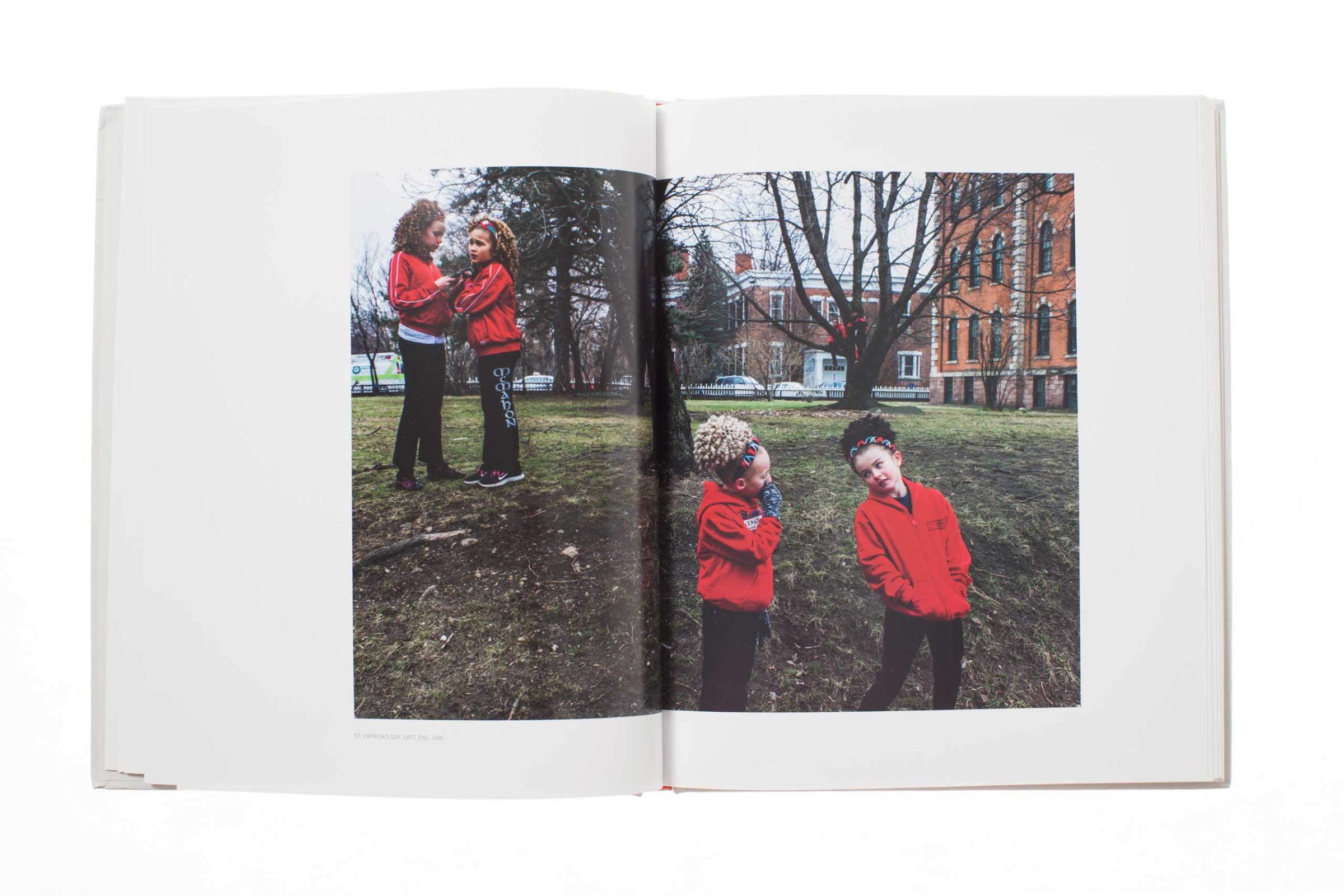
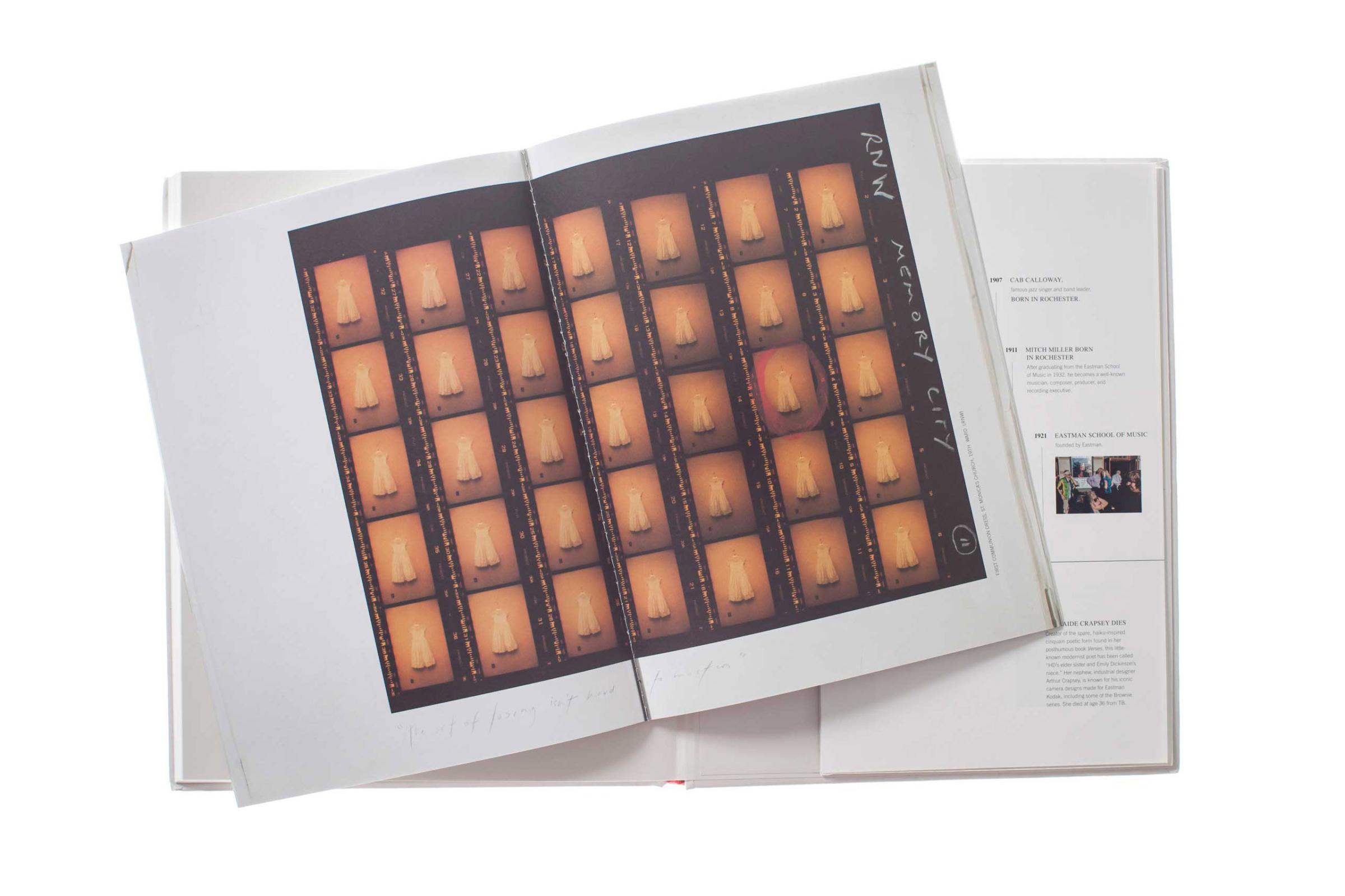
Two books published by Radius this year followed this principle and included a companion edition to the main volume: Alex Webb and Rebecca Norris Webb‘s collaboration Memory City—a plaintive look at Kodak’s 125-year home, Rochester—intertwines work by the two photographers in the main book, with a smaller accompanying booklet again mixing imagery from both photographers along with writing about the region.
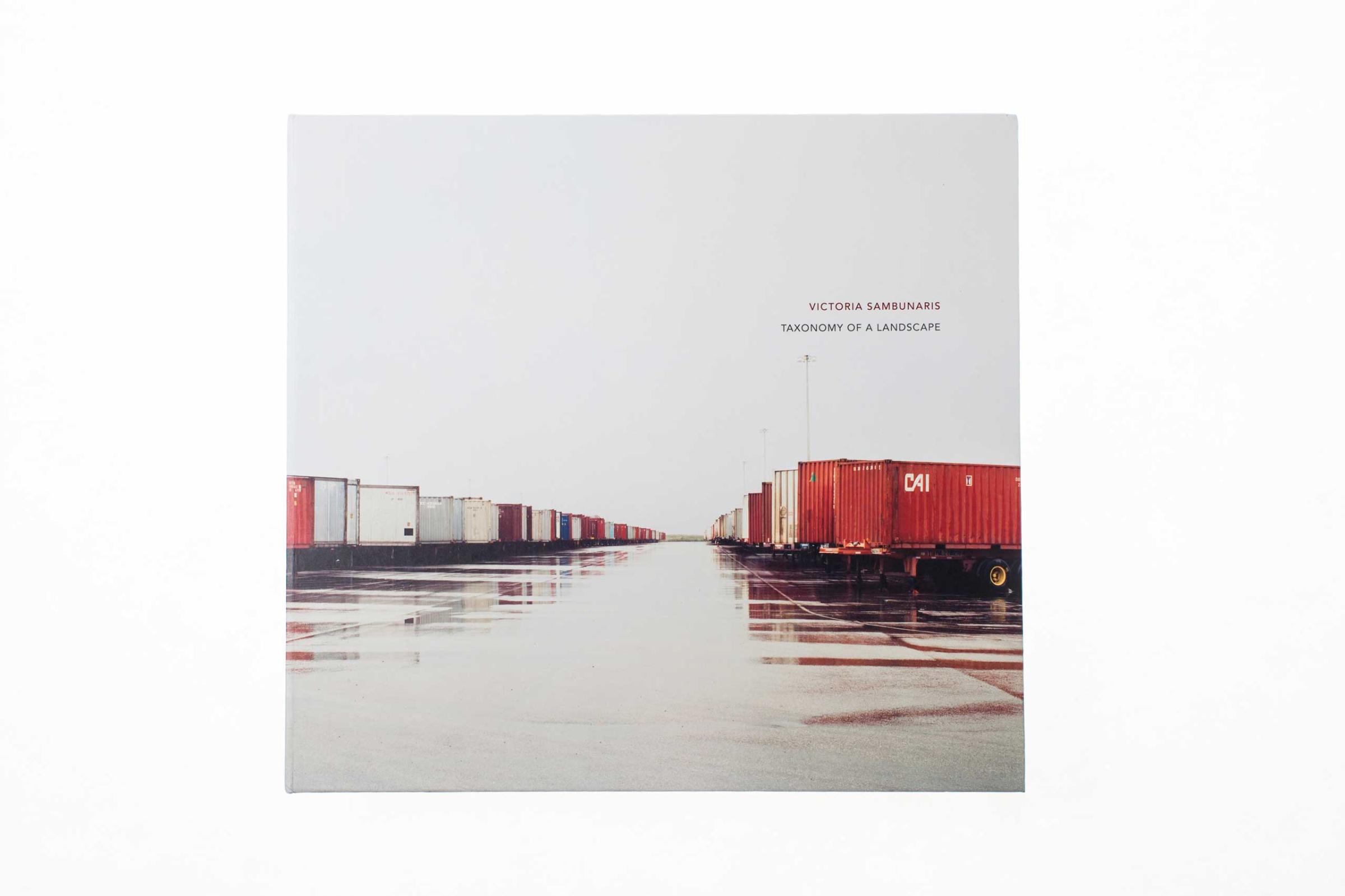
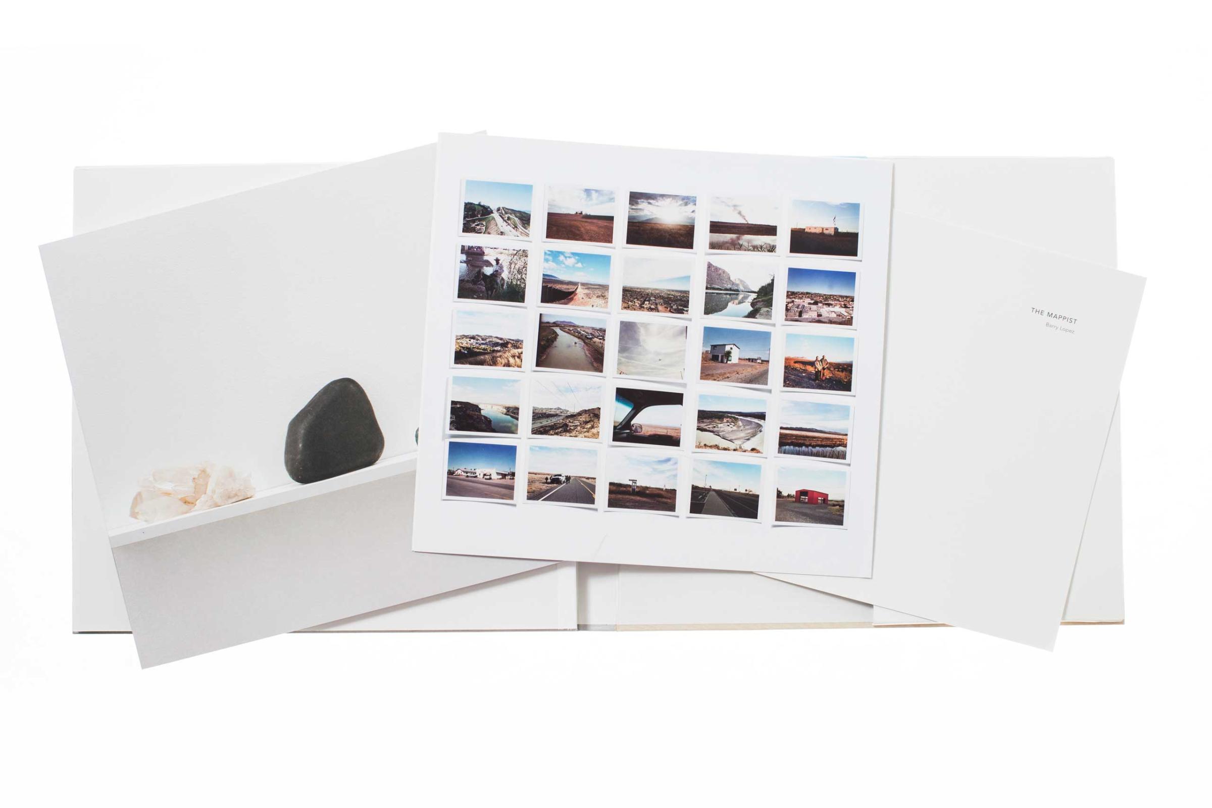
Victoria Sambunaris‘ Topology of a Landscape augmented her main book’s stunning landscape photography with three supporting pieces—a booklet of personal ephemera (note books, maps and objects taken and collected on the road) a small text leaflet and a fold out of Polaroid images.
In each case the additional booklets allow not only for a distinct separation and organization of content but for a cleaner more focused photo-centric experience befitting of the photographic work in the main publication, while affording the reader the opportunity to gain more insight and context through the text and additional imagery contained in these supporting materials.
Read Part 1 – Direct to Audience.
Read Part 2 – Documentary Still Life.
Read Part 3 – The Portrait Series.
Read Part 4 – The Contemporary Photo Essay.
Read Part 5 – From Stills to Motion.
Phil Bicker is a Senior Photo Editor at TIME


More Must-Reads from TIME
- Donald Trump Is TIME's 2024 Person of the Year
- Why We Chose Trump as Person of the Year
- Is Intermittent Fasting Good or Bad for You?
- The 100 Must-Read Books of 2024
- The 20 Best Christmas TV Episodes
- Column: If Optimism Feels Ridiculous Now, Try Hope
- The Future of Climate Action Is Trade Policy
- Merle Bombardieri Is Helping People Make the Baby Decision
Contact us at letters@time.com