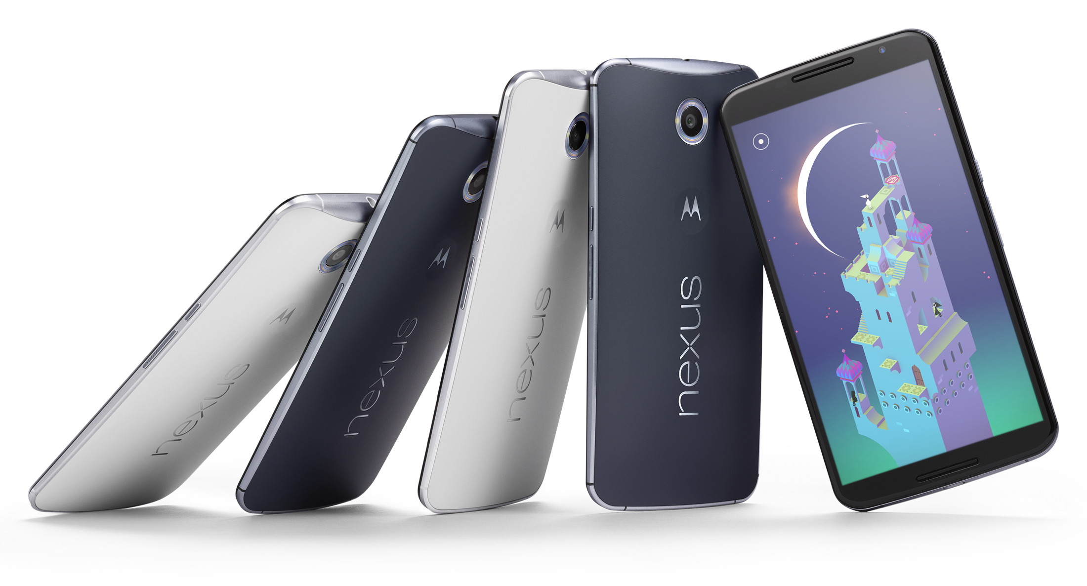
This hands-on originally appeared on Trusted Reviews.
In recent years, Google’s Nexus smartphone line has become synonymous with high-end functionality and great value for money. The Nexus 6, however, is something of a curve ball, and a massive one at that.
It’s a phone brimmed with high-end components – a 2.7GHz quad-core Snapdragon 805 processor, QHD display – but one which has overlooked mass market appeal in favor of a phablet dwarfing 6-inch form factor. As the phone’s size has gone up, so too has its price. The handset will set you back $649 or $699 depending on your choice of internal storage – 32GB or 64GB.
Nexus 6: Design
There is no getting away from it, the Nexus 6 is huge. At 159.3mm tall, 83mm wide and 10.1mm thick it dwarfs flagship phones such as the Galaxy S5 and LG G3. Although it features an overall footprint not much larger than the iPhone 6 Plus or the Samsung Galaxy Note 4, it doesn’t carry its size as well as either rival.
I found the phone to feel bulky and cumbersome from the start. Its considerable 184g weight is distributed well across the phone’s sizeable form, but unlike some overweight handsets, the Nexus 6 does little to hide its size. It’s wider than the 6 Plus, less graceful than the Note 4 and fatter than both — it’s an awkward, gangly teenager of a handset.
Visually, the Nexus 6 is basically an oversized Moto X. It’s not ugly phone, but it lacks the refined simplicity of the Nexus 5 and certainly can’t match the iPhone 6 Plus or Note 4. The two-tone colour scheme is easy on the eye and the metallic blue edges give the phone an air of elegance, but this is overshadowed by the phone’s cheap-looking – and feeling – plastic back.
Further highlighting the Nexus 6’s awkward design are the phone’s physical buttons – a power key and separate volume rocker. Both feel dwarfed by the handset’s overall size. They are well located in the centre of the phone’s right-hand edge, but are small and fiddly to operate.
Nexus 6: Screen
As with the phone’s overall look and feel, the Nexus 6’s screen fell slightly short of expectation on first use. While the handset’s 5.96-inch, 2560 x 1440 pixel QHD panel is sufficiently sharp and detailed, it lacks the pop and vibrancy of either the Note 4 or 6 Plus.
Unusually for an AMOLED panel, I found the Nexus 6’s colour range to be a little subdued. Hues aren’t exactly muted but neither do they wow. This ran throughout all elements of the Nexus 6 from the new Material OS design to web pages and the image viewer.
Where visuals were slightly off, the screen’s touch capabilities and performance were on point. Screen transitions were smooth, swipe gestures fluid and all multi-finger commands handled with ease. Brightness levels are also hard to fault. The phone’s screen adjusted elegantly to bouts of direct sunlight and periods in a shadowy corner.
We’ll need more time with the Nexus 6 to judge the screen definitively, but it doesn’t wow as much as the raw size and resolution suggest…
For the full Google Nexus 6 Hands-On, please visit TrustedReviews.com.
See more from Trusted Reviews:
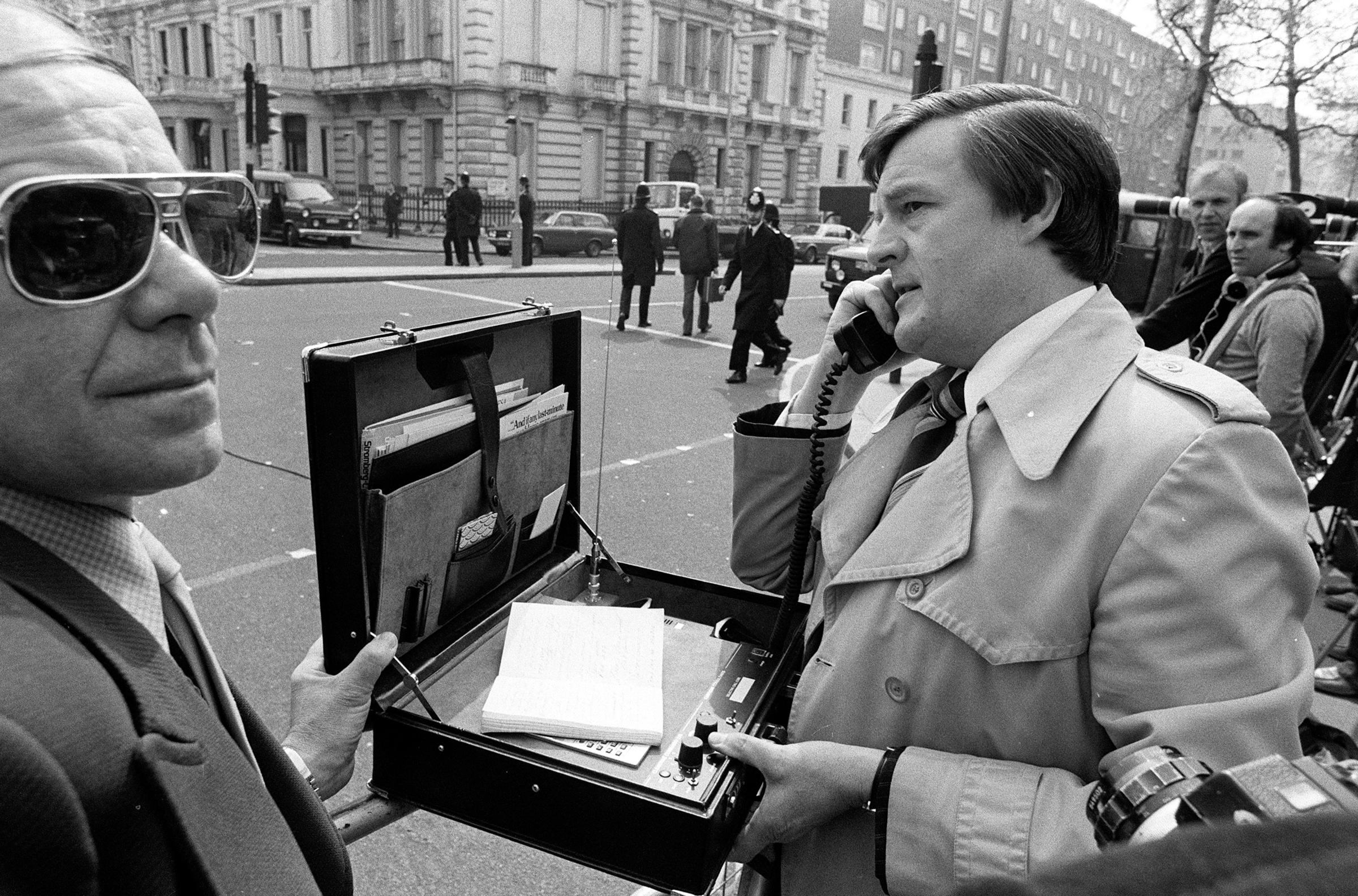
PHOTOS: The Rise of Mobile Phones from 1916 to Today








More Must-Reads from TIME
- Cybersecurity Experts Are Sounding the Alarm on DOGE
- Meet the 2025 Women of the Year
- The Harsh Truth About Disability Inclusion
- Why Do More Young Adults Have Cancer?
- Colman Domingo Leads With Radical Love
- How to Get Better at Doing Things Alone
- Michelle Zauner Stares Down the Darkness
Contact us at letters@time.com