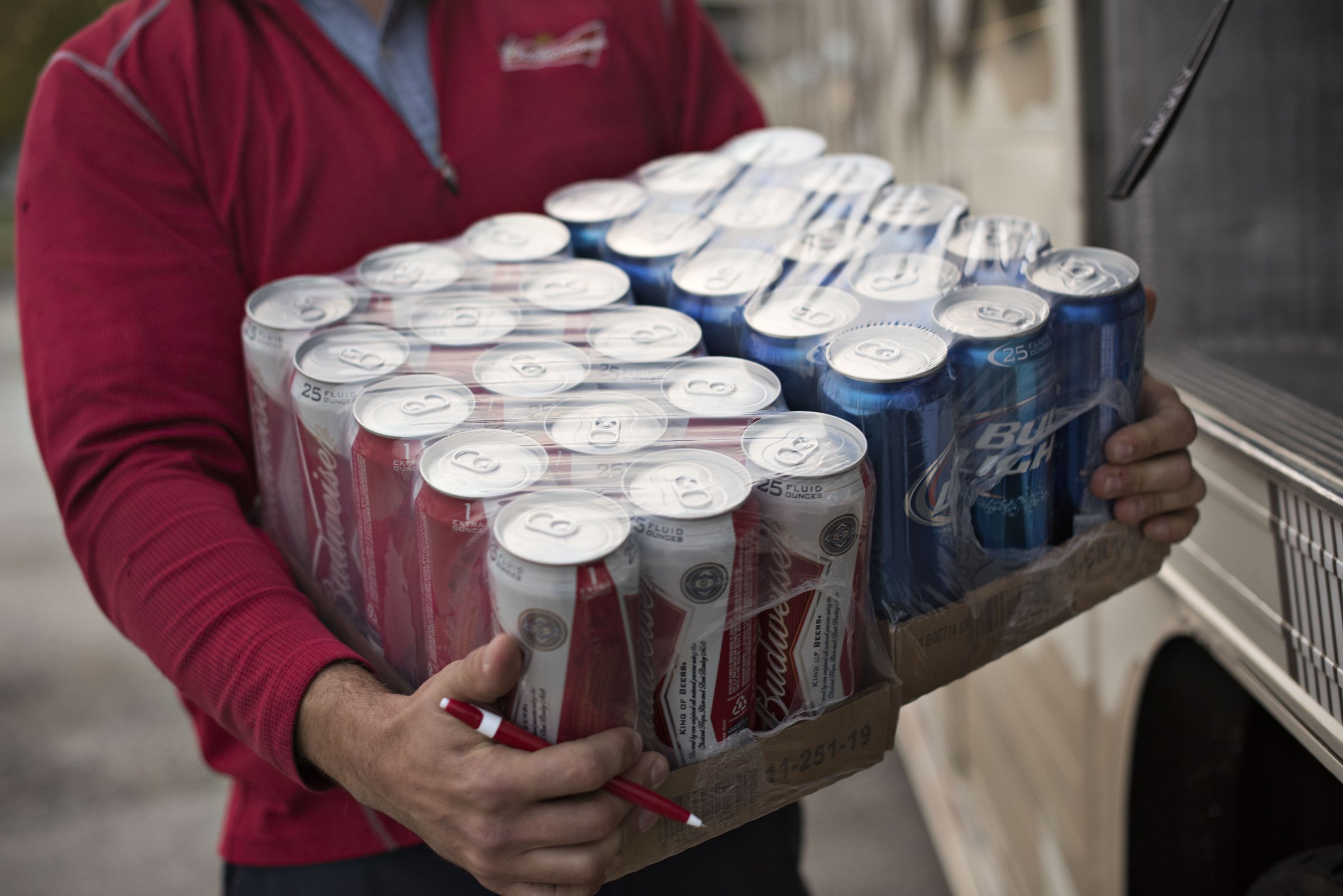
If the price of your pints seems steeper than it did a year ago, you might be on to something.
Depending on where you live, the price of alcoholic beverages was increasing faster than the rate of inflation heading into this fall season. This rate of increase is according to Consumer Price Index (CPI-U) data for all urban consumers released periodically by the U.S. Bureau of Labor Statistics.
This first chart shows how fast alcohol prices increased or decreased when it comes to alcoholic beverages alone:
2014 Consumer Price Index – Alcoholic Beverages | FindTheBest
Note that we are using only eight months of 2014 data in the above chart to compare against the 2013 yearly index average for each area.*
To better understand these numbers at scale, consider for a moment the all-items CPI-U basket, a weighted average of expenditures across all consumer goods and services. It’s the most common measure of inflation in the U.S. Throughout the year, the BLS publishes U.S. city average index values as well as more granular metropolitan index values. You’ll often hear about the inflation rate. Specifically, this number tells us how fast the index value for all the items in the CPI-U index is increasing for a given timeframe. As of August 2014, that number was averaging 1.65%, up from last year’s total average of 1.46%:
2014 Consumer Price Index – Cities | FindTheBest
In nine of the 25 metro areas considered, the price of alcohol outpaced the ongoing 2014 rate of inflation. Naturally, these were areas in which the price of alcohol was increasing the fastest.
The fact that alcohol prices were increasing the fastest in the San Francisco Bay Area is not necessarily an indication that the Bay Area’s alcohol is the most expensive in the nation. Because a CPI measures how fast prices change in one area over time, it can’t be used to compare prices across cities. Increases or decreases, however, can be compared across geographic areas over time.
If you’re wondering about specific alcoholic beverages, it’s mostly beside the point. For those living in an area where the price of alcohol was increasing faster than inflation, drinks this weekend really might be a little more expensive.
*In FindTheBest’s CPI comparison topic, we use the yearly average of monthly index values. Using the yearly average smoothes out the potential volatility of year-over-year comparisons because it incorporates more data points. So measuring against the 2013 yearly index average for each area, the chart shows the percent change from that 2013 yearly index average to the end of August 2014. The August to-date average covers eight months of BLS data, though indexes for most metro areas are released on an odd/even basis or else a semiannual one.
This article was written for TIME by Ryan Chiles of FindTheBest. More from FindTheBest:
The 15 Richest Members of Congress
More Must-Reads from TIME
- Inside Elon Musk’s War on Washington
- Meet the 2025 Women of the Year
- Why Do More Young Adults Have Cancer?
- Colman Domingo Leads With Radical Love
- 11 New Books to Read in Februar
- How to Get Better at Doing Things Alone
- Cecily Strong on Goober the Clown
- Column: The Rise of America’s Broligarchy
Contact us at letters@time.com