
The language that journalists use tells us a lot more than what happened today—there is also a subtext about which topics people want to read about, who is considered noteworthy. Changes in that subtext over time reflect changes in our perception of the world.
A notion like that might sound all nebulous and soppy without hard numbers to back it up. Luckily, we have something even better than numbers: colorful charts! On Wednesday, the New York Times made public a tool that their editors have been hoarding among themselves since 2012. Called Chronicle, the machine allows users to search for and compare how often certain terms have appeared in their coverage between about 1850 and 2012.
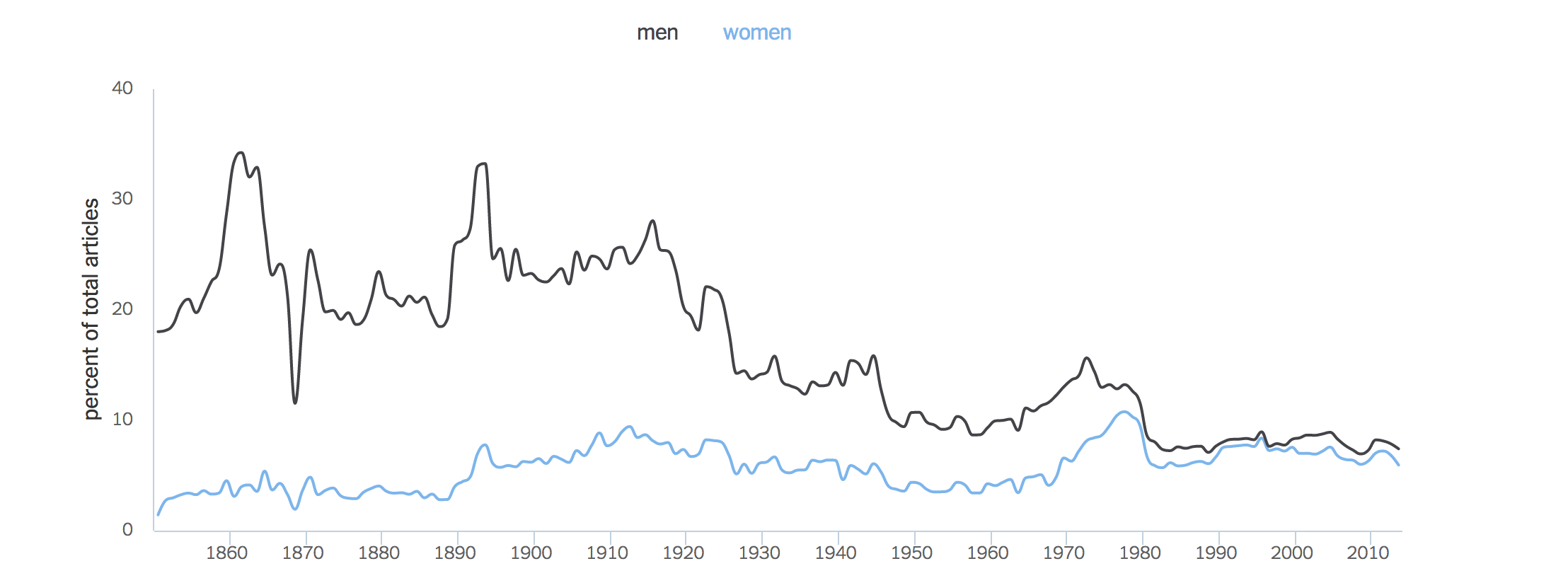
Take, for instance, this telling demonstration of how much that media outlet has valued news related to women, compared to men, over time:
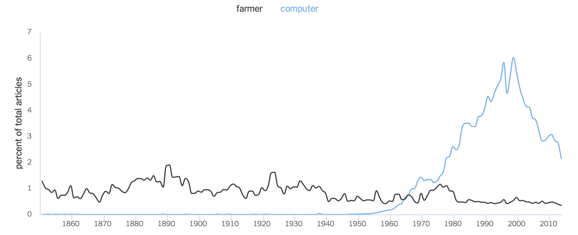
Or take a gander at the amount of times writers have felt need to use the word computer, as opposed to farmer:
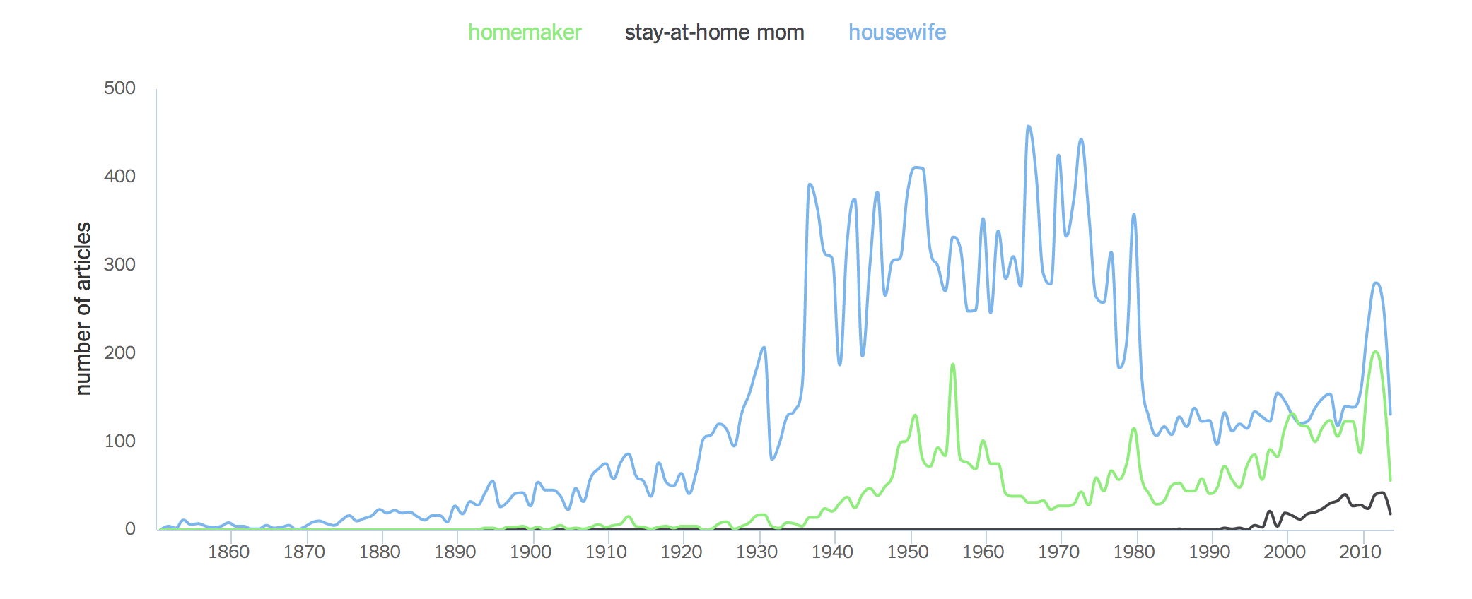
Consider a concept like a mother or woman who is married and does not work. The way we’ve referred to this class of people, responding to insinuations of value or being de-valued, has also shifted:
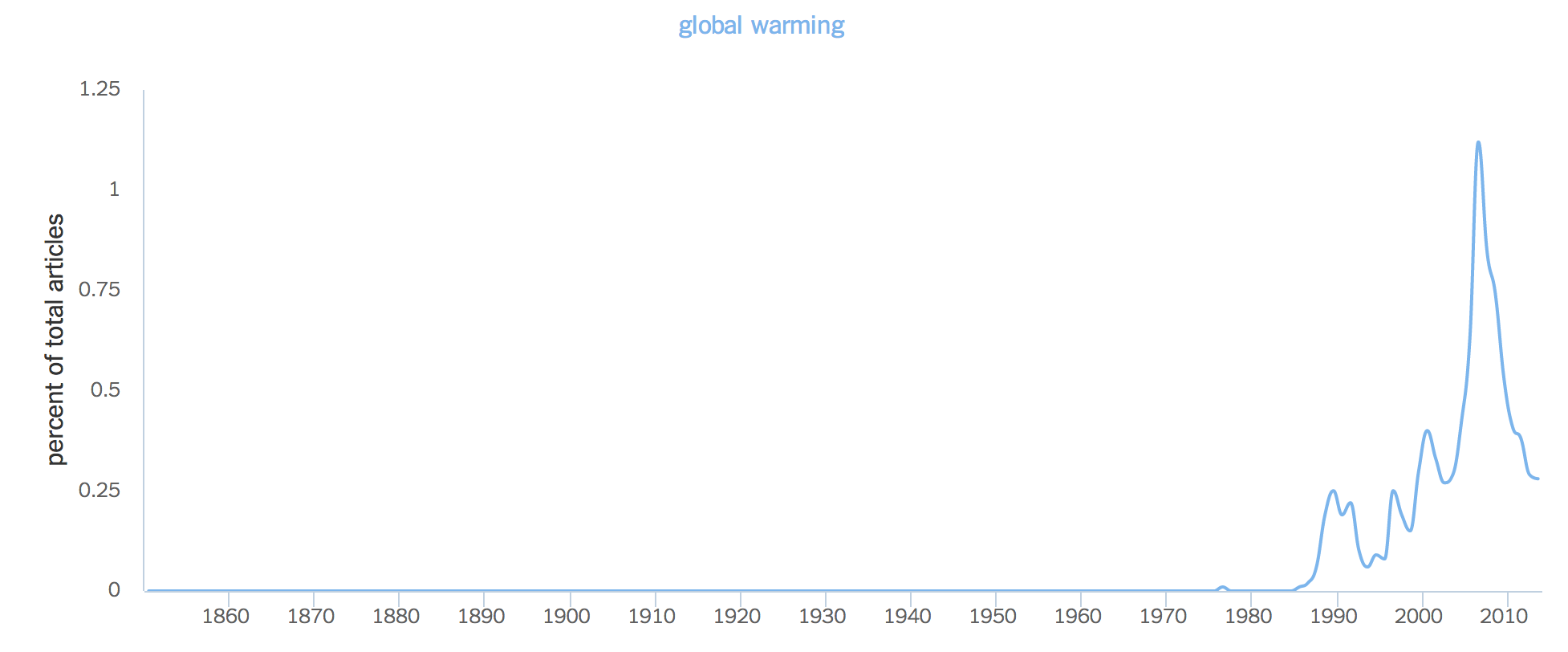
Then there are topics that we’ve come to care about that didn’t matter or didn’t even exist as concepts in previous decades, some related to the environment:
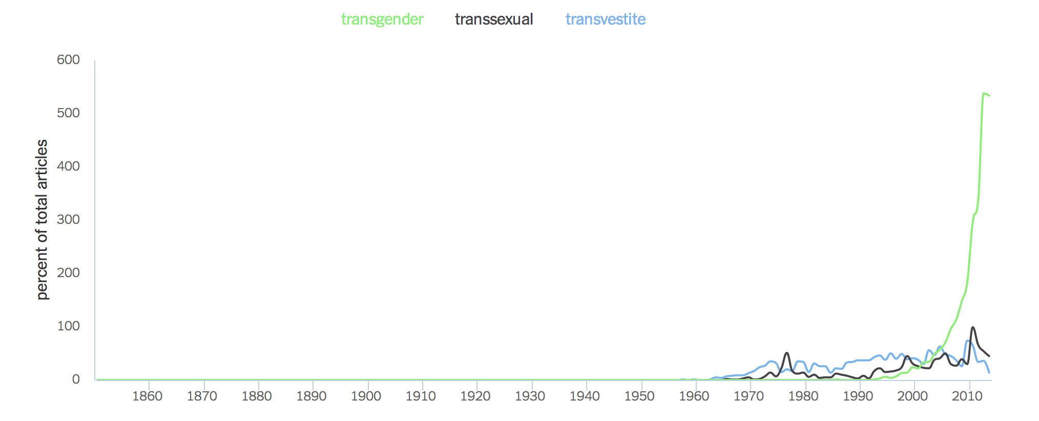
Some related to gender:
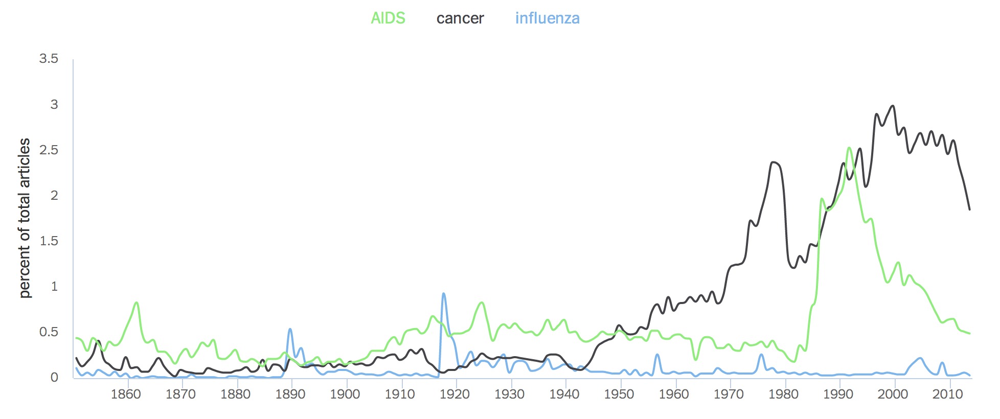
Some related to disease:
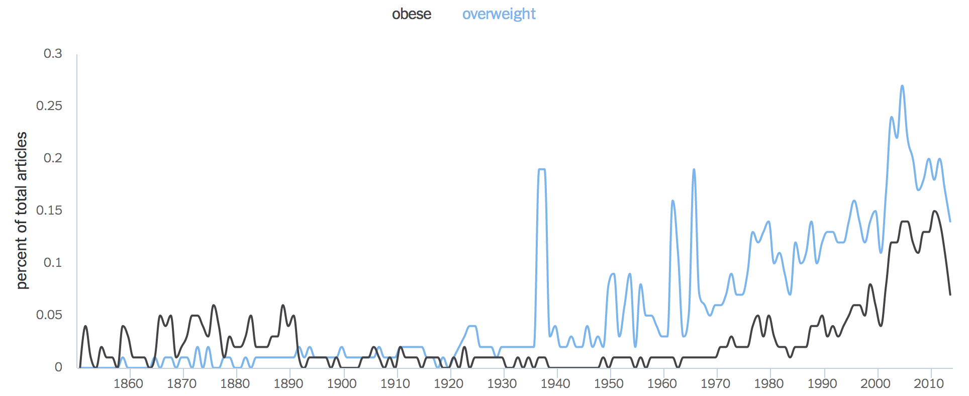
Some related to our bodies:
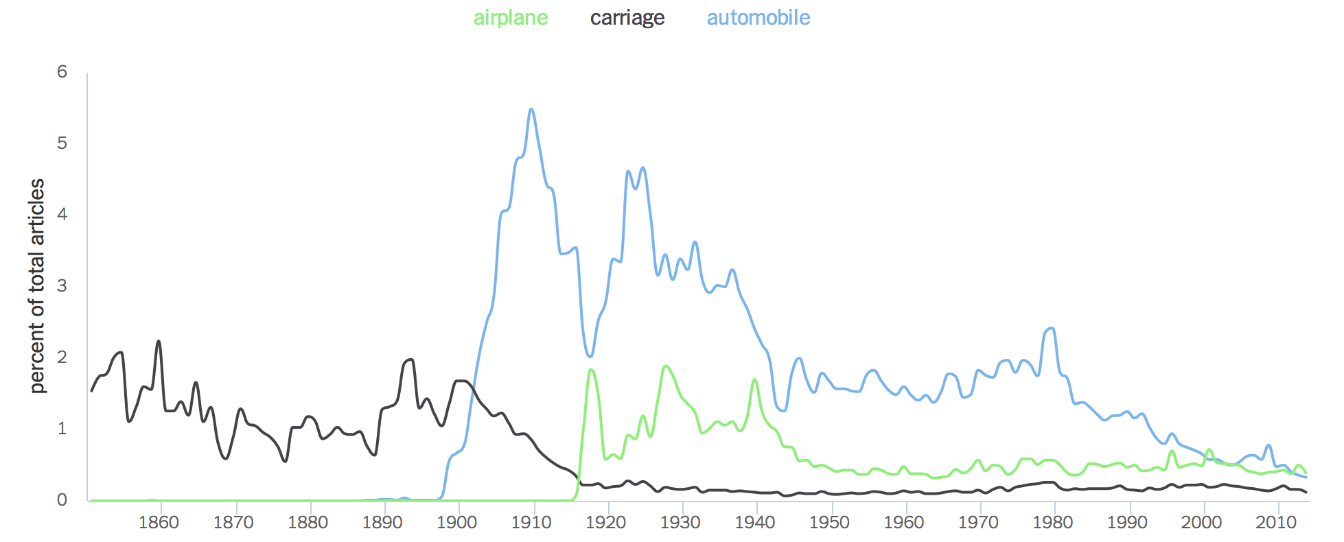
And some related to how we transport those bodies:
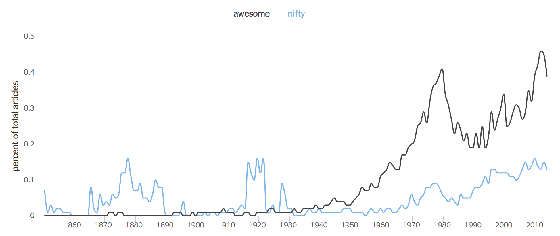
The charts can tell us about how slang has evolved:
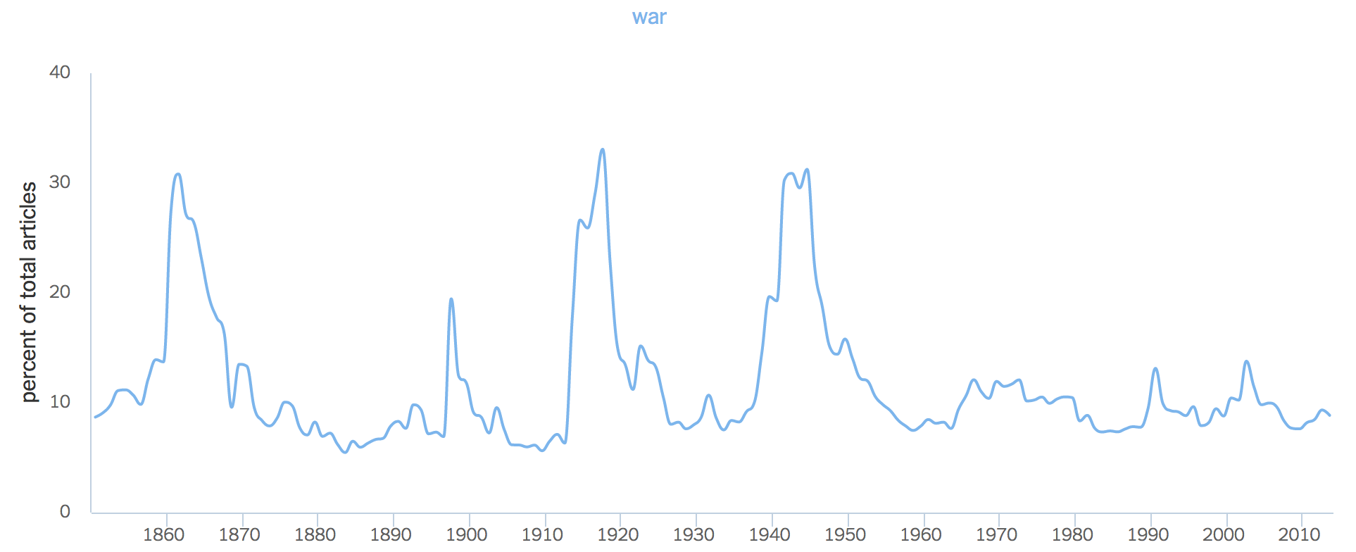
And what conflicts we’ve lived through, as well as how much relative attention we paid to them:
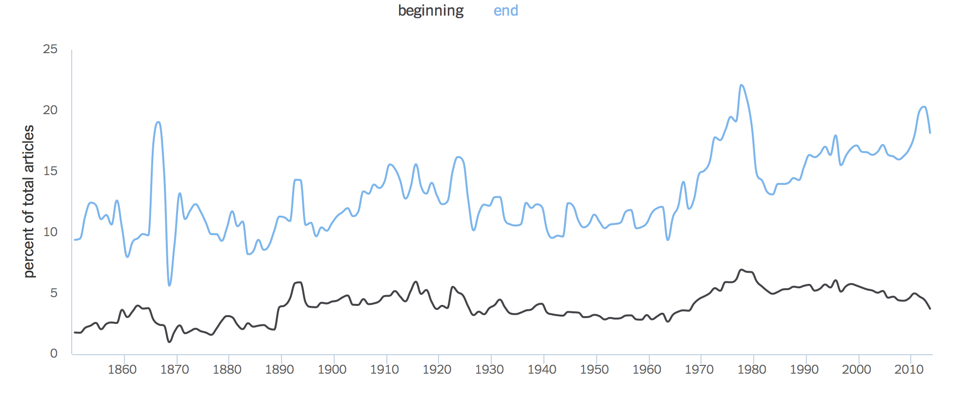
You can even ask the machine philosophical questions, like whether people tend to care more when something starts or finishes. The answer might not be definitive, but you will at least find yourself presented with a lovely new visual aid:
This is an edition of Wednesday Words, a weekly feature on language. For the previous post, click here.
More Must-Reads From TIME
- The 100 Most Influential People of 2024
- How Far Trump Would Go
- Scenes From Pro-Palestinian Encampments Across U.S. Universities
- Saving Seconds Is Better Than Hours
- Why Your Breakfast Should Start with a Vegetable
- 6 Compliments That Land Every Time
- Welcome to the Golden Age of Ryan Gosling
- Want Weekly Recs on What to Watch, Read, and More? Sign Up for Worth Your Time
Contact us at letters@time.com