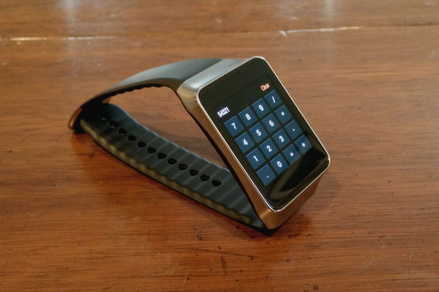
If you want an example of everything wrong with smartwatch apps right now, just look at all the Android Wear calculators.
I currently count four calculator apps for Google’s wearable platform, and they’re all useless. You need pinpoint touch precision to enter each number, and none of the apps include a backspace key for when you inevitably mistype something. Using a calculator app on your phone would be faster and less frustrating.
These unnecessary calculator apps underscore the biggest challenge for Android Wear–and for that matter, all smartwatches–right now: Most people are happy to just take out their smartphones, so there’s little need for a watch that tries to do all the same things on a smaller screen.
For smartwatches to make sense, they need to go beyond what a phone can do on its own. That idea seems lost on developers who are creating weak imitations of existing smartphone apps, including games, drawing apps, flashlights and calendars.
Google has tried to discourage these kinds of apps, both in its documentation (“inputs requiring fine-grained motor skills are avoided”) and through Wear’s interface, which deliberately makes smartphone-like apps difficult to launch. But developers are undeterred. In fact, someone has even come out with a third-party app launcher for Wear that seems likely to encourage more bad behavior.
Even some of the highlighted Android Wear apps in the Google Play Store miss the point: Why would anyone want to browse Tinder on a smartwatch, when the smartphone version offers a better experience? How often are you really going to ask the Eat24 app for delivery when you can only get exactly what you’ve ordered in the past?
To make the case for smartwatches, developers need to think more critically about the apps they’re building. To that end, I think it might help to consider a few basic questions:
Android Wear does have a handful of apps that answer “yes” to one or more of these questions, and app makers should take inspiration from these good examples.
Last weekend, for instance, I played a round of golf with help from the Golfshot app. After using the smartphone app to select the course I was playing on, the watch provided a constant read-out of my distance from the hole. If I was any good at golf, this would have been tremendously helpful for deciding which club to use, as my phone was safely stowed away in my golf bag for the rest of the outing. (See question number one.) It’d be even better if the app let you enter a score at the end of each hole, but this is a fine start.
Delta’s Android app is another example of a wearable app done right. If you check into a flight on your phone, the watch provides up to date boarding information right on your wrist (question two) and presents your boarding pass to use at the gate (question three).
Similarly, Allthecooks’ Android Wear functions can save time by showing recipe instructions on your wrist. Having those instructions follow you around the kitchen makes a lot more sense than having to constantly look back to your phone or tablet for reference.
One of the big criticisms of smartwatches so far is that they only make life more complicated. They represent another device to carry, another screen to keep charged every night, another set of apps to deal with.
The thing that interests me about Android Wear is its potential to simplify, presenting information in a way that helps us think about our phones less often. That’s not going to happen if developers keep taking the easy path, turning Android Wear into another screen full of apps.
More Must-Reads from TIME
- Cybersecurity Experts Are Sounding the Alarm on DOGE
- Meet the 2025 Women of the Year
- The Harsh Truth About Disability Inclusion
- Why Do More Young Adults Have Cancer?
- Colman Domingo Leads With Radical Love
- How to Get Better at Doing Things Alone
- Michelle Zauner Stares Down the Darkness
Contact us at letters@time.com