
-
Chapstick
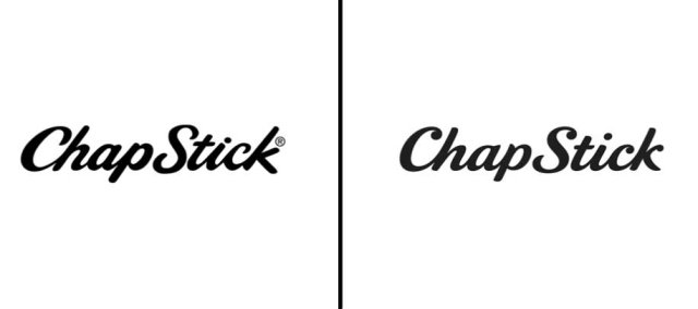
Chapstick Left: Previous Chap Stick logo; Right: Updated logo as of May, 2014. Chapstick very quietly and very subtly changed the font of its logo this May. Did you notice the difference?
-
PayPal
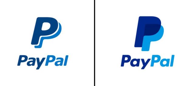
Paypal Left: Previous PayPal logo; Right: Updated logo as of May, 2014. It’s also relatively easy to miss the digital payment company’s May logo change. While the idea and color scheme is the same, PayPal decided to fully color in its two P’s.
-
Equinox
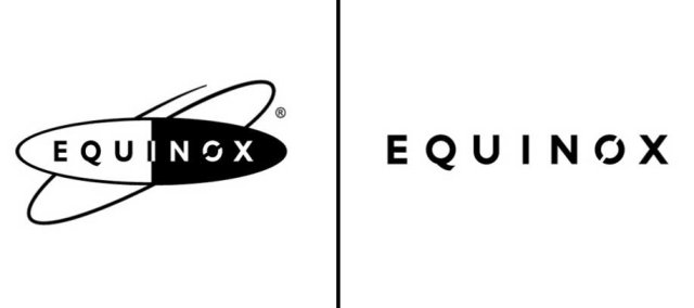
Equinox Left: Previous Equinox logo; Right: Updated logo as of June, 2014. Equinox’s ads are meant to shock. But the luxury gym’s new logo didn’t create a ruckus when it debuted in June. Equinox did away with the eclipse logo in favor of a sleeker look. According to a press release, the company “took a premium approach to typography and a clean, uncluttered layout, making the design look more sophisticated and contemporary.”
-
Morton Salt
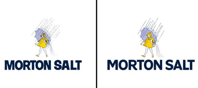
Morton Left: Previous Morton Salt logo; Right: Updated logo as of Jan. 2014. The iconic Morton Salt Girl has gone through a series of drastic changes since 1914. She has experimented with everything from new hairdos to new hemlines. For the first time since 1968, however, the salt company decided to have another go at her image by decreasing shadows and brightening her up a little.
-
Foursquare
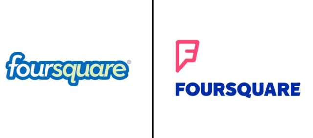
Foursquare Left: Previous Foursquare; Right: Updated logo as of July, 2014. In July, Foursquare unveiled a new logo that it hoped would send a strong message. “We designed it to be a mix of map pin and superhero emblem,” the search and discovery app wrote on its blog. “We’ve always thought of Foursquare as giving you superpowers to explore your city, and our new logo reflects that vision. It’s coming soon to a homescreen near you.”
-
Southwest Airlines
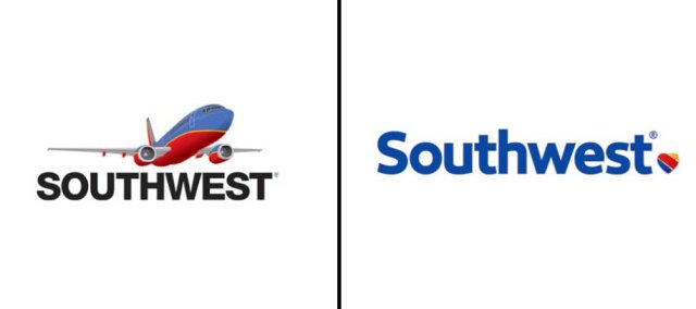
Southwest Left: Previous Southwest logo; Right: Updated logo as of Sept. 2014. Southwest Airlines decided to ditch the logo’s plane in September. Now, the company’s name — no longer written in upper case letters — is punctuated with a cute blue, red, and yellow heart.
-
Olive Garden
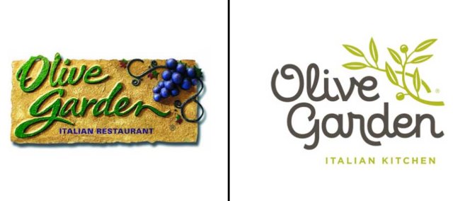
Olive Garden Left: Previous Olive Garden logo; Right: Updated logo as of March, 2014. The Italian chain majorly simplified its logo in March. Unfortunately, breadsticks were not included in the new design.
-
Hershey’s
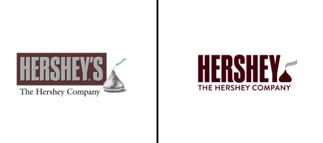
The Hershey Company Left: Previous Hershey's logo; Right: Updated Hershey logo as of Aug. 2014. The candy company changed its 3-D logo — complete with a realistic, silver Hershey’s Kisses brand chocolate — for a flatter look in April.
-
Airbnb
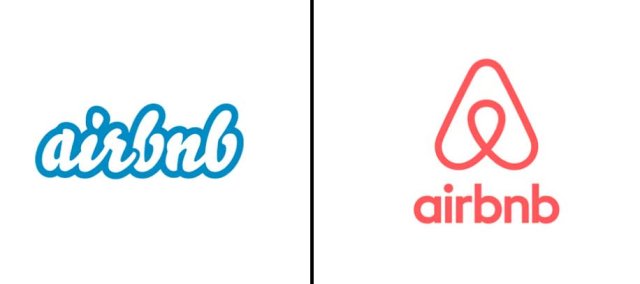
Airbnb Left: Previous airbnb logo; Right: Updated logo as of July, 2014. Airbnb changed its logo in July. Some complained that the rental service’s logo design “Bélo” — meant to represent “the universal symbol of belonging” — actually resembled sexual organs. “We weren’t aware to be honest,” founder Ben Wright told the BBC. “In the grand scheme of things, it doesn’t really bother us too much what people are saying about it.”
-
Pizza Hut
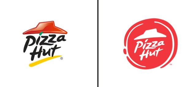
Pizza Hut Left: Previous Pizza Hut logo; Right: Updated logo as of Nov. 2014. During Pizza Hut’s November rebranding, the chain didn’t just add salted pretzel, toasted cheddar, curry and fiery red pepper crusts to its menu. Pizza Hut also adopted a new logo. The new look does away with black letters and contains the company name in a pizza-shaped red circle.