From Florida to U.S. Soccer
-
10. Uber
Uber’s logo refresh successfully aims for readability, with bolder lettering and less space in between characters. The new app icon, however, confusingly does away with the recognizable “U” design in favor of something that looks more like an old-school New York City subway token—certainly not what a 21st-century transportation startup wants to invoke.
-
9. Kodak
The Rochester, N.Y.-based Kodak has been hit hard by the shift from point-and-shoot cameras to smartphone photography, but it’s still kicking, now focused more on high-end graphics and commercial printing than making cameras. Its new modernized logo reflects optimism for brighter days ahead, with two beams of light — the “photo” in “photography” — styled to resemble a “K.”
-
8. AT&T
AT&T is making a big play to become more than a telecom giant, recently scooping up pay-TV provider DirecTV and media behemoth Time Warner. Along with those expanded ambitions came a subtly modernized logo, which ditches the company’s name in favor of a simple but refreshed version of its well-known blue globe.
-
7. Vevo
Vevo is home to a good chunk of the world’s music videos, with artists including Justin Bieber, Rihanna and Taylor Swift. Lots of Vevo views happen on YouTube, but in a quest to become more of a destination unto itself, the company this year rolled out a redesigned app and new logo, which gets rid of the italics tilt and gets hardened rather than rounded edges.
-
6. Tronc
The Tribune Publishing Company, owner of the Chicago Tribune, Baltimore Sun, Los Angeles Times and other newspapers, controversially renamed itself “tronc” over the summer, short for “Tribune Online Content.” The new logo, with its colorful, pixelated styling, matches the firm’s effort to be seen as a digital-first brand rather than a stodgy old newspaper company.
-
5. Pandora
Music-streaming service Pandora had a logo refresh this fall along with the launch of Pandora Plus, a subscription-based offering with offline listening and other features. The new logo goes lowercase from all-caps, with a lighter shade of blue, to boot. Can it help Pandora fight off well-financed rivals like Apple Music and Amazon?
-
4. Netflix
This one only gets partial credit, because the video-streaming company says it’s not entirely replacing its old logo. Instead, this new N is a refreshed icon that the company uses on social media and in other locations. But it’s a bold, eye-catching design, with a prominent cross-line and tightly spaced posts.
-
3. Instagram
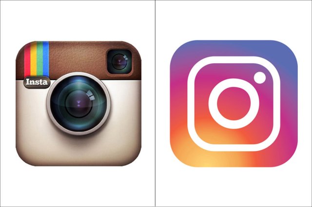
Instagram takes top honors for the wildest change, moving from a camera-style icon that honors the film shooters of yesteryear (Polaroid, mostly) to a highly stylized, purple-blue-yellow rainbow effect. It was a controversial change at launch, but it certainly helps the app stand out on your phone’s home screen.
-
2. Florida Panthers
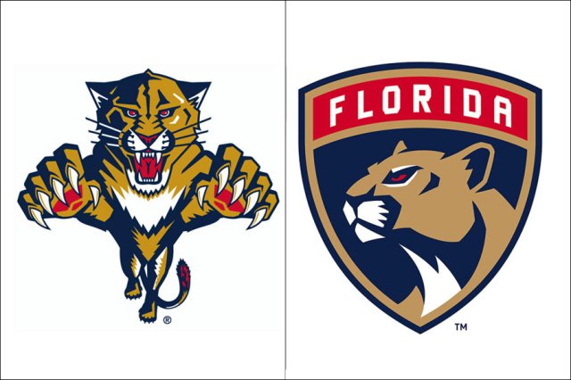
Should Florida, a state with no naturally occurring ice, even have hockey teams? We’re fine with it as long as we get logos like this, a classy shield-style design that’s a welcome update from the NHL team’s in-your-face panther of old. (Let’s not even discuss the palm tree-crossed-with-hockey-stick thing.)
-
1. U.S. Soccer
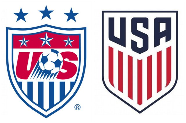
U.S. Soccer was in desperate need of a visual refresh, its former shield stuck in the design mentality of the early aughts. The new design was worth waiting for, a crisp and highly modernized logo that belongs on Captain America’s shield as much as it does a soccer kit.