When publicized far and wide enough, infographics, some experts argue, can save lives.
The communicative value in visualizing data towards improving public health outcomes is long-established, going back over two centuries. And while the earliest examples were intended to inform discussion and debate among an elite social sphere, they also sought to address real-world problems.
From 1820 to 1830, an enthusiasm for statistics began to emerge across the western world, leading to an era of statistics concerned with reform. It was led by individuals who sought to disrupt what they saw as the chaos of politics and replace it with a new apolitical regime of empirical, observed fact. This new approach would come to be seen as a field of action, as an applied science, providing empirical weight to the new, intellectually dominant spirit of political economy.
Following the creation of the General Register Office (GRO) in 1837, the first wave of statistical enthusiasm was applied to poverty and to the lived environment of the poor; the progressives who undertook these surveys did so in the legal context of the reforming acts of the early 1830s. Separate from (but at the same time, often socially or professionally connected to) the governments of this era, a network of liberal-minded, reforming individuals hailing from business and professional classes busied themselves in statistical pursuits. Within a few years, in the capital and in the major cities of the industrial north, a series of societies was founded, each bearing the imprint of their own members’ interests and concerns.
Health matters tended to dominate the concerns of the societies in part because health represented “a fundamental component of the well-being of the working classes,” as medical historian John Eyler writes in his book “Victorian Social Medicine,”; but also because data were comparatively easy to produce.
The emergence of these new societies coincided, in the 1840s, with a wider publishing revolution; new communications and printing technologies were making possible both increasingly affordable and improved-quality print publications, paving the way for early public health visualizations.
William Farr, regarded as one of the founders of medical statistics and epidemiology, started his career in medical journalism rather than in practice, which in turn helped him cement his reputation as an expert on vital statistics. In 1839 Farr joined the Statistical Society of London, remaining a core member until his retirement. A regular contributor to one of the world’s oldest medical journals, The Lancet, Farr combined sympathies for liberal reform with the demeanor of the professional statistician. Like many of his peers in the statistical societies of this era, he struggled to balance an ideological inclination toward self-help, with statistical findings that mitigated state intervention.
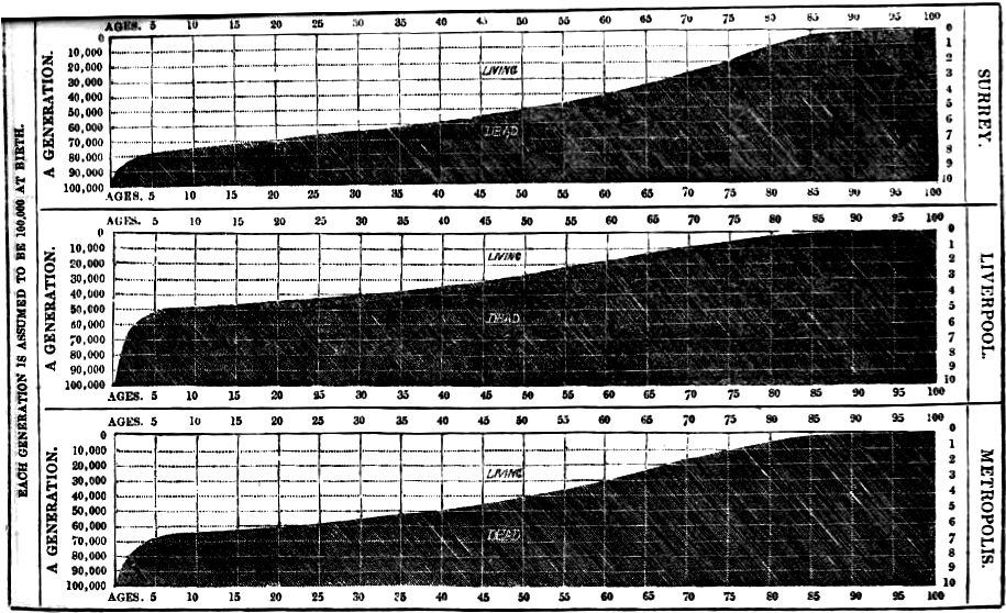
The GRO’s policies under Farr were anti-contagionist (in terms of medical outlook), and environmentalist (in terms of reform), writes the late sociologist and historian of science Alain Desrosières. Farr used graphics in his publications for the GRO, some of which, though certainly not innovative, had a striking impact. For example, in his summary report, published in the “Fifth Annual Report” (1843), three line graphs are used to juxtapose mortality rates between Surrey, Liverpool, and an average Metropolis, demonstrating wide variation in the laws of mortality across the distributions. The middle of these three charts, representing Liverpool, showed that half the children there died before the age of 6 — challenging previously held convictions of the time that the rapid growth of the city was proof that its environmental climate was healthy.
Another medical journalist who experimented with data visualization, John Snow, started his trade in London during the mid-1830s, having several papers published in The Lancet and the London Medical Gazette. “On the Mode of Transmission of Cholera” (1849) was published in the same year that Snow published articles about cholera in the Medical Gazette and Times. He proposed that the disease was carried in water supplies contaminated with diarrhea and that it passed via human contact and through contact with contaminated matter.
In his statistical maps, he used GRO data reports — “Weekly Return of Births and Deaths in London” — to map local incidences of the disease and to compare them with previous outbreaks. The centrality of Snow’s findings to medical cartography, geography, and epidemiology are long established in the literature — but a question remains as to why he failed to convince his contemporaries of the logical conclusion of his findings. Tom Koch, a clinical ethicist and the author of “Cartographies of Disease,” suggests Snow did not put forward a compelling general theory to substantiate his local findings — he refused to challenge the zymotic theory (the belief that infection was exclusively a consequence of airborne vapors), a theory promoted in the writings, diagrams, and maps of, among others, William Farr.
Through family ties, Florence Nightingale, a trailblazing statistician, social reformer, and nursing pioneer, became acquainted with many of the leading medical figures of the day, including Farr. Nightingale and Farr developed a mutually advantageous relationship based on shared goals, at least initially, in which he provided her with statistical advice, while she provided him with access to her politically influential contacts. When the Crimean War broke out in September 1854, The Times’ William Howard Russell sent back a series of damning reports from the front, causing great disquiet among its readers and the wider public, raising awareness of the army’s lack of preparedness, and poor medical management of the wounded. War Secretary Sidney Herbert was compelled to act, asking Nightingale to visit the army hospitals, in the Crimea, at government expense.
Just as Nightingale’s presence at Scutari Barracks hospital, Istanbul, had been precipitated by the press, so too her reputation was cultivated, as a consequence of favorable coverage in The Times that popularized her persona as “The Lady with the Lamp” who spent much of her time doting on convalescing soldiers. Although taking up what was primarily an administrative role, Nightingale paid regular visits to the wards, developing a strong affection among the soldiers, leading to her symbolic association with maternal caring.
After the war, in September 1856, Nightingale was invited to Balmoral to discuss her experiences and thoughts with Queen Victoria and Prince Albert, leading a few days later to an interview with Lord Panmure, who agreed to the setting up of a commission to investigate the shortcomings of the army’s medical infrastructure.
Nightingale’s “Notes on Matters Affecting the Health, Efficiency, and Hospital Administration of the British Army” (1858) was damning in its conclusions about the consequences of the deleterious sanitary conditions in the army hospitals of the Crimea; deaths from (mostly) preventable disease outnumbered deaths on the battlefield (or injuries accrued on the battlefield) by a factor of seven to one. For Nightingale, disease was a quality of the human condition, not something that may be isolated and treated in a particular context.
Nightingale had a natural flair for infographic design, or “statistical aesthetics,” to quote John Eyler, which she used to accentuate her work. She was as attuned to the persuasive power of data visualization as she was in her use of written rhetorical techniques. She thought her graphical forms had the power to speak both to the public and to the Queen; however, these forms were not discursively addressed to a wide-ranging, reading public — indeed some were only published, if at all, buried away in the appendixes of several-hundred-page-long government reports.
In March 1858, Nightingale developed a sophisticated media campaign, in order to maintain the political momentum of the commission’s findings and to ensure its recommendations were carried out. She identified a number of editors who could be enlisted in getting her message across, supplying their names to the commissioner (and close personal friend) Sydney Herbert. She focused her efforts on the “heavies” — the quarterlies and reviews whose editors garnered a higher degree of respect in polite society than any daily newspaper editor of the day could realistically hope for. Nightingale put together individualized “press packs” for each one of these contacts, comprising “outlines, the facts, even the headings for all articles”; though all were to be published anonymously.
Both Nightingale and Farr were concerned in their statistical investigations with uncovering natural laws about human behavior. If man could discover these laws, they reasoned, he might adapt society accordingly, in an act of progressive improvement.
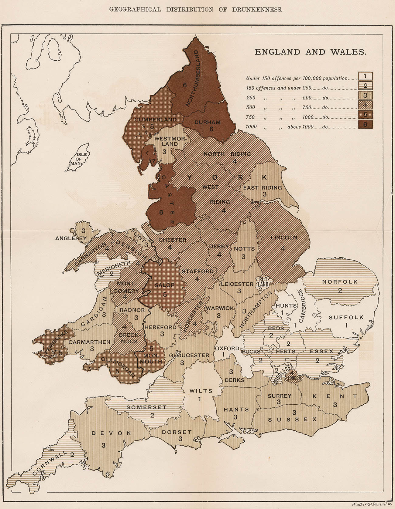
This deterministic (albeit not fatalistic) principle owes a debt to Adolphe Quetelet. In 1831, Quetelet published a map of property crimes in France, which was used to visually support his argument that, regardless of human agency, crime obeyed natural laws and increased in relation to increasing social inequality. Quetelet’s approach was empirical, experiential, and predicated on statistical inquiry. Later, his “Sur l’homme et le développement de ses facultés, ou Essai de physique sociale” (1835), the first work to apply statistical method to social problems, exerted a particularly strong influence over Nightingale. In this book she could perceive the intellectual culmination of a mind she thought keenly attuned, like hers, to the systematic collection of data.
Nightingale was acutely aware of the rhetorical power of infographics. She took much the same aesthetic delight in statistics as Priestley took in chronographs; they represented for her a “moral imperative, a religious duty,” writes Eyler, toward God’s divinely ordained plan. That said, Nightingale’s contribution to public health was thoroughly pragmatic. She was a shrewd publicist and political actor, but her legacy as a popularizer of infographics is not so clearly established. Those texts containing her diagrams were not commonly available in public library catalogs of the day.
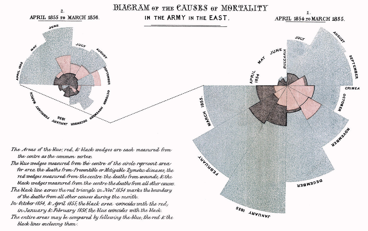
Nightingale’s polar area diagrams (or exploded pie charts) owe a debt to William Playfair’s innovations, but also, no doubt, to her long-term collaborator William Farr, who experimented with circular charts in his earlier publications. Lee Brasseur, an expert in the field of visualization, has set out a compelling critique of the visual rhetoric of three of Nightingale’s diagrams as they appear in her 16-page pamphlet, “A Contribution to the Sanitary History of the British Army” (1859) (a publication that attributes tables and diagrams to Farr). These three lithographic prints, published in a short, highly impactful pamphlet, comprise (according to Brasseur) a coherent (and persuasive) sequential progression in visual rhetoric.

The first, titled “Diagrams of the Mortality in the Army in the East,” sets out monthly mortality rates in the army during the first and second years of the war; the first (larger) diagram concerning mortality rates in the first year draws the viewer’s eye to the right, before a dotted line draws attention over to the smaller diagram on the left, concerning the second year’s mortality rates. The viewer is invited to juxtapose these mortality rates against a concentric circle in each diagram that expresses the average mortality rate of Manchester, one of the deadliest towns in England at the time.
Inviting the viewer to reflect upon what might be the cause of these discrepancies, the second chart, “Diagram of the Causes of Mortality in the Army in the East” demonstrates using color-coordinated polar area diagrams that the majority of fatalities are due to preventable disease. Having first set out the scale of the problem, and then second, having explored the reasons for the anomaly, Nightingale then sets out in a third diagram, comprising monthly mortality rates, the outcome of improvements that had been made after March 1855, in Scutari and Kulali army hospitals. Collectively, these three diagrams represent a devastating visual critique of the army’s culpability in many needless deaths at the Crimean front.
Nightingale’s polar area diagrams play with the metaphorical implications in William Playfair’s circle diagrams in a highly effective way. These charts challenge the seeming unity, continuity, and coherence of the phenomena they express. The variation in the scaling of each section implies a sense of discontinuity, but also the same spirit of cartographic empiricism that speaks through the wider statistical maps of the 19th century.
These forms embolden the viewer with a sense of power, authority, and purpose, to cast a scrutinizing lens over the problem of the social ills of the day. But they also represent discontinuity; things clearly cannot simply go on as they are — change is implicit, change is necessary. This pamphlet is a multimodal medium, combining highly charged interpretive and explanatory discursive elements, into a compelling work of publicity. Nightingale’s approach speaks more to technique than to method. She sought to communicate Quetelet’s foundational statistics to a non-specialist, but nonetheless elite audience.
However, passionate statistician though she may have been, the Victorian press had, it seems, little to say about Nightingale’s innovations. Though read within (and presented to) an esteemed audience, the visualizations of Nightingale and Farr could hardly be said to have had a significant, direct public impact. It wouldn’t be until the rise of popular almanacs toward the turn of the 20th century, and in turn the modern daily popular British press, that the wider public would begin to encounter infographics.
Murray Dick is a lecturer in multimedia journalism at Newcastle University and the author of “The Infographic: A History of Data Graphics in News and Communications,” from which this article is adapted.
More Must-Reads From TIME
- The 100 Most Influential People of 2024
- Coco Gauff Is Playing for Herself Now
- Scenes From Pro-Palestinian Encampments Across U.S. Universities
- 6 Compliments That Land Every Time
- If You're Dating Right Now , You're Brave: Column
- The AI That Could Heal a Divided Internet
- Fallout Is a Brilliant Model for the Future of Video Game Adaptations
- Want Weekly Recs on What to Watch, Read, and More? Sign Up for Worth Your Time
Contact us at letters@time.com