Last Thursday, Facebook announced that it was about to release an iPhone app called Paper. The app is now available from Apple’s App Store. If you use Facebook on an iPhone, you really need to try it.
That’s because the app — unlike other Facebook mobile efforts such as Messenger and the failed Snapchat knockoff Poke — isn’t a specialized tool or a side project. It’s Facebook — almost all of it, anyhow — rethought for a small screen, with 2014 aesthetics.
By calling it Paper and leaving the original Facebook app untouched in the App Store, the company smartly avoids leaving users feeling like radical, jarring change is being imposed upon them. But it’s hard to imagine that Mark Zuckerberg & Co. don’t see the ideas in this app as a first rough draft of Facebook’s future, period.
(Side note: For now, at least, I’m going to err on the side of usually referring to this app as “Facebook Paper,” since a well-known and excellent iPad app already has the name “Paper.”)
Most of what you can do in the standard Facebook app for iPhone, you can do in Facebook Paper. There are some exceptions: I don’t see lists, apps or events, for instance. Whether you’re likely to want to use Paper full-time depends in part on whether you’re a heavy user of any of the missing items. (I’m not.) And what’s new basically boils down into two things: The interface and the sections of news organized by topic.
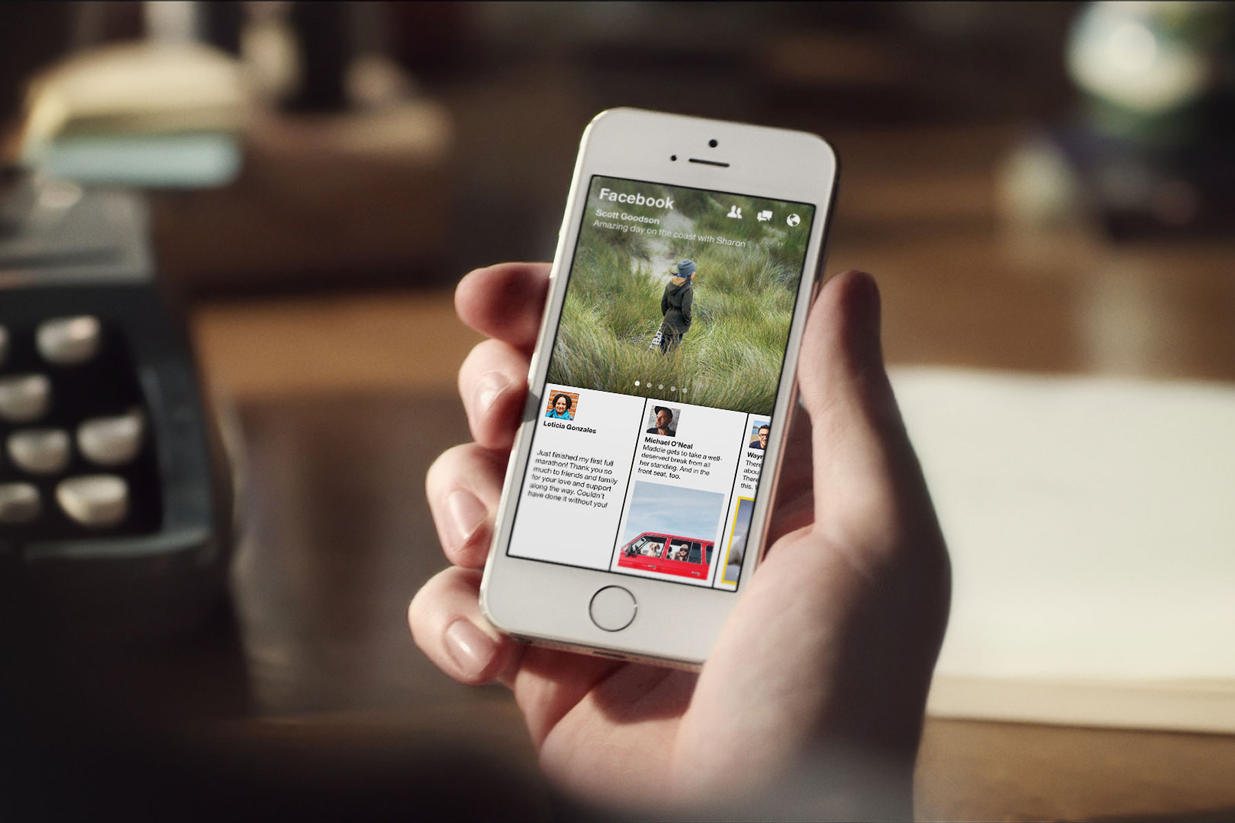
First, that new interface. It really does dispense with much of the stuff you associate with Facebook, including the company’s trademark blue trim and emphasis on lots and lots of vertical scrolling. Now everything’s cleaner, with a large content panel on the top, smaller horizontally-scrolling ones on the bottom, lots of big images and a profusion of fluid animation effects.
Overall, I like it very much, though I expect that not everybody will be fond of all the horizontal scrolling, which departs from the norm of smartphone interfaces. And the type in the small panels is pretty darn teensy: People with aging eyeballs may need to squint.
Besides the new look, Facebook Paper involves a bunch of gestures that may not be intuitive from the get-go. For instance, you swipe the large panel to the left or right at the top to move from section to section, and pull down on a story you’re reading to move back into the section it came from. Photos show up in oversized views you can pan back and forth by wiggling your phone to and fro.
Within five minutes, I’d figured everything out — where to find features, and how to navigate with flicks of my thumb. But it’s such a daring makeover that people who are largely comfy with Facebook as it already exists on the iPhone may find it a shock to the system.
(Side note: When you first launch the app and begin exploring it, a tutorial keeps butting in, with no way to shut it off. I assume that I’m not the only person who bristles at such things and therefore ignores them, rendering them ineffective. I’d much prefer more conventional help I could peruse at my leisure — which Facebook Paper doesn’t seem to have.)
Then there are those topic-based sections. You can add whichever ones appeal to you and order them as you please, then read them like a magazine. It gives Facebook Paper a bit of a Flipboard feel.
I count 19 sections in all, many of which have names that emphasize cleverness over clarity, as sections in dead-tree magazines often do. There’s a sports section called “Score” and a photo section called “Exposure,” for instance. One called “Pride” has the tagline “There’s strength in community” — you can probably guess the theme, but I’m curious why Facebook doesn’t just state it directly.
More than any form of Facebook I’ve seen in the past, these sections are less about your friends and other assorted individuals, and more about established experts. The content in each one is dominated by brand-name media: In Tech, for instance, I see items from Gizmodo, The Verge, Techmeme, TechCrunch, Cnet, 9to5Mac and others. But I also see some posts from Facebook users — well-known ones, at least, such as Search Engine Land’s Danny Sullivan, the New York Times’ Nick Bilton and Mashable’s Pete Cashmore. (Full disclosure: I saw plenty of TIME stories in sections such as Headlines and Ideas.)
As with the rest of Paper, sections have a big panel at the top and browsable smaller ones below. Even though the app still displays articles by giving you the same view you’d see if you simply visited the site where the item was published, it now shows them in a less cramped full-screen mode, which makes for easier reading. You can also save stories to read-later services such as Pocket, Instapaper and Safari’s Reading List.
As far as I can tell, everybody who chooses to browse a section gets exactly the same feed, chosen by human editors rather than a fancy algorithm that knows I like to read about smartwatches but don’t care much about graphics cards — but that I prefer desktops over watches. So the sections don’t feel all that Facebook-y, and I don’t think they present an immediate existential threat to existing ways to read news on an iPhone, such as Flipboard, Zite, Circa, News360, Inside and many, many others.
Still, these sections are a big deal. Facebook is figuring out how to organize itself by subject. It’s incorporating external content more elegantly than before. And it’s giving you a way to efficiently find out what’s new in the world, rather than expecting you to dive into your newsfeed and hoping that your friends point you in the right direction. It’s easy to envision how this modest first pass at the idea might evolve into something much more powerful.
And even though Facebook’s last ultra-ambitious idea — Facebook Home — turned out to be, um, something less than a game changer, Facebook Paper feels like it has a shot at the big time. Especially if the influential types who will be the first to try it recommend it to friends and family, and especially if it arrives on the iPad, Android devices and other platforms. Assuming it doesn’t flop, it’ll be interesting to see how Facebook manages its two iPhone incarnations, and whether it ever takes steps to nudge less adventurous users into the Paper camp.
I’m a sucker for slick, modern interfaces, so I expect that Facebook Paper will be my Facebook app of choice on the iPhone. If you install it, let me know what you think.
More Must-Reads From TIME
- The 100 Most Influential People of 2024
- The Revolution of Yulia Navalnaya
- 6 Compliments That Land Every Time
- What's the Deal With the Bitcoin Halving?
- If You're Dating Right Now , You're Brave: Column
- The AI That Could Heal a Divided Internet
- Fallout Is a Brilliant Model for the Future of Video Game Adaptations
- Want Weekly Recs on What to Watch, Read, and More? Sign Up for Worth Your Time
Contact us at letters@time.com