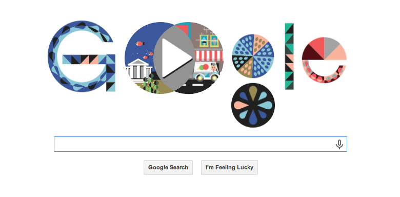
Correlation has never looked this cute. Google created an interactive illustration in honor of the 180th birthday of logician and philosopher John Venn — best known, of course, for inventing the circles known as the Venn diagram. The doodle allows you to choose from five different subjects (mammals and sea life, for example) along with five descriptors (thrives in cold, has wings, etc.) and then see the resulting correlation. Okay, it sounds kind of boring, but it’s really quite cute and whimsical.
Check out some of the diagrams:
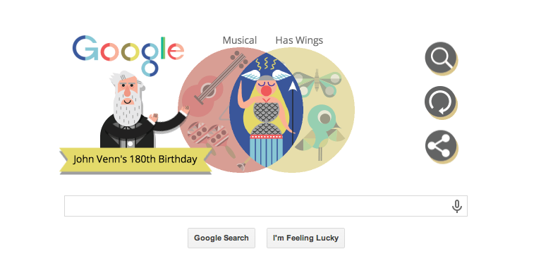
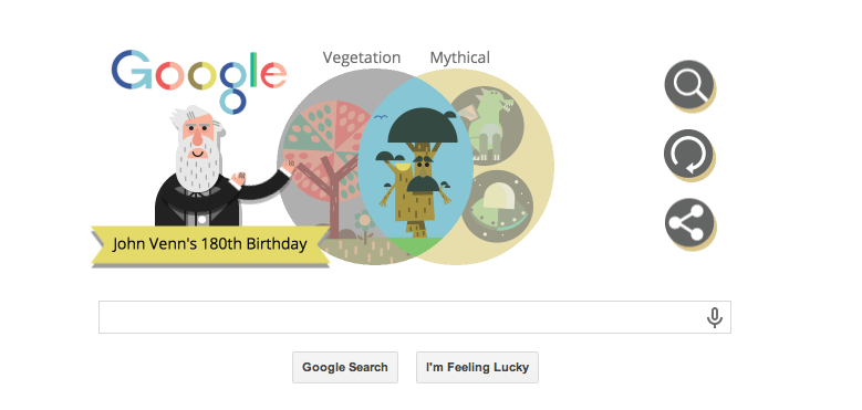
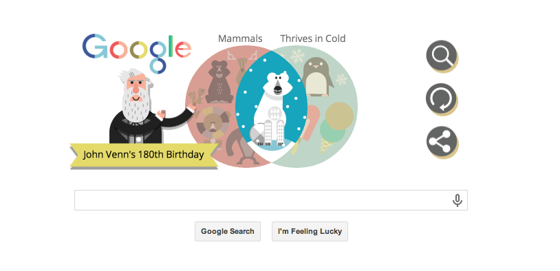
Though the concept behind this seems pretty simple, it took quite a while to flesh out, the doodle team explains in a blog post. But what ultimately fueled the final version? “Sound logic and silliness.”
More Must-Reads From TIME
- The 100 Most Influential People of 2024
- The Revolution of Yulia Navalnaya
- 6 Compliments That Land Every Time
- What's the Deal With the Bitcoin Halving?
- If You're Dating Right Now , You're Brave: Column
- The AI That Could Heal a Divided Internet
- Fallout Is a Brilliant Model for the Future of Video Game Adaptations
- Want Weekly Recs on What to Watch, Read, and More? Sign Up for Worth Your Time
Contact us at letters@time.com