This post is in partnership with the Harry Ransom Center at The University of Texas at Austin. A version of the article below was originally published on the Ransom Center’s Cultural Compass blog.
Johann Gutenberg and Johann Fust’s Biblia latina (Mainz, 1454–1455) represents the first substantial book printed from moveable type on a printing press. Without question, it is a milestone in information technology. And yet, it is important to remember that Gutenberg and his business partner were operating within an existing book trade and catering to highly literate customers who, for the most part, already had a need for the very book that the two men were selling. When undertaking the first major test of their new technology, Gutenberg and Fust minimized risk by choosing a title—arguably the title—for which there would be a guaranteed and sufficiently wealthy audience; they knew very well that the Catholic Church and its religious communities needed Bibles. In fact, the first documented account of the Gutenberg Bible shows that their decision to print Scripture was a savvy one. Reporting on what he had seen at the Frankfurt Book Fair early in 1455, the future Pope Pius II claimed that the entire edition of between 158 and 180 copies had sold before Gutenberg even finished printing it.
In Mainz, Gutenberg and his team were the progenitors of a technology, not of a market for books, and while it can be tempting to see the printing press as a harbinger of modernity, it is difficult to find a book that is more thoroughly medieval than the Gutenberg Bible in terms of its appearance, early ownership, and use. And this was by design. Though produced in a new way, the success of Europe’s first major book in print depended on its ability to perform like what was already out there: manuscripts.
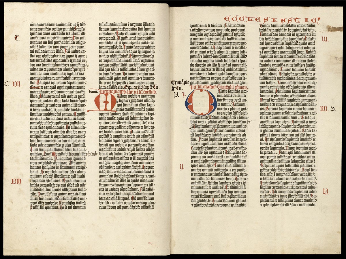
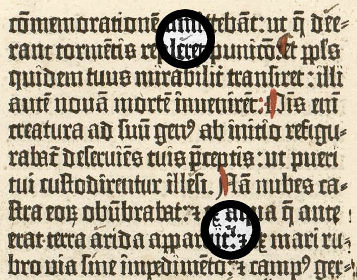
The Harry Ransom Center recently turned the pages of its copy of the Gutenberg Bible. In the opening now on display, we see that decorative initials and other rubrication have been added by hand. Medieval readers were accustomed to Bibles that incorporated color both for decoration and to aid reading, and Gutenberg worked to oblige those readers, even though the printing press itself was not entirely up to the task just yet. Elsewhere in this copy, there is evidence that Gutenberg experimented with integrating red text with black, but he clearly found it difficult and gave up on the ambition early in the process of printing his book. Instead of insisting on a completely black-and-white text, though, he elected to enable the conventions of earlier Bibles by leaving blank spaces for a manuscript rubricator to fill in later. (Can you spot which parts of the text are in Gutenberg’s print and which are in manuscript? Hint: scribal work in this copy includes some of the black text.)
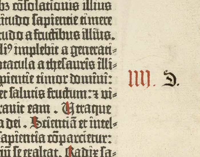
Additionally, there is evidence here and throughout the two volumes that Carthusians owned this Bible and that it formed an integral part of their regular worship: letters and numbers in the margins of these pages from the end of Wisdom and the beginning of Sirach (Ecclesiasticus)—“P,” “S,” “T” and “I,” “II,” “III,” etc.—were added by hand to specify the readings for feast days and Sunday services. Groups like the Carthusians needed Bibles that could be easily read aloud in a communal setting, and Gutenberg and Fust surely intended for their large book to cater directly to this need. The same report that specifies the number of copies Gutenberg printed also remarks that the text of his Bible was large enough to be read without the aid of glasses, a feature that surely would have been attractive to any Church’s designated lectors (readers).
Later, near the beginning of Ezekiel (fol. 429v), a scribe has added instructions on how to use the letters and numbers to the lower margin of this copy:
When the Dominical Letter is A, follow A, B, C [etc.] for the feast days. For all other times, follow the headings P, S, and T; and on Sundays follow the numerals I, II, III, and so on; the sacristan [a church officer] must take care that the lectors make no mistakes in determining the readings.
This means that, in the years where Christmas and New Year’s Day were on Sundays, readings for feast days were specified by a sequence of letters from A–H. For years where this was not the case, feast day readings were designated by P[rima], S[ecunda], and T[ercia]. And for regular Sundays, readings were marked by Roman numerals from I–VIII.
In addition to the marginalia indicating what to read, there is punctuation within the biblical text indicating how to read it. Beginning with the very first line of the pages displayed here from Volume II, there are numerous accent marks, and, from the ninth line onward, the top dot of some colons has been transformed into what looks like a small “7.” The punctuation mark that results from this modification, which is known as the “punctus circumflexus” or “flexa,” instructs readers to allow a medium-length pause before continuing. For the community that made these customizations, it was important not only that the Bible be read aloud but also that it be read aloud well. The origins of print, it turns out, were at least as much in community and orality as they were in private, silent reading.
The information in this post is deeply indebted to the research of Eric Marshall White, whose “The Gutenberg Bible at The Harry Ransom Center” appears in the CD-ROM edition of The Gutenberg Bible at the Harry Ransom Center.
More Must-Reads From TIME
- The 100 Most Influential People of 2024
- The Revolution of Yulia Navalnaya
- 6 Compliments That Land Every Time
- What's the Deal With the Bitcoin Halving?
- If You're Dating Right Now , You're Brave: Column
- The AI That Could Heal a Divided Internet
- Fallout Is a Brilliant Model for the Future of Video Game Adaptations
- Want Weekly Recs on What to Watch, Read, and More? Sign Up for Worth Your Time
Contact us at letters@time.com