There are more than 4,800 “real” covers of TIME magazine that have been designed over the past 94 years. That’s certainly a lot of history, but it may well be dwarfed by all of the “fake” TIME covers that have been produced over the years. Occasionally, these knockoff covers generate real news.
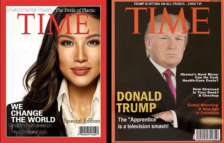
The latest version (as reported by NBC News) is a fake one by Mina Chang, the deputy assistant secretary in the State Department’s Bureau of Conflict and Stability Operations. Chang’s version features a different TIME logo (using the font Bembo Book for the logo), but reuses a subhead (The Perils of Plastic) from a real TIME cover featuring Apple’s Steve Jobs from April 12, 2010.
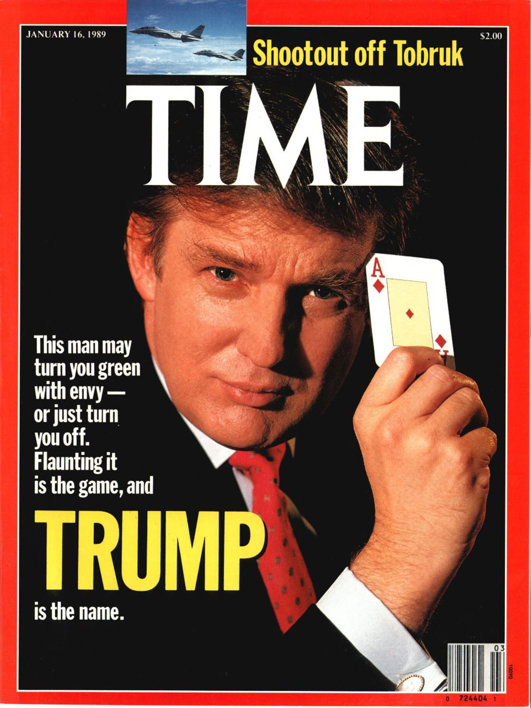
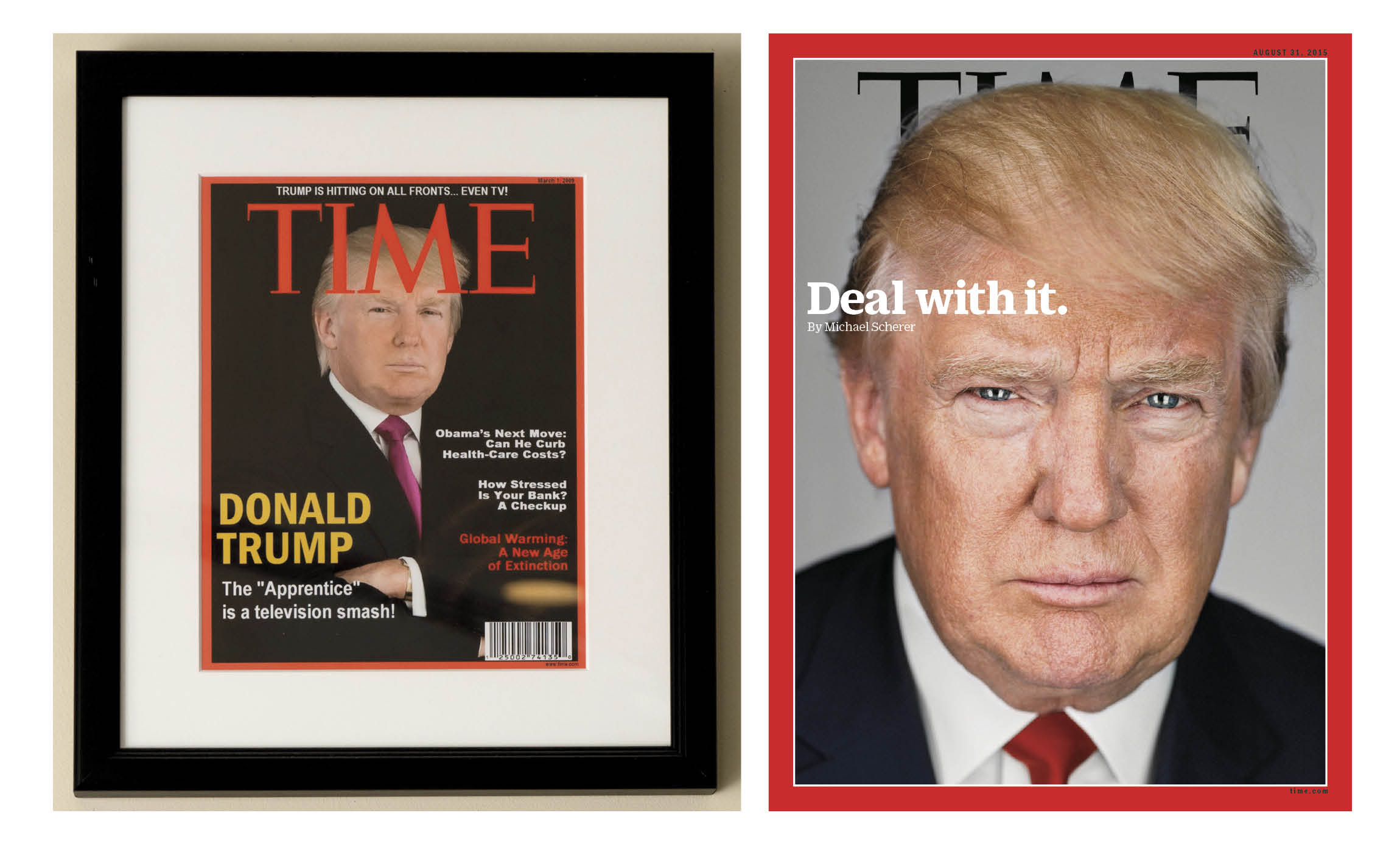
This latest “fake” follows one from President Donald Trump. He had a fake one from March 1, 2009 featuring an image of President Donald Trump and headline calling his reality TV show “The Apprentice,” a “smash.” The Washington Post reported in June 2017 that the fake cover had been displayed in at least four of President Trump’s golf clubs. In fact, there was no cover of TIME on March 1, 2009, and Trump has only been on one cover of TIME (Jan. 16, 1989) prior to running for president.
So, how do you spot a fake TIME cover?
Here’s a quick guide:
First the Logo
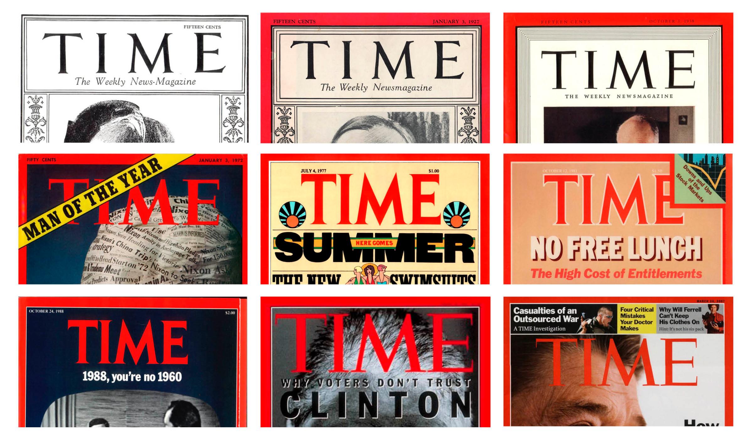
Most fake covers of TIME get the logo wrong. It’s either too vertically scaled, the word TIME is tracked out too much or the logo is in a different font altogether (as in the case of Chang’s fake cover). The current iteration of the TIME logo has been in use since the early 1990s and originally spanned the entire width of the cover. It was scaled down slightly to its current size in March 2007 during the redesign by Pentagram, a New York design firm. In the case of the fake Trump cover, the logo is slightly larger vertically than it would have been in 2009 and it’s also placed too high inside the border, which wouldn’t leave enough room for the three-line “rooflines” referring to other stories in the magazine, which was also used during that period.
The Border
Most fake covers do include the red border—although in the case of the Trump cover it appears in the frame to have a thinner border. TIME’s iconic red border has been in existence since Jan. 3, 1927 (the first four years did not include the trademarked red border). Most knockoffs also don’t include the thin white border that separates the red from the image.
The Image
TIME has put Donald Trump’s image on the cover a total of 30 times (and counting) and in the process we’ve commissioned a few of the world’s best photographers and illustrators, including photographers Nadav Kander and Martin Schoeller and artists Edel Rodriguez and Tim O’Brien. That type of artistic quality and creativity is not typically seen in fake covers, which usually feature stock imagery or lower-quality portraits. Also, in the case of the fake Trump cover, the head would have likely been silhouetted over the logo, creating what many people refer to as “devil horns.”
The Typography
Since most of our readers now see the TIME cover digitally—either through our cover animations on Instagram, Facebook or through other social feeds and news stories—the type design of the cover has also transformed. No longer do we feature “rooflines” above the logo that point readers to stories inside. Instead, the cover takes on a poster-like feel with a mission to create a simple and impactful message. In 2009, most of these inside story teasers were placed above the logo and the primary typeface was Benton Bold Condensed, a hand-crafted font modeled after the Franklin Gothic version in use today. As for the heavy use of punctuation: we do like punctuation for emphasis (evident in the use of periods on four covers concerning Trump (“Deal With It.”, “Meltdown.”, “Total Meltdown.” and “Nothing to See Here.”) But exclamation points and question marks are another thing – particularly the four (!) in use on the fake Trump cover.
In the end, if you’re still not sure if it’s a real TIME cover, it’s best to check the TIME Vault, where every TIME cover is on display.
D.W. Pine is TIME’s creative director. He has designed more than 500 magazine covers for TIME.
More Must-Reads From TIME
- The 100 Most Influential People of 2024
- The Revolution of Yulia Navalnaya
- 6 Compliments That Land Every Time
- What's the Deal With the Bitcoin Halving?
- If You're Dating Right Now , You're Brave: Column
- The AI That Could Heal a Divided Internet
- Fallout Is a Brilliant Model for the Future of Video Game Adaptations
- Want Weekly Recs on What to Watch, Read, and More? Sign Up for Worth Your Time
Contact us at letters@time.com