One of the great blessings of TIME’s expansion on multiple platforms–digital, video, mobile–is that it allows us to reimagine our print journalism at the same time. We often hear from readers about what you look forward to in these pages, and with this issue we are introducing some new features and design elements aimed at bringing you a better experience each week.
It will always be our mission to tell great stories, like Eliza Gray’s investigation into what it takes to land a job in the age of intrusive algorithms. That mission does not change, other than to make those featured stories a bit easier to read–more on that in a moment. But with this issue, we launch three new sections, in order to cover a wider range of topics with more stories and capture not only the people and events in the news but also the ideas and arguments behind them.
Time was born from the idea that time is valuable and we should help you use it well. So the issue opens with The Brief (named after our daily TIME.com news summary), a brisk overview of what’s happening in the U.S. and abroad, not only in politics and business but also in science and health, technology, education, sports, crime and society. This is followed by a new section called The View, which reflects our growing coverage of the ideas and innovations that are daily reshaping our lives. This week our media critic James Poniewozik explores what it means that there are now more than 350 original shows on TV, compared with a dozen or so when many of us were growing up. We look at NASA’s new flying saucer and new research into memory improvement. This section will also include commentary from regular columnists like Joe Klein, Kareem Abdul-Jabbar and Rana Foroohar as well as contributing voices. At the back, the final section of the magazine is Time Off, which serves as a guide for your free time: what to watch, read and see, or a great trip to plan or a dish to cook.
One of our goals was simply to make the magazine easier to read. We enlisted typographer Kent Lew, who through months of collaboration gave us all a profound new appreciation for the art of the font. For headlines we are introducing Duplicate Ionic, designed in a style with roots in the 19th century and commonly used in early newspapers. “Duplicate Ionic inherits this air of trustworthiness,” Kent says. For the body copy, Kent created a brand-new typeface, which he has named Haffner. It was designed to be elegant, understated and most of all, easy to read.
The entire project was overseen by our creative director D.W. Pine and design director Chrissy Dunleavy, working with our art, photo and graphics departments along with senior editor Dan Macsai, who coordinates the coverage in our opening sections. Unlike in days past, when magazines would undertake wholesale redesigns every few years, we have come to see our design as an evolutionary process. We are continually listening and learning, following the topics you are most interested in, the approaches to storytelling you find most compelling. We will keep experimenting in weeks to come, even as we also focus on new digital features and our enhanced mobile app. We look forward to hearing what you think.
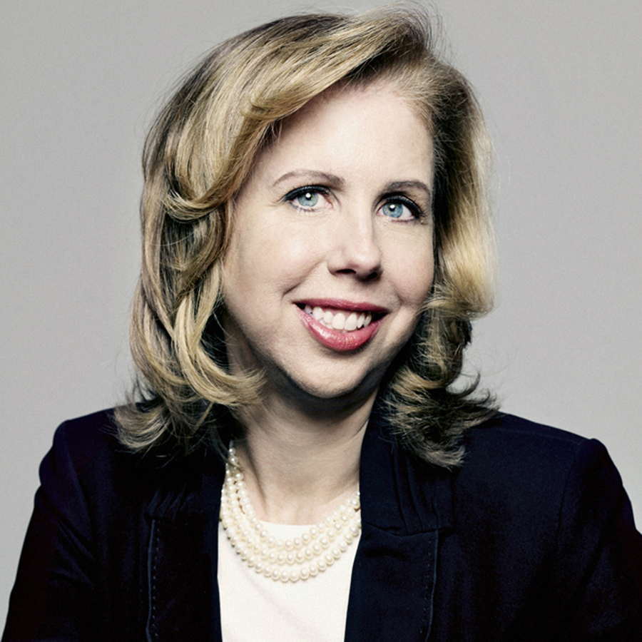
Nancy Gibbs, Editor
More Must-Reads From TIME
- The 100 Most Influential People of 2024
- The Revolution of Yulia Navalnaya
- 6 Compliments That Land Every Time
- What's the Deal With the Bitcoin Halving?
- If You're Dating Right Now , You're Brave: Column
- The AI That Could Heal a Divided Internet
- Fallout Is a Brilliant Model for the Future of Video Game Adaptations
- Want Weekly Recs on What to Watch, Read, and More? Sign Up for Worth Your Time
Contact us at letters@time.com