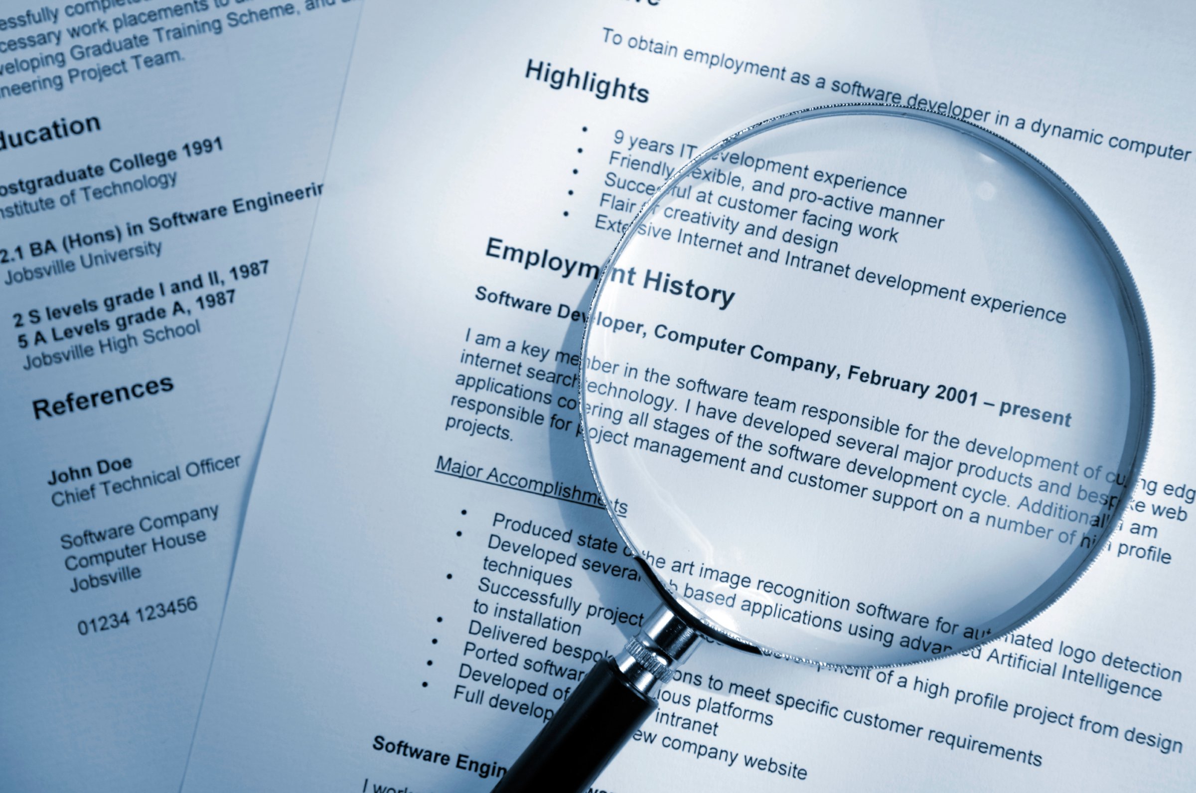
If you’re looking for a job and not paying attention to what font you use on your résumé, you’re making a big mistake. It’s true that most of us don’t go around thinking about fonts, which is the way it should be when it comes to showcasing your professional accomplishments. If a font gets noticed, it’s almost always in a bad way. Here are experts’ tips for avoiding this.
Here’s your best bet. You can’t go wrong with Helvetica, the experts say. “Helvetica is so no-fuss, it doesn’t really lean in one direction or another. It feels professional,” designer Brian Hoff tells Bloomberg in a recent article about résumé font dos and don’ts. “Helvetica is safe.” Also good options, experts say, are other straightforward sans-serif fonts like Calibri or Cambria.
Stick with what’s safe. “You’re always going to be OK with the default Microsoft Office font,” says Andrew Challenger, vice president at executive outplacement firm Challenger, Gray & Christmas. Just by virtue of the fact that everybody’s seen it a million times and is used to looking at it, the font will fade into the background and let the actual contents of your résumé stand out, as it should be.
But not too safe. It is possible to be too conservative, though. Times New Roman, for instance, can suggest to an interviewer that you’re stuck in your ways. “You’re not not going to get a job” if you use Times New Roman, Challenger says, but at the same time, it’s better to show that you’ve taken the initiative to keep up with the times. “These things change,” Challenger says. “If you haven’t updated your resume in five years, it’s probably in a font that’s no longer in favor.”
Hoff feels more strongly about this, telling Bloomberg, “It’s telegraphing that you didn’t put any thought into the typeface that you selected… It’s like putting on sweatpants.”
Skip script. “Basically anything that looks remotely like cursive is a surefire way to get your résumé thrown away right off the bat,” warns Will Wegert, president of resume-writing service Cold Caller, in a post on his company’s blog. “While you might be trying to make your résumé look fancy or artistic, it only serves to make your résumé more difficult to read,” he says. And not being able to quickly scan a résumé is the kiss of death.
Nix nostalgia. “Those typewriter type fonts like Courier, stay away from that,” Challenger says. There’s no place for stylized old-fashioned in today’s busy workplace environment, he said. “You’re not writing on a typewriter, so don’t do it.”
This is obvious, right? Don’t ever, ever use Comic Sans or other casual fonts on your résumé. And don’t even think about emojis. “It’s a categorical no,” Challenger says. “That is not presenting the right image.”
More Must-Reads From TIME
- The 100 Most Influential People of 2024
- The Revolution of Yulia Navalnaya
- 6 Compliments That Land Every Time
- What's the Deal With the Bitcoin Halving?
- If You're Dating Right Now , You're Brave: Column
- The AI That Could Heal a Divided Internet
- Fallout Is a Brilliant Model for the Future of Video Game Adaptations
- Want Weekly Recs on What to Watch, Read, and More? Sign Up for Worth Your Time
Contact us at letters@time.com