Microsoft has a theory that your workday splits precisely into two categories: Those moments when you’re sitting still in front of a screen 10.2 inches or above, and those moments when you’re on the go, holding a screen 10.1 inches or below. One-tenth of an inch, Microsoft says, has a profound impact on the way you work.
Microsoft has kept that dividing line in mind when designing the next generation of Office apps for Windows 10, which launches this summer. TIME got an early look at the new Windows Phone apps this week, which will be released in preview mode for Windows Phone Insiders by the end of the month. The company hopes the software’s new interfaces will let workers switch seamlessly from desktops to tablets to smartphones without straining their eyes, fingers or thumbs.
In practice, the redesigns bring design tweaks that are subtle but deeply effective. For example, that ribbon of menu options in Word, typically entrenched at the top of the screen, flips to the bottom of the screen on smartphones. And why not? That’s where your thumbs are, after all.
The menus themselves pack a surprising number of features into the smartphone’s limited screen space. Flick up the menu in Word, for instance, and it displays a few of the formatting menu’s greatest hits – Italicize, Bold, and so on. One more flick of the thumb reveals a deeper list of all of those nit-picky buttons you might have waited to use at the desktop. Now they glide underneath your thumb for easy picking.
Excel, too, makes the leap to smartphones with hardly a loss in functionality. The 400 or so functions familiar to power users have been repackaged into larger groupings (Statistical, Engineering, etc.). Tap on any one grouping and nerd out at the mathematical possibilities.
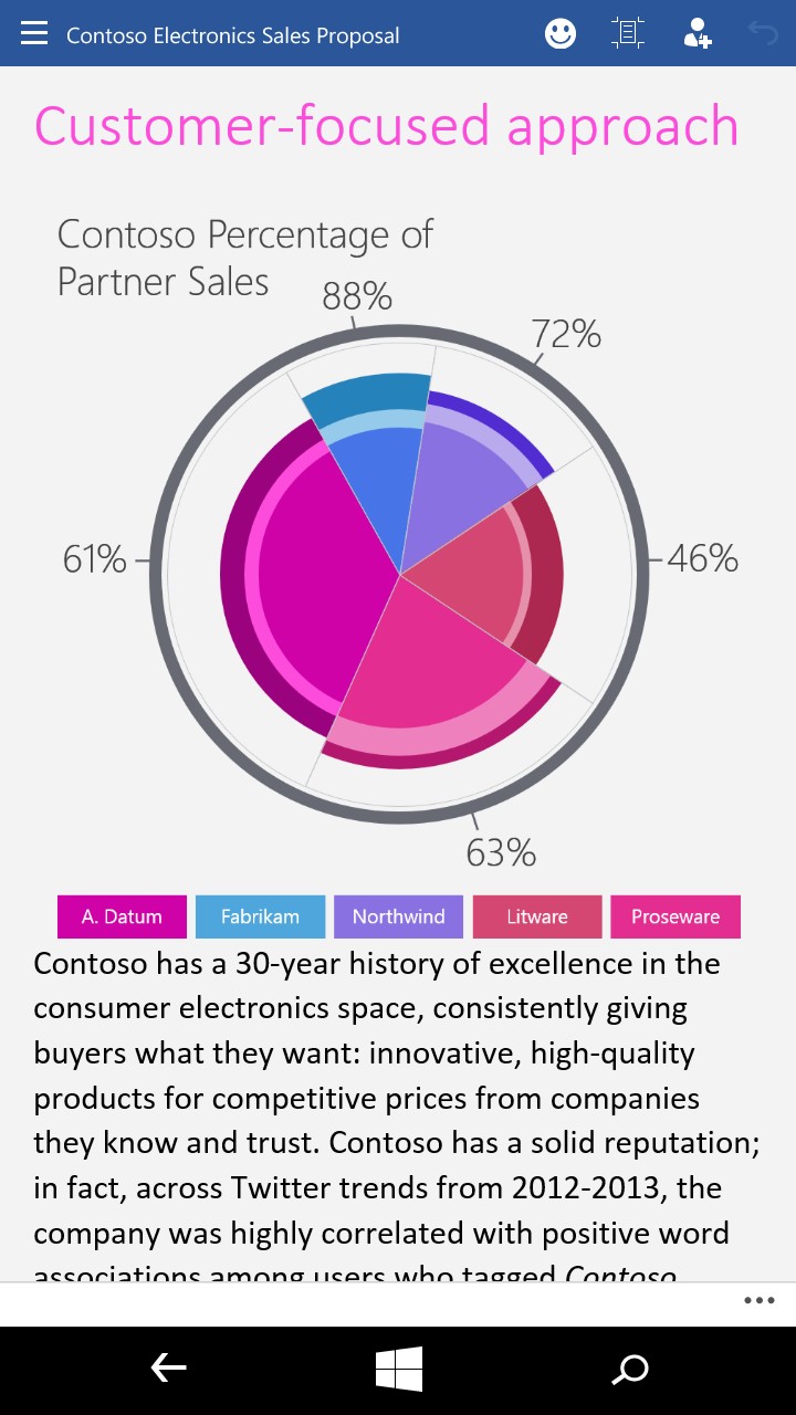
PowerPoint slides are editable from the title bar down to table cells. One of the few functions that won’t be available on smartphones are precise manipulations of borders and objects — a thumb can only do so much on a touchscreen.
The question remains whether Office users pine for so many functionalities while on the go. Microsoft Office General Manager Jared Spataro said that many of the designs were self-evident to the team. “It’s almost a gut feeling in some cases,” he said, but each idea was carefully vetted by focus groups. Researchers traced their eye and finger movements across various screen sizes.
Still, there are more radical ways to redesign apps beyond thumb-centric designs. Microsoft offered a hint of how its apps could begin to anticipate users’ needs with the introduction of a new search bar in Microsoft Word. Type in a keyword, such as “strikethrough,” and the button appears automatically below the search bar, sparing users the trouble of finding it themselves. Even pushier apps like Sway can format an entire slide presentation automatically, changing fonts and backgrounds in one tap of a button. For now, though, Microsoft seems intent on porting familiar functionalities from the desktop to the tablet and smartphone, rather than overwhelm users with new tricks. It’s a fitting early step into the mobile era.
More Must-Reads From TIME
- The 100 Most Influential People of 2024
- The Revolution of Yulia Navalnaya
- 6 Compliments That Land Every Time
- What's the Deal With the Bitcoin Halving?
- If You're Dating Right Now , You're Brave: Column
- The AI That Could Heal a Divided Internet
- Fallout Is a Brilliant Model for the Future of Video Game Adaptations
- Want Weekly Recs on What to Watch, Read, and More? Sign Up for Worth Your Time
Contact us at letters@time.com